
A Complete Guide to Law Firm Websites
Whether your law firm is an established local leader or the new kid on the block, a great website is a must. Why? Considering that most people research online before making any big decisions, your website is the prime opportunity to connect with prospective clients and show them why your firm is the right choice for the task at hand.
We’ve been building custom law firm websites for over a decade, but we know that the process can be more than a little intimidating for those who haven’t taken on this type of project before. Luckily, we’re here to break things down into manageable pieces so that you can approach your firm’s website armed with the knowledge needed to plan, launch, and maintain a stellar web presence that will set your firm apart and exude the quality and professionalism of your practice.
In This Post
What a Great Law Firm Website Design Looks Like
Law Firm Website Accessibility and User Experience
Law Firm Website Content Recommendations
Use Content and Calls-to-Action to Generate Leads
What a Great Law Firm Website Design Looks Like
If you’re just beginning a law firm website redesign, you’ll want to think carefully about your goals for the project and more generally, the purpose that your website will ideally serve. For most firms, a website is meant to (1) attract new clients, (2) establish authority and expertise, and (3) explain why the firm is a better choice than competitors who do similar work.
You can accomplish these goals in a number of ways, but we’re going to begin by exploring the design side of visitor engagement and retention. Think of it as creating an awesome first impression.
Examples of Effective Law Firm Website Design
The following examples are law firm websites that we love. And even though they vary widely in style and scale, the sites are equally effective because each one grabs visitors’ attention immediately, clearly communicates key information, and develops a distinctive and recognizable visual identity.
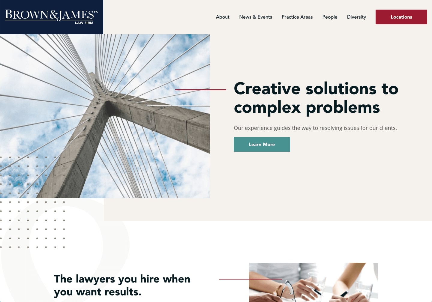
Brown & James
Brown & James is a midwestern law firm whose practice areas range from Arson-Fraud Litigation to Life Sciences. Their website is a great example of how a neutral color palette can be transformed by modern shapes and unique background textures. The site’s design isn’t what a visitor might expect from a law firm website, which makes it all the more intriguing to scroll through and explore.
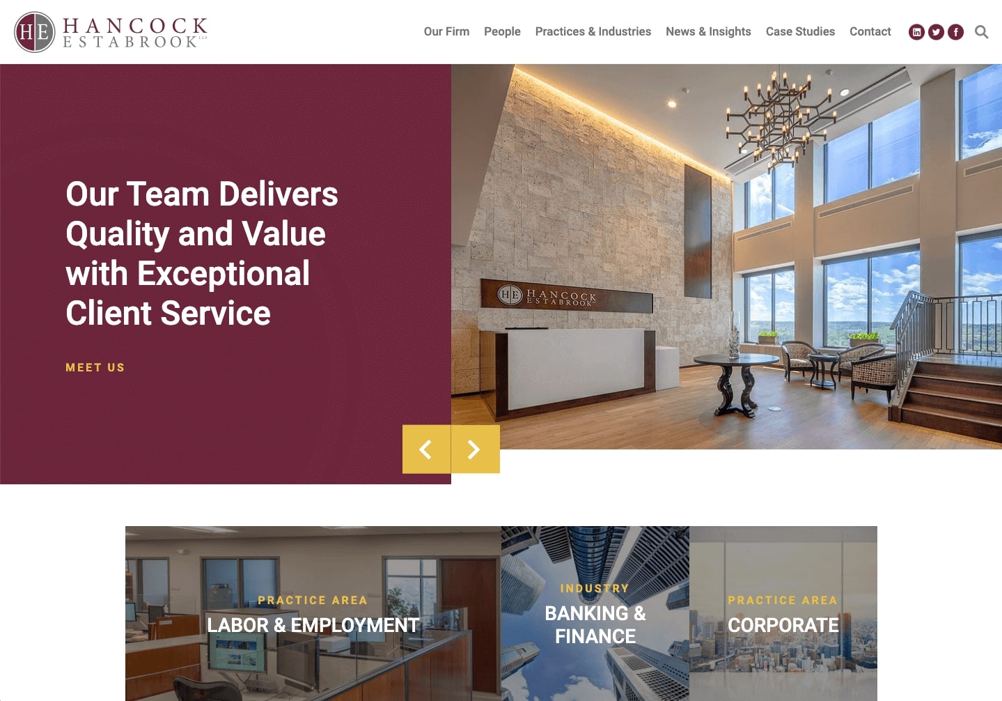
Hancock Estabrook
Founded in 1889, Hancock Estabrook is a central New York law firm with a track record of outstanding customer service. Their site is a good example of how a traditional approach can be modified with dynamic elements that add movement and interest.
On the homepage, for example, the firm utilizes an image slider that highlights multiple stories and headlines. This feature allows visitors to interact with the page and makes them more likely to click through and read more. Further down (and throughout the site), subtle hover effects bring in brand colors and make for an elevated user experience.
Hutchison
Hutchison’s website shows how bold brand colors can be used to create a homepage that really packs a punch. The bright orange hue is instantly recognizable, and it’s likely to stick with site visitors as they browse competitor sites that are more subdued.
In addition to the memorable monotone look, Hutchison’s site also demonstrates how a boutique firm can appeal to their niche right off the bat. The homepage headline, “Embracing the Entrepreneurial Spirit,” immediately signals to site visitors that the firm specializes in supporting entrepreneurs. This messaging is clear, direct, and effective in getting an essential point across.

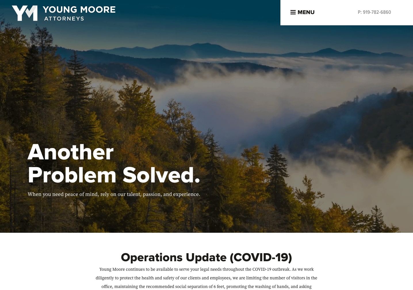
Young Moore
Based in North Carolina, Young Moore prominently clarifies their roots with a series of videos from across the state. Not only does this contribute to their stand-out design, but it begins to establish the firm’s character and local approach.
Young Moore’s headline and check-mark logo solidify the firm’s problem-solving mindset and sleek aesthetic. Like some of our other examples, the unexpectedly modern design communicates to site visitors that Young Moore takes pride in being different from other firms.
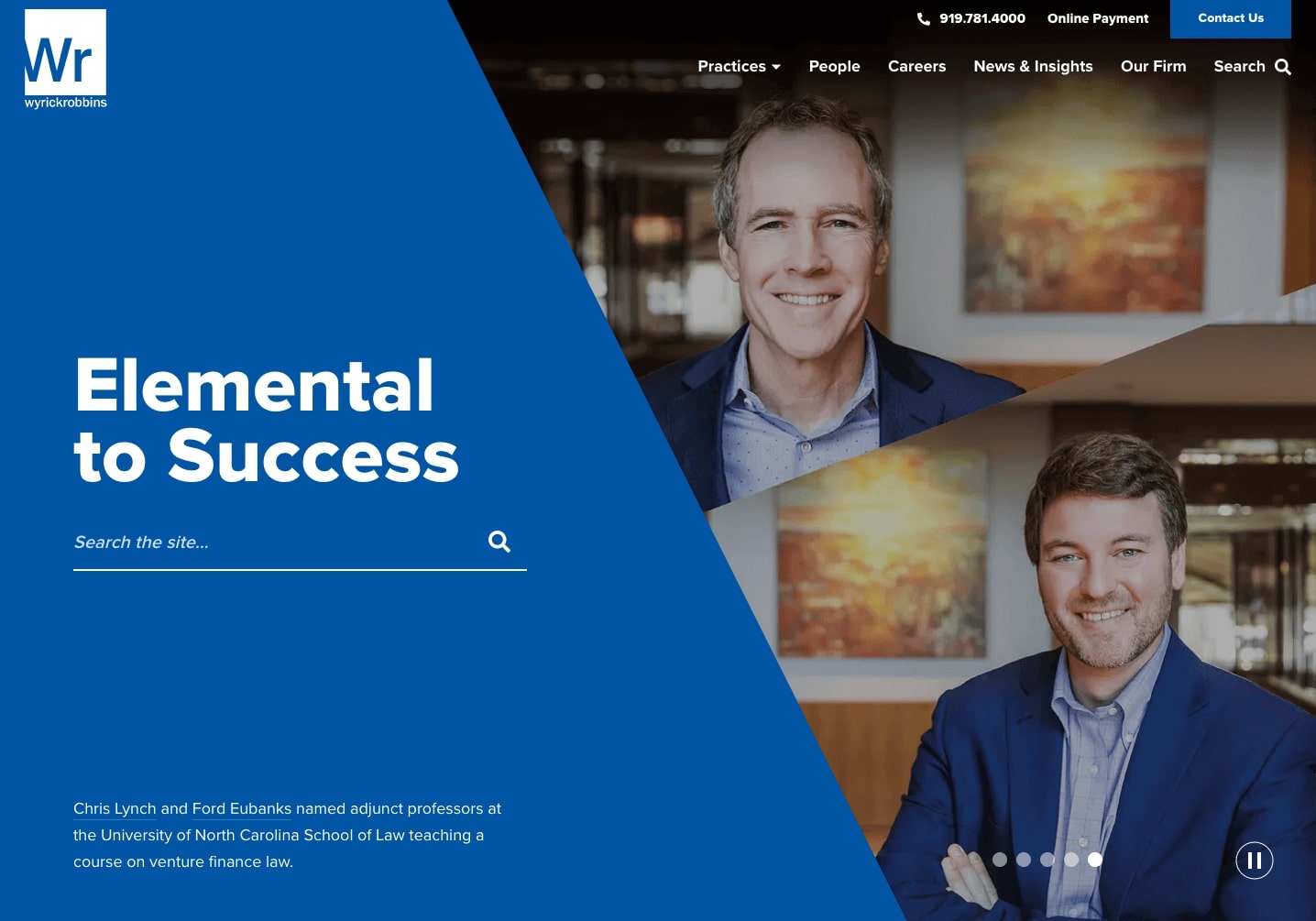
Wyrick Robbins
Wyrick Robbins yet again shows how a strong brand (or in this case, the Periodic Table theme) can be used to make a lasting impression on website visitors. Consistent through the firm’s logo, slogan, and homepage design, the idea of “elements” becomes a core building block for the rest of the site. Combined with clean lines and Wyrick’s signature shade of blue, the site easily captures visitors’ attention while forming the firm’s unique identity.
Now that you’ve seen a few examples of great law firm website design, let’s take a closer look at the trends and features that contribute to their online success.
Law Firm Website Design Trends and Best Practices
Our examples may look different from one another, but they come together in that they all make use of law firm website design best practices. Let’s walk through what that means in terms of specific design features.
This is a condensed version of the points that we cover in our blog post, Twelve Common Features of a Modern Law Firm Website. Head over there to read more about each design element!
Dynamic Masthead
Your website’s masthead (also known as the banner or hero) is the first thing that site visitors see when they land on your homepage. It often includes an image, slogan, or ambient video, and it plays a huge role in setting the tone for the rest of your website.
A dynamic masthead captures visitors’ attention with movement (think video, rotating slides, animation, etc) or unique design features like bold colors, typography, or patterns. And in addition to looking great, the best dynamic mastheads also emphasize something special about the firm – whether that’s deep local roots or award-winning customer service.
As you saw in the examples above, mastheads can be fully customized to match your firm’s vision, colors, and aesthetic.
Streamlined Navigation
This is more of a necessity than a trend. When prospective clients are exploring your website, you want to make it quick and easy for them to find exactly what they’re looking for. This can be done with a top navigation bar that directs site visitors to essential sections on practice areas, attorney bios, firm history, and other important topics.
For those looking for a solution that’s even more compact, navigation links can be condensed into a simple dropdown or “hamburger” menu. Hamburger menus – named for the three horizontal lines that slightly resemble the food – make for an ultra-minimal look that transitions smoothly from desktop to mobile.
Want to read more about what to include in your main navigation? Check out our blog post, Creating Your Website’s Sitemap and Main Navigation Strategy. There you’ll find examples, additional tips, and more information about the points we discussed above.
Content-Rich Practice Areas
More often than not, site visitors are using your website to evaluate your firm’s experience, qualifications, and service offerings. In short, they’re looking to your digital presence to determine if you’re a good fit for the case or project. That’s where practice area pages come in.
Instead of presenting your practice areas in list, make the most of your website by creating an in-depth page for each of your specialties. In addition to providing an overview of the topic, these pages can highlight blog posts, events, awards, and attorneys that directly relate to the area in question. You can think of each page as a practice area “hub.”
Check out Wyrick Robbins’ Banking and Financial Institutions page as an example. We love how it moves beyond a basic overview to include extras like relevant transactions, recent news, and related practice areas.
Whitespace
Law firm websites typically include a large amount of content and resources. It’s unavoidable. But it’s important to make sure that site visitors aren’t overwhelmed by all of the materials that are housed on your website. Design-wise, you can break up dense content by selecting layouts that build in strategic whitespace.
Whitespace is just what it sounds like – it refers to portions of a design that are left intentionally blank or empty. This “breathing room” is essential because it allows site visitors to focus on each area of content without distraction or confusion. Need an example? Our client Saxena White does a nice job of padding their content with plenty of space.
Robust Attorney Bios
It’s only natural for prospective clients to be curious about your team. Your staff members are the ones who are building relationships, solving problems, and communicating with clients on a daily basis. Aside from meeting in person, the best way to introduce site visitors to your attorneys is through your website.
Gone are the days of limiting bio pages to a name and basic contact information. Now, the strongest law firm websites utilize comprehensive attorney profiles that feature each person’s professional headshot, credentials, educational background, and sometimes, even community involvement or hobbies. This information is often paired with person-specific announcements (like recognition by Super Lawyers or Best Lawyers), career highlights, and articles or posts that the attorney has written for the firm’s blog.
Define Your Unique Value Proposition (and Put It Front and Center!)
Above all else, your site’s design should unequivocally reinforce your firm’s unique value proposition. That means that you should quickly identify what makes you stand out from your competitors and explain why these factors position your firm as the best choice for prospective clients.
As you establish your unique value proposition, you’ll want to communicate it in a way that site visitors can grasp very quickly. Otherwise, they may leave your site prematurely thinking that you’re a carbon copy of the other firms that they’ve already researched. Try using client-focused language (along the lines of “what we can offer to YOU” rather than “why our firm is the best”), jargon-free terms, and prominent placement on a variety of site pages.
Our client Rania Combs of Texas Wills and Trusts does this well on her site’s homepage. Before diving into her services or qualifications, she deftly informs site visitors that her firm’s unique value lies in convenient access, flexible office hours, and remote collaboration. You can do the same thing by outlining any special features – like extended hours, virtual meetings, a free introductory conference, or affordable prices – that set your firm apart.
Law Firm Website Accessibility and User Experience
So far we’ve only scratched the surface of what it means to create a successful and effective law firm website. In this section, we’ll look behind good design and dig deeper into what it takes to build a website that’s as functional as it is attractive.
User Experience Considerations for Law Firm Websites
Website design and development is driven largely by the type of experience that we want for users. In general, that desired experience is one that’s intuitive, uncomplicated, and satisfying. Mastering this balance leads to positive experiences and return visits, and forgoing it can cause users to become frustrated and abandon a site completely.
So what makes for a great user experience?
Connected Content. We’ve said it before, and we’ll say it again: make it as easy as possible for your site visitors to find what they’re looking for! In terms of your website’s structure, that means connecting information in a way that’s logical and easy to follow.
For example, it’s easy to imagine that a site visitor could land on your homepage, check out a practice area, then look for an attorney who specializes in that topic. Support these types of common patterns with buttons, links, and calls-to-action that easily carry visitors through your site’s content.
Varying Content Structure. It’s common knowledge that our attention spans are shrinking. Online, that means that companies and marketers are turning to variety to keep website visitors focused and interested.
When putting together your law firm’s site, you can achieve variety by enriching each page with a mix of different content types. On a practice area page, for example, you might include a bulleted list of services, a featured attorney, a video about your work, and a grid of related resources and articles. The assorted content offers a welcome break from mundane, text-only layouts and keeps visitors engaged as they scroll down the page.
Search & Filter. For site visitors who are looking for something specific – like a particular blog post or their attorney’s contact information – it’s helpful to offer a search function that will quickly point to answers and results. This is important for sites of any size. Even if you don’t have a large amount of content and resources, site visitors will still value the ability to search directly for what they’re looking for.
Similarly, you can improve the user experience of your blog or resource library by adding filters for categories or topics. This way, visitors can customize their browsing experience and efficiently page through content that’s relevant to their needs.
Interaction. You may not think of your law firm website as a platform with a lot of interactive features, but the reality is that any great website uses subtle effects and animations to ensure that visitors know that the site is reacting to their actions and requests.
Think about buttons, for example. On a webpage, a button is really nothing more than a colored shape or outline overlaid with a text label. So to communicate that a button is actually clickable, many sites add a hover effect that makes the button change color, move up or down, or increase in size. The addition of a subtle effect enhances user experience by adding visual feedback that confirms a feature’s function.
Similar interactive effects can be added to links, dropdown menus, and animated icons or videos.
A hover effect is a change that occurs when a user places their cursor over a design element. Common examples include color changes, size changes, and the appearance of an outline.
Mobile Compatibility. More than half of the world’s web traffic comes from mobile devices. So needless to say, your website’s mobile performance really matters. During the design and development process, you’ll want to pay special attention to how your site will work on cell phones and tablets.
Some key things to think about:
- Menus. If you have a full-width navigation bar on your desktop site, consider using a hamburger menu for your mobile version. This will save space and make sure that site visitors have easy access to all menu items.
- Layouts. How will your designs change to fit narrow mobile screens? Multi-column and grid layouts may need to shift to a vertical orientation. Sections could break off into collapsable tabs. Images should be resized so that they don’t overwhelm screen space.
- Buttons and Links. Are buttons and links sized appropriately for mobile use? Small buttons can be difficult for some users to access on touchscreen devices.
Law Firm Website Accessibility
For a website to truly maximize user experience, it must prioritize the experience of all users – including those of different ability levels. That means that your firm’s site should have features in place that allow people with disabilities to navigate the platform with ease. Let’s take a look at what that means in practice.
Generally speaking, web accessibility makes it possible for people with a range of disabilities to use websites in a way that works for them. For some, that could include a screen reader or another assistive technology, and for others that might mean simply enlarging the text or zooming in on certain features. Regardless, accessibility can be built into a site’s design by paying extra attention to the areas below.
Color Contrast
Contrast refers to the difference between two things – in this case, shades of color. It’s important for website designs to use high contrast colors to ensure that site visitors can read all content, buttons, and links.
This isn’t to say that colored backgrounds and text are off limits. In fact, shifting background colors for buttons and menus can often make them easier to locate and read. It can be tricky, however, to identify which shades have enough contrast and which shades do not. We like to use Stark’s free contrast checker to test our colors and make sure that they meet basic ADA guidelines.
Descriptive Buttons and Links
Throughout your site, it can be tempting to include buttons with vague labels like “Learn More,” or “Sign Up.” These may make sense in context, but accessibility best practices call for labels that are a bit more descriptive about each button’s function. This is helpful for site visitors who skim or skip ahead – either with a screen reader or on their own.
It’s easy to customize your button labels to match their purpose. For example, a standard “Learn More” button could become “Learn More About (Firm Name),” “Learn More About (Practice Area),” or “Learn More About (Our Team, Our History, Our Approach),” etc.
Text Formatting and Headings
In order to improve your site’s readability, be mindful of the ways that you’re positioning and structuring your text. Text boxes should sit near the center of the page and max out at around 770px. If you go any wider, visitors will have a hard time moving from line to line and may become frustrated.
Additionally, you should break up large blocks of text with section headings that efficiently summarize the content. This way, visitors can quickly identify what they’ll be reading about and skip ahead to any sections that they’re particularly interested in.
Alt Text for Images
Alternative text (often shortened to alt text) is a brief description that’s included in the code for an image or video that appears on a website. It’s used by screen readers to describe photos, graphics, or anything visual to users who have limited eyesight.
Visuals are a defining part of any website, so alt text is a necessary part of creating an inclusive experience for all types of site visitors.
Want to read more about web accessibility? Check out our blog post, Web Design and ADA Accessibility Best Practices. There you’ll find examples, additional tips, and more information about the points we discussed above.
Law Firm Website Content Recommendations
Now that we’ve covered the fundamentals of law firm website design, trends, user experience, and accessibility, let’s bring it all together into an outline of the pages that your law firm website should include.
Home. Your homepage should lay out options for different visitor groups in an intuitive and clear manner. This way, visitors can quickly segment themselves and view targeted information based on what they’re looking to do. That could be exploring the firm’s history in a specific practice area, checking out the latest news, or reaching out to hire the firm.
About. Your About page should offer some background information about your firm. Site visitors want to know when the firm was founded along with core values, approach, and anything that sets your firm apart.
Attorneys. This page is about your team and their qualifications. Use the space to introduce each attorney and their specialties.
Practice Areas. Perhaps one of the most important pages on your website. Clearly explain each of your practice areas and any related services that you can provide. This will help visitors determine whether or not you’re equipped to meet their needs.
News. Your News page keeps clients and site visitors informed about your firm’s latest developments. It’s a great place to post announcements, updates, and press mentions.
Resources. A Resources section is the perfect place for whitepapers, guides, and articles on hot topics and frequently asked questions. This section also offers an opportunity to showcase your expertise and improve SEO for a wide range of queries.
Testimonials. While you may not need a dedicated page for client reviews and testimonials, it’s very helpful to include them throughout your site to reinforce your firm’s credibility and experience. No matter how polished and impressive you may make yourself sound, prospective clients want to hear from real people about real outcomes. Testimonials can be creatively added to your homepage, practice area pages, attorney bios, and more.
Contact. A Contact page gives visitors the chance to reach out to your team with questions or a request for more information. You can make this easy with a simple form that gathers the visitor’s name, email address, and message.
Remember, these are just the basics. Many firms benefit from including additional pages, tools, and resources that are specific to their practice. More on that when we get to Content Marketing for Law Firms.
Use Content and Calls-to-Action to Generate Leads
Once your website is up and running, it’s time to think about strategies for maximizing your online potential. Thus, this section will explain how to maintain your website in a way that generates leads and organic traffic.
Generating Qualified Leads
Your website is one of your strongest tools for lead generation. And it’s ideal – you can fill it with helpful, detailed information that proves why your firm is the right choice for a potential client.
Once a client is convinced, your website should also make it easy and unintimidating to take the next step. Wondering how to do that? Read on.
Calls-to-Action
Put simply, a call-to-action (CTA) is a statement that encourages site visitors to further engage with the cause, business, or product that the website is promoting. While a nonprofit CTA might call on visitors to donate or volunteer, a law firm CTA is more likely to prompt users to request information, join an email list, or download resources like whitepapers or guides.
The most effective law firm CTAs are concise, compelling, and descriptive of the outcome that will occur after the user hits “submit.” Additionally, they’re placed strategically throughout the site so that visitors are never left searching for a way to follow through.
PRO-TIP: Try including a CTA on each of your Practice Area pages. Since visitors have just read about your services and expertise, they’re perfectly primed to connect with your team.
Design-wise, strong CTAs capture visitors’ attention with engaging headings, colors, images, and styles that stand out from the rest of the site. Don’t be afraid to be bold!
Need some help crafting the perfect CTA? Check out our blog post, Examples of Calls-to-Action on Websites, for guidance on styling and writing a great CTA.
Forms
Most often, CTAs direct site visitors towards a form where they can complete the action that has been requested of them. This is where a casual visitor becomes a legitimate lead. You’ll want to streamline your firms – to avoid user fatigue, confusion, and frustration – by making them user-friendly. Here’s how:
- Keep it brief. Only gather the information that you really need. For an email signup, that could be as simple as two fields: name and email address. Short forms are quick and manageable, while unnecessarily long ones might cause visitors to abandon the process completely.
- Make it clear. Clearly define your fields so that users know exactly what you’re asking and where to type their answer. You can do this by placing labels above response boxes (instead of inside) and separating fields with an appropriate amount of space. This is especially important for accessibility.
- Include a can’t-miss “Submit” button. Make sure that users are actually submitting your form by placing the button in an obvious location (like below your last field) and making it stand out with color or size.
By filling your site with effective CTAs and intuitive forms, you’ll be well on your way towards generating leads and increasing your conversion rate. Next, we’ll talk about how to attract and grow site traffic in the first place.
Content Marketing for Law Firms
When it comes to marketing, law firms take a variety of different approaches. Some rely on word-of-mouth and referrals, while others follow highly coordinated marketing plans that involve advertisements online, in print, or on television. Content marketing falls somewhere in the middle.
Content marketing is a strategy that involves creating website content that’s meant to attract and engage a specific audience online. By driving traffic to a company’s website, the new content causes the business to gain exposure and authority, and with it, new clients or sales.
Since law firms can offer plenty of valuable advice, guidance, and knowledge, content marketing is an excellent strategy for growing traffic online. Below, we’ll walk through some of the best formats for packaging and sharing information with site visitors.
The Value of a Law Firm Blog
Blogs are a popular feature for law firm websites because they’re a great place to compile the helpful content that visitors are looking for. Attorneys can post articles about common legal questions, current events, firm news, or anything related to their practice areas. Not only is this content genuinely useful for site visitors, but it also showcases the firm’s depth and breadth of knowledge.
It’s a win-win situation, and the proof is in the pudding. Companies with blogs generate 67% more leads per month.
Using a Law Firm Podcast to Attract Site Visitors
For law firms interested in a nontraditional method of content marketing, a podcast might be the way to go. Podcasts are already incredibly popular, and they appeal to the many people who prefer multitasking to reading articles on the computer.
Like blog posts, podcasts can cover a wide range of topics. Our client McCullers, Whitaker, and Hamer produces a video podcast on various elements of their work. And it’s not as difficult to get started as you might think. All you need is a microphone, a computer, and an audio editing software like Apple’s GarageBand or Audacity (it’s free!).
Building a Following with Videos and Webinars
Videos can also play into your content marketing efforts. Targeted discussions, presentations, and webinars inform site visitors and demonstrate your firm’s expertise.
You could even consider using a particularly strong webinar as an incentive for site visitors who sign up for your firm’s email newsletter. This is considered a “lead magnet” – something that you can offer in exchange for a visitor’s contact information.
Thinking Beyond Your Law Firm Website
If you’re dedicating time to content marketing, you’ll also want to make sure that you’re publicising your new material in places where it can be discovered. There’s nothing worse than having your hard work go unnoticed!
As you produce new content, consider sharing it out via:
Social Media. Social media is a powerful tool for driving traffic to your website. Sharing your firm’s blog posts, podcast episodes, and videos ensures that followers know that they can find high quality, up-to-date content on your website. And once they click through to read one article, they’re likely to stick around and see what else your website has to offer.
In addition, posts that are re-shared or re-tweeted can reach an even larger audience that may not have been otherwise aware of your firm.
Want to know more about social media for law firms? Check out this post: 10 Common Mistakes Law Firms Make on Facebook
Email Newsletters. If you have one, you can use your newsletter to enhance your content marketing work. Try highlighting a few of your best recent pieces in your next issue. Since recipients have already expressed interest in your firm by joining the list, they’re an ideal group to reach out to with your latest and greatest website content.
Content marketing can seem like a lot to take on – especially for a law firm that’s busy with day-to-day work and other projects. With that in mind, it’s helpful to remember that (1) you don’t have to tackle everything at once and (2) you’re already an expert on the topics that your content will feature. Just set aside a little time each week to chip away at your content creation and your efforts will pay off in the long run.
Law Firm Website Search Engine Optimization
Even if you’re doing everything right, your law firm’s website may not reach its full potential without a little search engine optimization. Search engine optimization (often shortened to SEO) is the process of strategically positioning a website and its content to rank well on Google and other search engines. Better search engine performance means more website traffic, more exposure, and more prospective clients.
Use the tips below to boost your site’s SEO and grow organic traffic.
Keep Your Content Recent & High Quality
Google’s ranking algorithm is largely kept under wraps, but generally, the search engine prioritizes content that is recent, accurate, and relevant to a searcher’s query. Thus, SEO is closely related to the content marketing work that we discussed in the previous section.
When you’re writing for your firm’s website, be sure that your pieces are detailed and comprehensive. Google likes content with depth, meaning that high quality posts about specific topics are likely to perform better than posts that don’t go beyond surface level observations.
You’ll also want to be posting new content regularly. Laws, standards, and industry best practices shift over time, so your site should always reflect what’s current and relevant. This brings us to our next point.
Refresh Old Posts with New Information
As the years go by, content that was once great becomes dated and inaccurate. But there’s no need to waste that good work when you can spin it into something new.
Every now and then, take a look through your site content and refresh old posts with updates. You can do this by correcting outdated facts and statistics, supplementing the post with new information, and republishing it with a note that points out the reason for the update. Updates cause Google to reevaluate your content and hopefully(!) rank it higher.
Connect Related Content
For both site visitors and Google, it’s helpful to structure your website in a way that’s easy to navigate. One way to do this is by adding internal links to content that visitors might be interested in looking at next. This practice benefits SEO by increasing each page’s depth and offering a clear path through your website’s content.
Practice area pages are an ideal place to begin when thinking about connected content. In addition to explaining the topic and services, you can feature links to related attorneys, recent news articles, blog posts, and resources that complement the practice area content. You can take a similar approach with individual bio pages (linking to the attorney’s publications and practice areas), blogs, and other posts.
Strategic Selection of Keywords
As you become more comfortable producing content, you’ll eventually want to refine your SEO strategy by incorporating keyword research. At a basic level, keyword research helps you identify which terms users are searching for and the search volume for those particular queries.
When selecting keywords to try to rank for, pick phrases that are specific to your practice instead of general terms that are more competitive. For example: you’ll have a better chance at performing well with a keyword like “affordable divorce lawyer raleigh nc” than simply “divorce lawyer,” a term that might get thousands of queries per month. Once you’ve identified some keywords, you can begin working them into your site content and blog posts.
Programs like SEMrush, Moz, and Yoast SEO (a WordPress plugin) can help to gather and suggest appropriate keywords for you to target. While these kinds of tools are usually only available with a paid subscription, they can be well worth the cost – especially because they offer numerous other features that address additional elements of SEO.
Include SEO-Rich Resources
As we mentioned in our section on Content Recommendations, online resources benefit site visitors along with the firm that creates them. Why? Resources often contain valuable keywords and deep information that can boost your site’s SEO.
Some common resources that rank well for relevant terms are:
- Checklists to prepare for something that prospective clients might face
- Guides for planning ahead for situations that are relevant to your firm’s expertise
- Answers to commonly searched questions or dilemmas that clients might encounter (check out AlsoAsked.com for a head start!)
- Tips about things that prospective clients should beware of
Read our blog post, Search Engine Optimization (SEO) for Law Firms to see how we used these strategies and others to help a law firm client regain lost Google traffic.
A Great Law Firm Website is Transformative
From design inspiration to accessibility recommendations to SEO tools, we’ve covered a lot in this post. But it all comes down to this: A sophisticated website is essential for any law firm that wants to stand out as professional and relevant in today’s high-tech world. Without one, you risk missing out on new clients and opportunities that build momentum from your website.
However, we know that web projects have a lot of moving parts, and that they can be tricky to manage on your own. So no matter where you are in the process, it can be helpful to have an expert on your side.
If you’re just getting started, think about writing and submitting an RFP to a handful of web design agencies that you love. If your firm’s existing website only needs a minor facelift, reach out to your favorite web vendor to see how they might rejuvenate your site’s look. And for anyone just looking to brainstorm, feel free to reach out to us – we’d love to help sort through your ideas and come up with a digital solution that’s perfect for your firm.


Comments
เสื้อโปโล
โพสต์นี้เจ๋งมากเลย เนื้อหาเกี่ยวกับปกโปโลมันน่าสนใจสุดๆ ผมแทบไม่รู้มาก่อนว่ามันมีผลต่อสไตล์ขนาดนี้ ถูกใจที่ผู้เขียนอธิบายให้ชัดเจนว่าตัดสินใจปกแบบไหนถึงจะเหมาะกับฉันCristian T
A professional website can make a huge difference for any business. I found that partnering with a website design agency phoenix was the best way to ensure my site was both attractive and functional.Leave a comment