
Twelve Common Features of a Modern Law Firm Website
For any successful business, a robust online presence has become an essential tool for attracting new clients, maintaining existing relationships, and educating a target audience about a particular product or industry. And for most, building that digital identity begins with a website.
In the past, law firm website designs were predictably static, traditional, and plain. But with the public’s increased expectation for creativity, many firms are moving towards a more modern aesthetic that prioritizes ease-of-use while maintaining polish and professionalism. In this post, we’ll explore the following twelve features of modern law firm websites:
- Dynamic Mastheads
- Hamburger Menus
- Streamlined Navigation
- Client-Focused Content
- Content-Rich Practice Areas
- Whitespace
- Robust Attorney Bios
- PDF Generators
- News & Insights
- Showcasing Awards
- Prominent Contact Info
- Optimized for Mobile Use
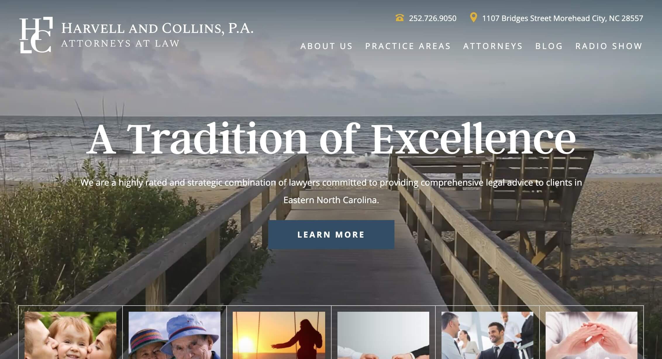
1. Dynamic Mastheads
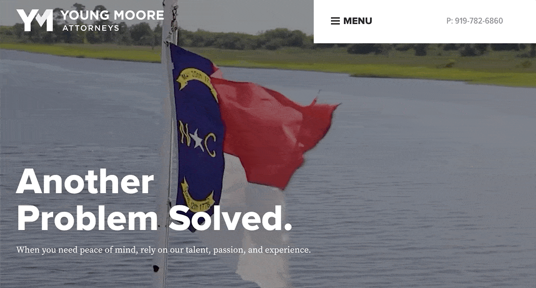
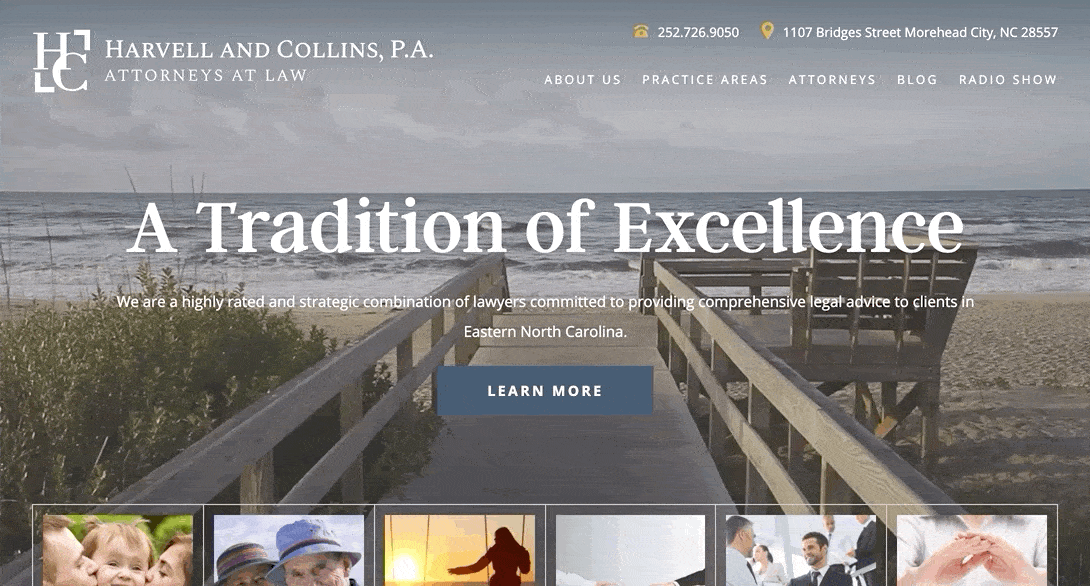
While old-school sites were quick to include an image slider in the homepage masthead, modern firms are utilizing this area to grab attention through ambient videos and bold static images. This switch allows the firms to emphasize what sets their practice apart and aids in developing a strong sense of brand.
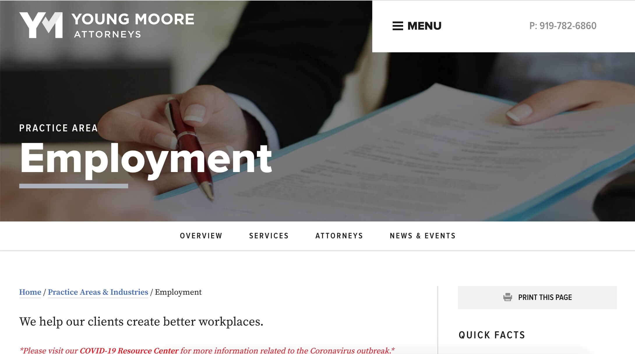
Both Young Moore and Harvell and Collins use ambient video to highlight their connection to the North Carolina communities, for example. The videos bring subtle motion by featuring scenes of the state’s flag, an overhead view of capital city Raleigh, and ocean waves that evoke the iconic North Carolina coast.
To see more examples of how our clients are using ambient video, check out the blog post, Examples of Ambient Video on Websites.

2. Hamburger Menus
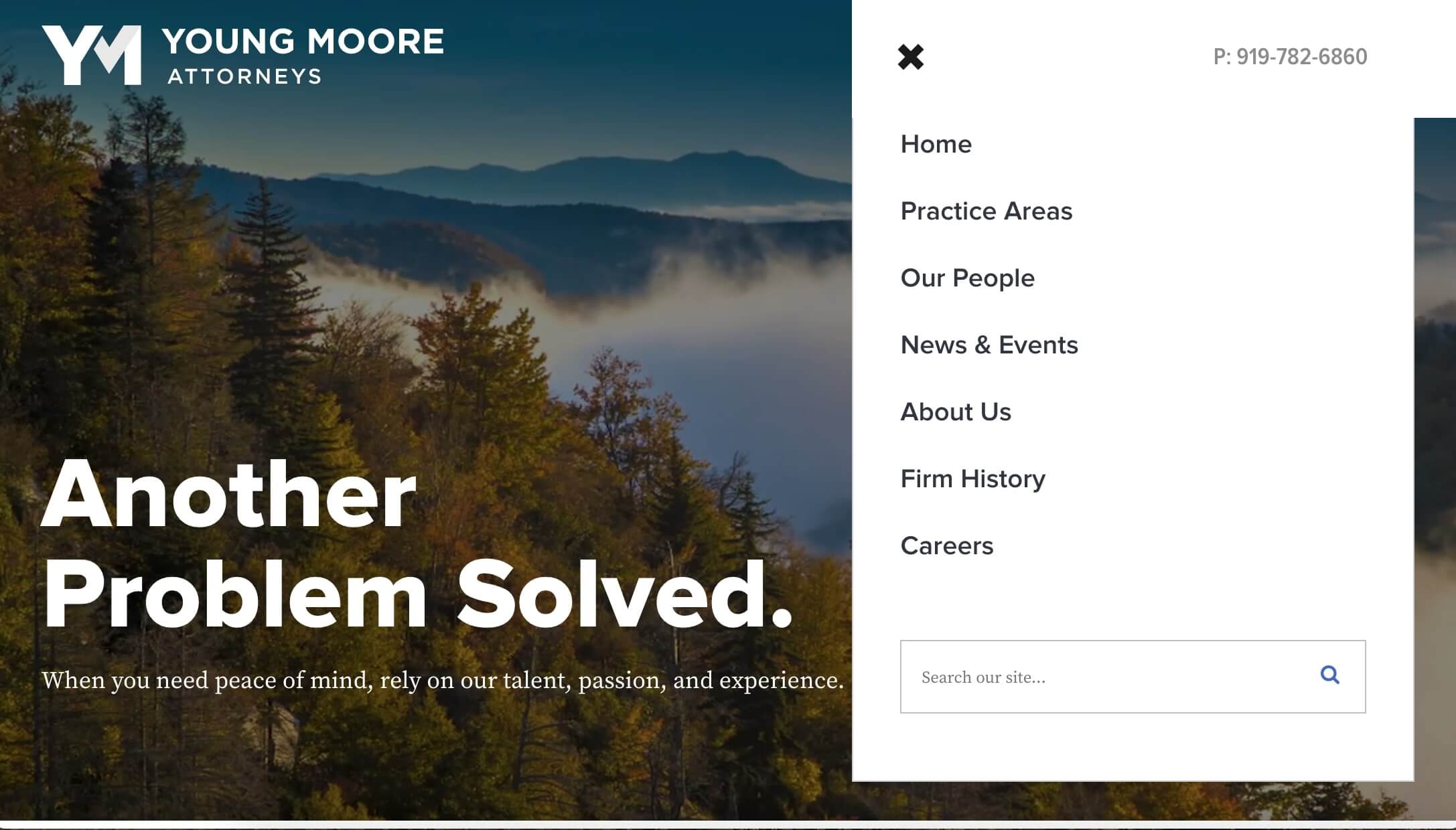
With a client-oriented mindset, modern law firms are restructuring their navigation to help site visitors access content without feeling overwhelmed. One way our clients are accomplishing this goal is by implementing a simple hamburger menu that leads to deeper levels of navigation. The menu’s ability to collapse lends a streamlined look to each page that contrasts with the clutter introduced by a clunky menu bar or static sidebar tabs.
Considering that more than half of the world’s internet users access the web via a mobile phone, the use of a mobile-first design like the hamburger menu is an increasingly important consideration when building a successful website. For our law firm clients, the hamburger menu perfectly bridges the gap between desktop and mobile to ensure a great navigation experience on all types of devices.
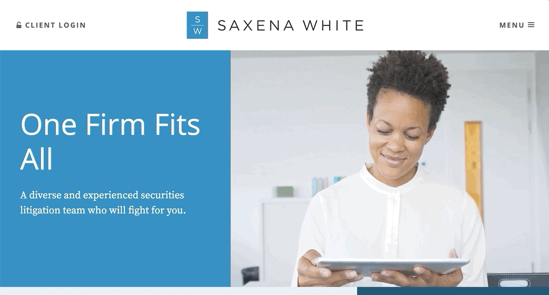
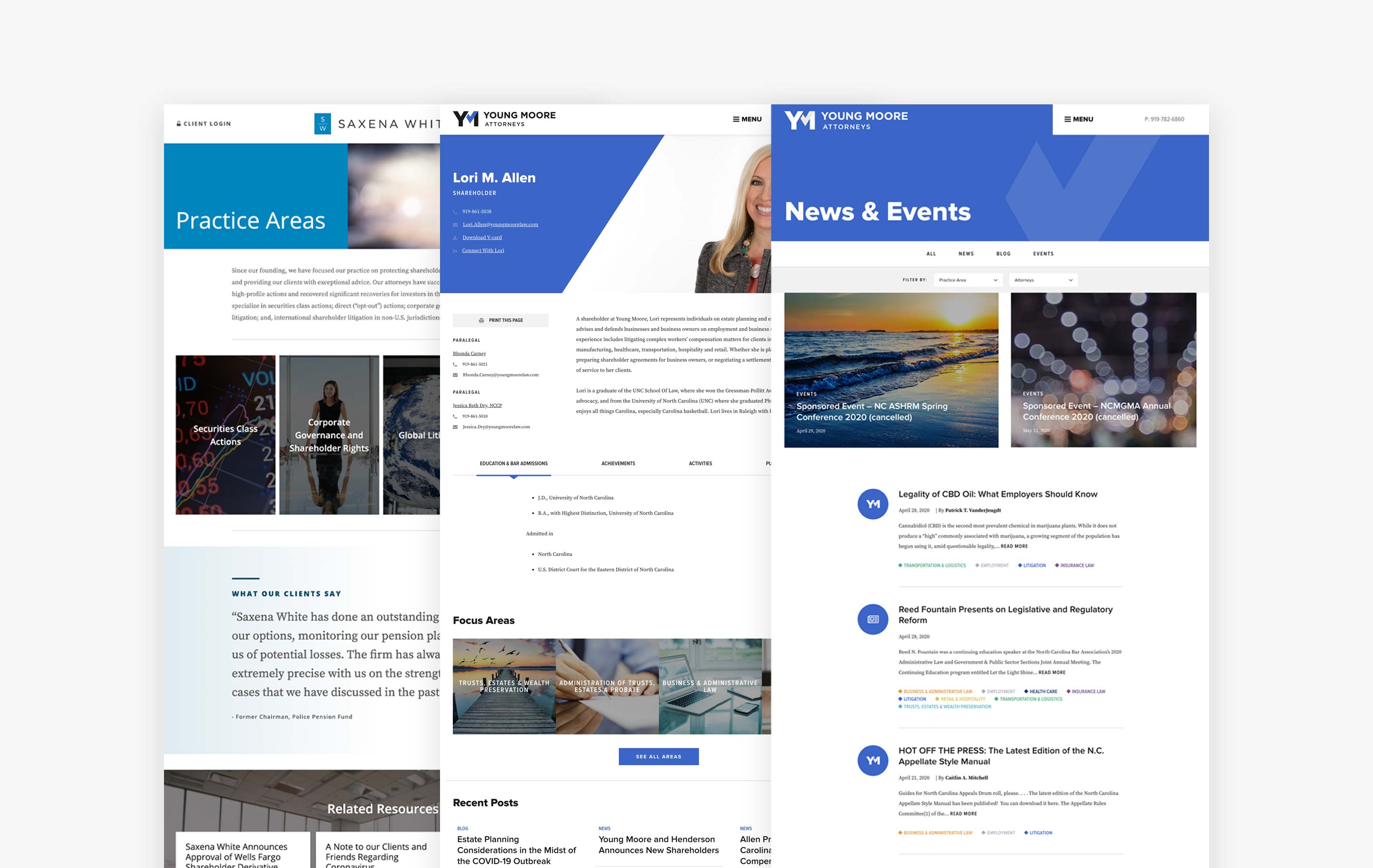
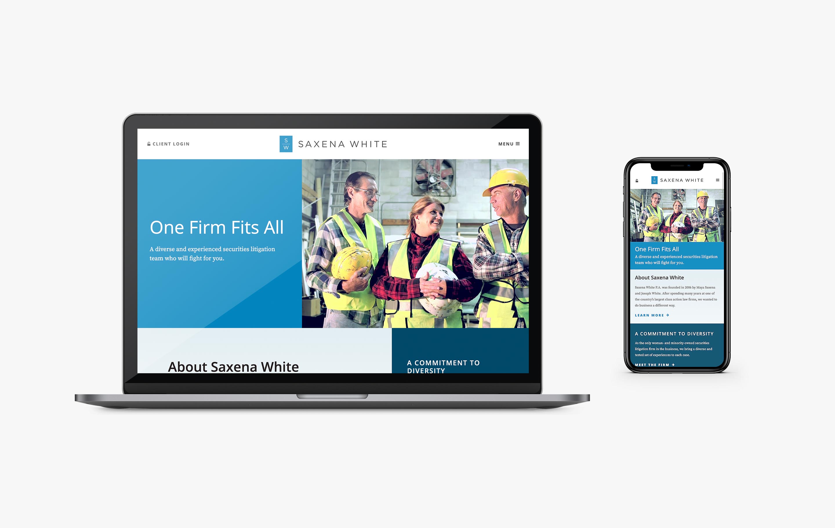
Some of our favorite menus exist on the sites we designed for Young Moore, Saxena White, and Parker Bryan Family Law. These firms use hamburger menus to guide site visitors towards their specific areas of interest.

3. Streamlined Navigation
Another way that our clients are emphasizing clear navigation is through the use of a simple main nav bar. This strategy works to simplify visitors’ decision-making process by directing attention to key pages like Practice Areas, Attorneys, and each firm’s About page.
Brown & James and Harvell and Collins do a great job at using a clear and concise main nav to streamline access to important site content. We like how the minimal main navs maintain choice while encouraging purposeful exploration of the topics that visitors are most likely to seek out.

4. Client-Focused Content
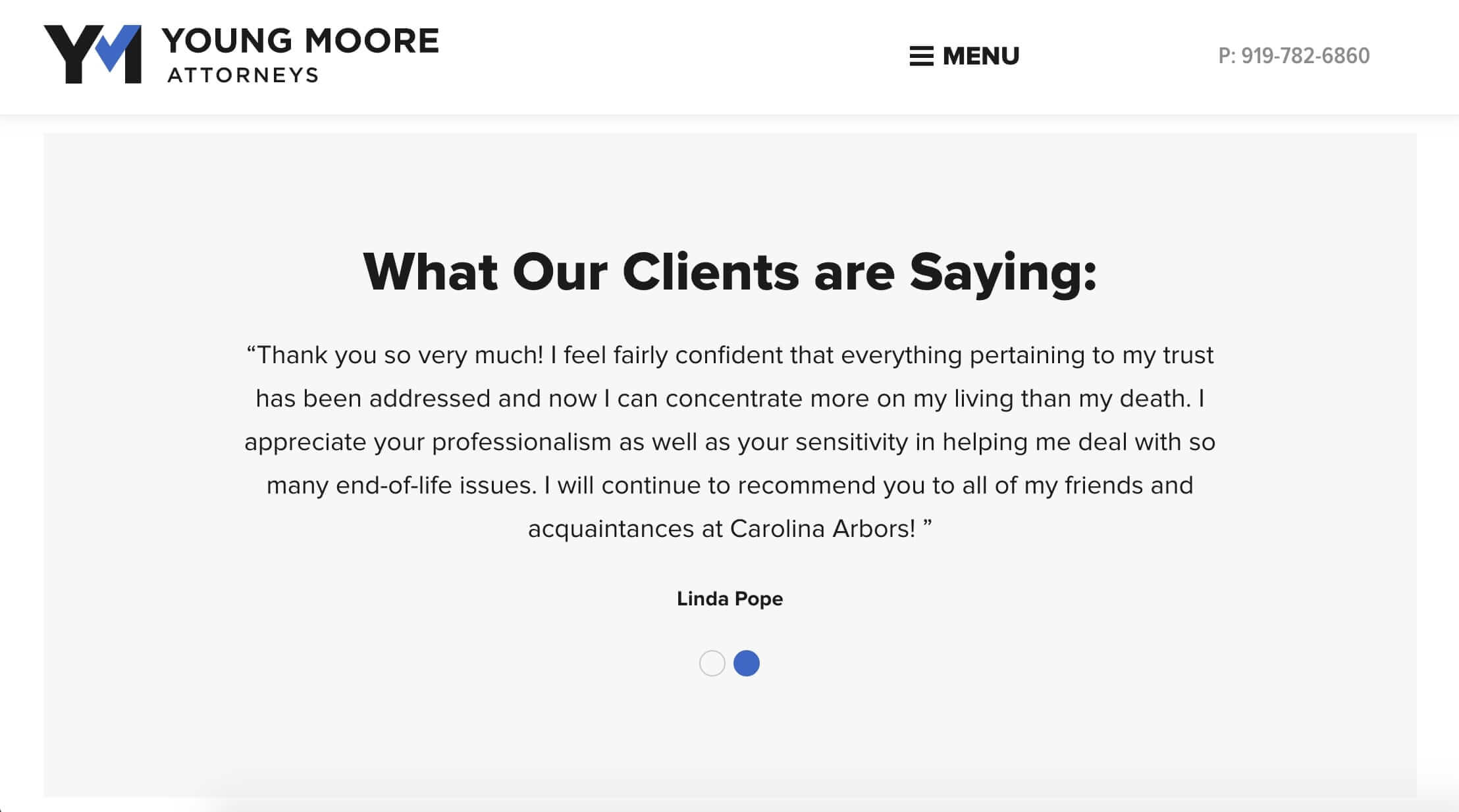
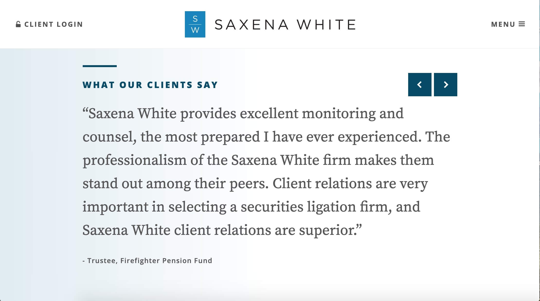
Similarly focused on client needs, modern firms are approaching their site content with the question “How can we help you?” This means the inclusion of informational blog posts, client testimonials, and practice areas defined by jargon-free language and an easy-to-follow format. By putting the client first, the firm becomes more approachable and offers the website as a resource rather than a place to compete with other law practices.
We love how Saxena White and Young Moore both feature a testimonial slider on their homepage. The client feedback humanizes the firm’s work and provides examples of what they might be able to do for prospective clients who visit the site.
5. Content-Rich Practice Areas
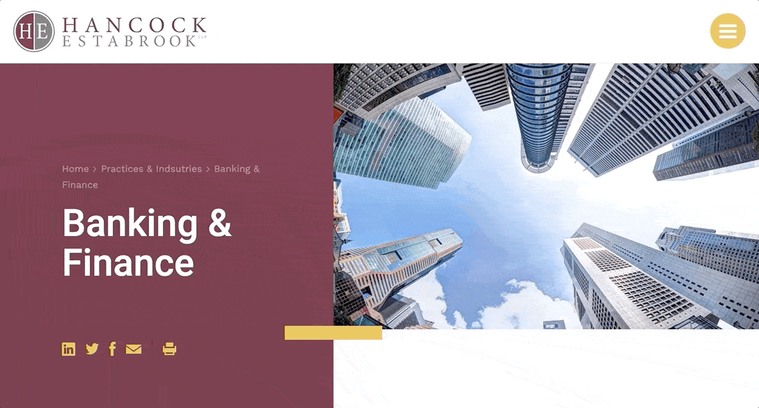
Deepening their commitment to supporting clients and meeting site visitors’ needs, firms are utilizing practice area pages to share all of the information that they have written about each topic. This means that practice area pages can function as a one-stop hub for exploring related news and publications, relevant awards, specific attorneys, case studies, and more. The detailed and comprehensive content demonstrates authority to both site visitors and search engines.
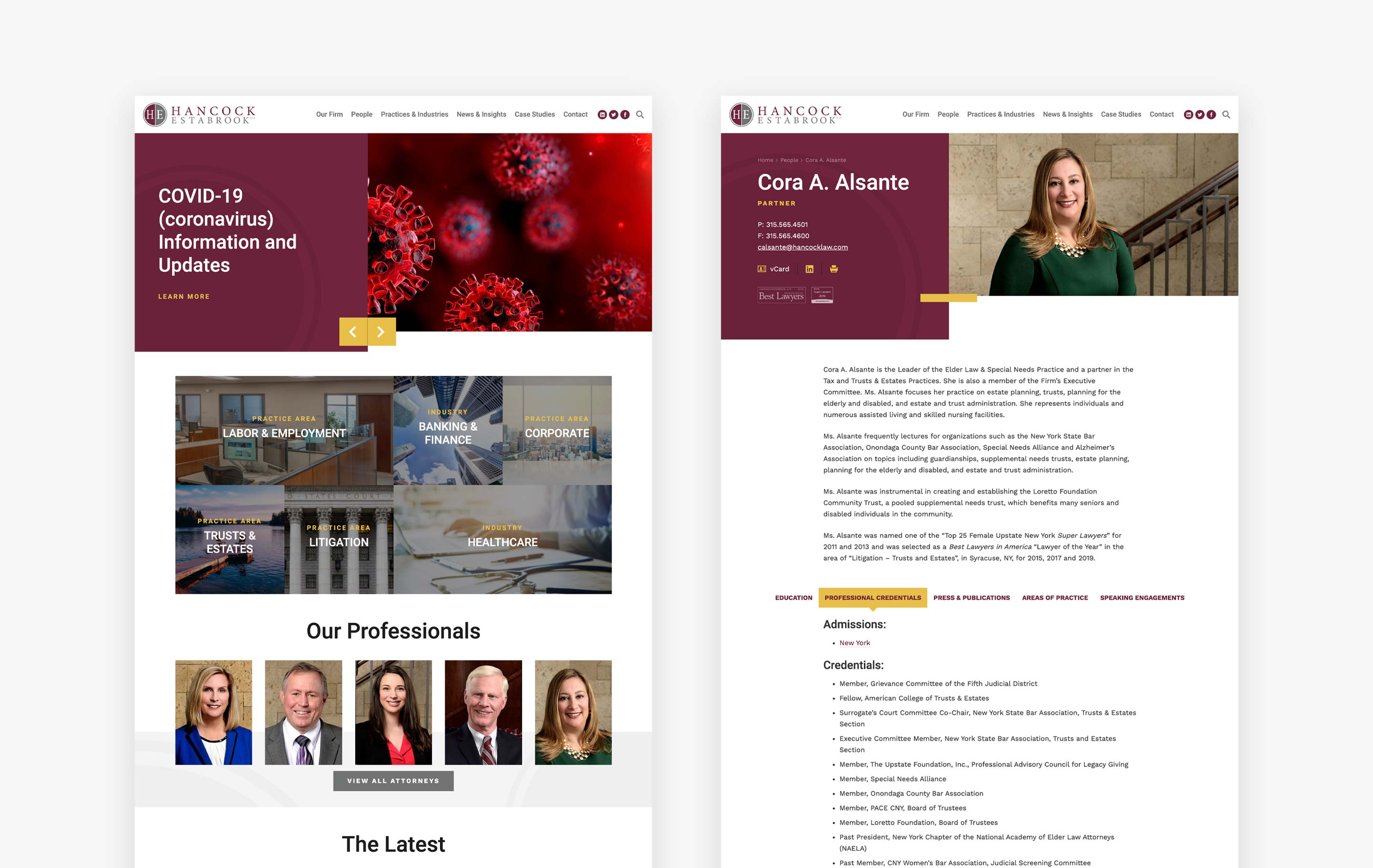
We really like how Hancock Estabrook’s practice areas move beyond the typical overview to include their full range of services, representative experience, topical articles, and links to attorneys who specialize in the given area. By including all relevant information about each subject, Hancock Estabrook anticipates visitors’ questions and demonstrates their expertise. Young Moore similarly enriches practice area pages with tabs that organize information that might be helpful to site visitors.
6. Whitespace
Out of necessity, most law firm websites include a huge amount of detailed information. This increases the sites’ utility, but sometimes interferes with visitors’ ability to take in all of the essential content. When text, images, and lists are packed together on a single page, the content becomes less readable and visitors are likely to abandon the site out of confusion or frustration.
A common feature of modern firms’ sites is the use of whitespace to let the content “breathe.” By separating blocks and cards with plenty of space, the important content stands out without the distraction of other design elements. Young Moore and Saxena White use whitespace particularly well throughout their sites.
7. Robust Attorney Bios
More and more, firms are choosing to showcase the people who make their practice unique – the attorneys. Not only are attorneys featuring prominently on homepages, but their individual bio pages are rapidly trending towards more detailed information about education, awards, credentials, publications, and community engagement. The in-depth bio pages allow site visitors to truly get to know the faces behind the firm, thus supporting better professional relationships and allowing prospective clients to learn about legal professionals from the comfort of their home or office.
We really like how Hancock Estabrook breaks down their bios into a series of clickable tabs. This format allows visitors to explore the bios based on the information that they’re most interested in.
8. PDF Generators
Another way that firms are adding to their bio pages is through the inclusion of PDF generators. PDF generators are a helpful feature for law firms because they make it easy to download site content and circulate the information both internally and amongst clients.
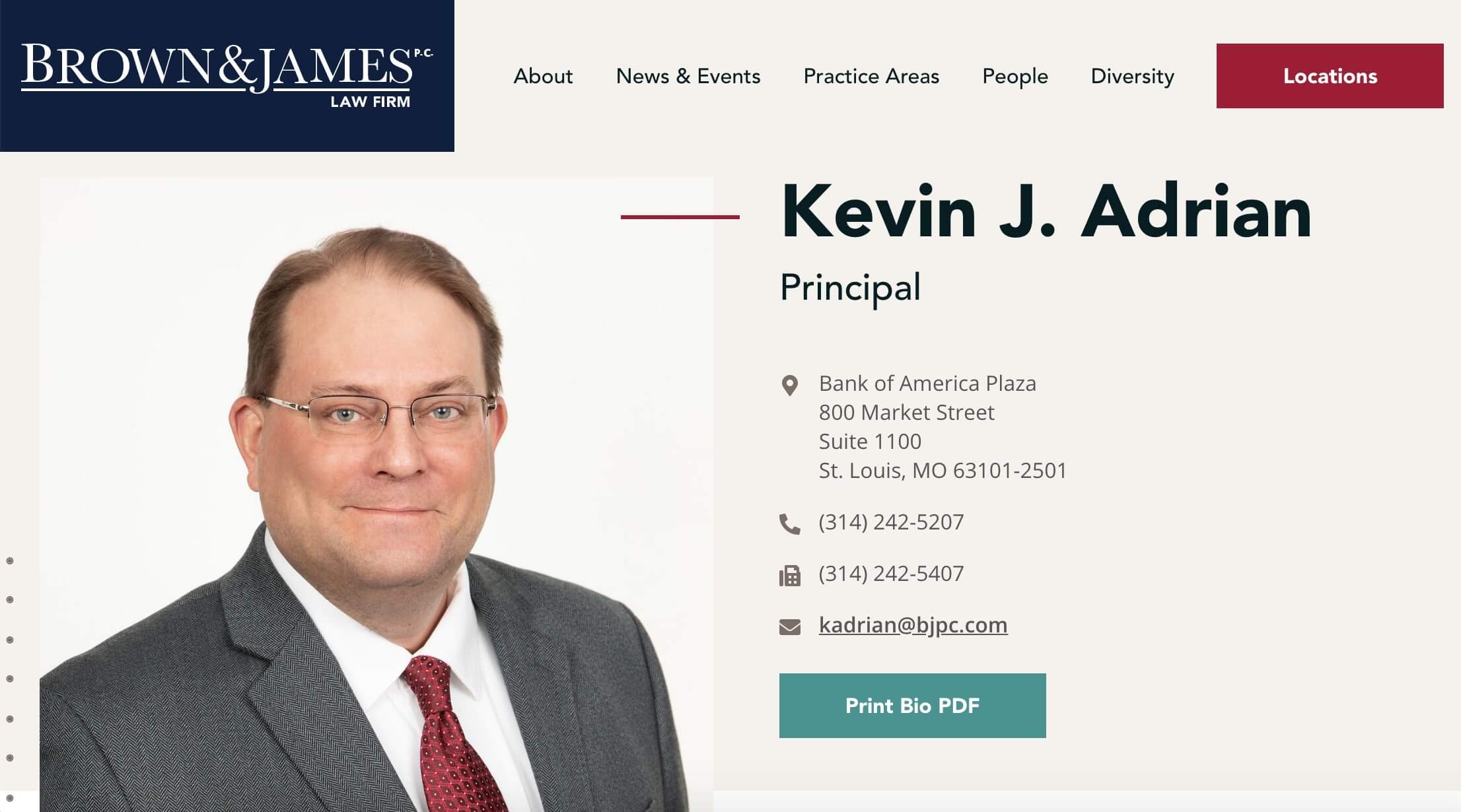
Brown & James and Hancock Estabrook both include PDF generators that produce detailed bio documents with the click of a button.

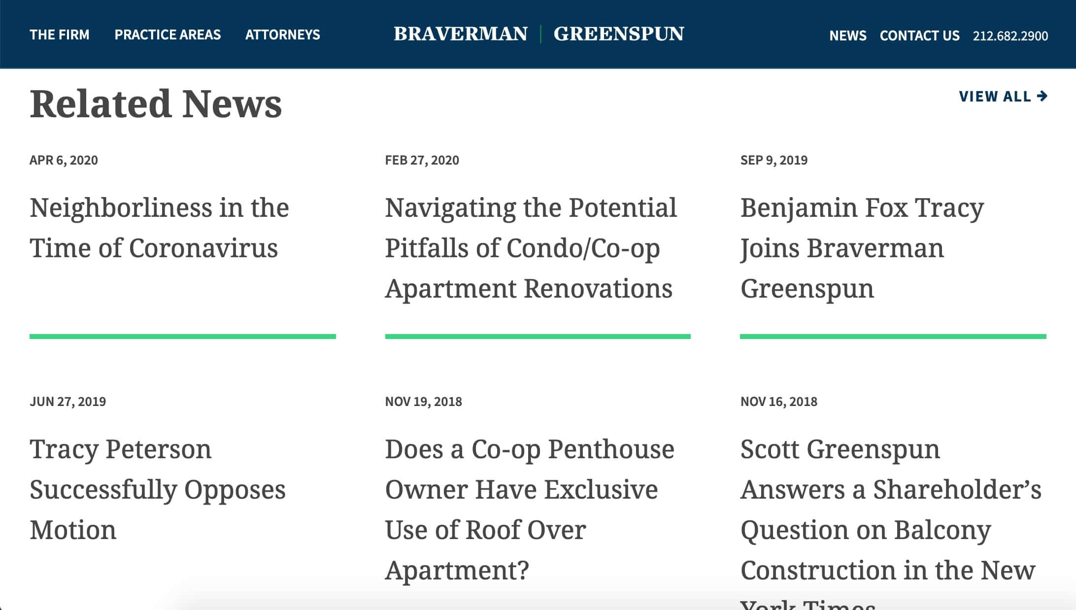
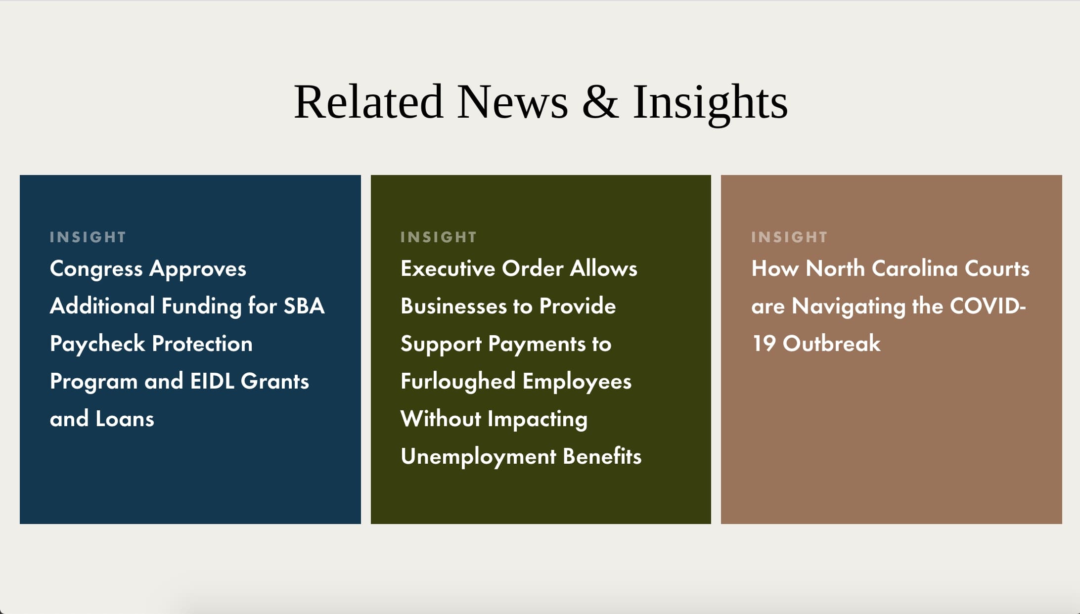
9. News & Insights
To encourage visitors to further engage with the site, modern firms strategically link to News & Insights content as it relates to other pages. Rather than relegating all news entries to their own section, the integration of articles creates a web of connected content that both supports SEO efforts and presents related information in a way that makes sense.
For example, a practice area page may include links to recent news posts about the same topic. On the site we created for Braverman Greenspun, their pages do just that. When visitors access their Real Estate group, they’re also exposed to news posts on construction regulations, co-op rules, and updates on recent cases. The same can be seen on practice area pages on the Tuggle Duggins website.
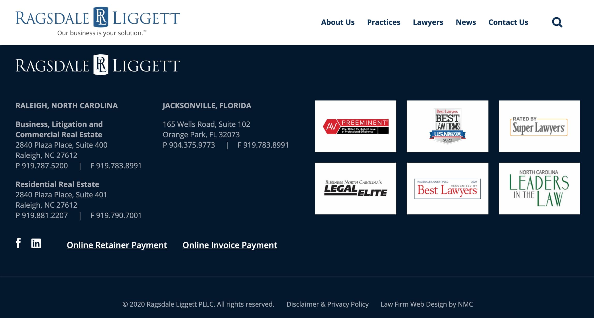
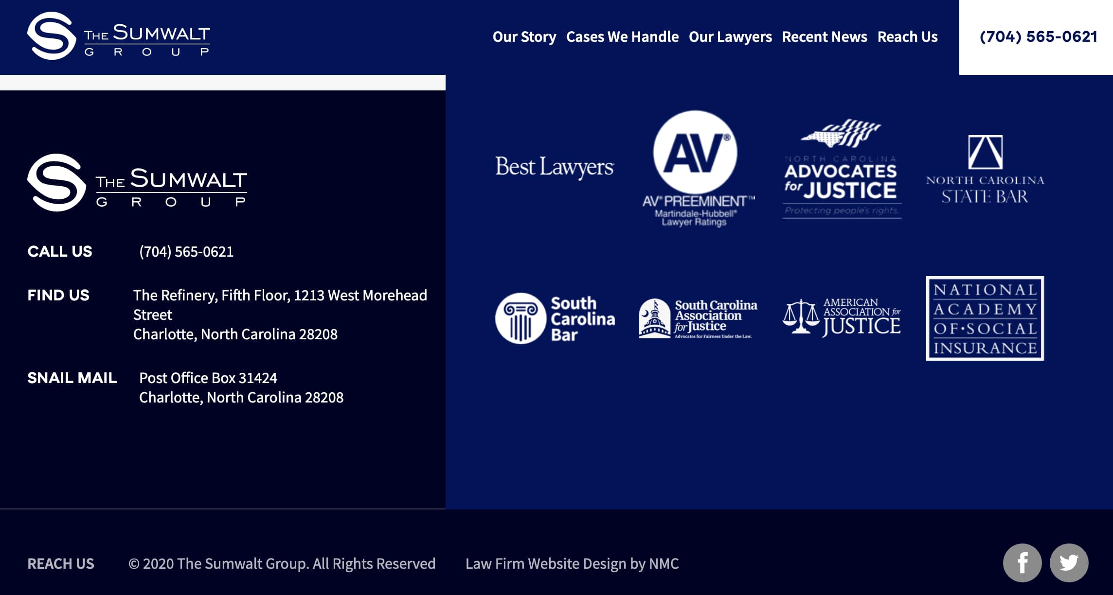
10. Showcasing Awards
Law firms and attorneys are regularly recognized with a variety of awards from publications and ranking organizations. To include these honors without distracting from more important site content, many firms are placing award logos in their site’s footer. By doing this, firms can subtly emphasize their prestige without sacrificing valuable space in their main content areas. Award grids can be seen in site footers on Ragsdale Liggett, The Sumwalt Group, Smith Debnam, and Manning Fulton. Several of these sites also feature awards on individual attorney bio pages.
11. Prominent Contact Info
This may seem like a given, but the best firms feature their contact information throughout their site in a highly visible location. Young Moore and Parker Bryan Family Law both include their telephone number directly next to the menu button that appears at the top right of each page. Naturally, the constant presence of the contact info makes it easy for visitors to reach out to the firm with any questions or requests for more information.

12. Optimized for Mobile Use
Last but not least, modern firms are ensuring that their sites are optimized for mobile use. Because so many clients and site visitors utilize mobile devices to surf the web, law firms must adapt by implementing responsive designs, fast-loading pages, and clickable links and phone numbers. When accessed on a cell phone, the site should automatically scale down and snap to fit the smaller screen. The best sites perform as well on mobile devices as they do on a desktop computer.
Conclusion
All in all, modern law firm websites are showing a swift departure from the traditional feel towards features that are more dynamic, user-friendly, and brand-oriented. This shows great progress for the industry and makes it possible for firms to expand their reach online.
For firms interested in developing their digital presence even more, the next step may be building a social media following. Our blog offers some great starting points for those interested in Social Media Management for Law Firms or Common Mistakes Law Firms Make on Facebook.


Comments
Khan Wali Barikzai
i have siv case and i need helpLeave a comment