
Examples of Calls-to-Action on Websites
Activate Site Visitors with Compelling CTAs
All websites – regardless of industry, design, purpose, or scale – encourage visitors to do something. A nonprofit might hope for donations. A political candidate could push for email signups. A B2B or B2C company might be itching to offer product demos or information kits. Even law firms use their websites to gather form submissions from prospective clients.
As different as each of these platforms might be, they come together by virtue of the fact that each one is calling visitors to action in one way or another. In marketing and web design, this is done by incorporating statements (like Learn More, Subscribe, Buy Now, Donate) and questions (like Want to help someone in need? Curious about our programs?) that point consumers towards a concrete next step.
On websites, calls-to-action (CTAs) take on multiple forms that can differ based on page location, available space, and each organization’s unique needs. A minimal button might get the job done for some, but others might require a more in-depth form to gather specific information that guides the sales or engagement process. We find that most sites use a strategic combination of CTAs to ensure that visitors are never far from the option to learn more, do more, or give back.
Read on for examples of six common CTA styles and what makes them effective in different contexts.
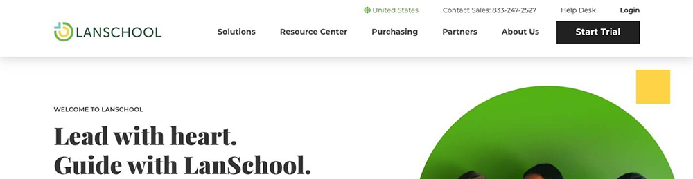
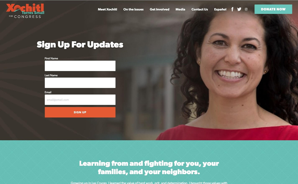
1. The Minimal CTA
What It Is: It’s ubiquitous, expected, and standard for most websites. We’re calling it “The Minimal CTA,” but it’s really just a button located in a website’s main navigation bar (typically at the top right of the screen). Since button size is limited, this type of CTA usually features a straightforward command like Donate, Sign Up, Buy Now, or Learn More.
Why It Works: Sometimes simplicity is best. This type of button CTA is centrally located and uses space very efficiently. And more importantly, site visitors are scanning the page left to right, so their eyes naturally drift across the content until they land on the request.


2. The Sticky CTA
What It Is: Sticky CTAs actively move with your site visitor as they scroll down a page. They’re dynamic, persistent (in a good way!), and add a nice amount of energy to sites that choose to use them.
Why It Works: Sometimes site visitors have tunnel vision. They’re looking for one topic or a specific piece of information, so they scroll right past other CTAs that are meant to grab their attention. Because a sticky CTA can’t be shaken off as easily, it’s more likely to be noticed by the focused site visitors who have missed out on other chances to connect.
And for visitors who are just browsing? Sticky CTAs are present throughout their time on the page, meaning that visitors can take action whenever they feel compelled to do so.
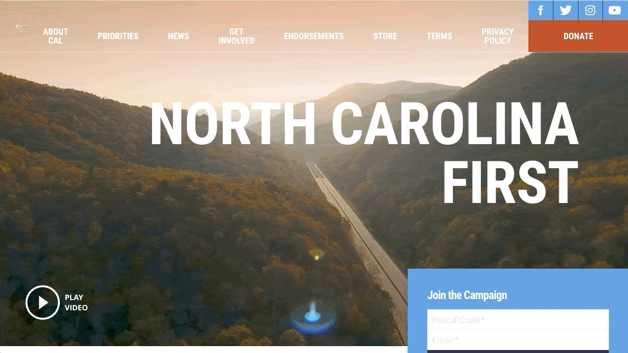
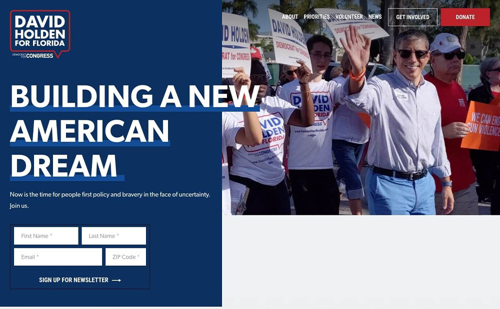
3. The Banner CTA
What It Is: So far, we’ve covered CTAs that can be thought of as secondary design elements. That’s not to say that they’re weak or forgettable – in fact, they’re often the opposite – but they’re not the main focus of the page that they live on.
A banner CTA, on the other hand, is built into the homepage design as a core element of the banner or hero. It’s the first thing that visitors see, so it can seriously impact conversion rates and visitor engagement.
Why It Works: Since this style of CTA features prominently into a site’s design, visitors are more likely to take notice and act on the CTA’s request. As you’ll see in the examples below, banner CTAs are a particularly effective way to attract visitors’ attention from the moment that they land on a site.
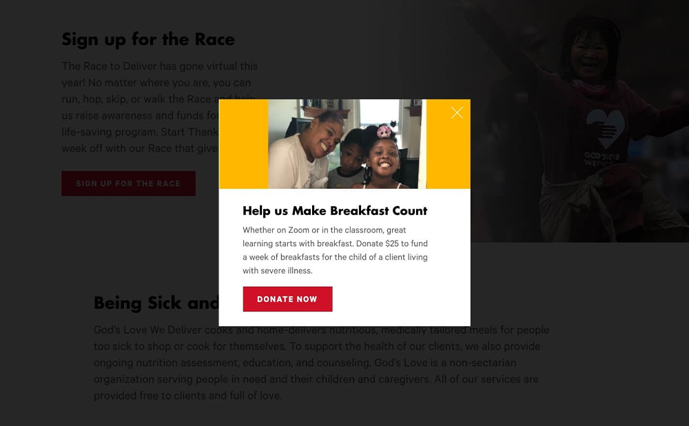
4. The Pop-Up CTA
What It Is: Similar to banner CTAs, CTA pop-ups immediately capture and hold visitors’ attention. They can be designed to match the rest of the site’s look and feel, and are often customized to accommodate images, buttons, and a variety of background effects.
Why It Works: Pop-up CTAs are successful because visitors must actively exit the pop-up screen – likely after they’ve read and absorbed the CTA message. Combined with background effects that blur or darken the primary site content, the additional step of closing the pop-up box ensures that the CTA isn’t ignored or dismissed.
Since they’re so dominant, we recommend reserving pop-up CTAs for only the most pressing and important issues.

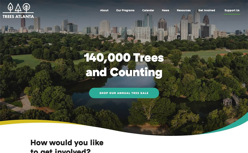
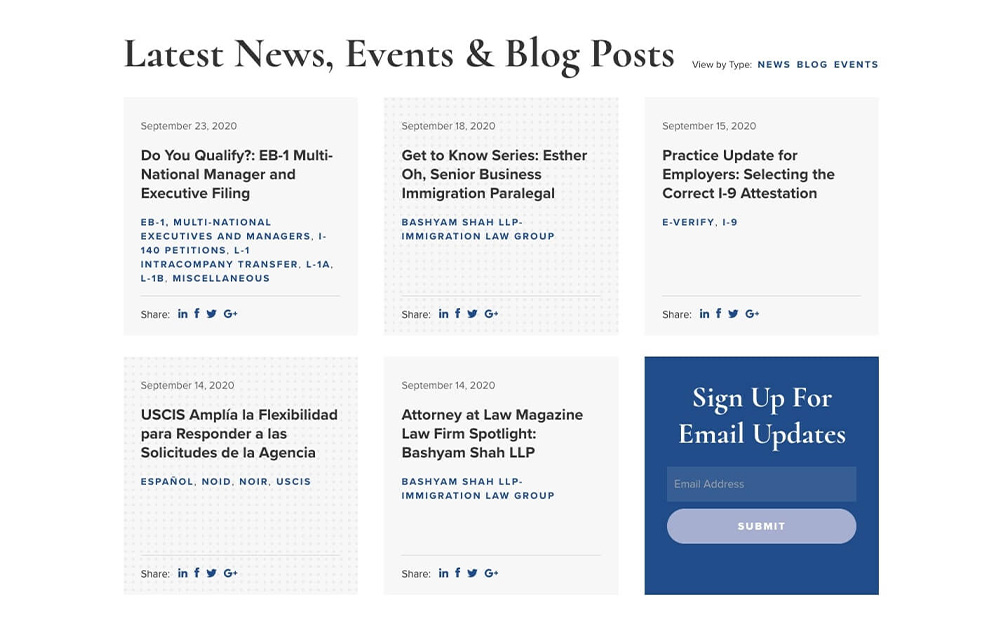
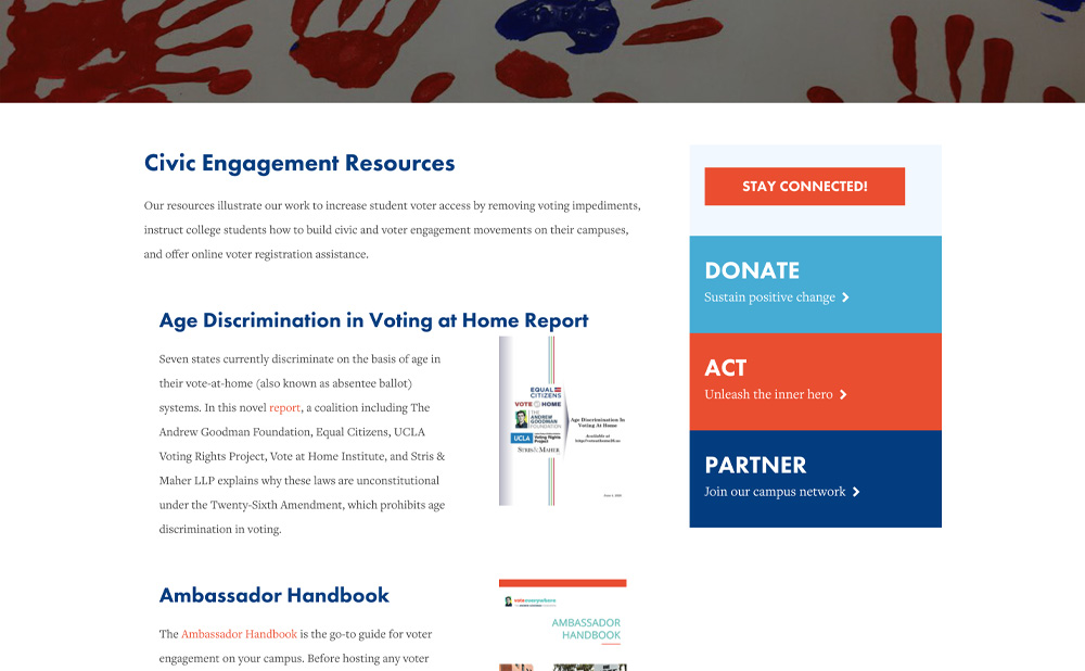
5. The Integrated CTA
What It Is: Integrated CTAs are just what they sound like – they’re CTAs that are mixed in with other site content on a variety of different pages. We often see them on interior pages, in sidebar sections, and in some cases, in subsections on a site’s homepage.
Why It Works: Integrated CTAs work by reminding visitors of the mission or “ask” as they peruse site content. They might be placed at the end of a blog post, or paired with a powerful About page. After reading the content, visitors can naturally make the transition from passive observer to active participant.
Because integrated CTAs are blended with other site content, they function best when used in combination with a variety of CTA styles. You might use a banner CTA on your homepage, a minimal CTA in your navigation bar, and integrated CTAs throughout the rest of the site.
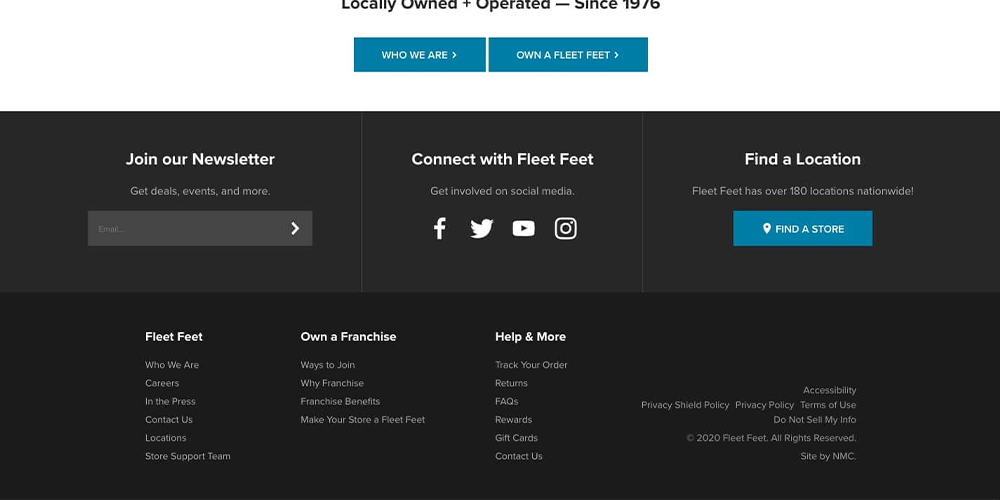
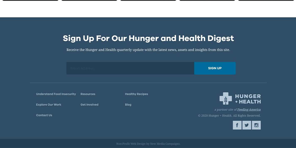
6. The Footer CTA
What It Is: As you’d guess, a footer CTA is located in a site’s footer and can consist of a button, a short form, an email signup, or a link to another page.
Why It Works: Footer CTAs are a great option for a couple of reasons. First, because they’re endlessly flexible. As you’ll see in the examples, they can be brief, in-depth, interactive, or simple. Fleet Feet even uses the space to highlight multiple next steps.
Second, they make the most of the space available. Instead of leaving the footer as a dead zone, footer CTAs add a final opportunity for visitors to take action on the cause, product, or program that the site is promoting. The footer is a natural endpoint, so it makes a lot of sense to fill it with an appropriate concluding request.
Next Steps
Once you’ve come up with a plan for how your site’s CTAs will look, you’ll next need to think through your messaging. Your call-to-action might not be long, so every word counts. The best CTAs are punchy, compelling, and approachable – all at the same time.
How do you achieve this? Our clients have had the best luck with descriptive phrases that tell a story and engage the user. For example, a nonprofit might add action to a donation request by encouraging users to join their cause, make a difference, or support a movement. This makes the contribution feel less like a rote donation and more like an act of participation in something larger.
Similar strategies can be employed across other industries. A B2B or B2C company might persuade users to request more information by offering a no-hassle trial period or a bold claim about the product or service. This way, prospective customers are drawn in through intrigue and curiosity – factors that evoke far more emotion (thus, action) than the mild response elicited by a general “Learn More” statement.
But no matter the industry, you’ll want to think carefully about your CTA’s wording and how your site visitors might react. With some practice (or the help of your local full-service digital agency!) you’ll eventually be able to determine what’s working and what’s falling flat.
Questions? Feedback? CTA styles that we missed? Comment your thoughts below!


Leave the first comment