
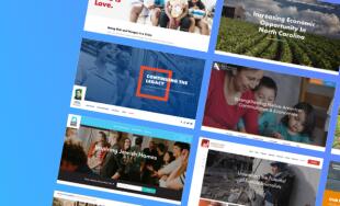
2020 Political Web Design Trends
As the 2020 election season starts to heat up, campaigns continue to launch new sites and refine existing sites. I think, historically, the 2008 Obama campaign website really represented a shift in the effort and quality of design that goes into campaign websites -- partly due to general technical and internet progress and partly due to his team's digital sophistication. Since that campaign, sites have continued to build on that foundation, leveraging new technologies, embracing new standards, and experimenting with designs. Sites in a given cycle tend to start to coalesce around certain trends, though, like any industry as they're proven to be effective.
Below are some of the more dominant, new trends for 2020 we've noticed so far at the dawn of this election seasion.
Ambient Video
Browser support, internet connections, and video compression have made it easier and accessible to feature high quality video on a site. More and more campaigns are using this in their feature area at the top of the page. Ambient video allows campaigns to connote excitement and progress, add some motion to the page, feel a bit distinct from a typical site, and help bring a campaign and candidate to life.
Not all campaigns use it in the same way. On Cal Cunningham's US Senate site (an NMC site), the video is full width and extends to the top of the page, immersing visitors in a rich experience with the candidate when they first land on the site -- there is also a prominent Play Video button that launches his full campaign ad in a popup. Kamala Harris uses hers as a split screen a little farther down the page, pairing it with her primary welcome message to draw attention to that important content and add some life to the words. Elizabeth Warren uses ambient video as a background to her main messaging; it's got a heavy color overlay, and is more about giving that sense of movement to the site (and campaign) and reinforcing her branding.
Political campaigns are fast moving, energetic enterprises that hinge on building mass movements, and ambient video helps bring some of that vibrancy to the web.
Sticky Calls to Action
An essential element of any campaign site is to gather data and earn donations. Over the past decade, the tactics to push these goals continue to progress with efforts like splash pages and popups to featuring the signup as the top element of the page. The newest trend, which seems to work well, are sticky Calls to Action (CTAs) that stay with a visitor as they scroll down the page.
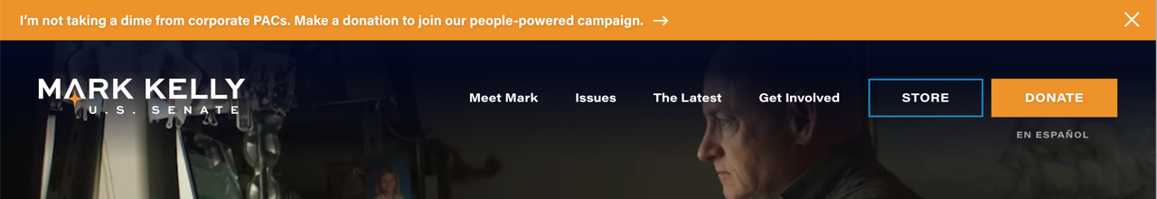
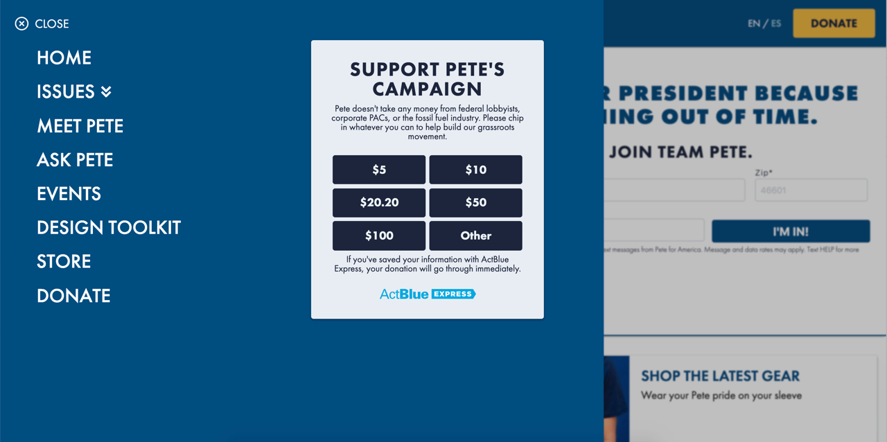
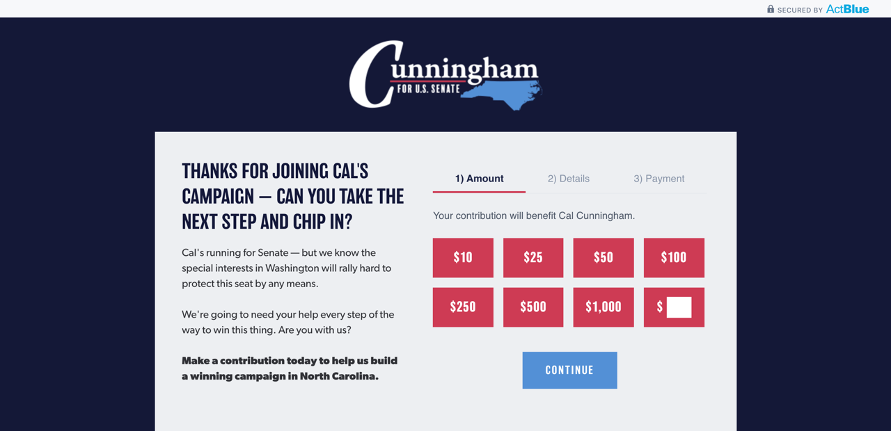
On the Cal site, there's not only a sticky main menu with a donate call out, but also a nifty sticky sidebar can be expanded to signup or make a donation. Another sticky CTA trend is attaching a key, action-focused message to the very top of the page and having it stick as someone scrolls; a great example is Mark Kelly's site, which uses a bright orange to distinguish his message about not accepting PAC contributions and links directly out to his donation page. Pete Buttigieg has a similar implementation to the Mark Kelly site, except that he anchors the CTA to the bottom of the page and also provides some pre-set donation options (we'll get into this later).
These sticky calls to action remove friction from a visitor turning into a supporter from any point on the page, helping build a database and grow contributions.

Hamburger/Mobile Menus
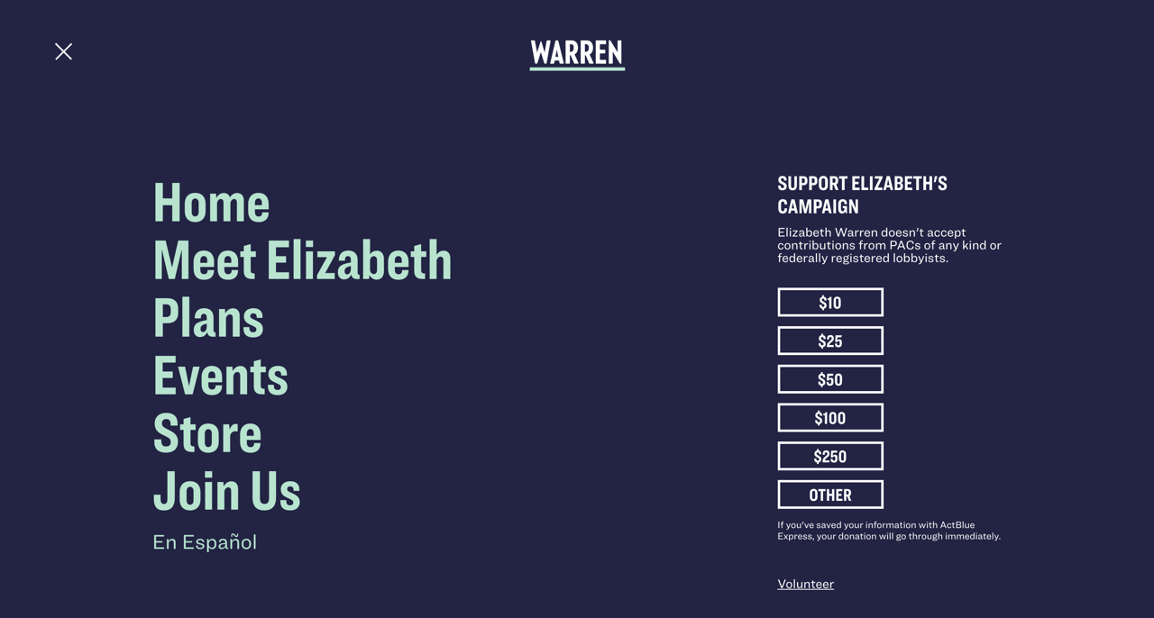
This trend is also one we've seen more in the corporate and nonprofit website design world, as well. More campaigns are going to a "hamburger" menu where it's just three lines on the screen -- the type of menu you used to typically only see on mobile apps and sites. The thematic and aesthetic reason behind this is that it gives a sense of a campaign being innovative, modern, and "mobile first" in today's mobile world. There are also functional reasons to embrace this trend. For example, since the menus expand so large, it's easy to quickly grow them as there are timely things a campaign wants to feature. They also take up less room on the page, giving a campaign more real estate to squarely focus on their message or main image/video. They can also provide another opportunity for a CTA.
Pete and Elizabeth Warren both embrace this trend and use it nicely. Their menus expand to cover the whole screen, each with a different effect, providing a full menu list. You can see that these menus can easily grow and shrink, based on the content needs of the day, which can vary depending on the stage and events of the campaign. Additionally, each has a prominent CTA next to the menu, providing an easy conversion path for any visitor who cares enough about the site to navigate around it.
These menu styles have gone from being on the fringe of acceptable since they could confuse some users, to being fully normal and comfortable. Every visitor is used to this navigation paradigm, and while the approach does not need to be embraced by everyone, it does offer some advantages for those who decide it's right for them.
Richer About Pages
Gone are the days when an About page was just a few basic paragraphs of text about a candidate, their job, and their family. About pages are now fully interactive experiences that really let a candidate bring their story to life. This cycle, we see campaigns continuing to push the About page farther and farther.
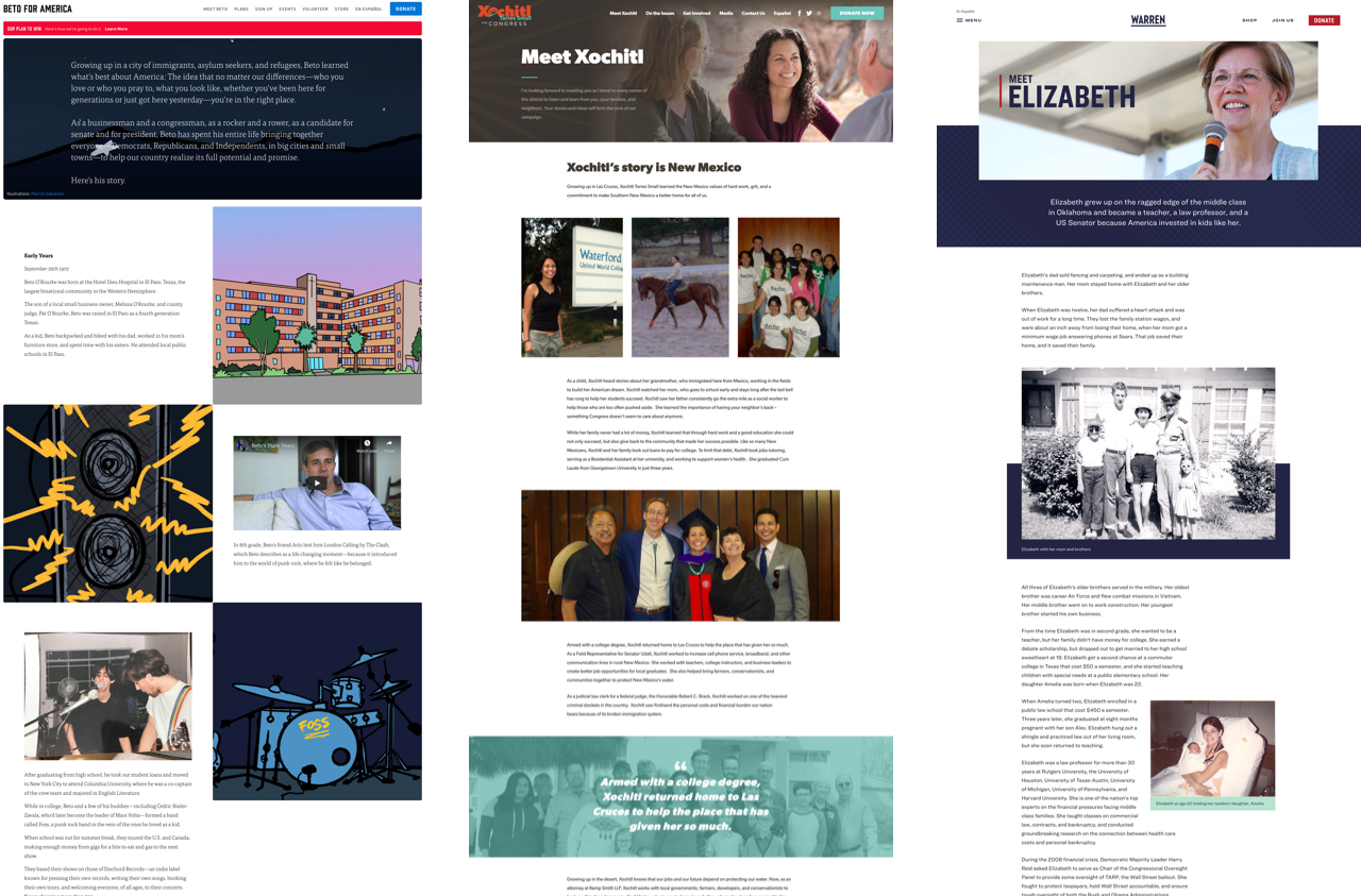
Beto O'Rourke uses a mixture of custom illustrations and live videos throughout his About page; these elements add color to his eclectic background that has been a focus of much coverage, and his embrace of illustration speaks directly to his artistic side and target generation to separate himself from opponents. Congresswoman Xochitl Torres Small (an NMC congressional campaign website design), she uses full-width images to break up the page, pull quotes backed by images, and more to paint a picture of her story. Elizabeth Warren takes a similar approach to the Xochitl site with images interspersed on the page and key facts pulled out.
An About page is the candidate's opportunity to make themselves feel a bit more real to voters who will likely never actually meet them, and more campaigns are working to paint a fuller picture of who they are and where they come from.
Signups Confirmations that Redirect to Donation Pages
A best practice we've seen gain more adoption is having volunteer and email signups link directly to the donation page upon completion. Campaigns are always trying to work visitors up the ladder of engagement and it's worth making a donation ask on anyone who has signaled they want to be more involved in the campaign. This is a calculated ask and the evidence we have seen is that it works, helping increase donations from visitors who are already primed to get more involved in the campaign.
Full Width Donation Banners with Options
Donation asks continue to become more prominent and easier to complete for visitors. In the past, it was just calling out the Donate in a different color in the main menu, then including Donate CTAs in sidebars and action centers, and now a trend is having donation asks being designed full-width blocks with quick donation amount options. The technique makes the ask stand out and easier to complete.
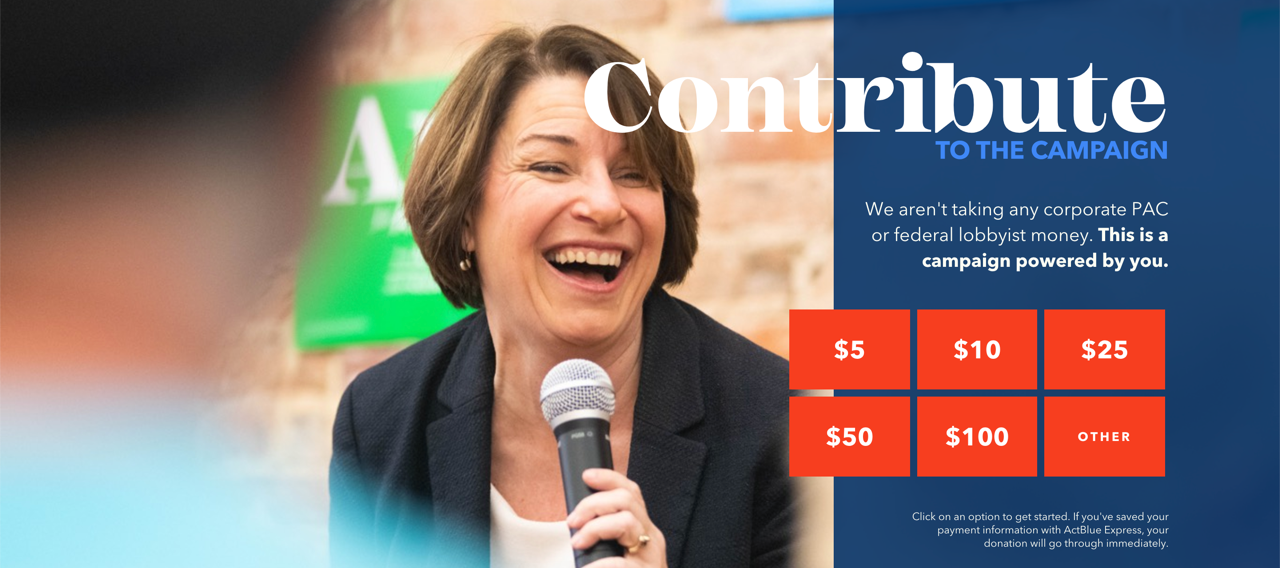
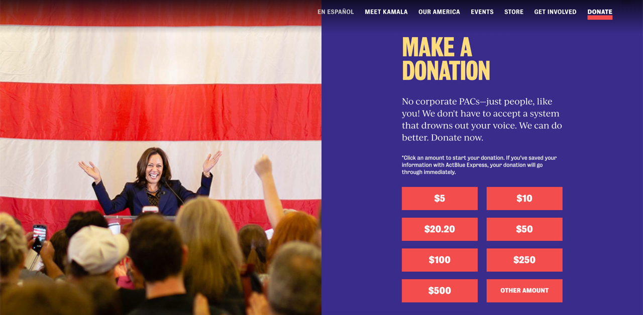
Amy Klobuchar's site has a full-width donation feature on her homepage and across interior pages, which allows her to pair an image and some messaging with the donate request along with having quick donate options that make it even easier for someone to click through and make a contribution. Kamala Harris has a unique approach where her full-width donation ask is at the very top of each page, immediately drawing a visitor's attention while also offering the same benefits of messaging and quick options.
Expanding the Contribution asks to be more substantiall and fully designed with quick donation options enhances the overall look of a key element on the site, lets candidate's present messaging with the request, and provides quick and easy access for donors to give.
Conclusion
Each of the trends above seems to push both design and functionality in a positive direction for user experience. Data is likely still being gathered on some of these techinques, and we'll see if they stay or fade. Also, some trends can become overused and start to get less effective, prompting campaigns to move away from them. But for now, these are here to stay, and we typically see trends trickle down from bigger races to local campaigns as they model themselves on higher profile sites. We'll keep an eye out for others that arise as there's still plenty of campaign season left!
Leave the first comment