
Nonprofit Website Design Examples and Best Practices
We’ve been lucky enough to work on hundreds of nonprofit web design and development projects over the years – from small local charities to large international organizations. While each of these brands have presented their own unique challenges, we’ve noticed many common elements that help to make these sites successful.
So, we spent some time digging into what exactly makes up a great nonprofit website! Read through the whole post to see what we consider the top seven criteria or use the links below to jump to specific tactics and examples.
- Strong visual identity
- Prominent calls to action
- Clear storytelling
- Demonstrating impact
- Secure
- Strategic third party integrations
- Cross-promotion of marketing efforts
Nonprofit brands should have a strong visual identity
It’s extremely important for nonprofits to have a strong visual presence. Your brand is a way to provide trust in your organization, create a professional appearance where current and prospective advocates can easily see if their money or time is well spent, and help raise recognizability for your organization.
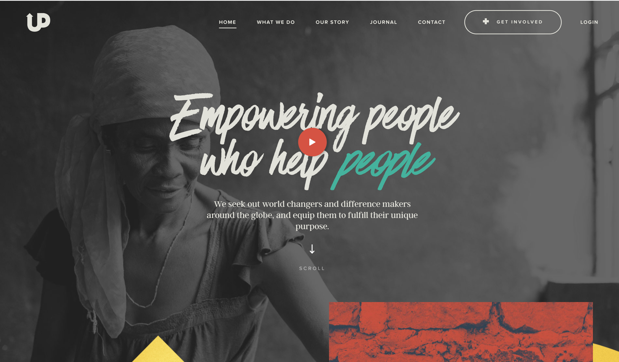
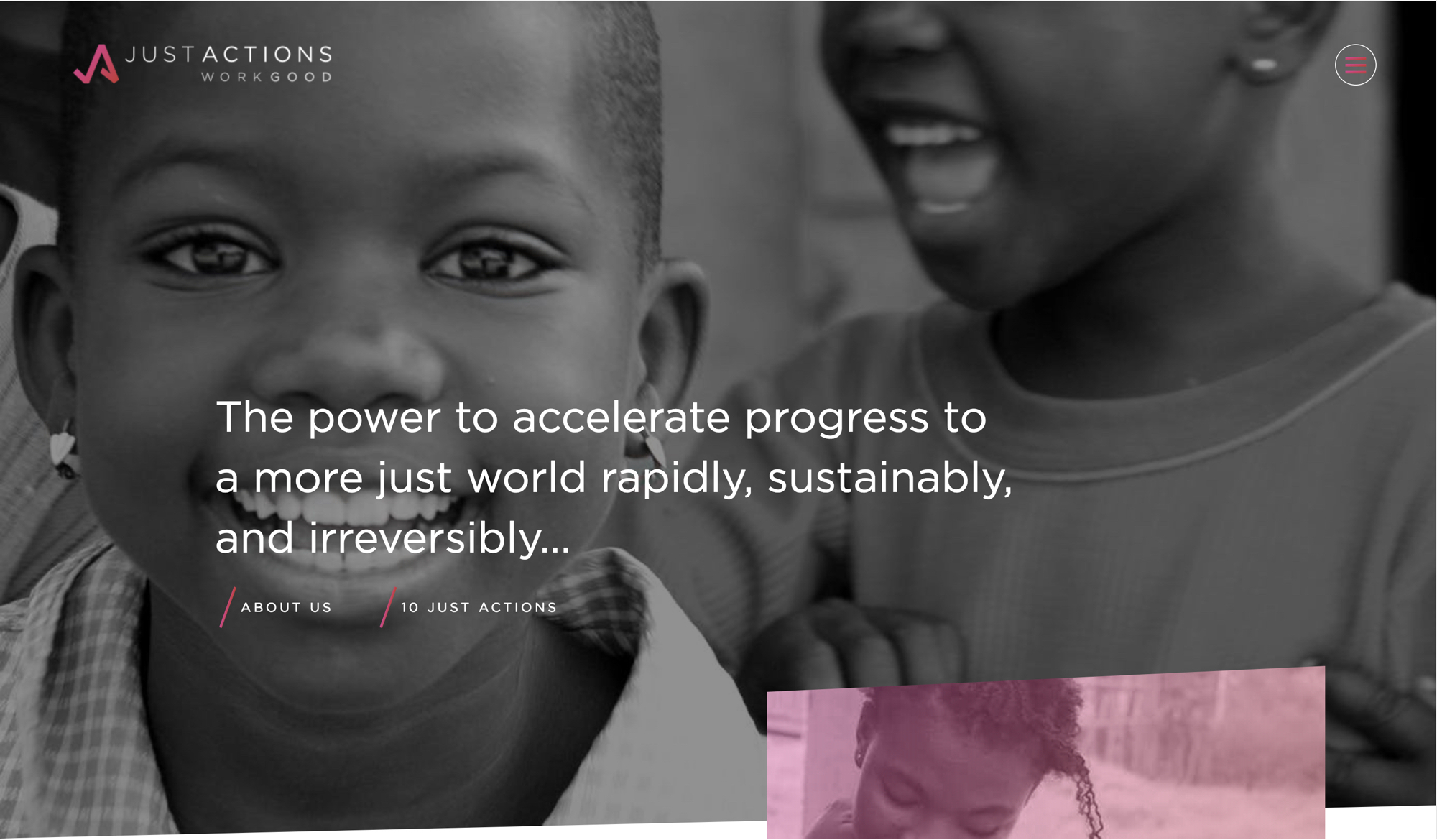
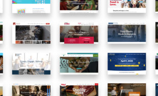
Take a look at the Upstream International and JustActions sites below. Both of these sites have more than a nice looking logo - they incorporate color, typography, textures, and photography styles to help tell who they are and what their organizations do.
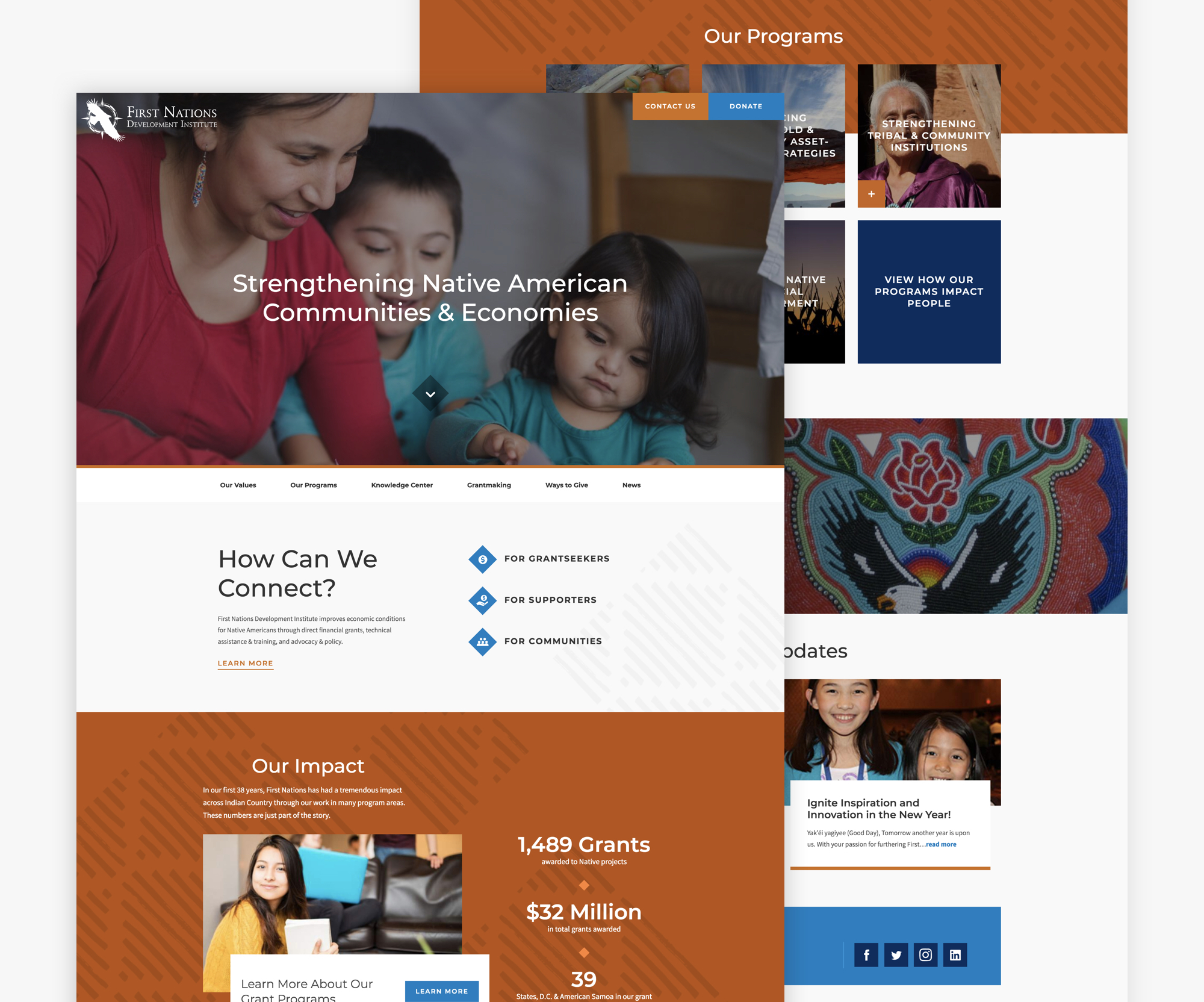
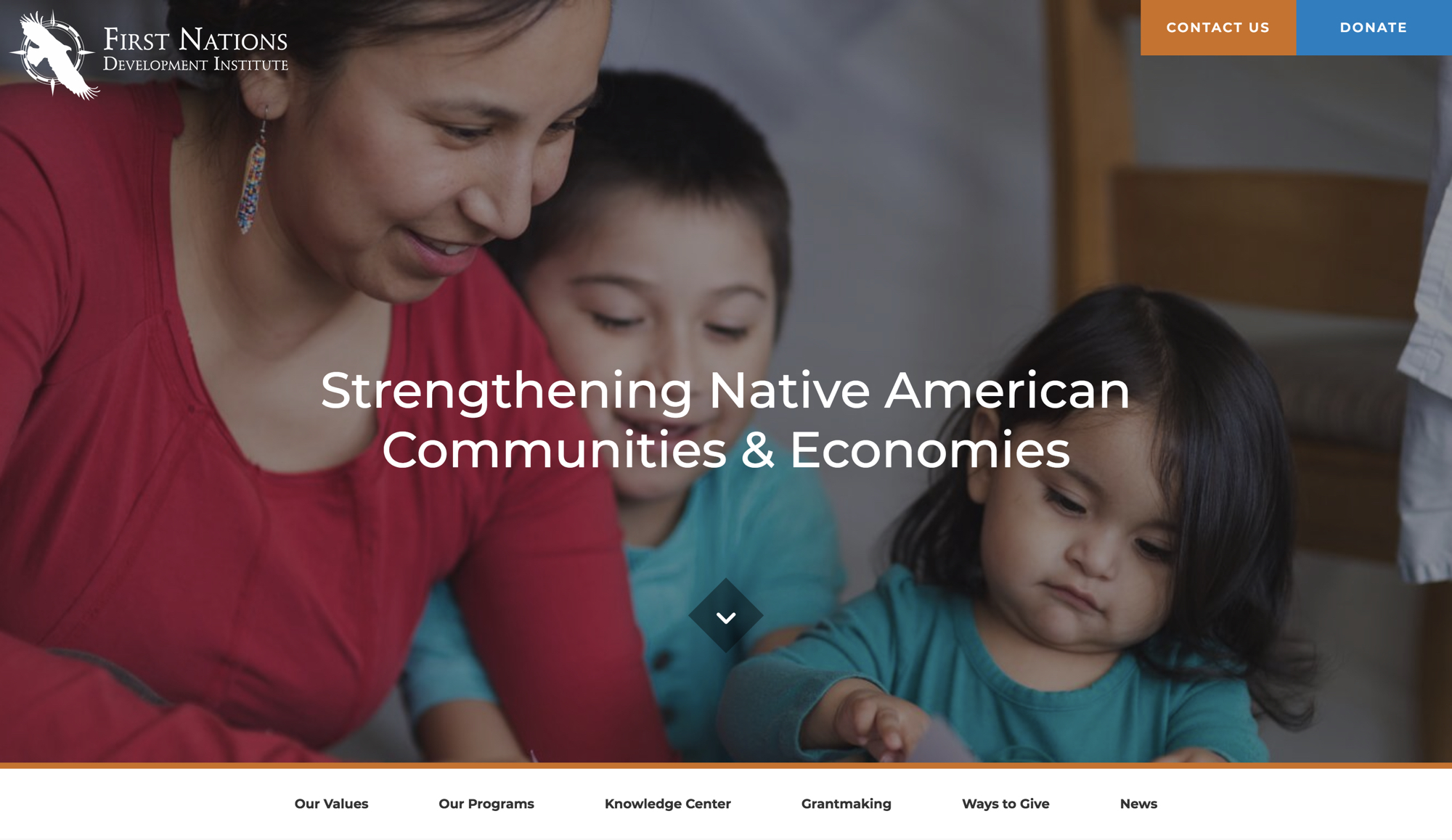
First Nations Development Institute is another site that does this well, and uses their visual identity to help bring cohesion across multiple and projects.
They utilize textured shapes, large photography, and bold hues of orange and blues to help tell their story.
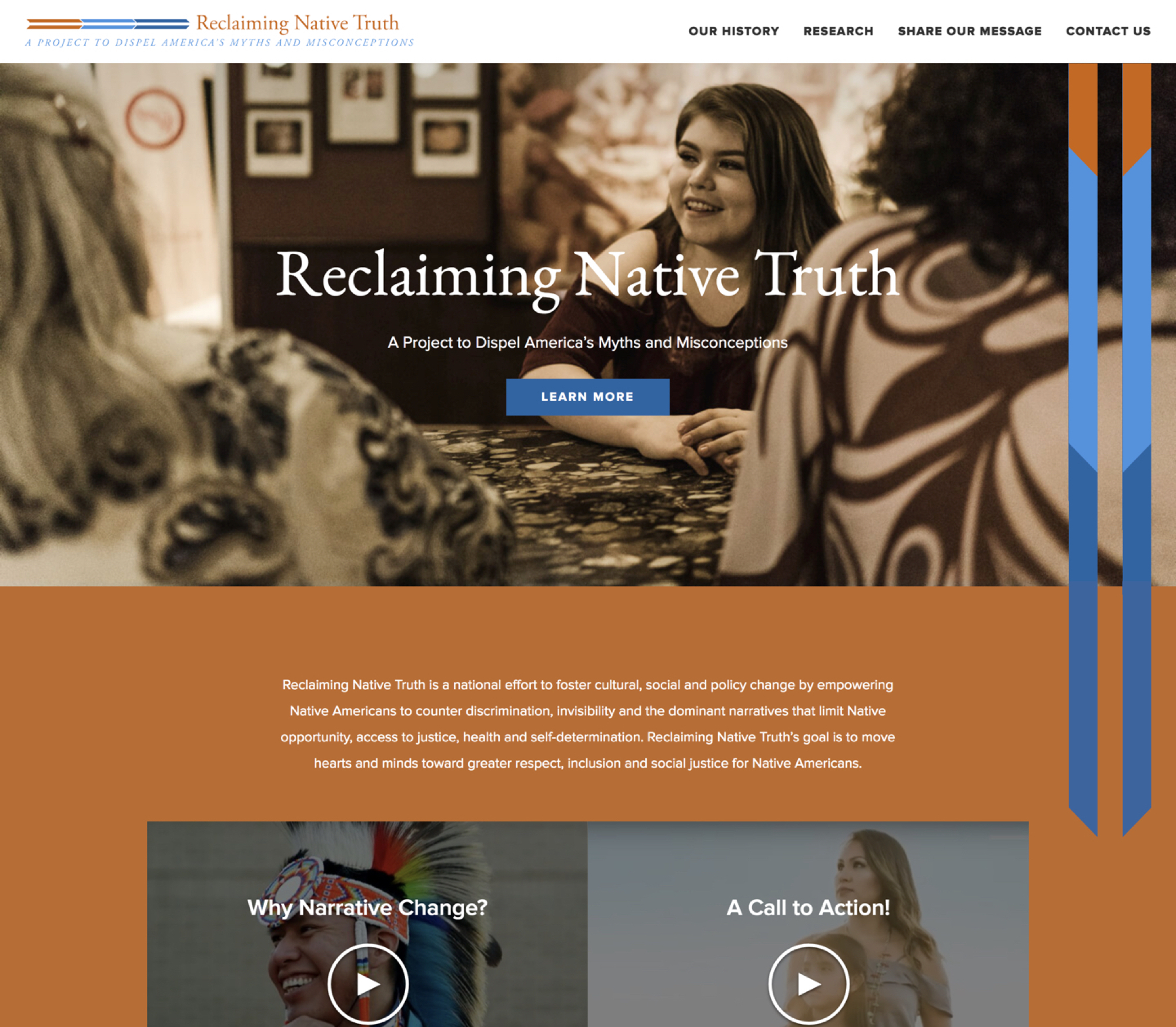
Reclaiming Native Truth, a project of First Nations, has its own separate site and logo. The orange and blues are reused in the RNT design along with the clean, full-width layout elements so that while the project website is distinct, is also flows well with the First Nations brand.
The visual design on these sites help create a huge sense of trust for their users and encourage them to want to engage and explore about those brands. If your organization doesn't have a strong set of brand standards, you should consider designing a mood board before your next web project, to help you hone in on the exact themes and feelings you want your site to evoke.
Feature prominent calls to action on your site
Every organization has a desired action for their users, whether that’s to get them to donate, volunteer, subscribe to email alerts, explore available grants in an interactive search tool, or something else. It’s important that these calls to action are easy to see and help push users to take action and interact with.
Let’s return to the First Nations site, which was an NMC project. They knew they wanted the primary actions to be to contact them or donate. Rather than having those links blend in with the other navigation links, they’re separated out as colorful buttons at the top of the masthead. This simple technique is an effective one, catching visitors' attention and clearly demonstrating a focus of the site.
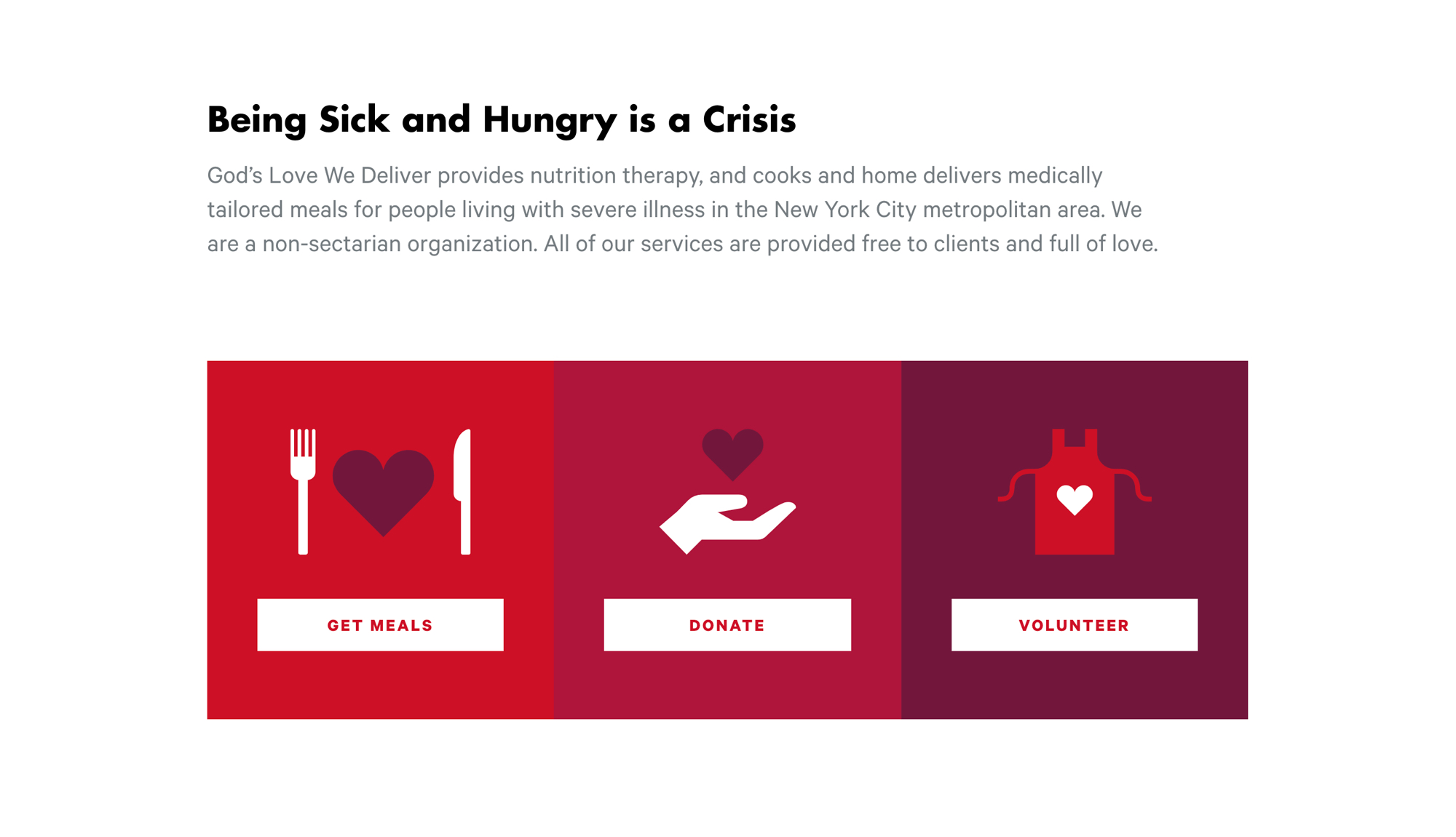
Additionally, when calls to action are used outside of the navigation, they should also be visually emphasized. We love the simple yet effective layout of the action buttons on God's Love We Deliver. The organization, which cooks and delivers meals to those with severe illnesses, boils down their site priorities to three main areas: Get Meals, Donate, and Volunteer. Those three buttons stand out to users through bold pops of color and the use of simple illustrations on a white background.
Your organization's website is not just a brochure with information about the nonprofit, but it's a tool to earn donations, volunteers, and advocates. Make it easier for visitors to know how they can help by effectively highlighting different calls to action and pushing them up the ladder of engagement.
Put your story front and center on your website
We still run into a large number of nonprofit sites that fail to describe to visitors who they are, what they do, and why they matter. Either it’s buried in a lengthy mission statement on some interior page or it’s not there at all. Communicating the purpose of your organization and how you provide solutions to a problem is an important way for you to build trust with your audience, and with web visitors having short attention spans, it's important to prominently feature it.
Telling your story doesn’t have to be done through just a block of text. IWMF does a great job of explaining what they do through visual sections on their homepage.
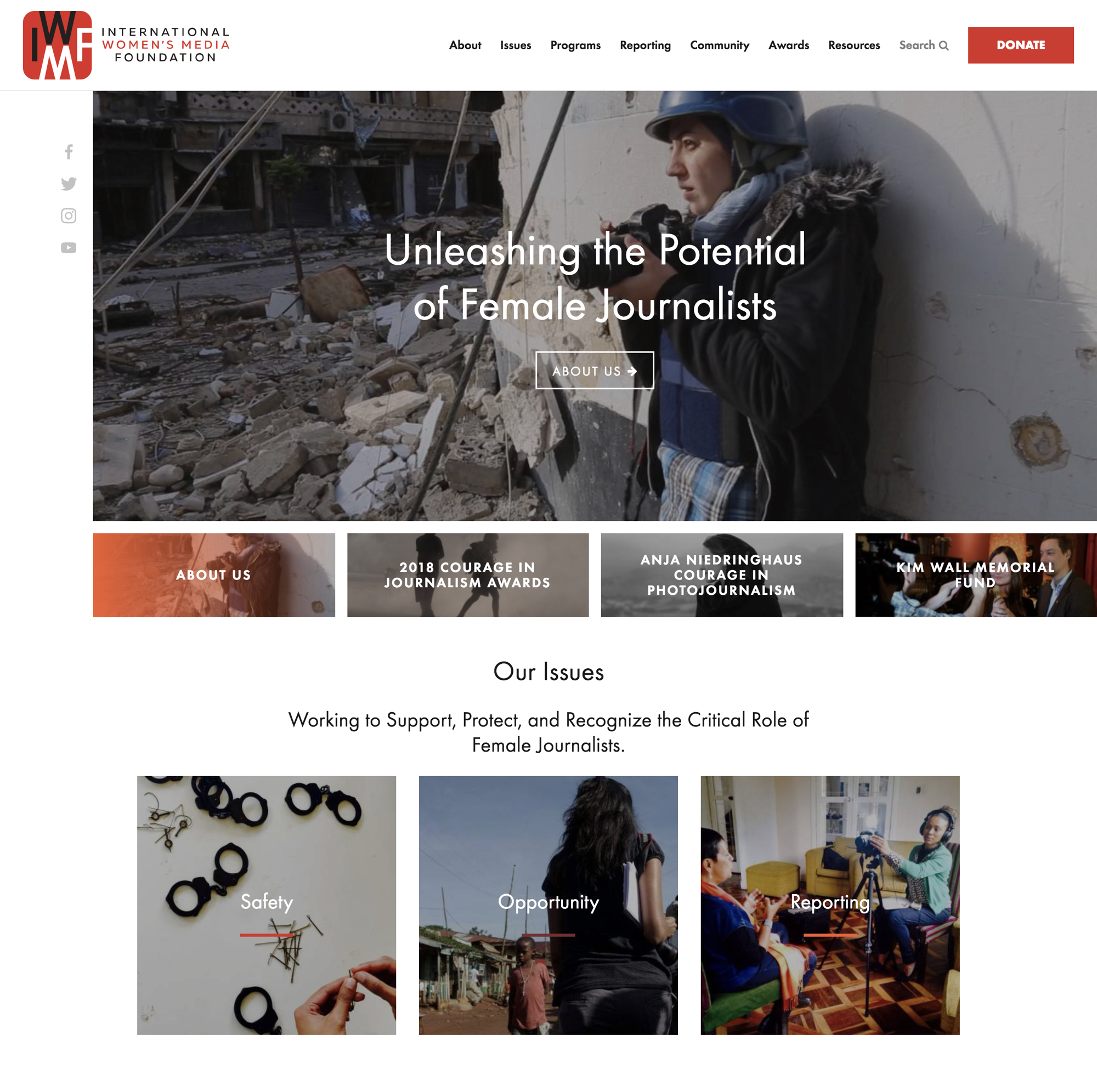
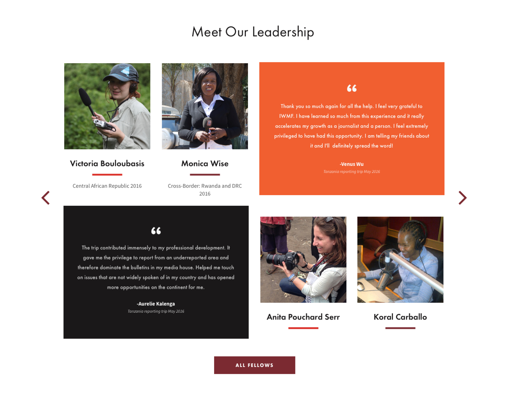
They start with the first slide in their banner carousel being an “About Us” slide. While they change out the other slides frequently, this one is permanent and displays their tagline and a link to their about page. As a user scrolls down, they succinctly describe the issues they are aiming to solve with large clickable tiles linking to more information on each problem. Finally, they showcase who they’ve helped by pulling in some of their fellows and a few testimonials in a visually-appealing grid directly on the homepage.
Don't make your visitors work to understand who you are and why you're worthy of their time and resources. Highlight your organization's purpose and value proposition upfront to quickly educate, engage, and excite visitors.
Promote your organization's impact
In addition to outlining your story, it’s important to highlight your impact across your site. If you are pushing visitors to volunteer or donate, it’s vital to show where their efforts and resources will be going and the impact they'll have.
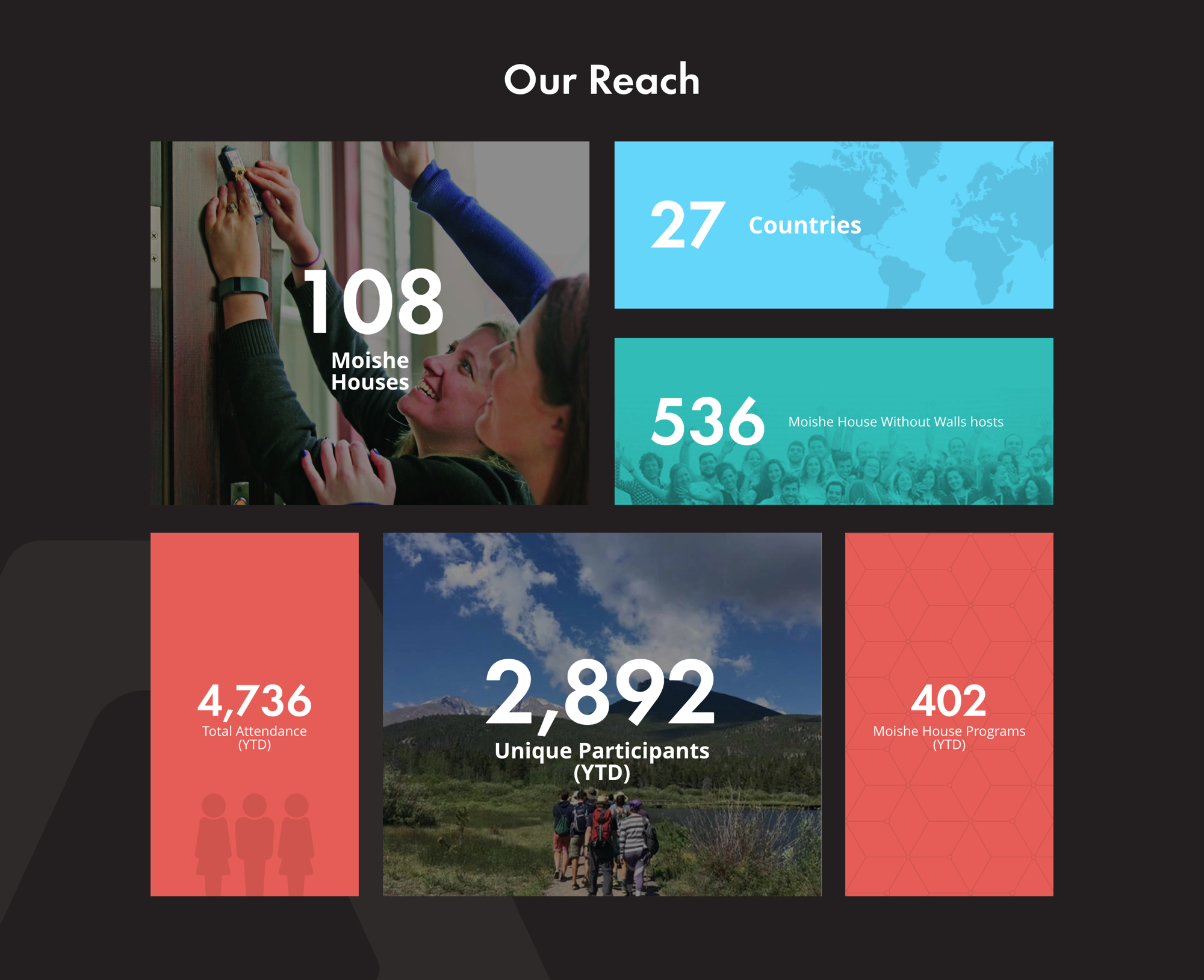
Moishe House does this in a fun and interesting way by displaying compelling statistics in a grid of tiles with vibrant backgrounds and large type.
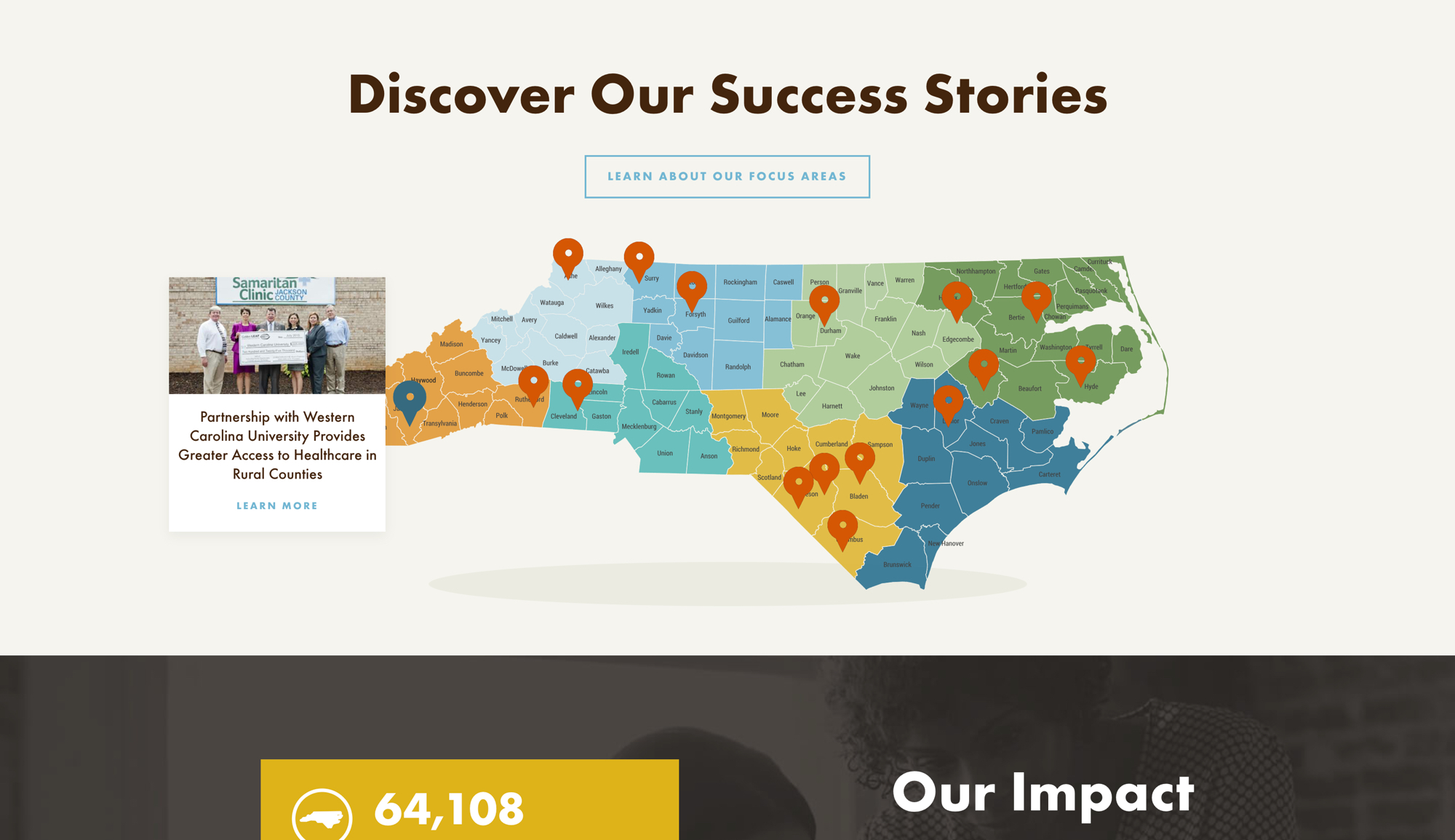
The NC organization Golden Leaf displays their impact in a more non-traditional, but equally engaging way. On their homepage, they include an interactive map with points that link to real life stories of each of their successes – showing the widespread impact they’ve had across the state.
People like to invest time and money not just in causes, but in results. Demonstrate to your visitors that you will be a good steward of their resources, putting them to work and making a real impact on behalf of the cause they care so much about aleady.
Build trust in the security of the site (SSL)
In the age of data breaches, users are extremely wary of releasing their information – particularly credit card information – online. Since online giving, forms, and basic search functions are integral tools for many nonprofits, it’s important that you prove your organization’s site is trustworthy and secure.
This can be done by adding an SSL certificate to your site. SSL ensures all data passed from the web browser to your site’s server is encrypted and secure – meaning it will remain private and protected. When a site has SSL, you’ve likely noticed that the url begins with “https” rather than “http”. As of 2019, Google began flagging any sites not using SSL, adding a “Not Secure” alert to the url bar of any site without it and penalizing non-secure sites in search results. This makes it even more imperative that you add SSL to your site as users are now hyper aware of any site’s potential security issues.
Most nonprofit sites will utilize some sort of third party service for accepting donations. Even if the donation technically takes place on a secure third party page, you should still ensure your site has SSL so that you appear trustworthy and your site is optimized for search engines. The rise of tools like Let's Encrypt make the process of setting up and maintaining an SSL certificate much easier and affordable and there's just not a good reason for your site not to be on https in today's web environment.
Utilize third parties that specialize in nonprofit technology
Using third party services for specific functionalities like accepting donations and managing volunteer schedules can be a cost-effective way to accomplish a more complex functionality on your website. It’s important, however, for the user experience to be as consistent as possible across the two platforms – your website and the third party. This can be accomplished in a number of ways. The third party services may:
- Have an iframe or script to embed the functionality directly on your site.
- Have an API that can integrate directly with your website
- Allow you to place your site’s header and footer code on their platform so your page(s) on their site look just like your website.
There are a ton of great third party services for a range of functionalities, but a few nonprofit-focused platforms we like for donations and data management are:
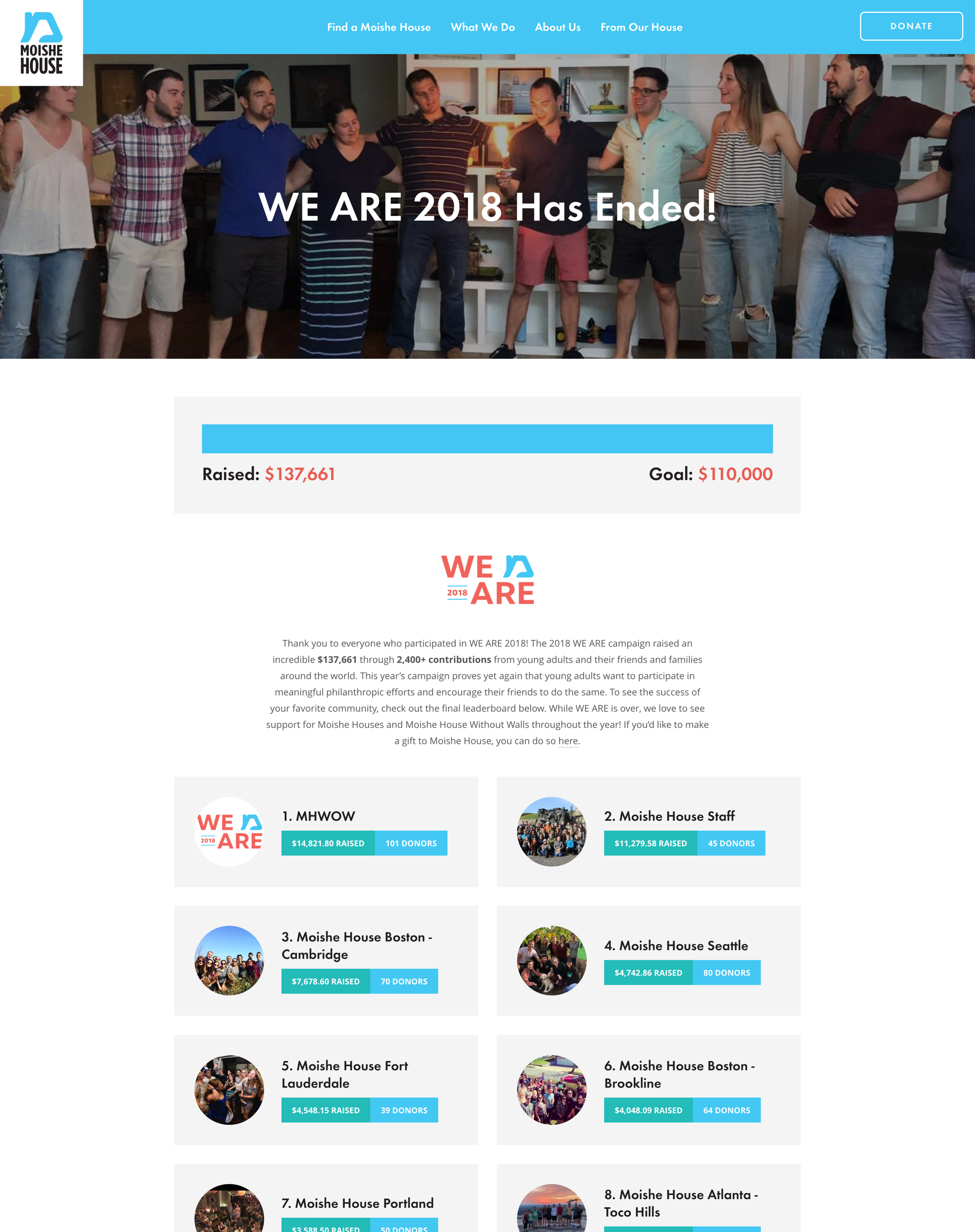
We often integrate with all the above tools and others when building nonprofit sites. For example, we love the integration of Classy on Moishe House's recent campaign to raise more funds for their programs. The service allowed Moishe to easily track giving through more than 100 sub-organizations and it flows seamlessly wth their site design.
Cross-promote other marketing efforts on your website
We understand that a nonprofit’s resources are often spread thin, which is why your website content does not have to be siloed from the rest of the marketing work your organization is doing. Perhaps your organization puts out a great email newsletter, you produce compelling donor videos, or you’ve got a team dedicated to focusing on your Facebook and Instagram profiles. All of these efforts can and should be integrated into your website.
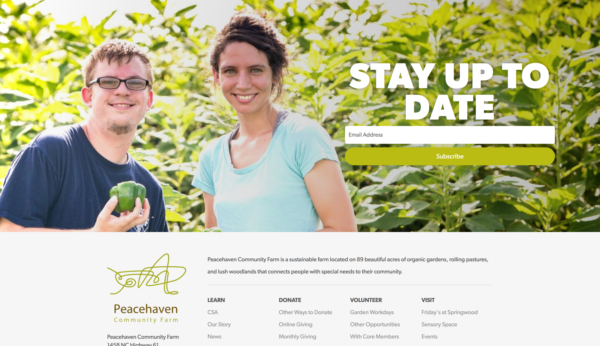
If many of your organization’s efforts go into an email newsletter, we suggest highlighting an email signup to capture more subscribers on your site. We love the simple, yet powerful impact of the sign up on the Peacehaven Community Farm site – which sits at the bottom of every page and includes a great background image and bold heading.
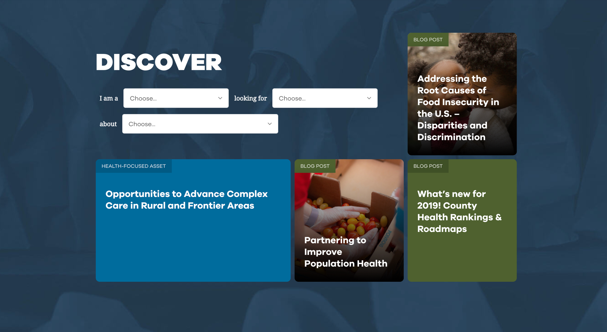
Feeding America's site, Hunger & Health, consolidates a wealth of professional nutrition resources - from research publications to blog posts to recipes. Rather than strictly keeping those materials offline or on their respective listing pages, they pull them together in a unique feed on the homepage. Users can see a small selection of the latest resources, while also being able to filter down to see very specific resource types and categories.
Conclusion
Your nonprofit deserves a website as strong as it's mission. Having a compelling visual identity, prominent calls to action, a focus on your story and impact, clear site security, nonprofit-focused third party integrations, and the inclusion of your organization's marketing efforts are all ways your organization's site can be brought up to today's design standards and best web practices.
Have any other ideas for what should be included on a modern nonprofit site, or examples of great nonprofit sites that include some of these practices? Please leave them for us in the comments below! And of course if this post inspired you to make some changes to your organization's website, don't hesitate to get in touch with us!

Leave the first comment