Physician Assistant Education Association

Building a Robust Digital Hub for a National Medical Membership Association

PAEA, the Physician Assistant Education Association, is a national membership association for physician assistant education programs throughout the United States.

If you’ve ever visited a doctor or specialist, it’s likely that you’ve had the opportunity to see a PA. A physician assistant – often incorrectly referred to as a physician’s assistant – is a highly trained medical professional who can examine and diagnose patients, prescribe medications, and develop treatment plans for a wide variety of conditions. PAs typically work alongside physicians in settings that range from hospitals to nursing homes to traditional medical offices.

As is the case in most professions, PAs are brought together for networking, continuing education, and events by large membership organizations that seek to build community and expand access to resources. PAEA, the Physician Assistant Education Association, does the same thing for PA education programs throughout the United States.

PAEA is the only national association for PA education programs, and all accredited programs in the U.S. are currently members. The association regularly supports the group with grants, workshops, fellowship opportunities and other resources.

As PAEA evolved and expanded their reach, they realized that a sophisticated nonprofit website design would be an essential part of organizing information and connecting with stakeholders. Thus, they approached NMC to design a new brand and association website with the goals of refreshing the PAEA identity and creating a consistent experience online.

Crafting a Nonprofit Association Brand

When we connected with PAEA, their leadership team indicated that the nonprofit was just entering an exciting period of growth. They had increased their program offerings, welcomed new members to their staff, and were more generally experiencing an uptick in interest in the PA profession. The timing was perfect for a full brand refresh.

The new brand centers on a cohesive, polished look that incorporates an engaging mix of typefaces, dynamic curved shapes, and welcoming visuals that evoke the association’s strong founding principles of community and inclusivity. The logo – as the centerpiece of the new identity – captures these concepts in an abstract mark, clean acronym text, and a concise tagline (“Learning for a Lifetime”).

Beyond the core look and impact, it was also important for the new identity to age well and stand apart from other medical and academic associations. In order to accomplish these goals, our designers prioritized a timeless aesthetic and avoided stereotypical shades of blue and traditional symbols like the caduceus and cross. All of this was captured in the digestible format of a web design mood board (example below).

With a solid plan for the new brand in mind, we moved on to the bigger task: bringing it to life on the web.

Consolidating Three Separate Web Presences

Prior to the redesign, PAEA had been using three separate websites to highlight different areas of their work. This approach had met their needs early on, but as the organization grew, the three domains quickly became unwieldy and confusing for stakeholders.

After strategizing with the PAEA team, we all agreed that a single, comprehensive website would be the best way to move forward. A unified information hub would remove any site visitor confusion, streamline maintenance processes for staff, and generally simplify efforts related to marketing and search engine optimization.

We began the website process by guiding PAEA through our standard creative brief. The brief asks questions about project goals, design preferences, target audiences, and technical needs. More importantly, it helps our team to make strategic recommendations that will maximize efficiency and user experience.

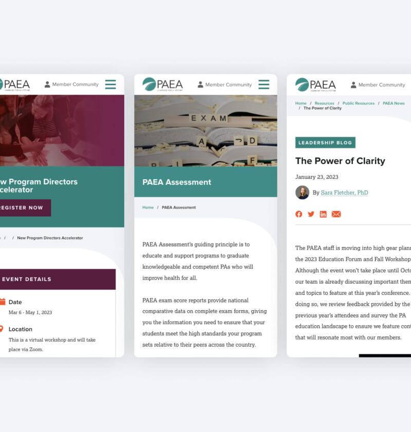
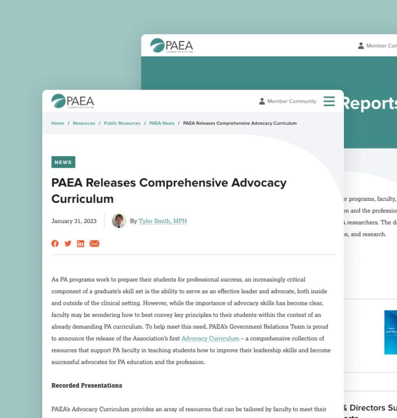
Considering PAEA’s wide range of target audiences – educational institutions, faculty members, PA students, and advocates, among others – we built a site with dozens of custom layouts and features that appeal to all potential site visitors. Whether they land on the homepage or an interior section, they can personalize their experience by accessing curated tools and resources through the main meganav menu. News postsevent listings, and other content feeds are also highly filterable, making it even easier for stakeholders to find the content that’s relevant to their needs.

Incorporating Engaging Site Features

The site is punctuated by engaging elements and features that package information in a way that’s easy to browse. Driven by proven nonprofit web design best practices, this sense of variety is highly intentional. More than creating pages that are visually interesting, it ensures that the site remains information-rich without becoming overwhelming for site visitors. Key features include:

  • Bold Statistics. Featured stats highlight PAEA’s impact throughout the site. These numbers grab attention and offer quick takeaways for casual site visitors and prospective member organizations.

  • Fun Icons. On landing pages like Public Resources, icons allow for intuitive identification of each topic. They also add a playful, graphic feel to pages that would otherwise only include text.
  • Efficient Sliders. The homepage uses interactive sliders to showcase main banner items along with powerful testimonials. In addition to encouraging visitors to engage with the site, the sliders pack in extra content without taking up valuable page space.
  • Sticky Nav. A “sticky” top nav guides users through the site. The bar is “sticky” because it stays attached to the top of the screen as users scroll down the page. Continuous access to menu items is particularly helpful because it makes it possible to navigate through the site without having to return to the top of the page for each topic change.
  • Handy Subnavs. Interiors like the Assessment pages bring in subnavs (think: helpful quick links) to break down major elements of each exam. This makes it easy for program administrators to jump between important topics and gather information.
  • Interactive Map. To show the reach of PAEA’s member programs, we built an interactive map directory that allows site visitors to explore opportunities on a map of the United States. Users can browse programs manually by clicking and zooming on the map itself, or filter by state via the link listings below the graphic. Visit our blog for more examples of interactive maps on websites.

Paving the Way for Future Success

The rest of the site can be updated through the user-friendly content management system. Here, admins are able to control everything from the site’s megamenu to individual sections and articles. And thanks to a flexible WordPress base, the site is primed to scale with PAEA as they add new programs, partners, and resources.

How does this work in practice? We kept future growth in mind from the outset. Each page is made up of content and media “blocks” that can be added, reordered, and customized with elements like headings, buttons, and icons. Moving forward, PAEA can use these blocks to build out new layouts that maintain the look of the site while housing entirely unique content.

All in all, the project was a resounding success. PAEA is fully equipped to take on an increasingly digital landscape with a fresh logo, a dynamic brand, and a single online hub where stakeholders can easily engage with the nonprofit and the larger PA education community.