
Examples of Interactive Maps on Websites
Bringing data to life with interactive maps
Updated 1/3/2024 – This post was updated from the previous version to include new examples of interactive maps from around the web and different industries.
Interactive maps are a great website asset to organizations with a large geographical reach. A map of any type does a great job of showcasing the scope of a group’s work, their influence, and their success. Making those maps interactive adds another element of engagement and functionality to the display.
Depending on the industry, our clients use interactive maps in different ways. Nonprofit website designs often use them to show the geographic distribution of projects, while B2B or B2C websites usually leverage them to display office locations or retail stores.
In this post, we'll walk through a variety of examples and explain what to consider when thinking about an interactive map for your next web project. Jump ahead with the links below:
Getting Started With Interactive Maps
When working with clients to design and build interactive maps, we understand that there is no “one size fits all” solution. We work with each client to determine what the map should convey, how the information should be displayed visually, and how it should respond to user interaction. Additionally, we think through the desired behavior and implement various integrations that will efficiently power the map with data.
When deciding on an approach, much of the process involves our team sharing various examples with clients. Examples help clients work out which functionalities they need, how they'd like to present the data, and the overall look and feel that they're drawn to. Three things we like to establish upfront to help guide the approach are:
- Should the map just represent a single data type (e.g., projects), have different data types represented on the same screen (e.g., past projects and current projects), or a toggle to let visitors get different views? And what is the data that should be displayed?
- What will power the data for the map and how frequently will it change?
- Should there be pins on the map to represent different individual locations or should the map represent the data in a different way?
While there are a number of other details to consider during the design and build process, these initial questions help everyone to gain a high level understanding of what data should be displayed, how the map should look, and the method to get the data onto the map.
Ongoing Map Management
In addition to guiding the design, the questions above also influence how the map will be built. We strive to build maps that are easy and intuitive for clients to manage. While the development and maintenance approach is largely guided by the data being displayed and the desired functionality of the map, we're often able to set it up so that the interactive map can be controlled directly through the Content Management System that the site is built on. This way, editors can input the content into the CMS and assign pins to specific addresses or locations.
For more complex datasets or those that rely on third-parties, a spreadsheet can also be a viable option. Clients can either upload their data spreadsheet to a specific place or in some cases, we can connect a live Google Sheet that powers the interactive map as it's edited. Sometimes this approach is easier than a CMS-powered solution when dealing with hundreds of datapoints that are maintained elsewhere.
We always design and develop interactive maps based on the goals and needs for that particular project, which has led to a wide variety in the types of maps in our portfolio. Below we've listed out some of our favorite examples along with brief descriptions about what makes each one special. Some of these maps were built by us, and others are great examples that we’ve encountered across the web. We like to share this list with clients to help them hone in on what they're looking for.
Interactive Map Examples
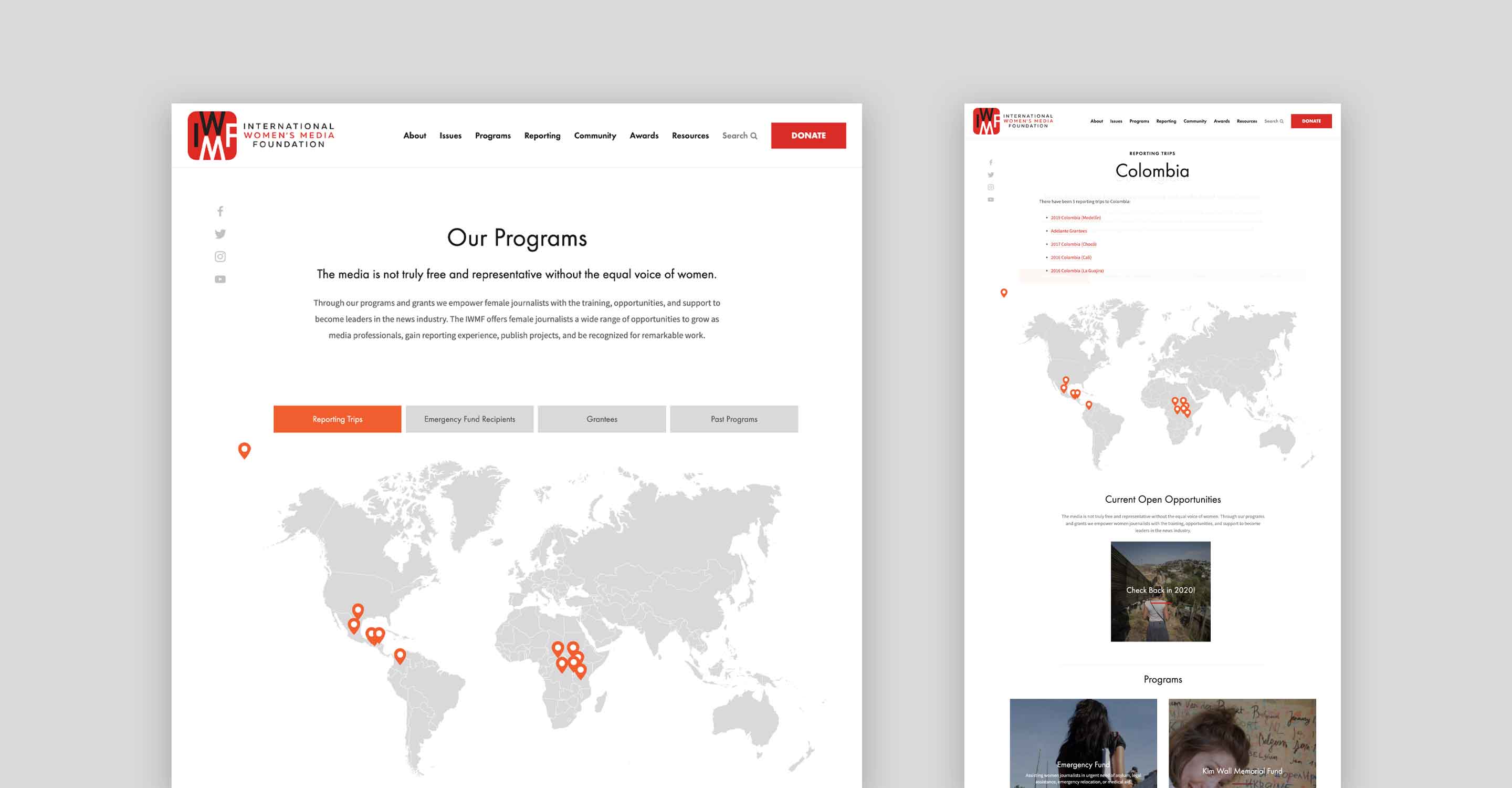
International Women’s Media Foundation
First on our list is IWMF’s program map (an NMC project). This map utilizes location pins to highlight the various countries that IWMF journalists have worked in. Once a user clicks on a location pin, a lightbox appears and displays additional information like past reporting trips, journalist biographies, and program information.
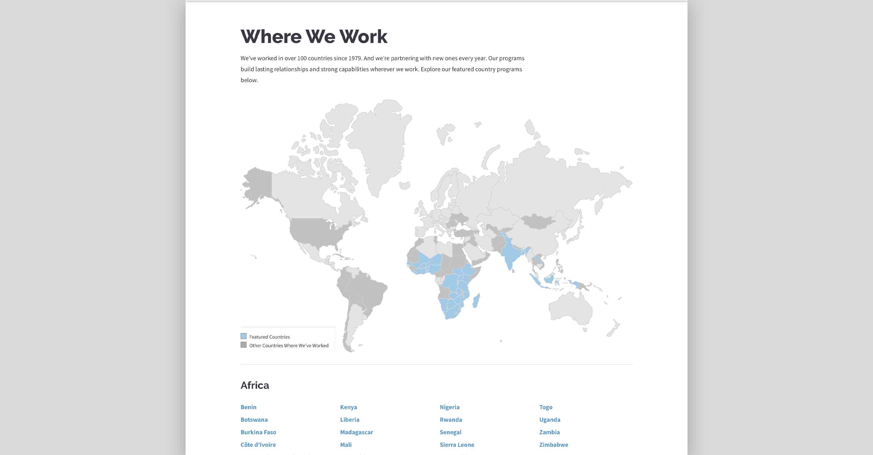
IntraHealth’s “Where We Work” map (an NMC project) is another great example that showcases the breadth of an organization’s impact. Through a color-coded system, this map highlights the countries in which IntraHealth has established programs and also reflects the other countries that they have worked in. When a user clicks on a “Featured” country, they are taken to that country’s dedicated page to learn more about the work that is being conducted within that country.
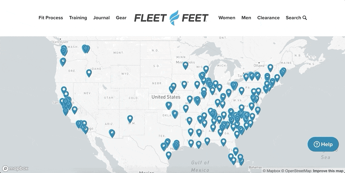
Fleet Feet’s interactive map (an NMC project) showcases the 180+ franchise locations that the major retailer has around the United States. Powered by Mapbox, each pin on the map represents a Fleet Feet franchise store and once a user clicks on it, it provides a popup that contains valuable store-specific information for customers.
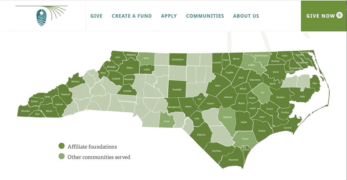
North Carolina Community Foundation
This interactive map reflects the different counties that NCCF serves (an NMC project). The North Carolina state map has a legend that details the different colored counties. Although users can interact with the map by simply clicking on the county tiles, they are are also able to filter the map based off of eight different regions. North Carolina has 100 counties, which could be overwhelming to review at first glance. But with this filter option, users are able to focus-in on a particular region within the state to learn more about the resources that are available to them.
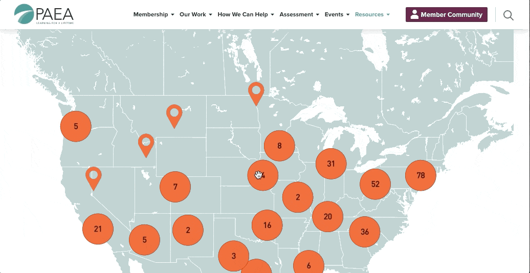
Physician Assistant Education Association (PAEA)
This interactive map was built as a part of our client PAEA’s larger nonprofit website redesign and logo project. The custom map serves as a visual directory of over 300 member schools across the United States. Because there are so many programs included, the map helpfully groups pins into clusters that, when clicked, reveal smaller regional subsets and individual map pins. Read more about the project in the PAEA case study.
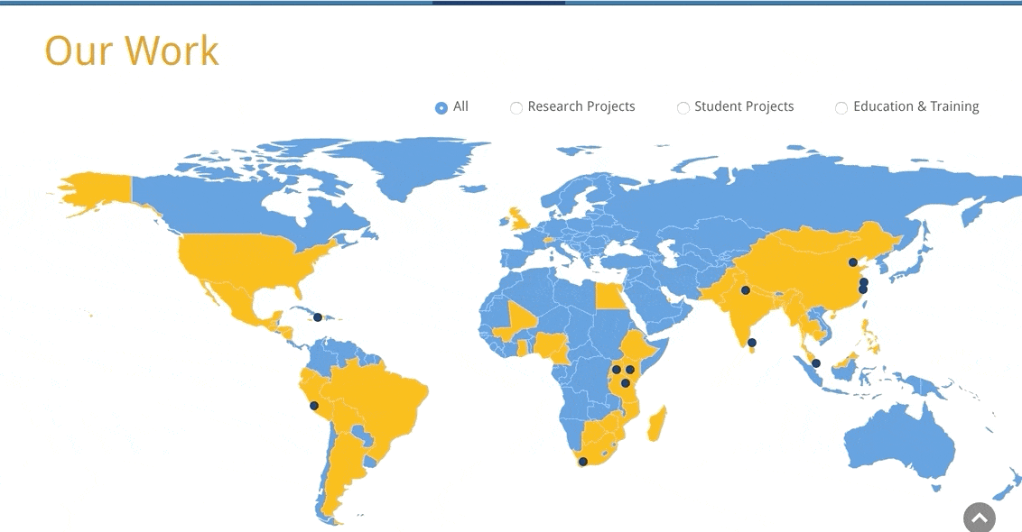
Although Duke University is based in Durham, North Carolina, they have a global reach through their various programs. The Duke Global Health Institute site (an NMC project) features a world-wide map that allows users to filter by research projects, student projects, or education and training, in addition to viewing their entire reach. With each filter option, the associated countries filter through various colors to showcase their presence. Additionally, each individual pin details the location’s name while the individual country tile takes users to a dedicated page that details the work going on within that country, applicable news, and research topics.
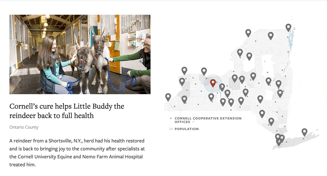
Cornell University has a very unique map on their site. The purpose of this map is to show the impact that Cornell University has made within communities across the state of New York. When clicked, each pin within the map showcases a different research initiative that is based in that specific part of the state.
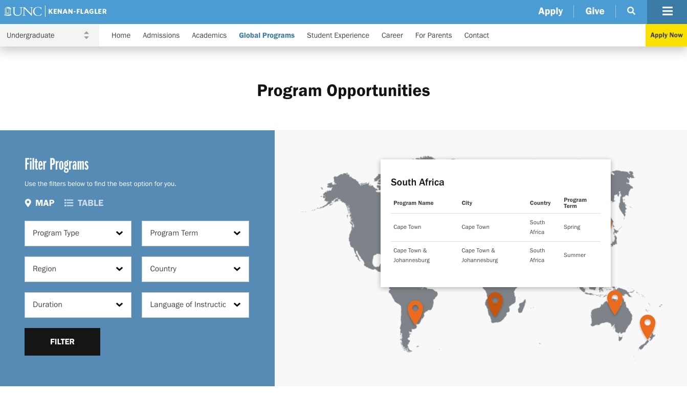
UNC Kenan-Flagler Business School
UNC Kenan-Flagler (an NMC client) shows another way that interactive maps can be used in higher education website design. On the Global Programs page, the map is paired with a series of filters that students can use to identify options for studying abroad. When filters are activated, the map only displays results that are a match. Users can also toggle results to show up in a table format for easier review.
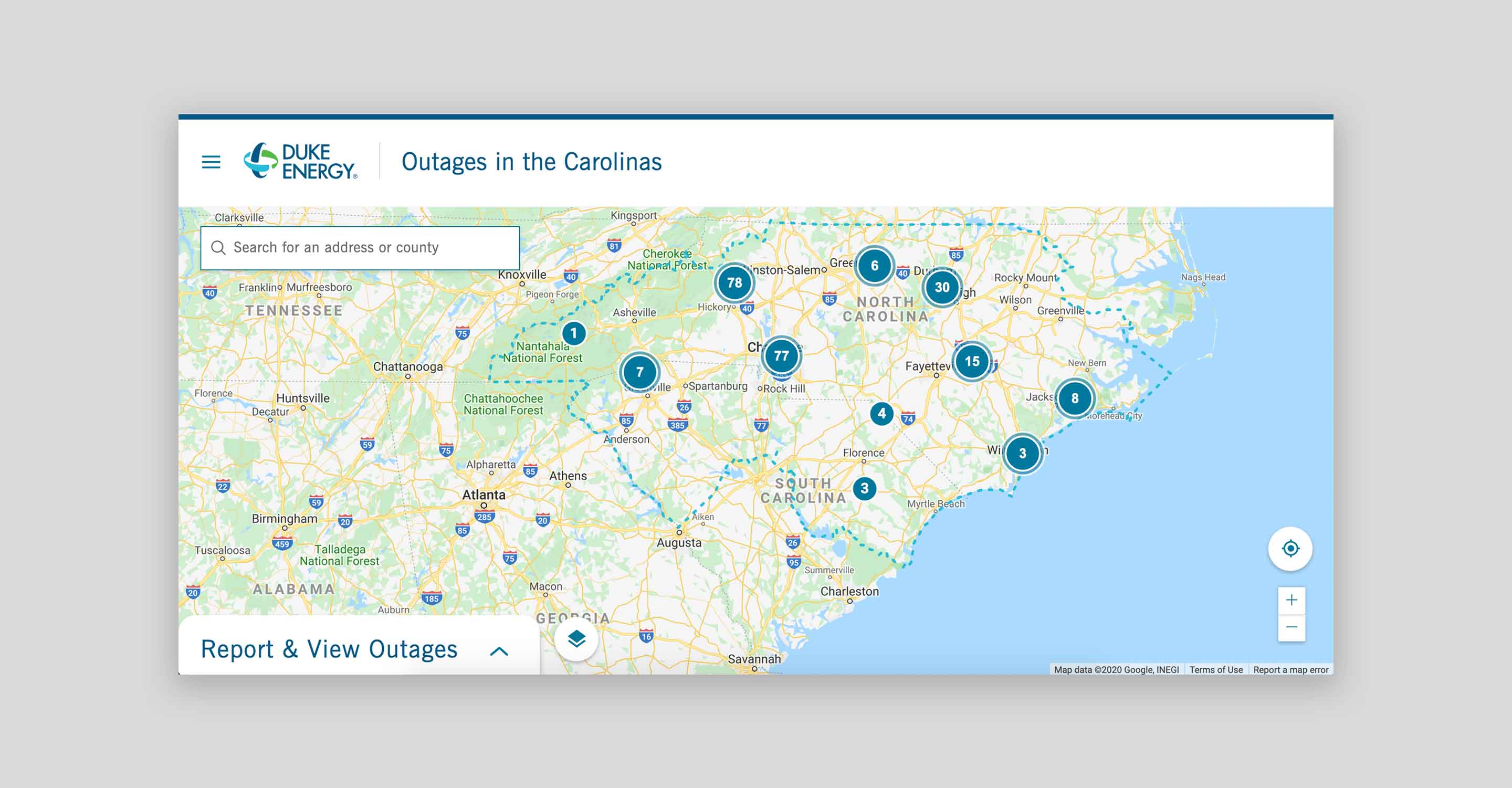
Duke Energy serves thousands of customers across five different states. With such a wide reach, their interactive outage map is a great resource for all of their customers.
Before customers are taken to the map, they are first prompted to select the state they reside in and then they have to select their account-type. From there, users are taken to a map that displays the appropriate information depending on their state and provider. From this point, they can then focus in on a specific location to see the amount of active outages, customers that are without power, when the outage was reported and the cause of the outage, in addition to the anticipated restoration time - wow!
This map does a great job of taking users to the information that is specific to them and then providing essential information in a digestible and informative way.
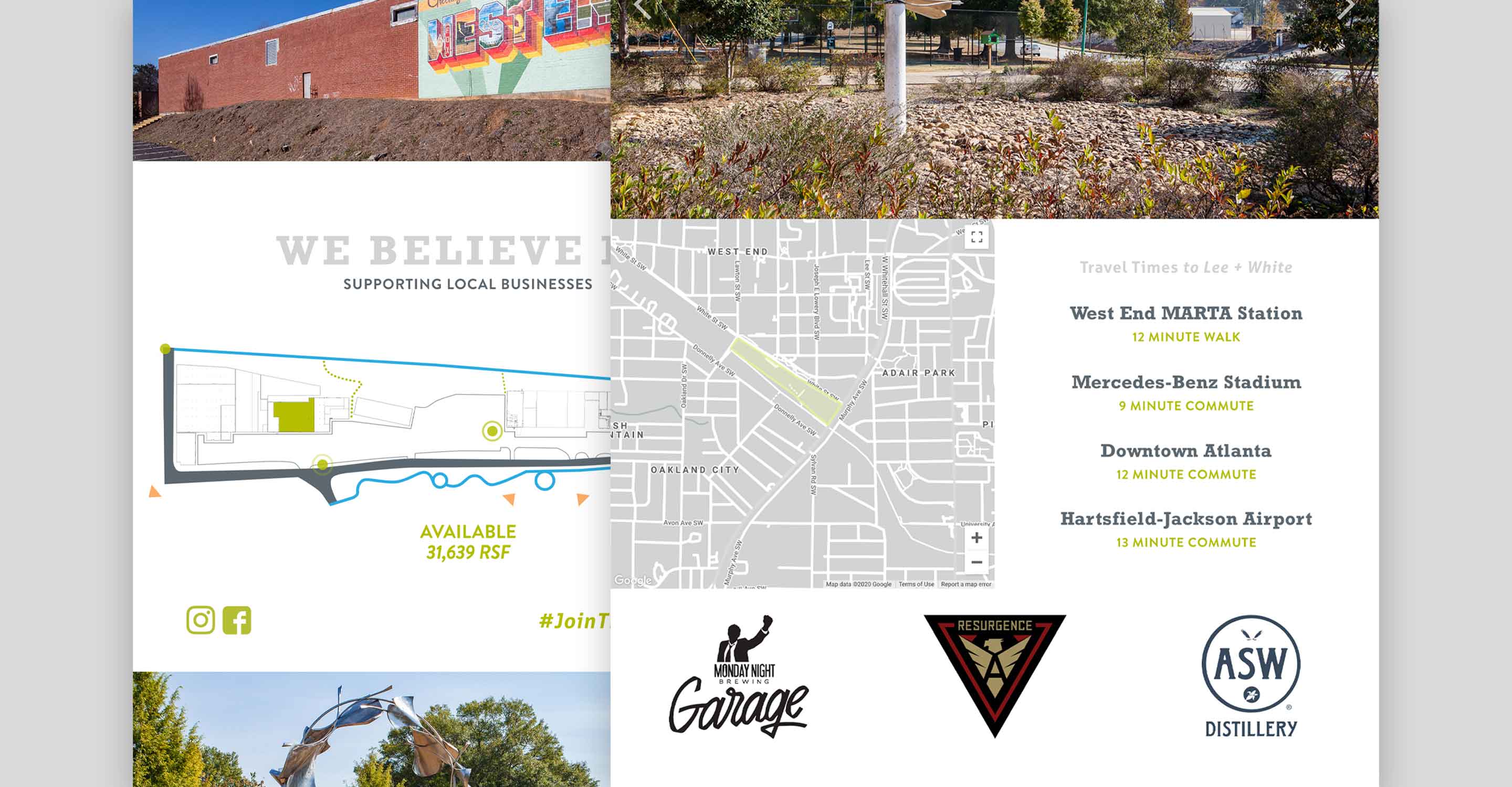
Lee + White is a 23-acre warehouse development located in Atlanta, Georgia. Currently, Lee + White buildings house breweries, restaurants, retailers, and a few food manufacturers. Additionally, the impressive property features more than a half mile of frontage along the Atlanta BeltLine with direct access to the trail, sounds like an entrepreneurs dream, right? The map on Lee + White details current occupancy and vacancy space for potential businesses. In addition to highlighting the space available within the warehouses, the map displays information regarding surrounding businesses, streets, and beltline access.
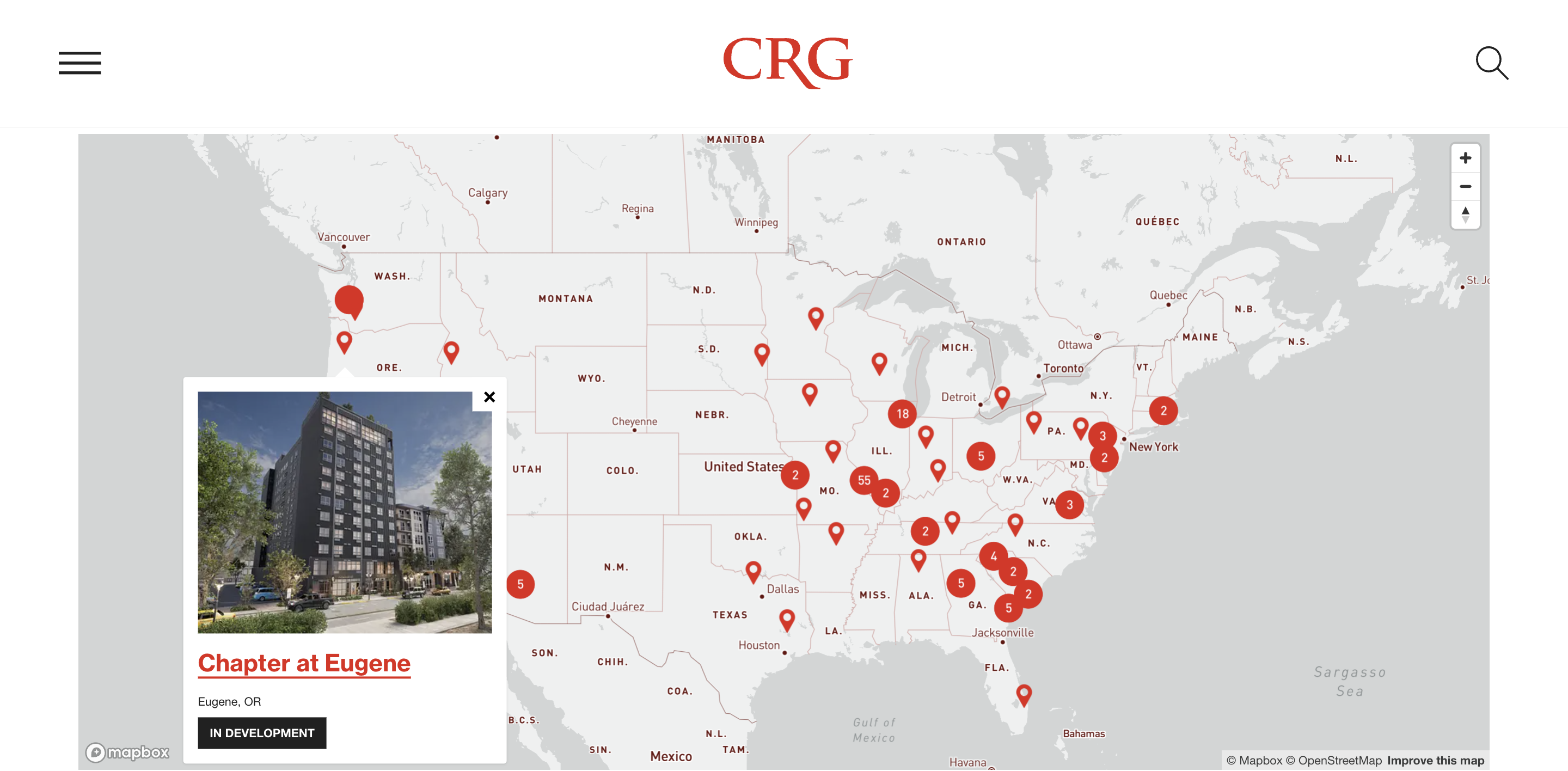
NMC developed an interactive map for CRG, holder of subsidiary Clayco, to allow for the company to visually showcase their portfolio of international development experience. The user can view these locations from a high level, or hone in on specific areas that house multiple development locations. The contrast between the map and markers allows for these locations to be the main point of focus, making it clear to the user that the markers and locations are associated with CRG.
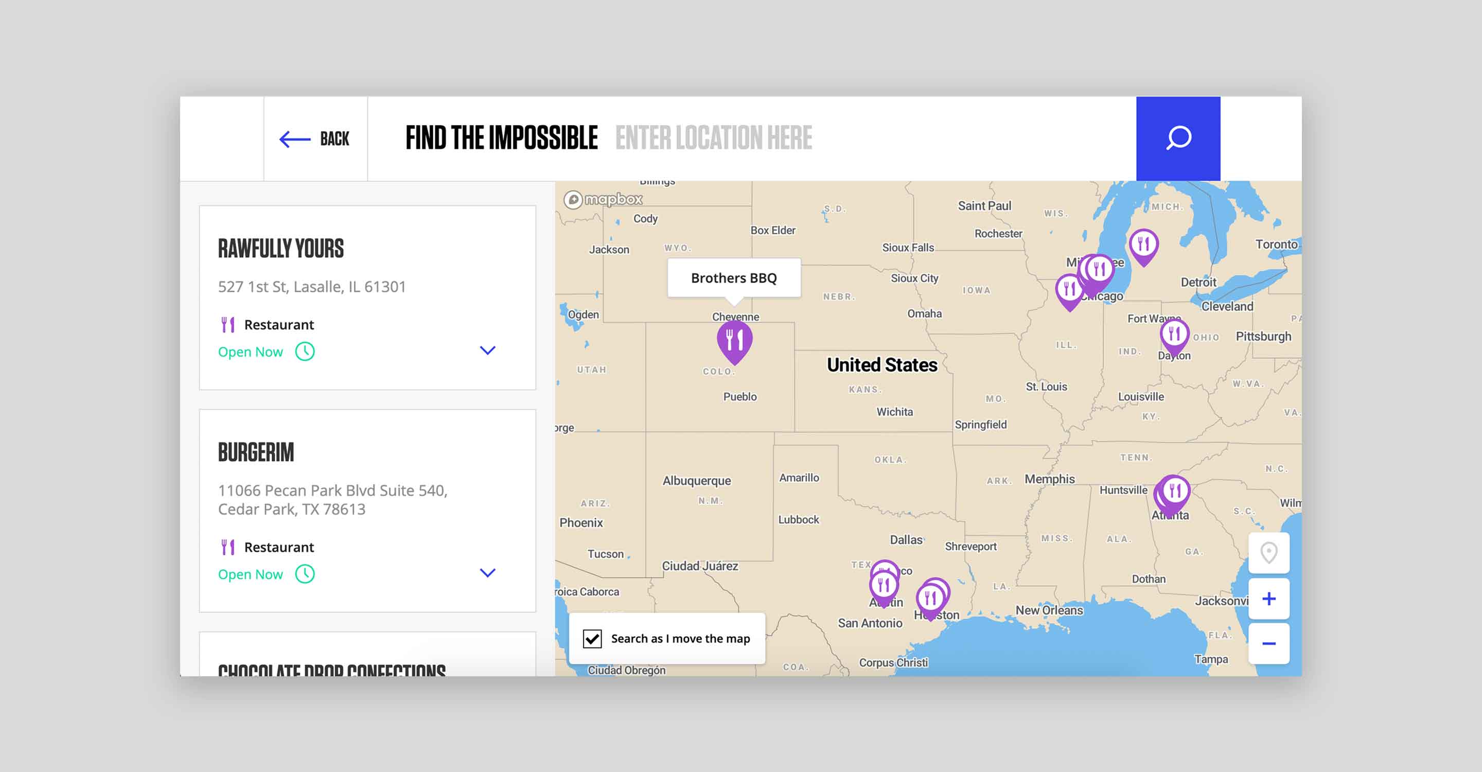
Although this map functions like a lot of the others on our list, it is visually very different. Impossible Foods’ map plays with bold font and colors, which is consistent with their overall brand.
Similar to WeWork’s map, users are shown a national view of Impossible Food’s locations to really showcase their presence within stores. Like most interactive maps, users are able to zoom in and out to find the information that is specific to them. However, as users continue to narrow their search, the map showcases more and more features like lakes, national forests, and metropolitan city grids.
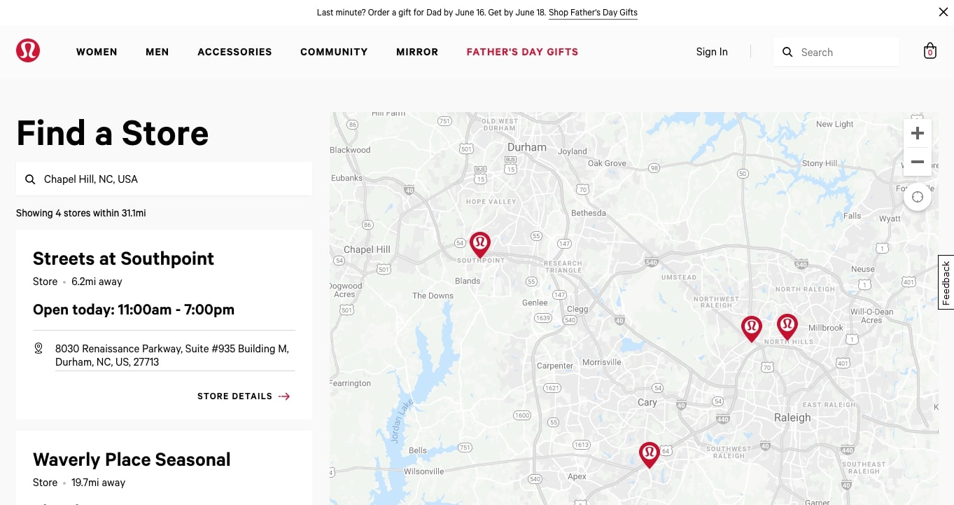
Like Impossible Foods, Lululemon uses an interactive map to display their store locations throughout the country. While the map looks similar to some of our other examples, custom details and an intuitive interface make it stand out as an excellent model that deserves discussion. The important thing about Lululemon’s map is that every element is true to their brand aesthetic and styling. Map pins feature the signature Lulu logo, clickable links hover to (brand color) red, and arrow buttons incorporate subtle movement. And when a user clicks through to a location page, a smaller map offers visual context and continuity.
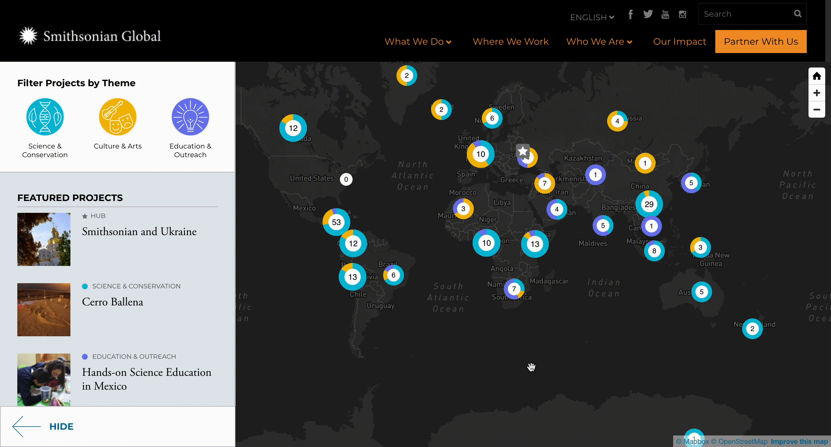
Smithsonian Global's interactive map serves as a representation of where their projects are located internationally. This map features an overlay providing contrast to allow the map pins to stand out among the map. Each map pin uses colors to represent the themes of the projects in that area. Additionally, users are able to filter the projects by theme, in which the colors on the markets adjust to show which areas have projects that align with the theme(s) chosen.
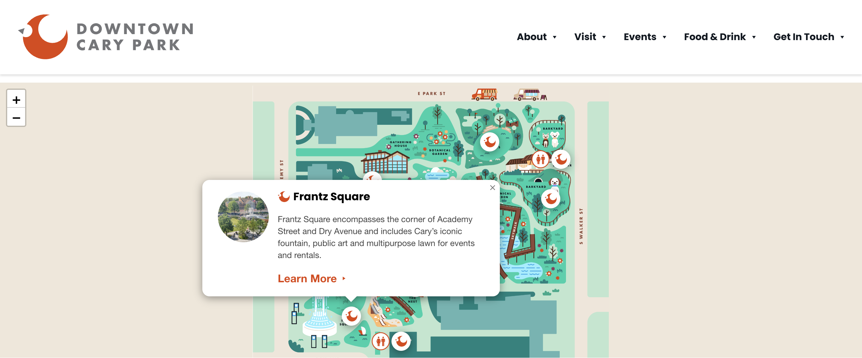
The interactive map developed by NMC for Downtown Cary Park is a creative visual showcase that serves the purpose allowing users to explore the different amenities that the park has to offer, and it highlights the different options with customized illustrations for pins. Users are able to select the different map pins on the map and view information regarding which amenity is in that area and what purpose it serves.
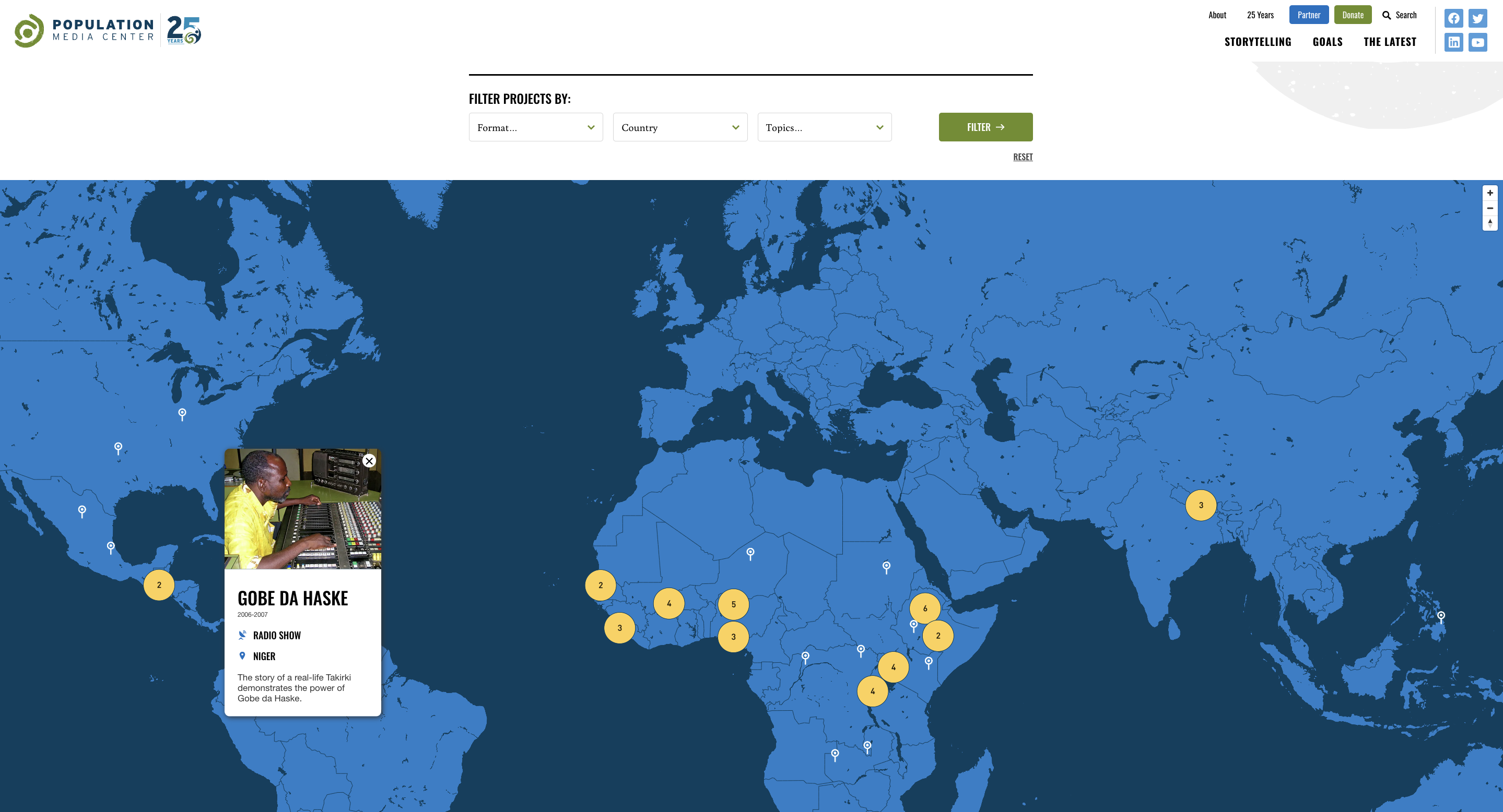
Population Media Center, one of our nonprofit projects, features an interactive map to visually represent the countries in which their projects are located. This map offers map pins that can be selected to show the specific project and associated project information. The interactive map also has an associated filter to allow users to only see projects that fall within the format, country, or topic that they are interested in. You can read more about our work with PMC in our case study on the project.
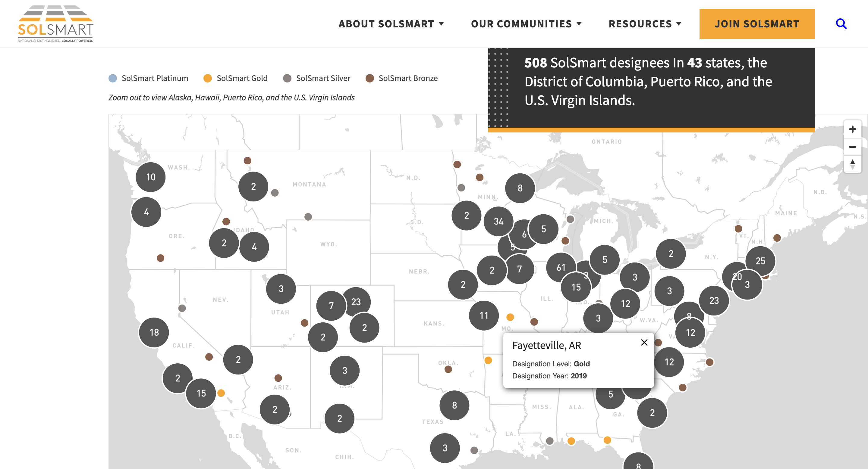
The interactive map on SolSmart’s site, developed by NMC, is powered by a salesforce database and serves the purpose of allowing users to explore the areas that have achieved SolSmart designation for their work to encourage solar energy use at the local level. Each map pin, when selected, displays the location and its designation level and year. These map pins are color coded to represent the designation level of each area.
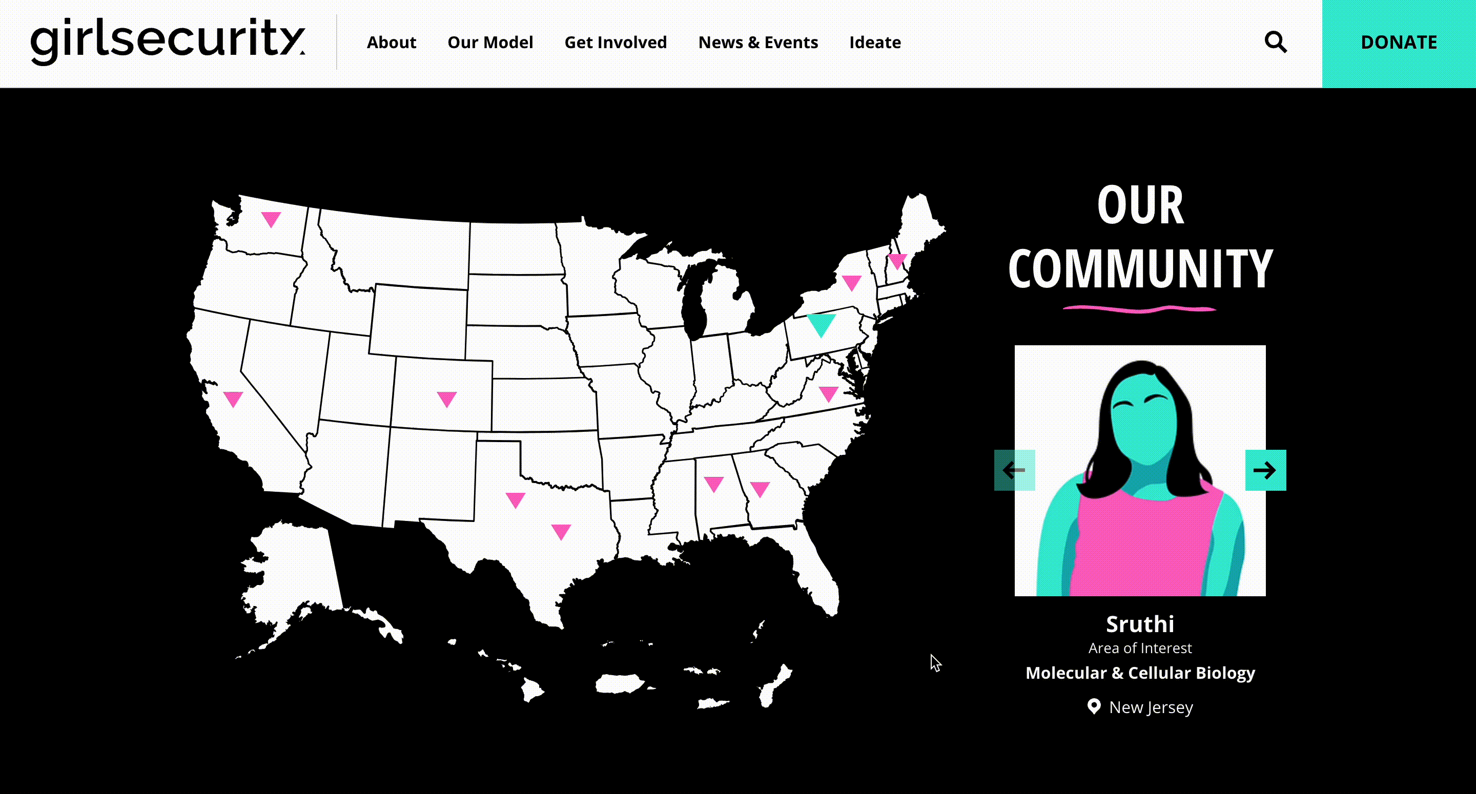
Girl Security, one of our nonprofit projects, features an interactive map to visually represent their community located throughout different areas of the United States. This map stands out amongst others as it uses a slider to present information regarding their community members rather than a pop-up dialogue box. With map pins that are clearly distinct from the map, it is easy for users to visualize where in the country these community members are located.
Conclusion
As you can tell, there are endless options when it comes to interactive maps. They are a great resource and display of information for all industries and businesses. If you are wondering how an interactive map could be incorporated onto your site, drop us a line and we’ll brainstorm together!
Related Posts

Spotlight 2019 Websites


Comments
luv
"Fantastic compilation of interactive map examples—really highlights how maps can enhance user engagement and storytelling. For my creative side project showcasing oversized printed t-shirt .designs on a global canvas, this was a great inspiration."Luis mejia
That’s so information textLuis mejia
That’s so information textSarah
Any idea the software used on the North Carolina Community Foundation map example?Leave a comment