
Building an Effective Digital Health Website: Best Practices & Examples
From wearable technology to apps that track wellness goals, it’s becoming increasingly clear that digital health tools are here to stay. While healthcare providers and organizations may not have the bandwidth to create their own trackers or virtual experiences, it’s certainly possible to incorporate digital health best practices by making website adjustments and considering the ways that patients interact online.
Telehealth and remote consultations are obvious pieces that can play a role in this shift, but they’re not the only options for keeping your practice or organization up-to-date digitally. Many of our healthcare clients enrich their websites with elements like virtual check-in, downloadable resources, and portals for submitting forms and payments online. These are the types of changes that we’ll be discussing in this post.
Why a Modern Digital Health Website Matters
If most of your business comes in through referrals or word-of-mouth, you may not think that your website deserves an investment of either time or money. But in reality, an outdated website is harmful because it (1) forces prospective patients to work harder to gather information about you and (2) gives the impression that you’re behind the times when it comes to technology. A common counter-argument might be that healthcare websites don’t need to be shiny or cutting edge, but if the site is clunky and tricky to navigate, site visitors might start to wonder where else you’re lagging behind – even if your approach to care is constantly evolving to match the latest standards.
All that to say that a professional and polished digital health website is an essential. Your website is a direct reflection of your approach, values, and organization as a whole, so it’s worth the work to make a good impression online.
Read on for best practices for creating an effective digital health website:
- Clear navigation to help users who may be acting urgently
- Thoughtful messaging and straightforward action plans
- Accessible design and features
- Easy-to-access resources for helping yourself and others
- Broader SEO terms to attract organic traffic
- Interactive map to help users find a local office
- Patient portal or online forms
Clear Navigation
For any website, navigation is a hugely important factor that determines whether or not site visitors will be able to quickly and easily find what they’re looking for. The stakes can be a bit higher for healthcare organizations because some users may be acting with urgency. For example – someone looking for immediate (but non-emergency) help during a health episode.
That said, a good navigation strategy for a digital health website means including important items in the main nav – things like About, Services, and Resources – along with special call-outs for crucial pieces like “Request an Appointment” or “Immediate Assistance.” The “special” items can be distinguished visually with a colored underline, button, or outline.
Important navigation items should be reinforced throughout the site with calls-to-action and links that point to related services, forms, providers, etc.
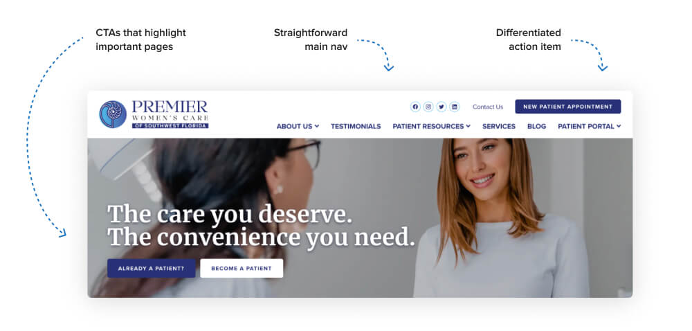
Case Study: Premier Women's Care of SW Florida
Our client Premier Women’s Care of Southwest Florida has a great navigation setup that makes it easy for site visitors to browse efficiently. Their main nav includes all of the standard items like About, Resources, Services, and Patient Portal, and pulls out key items (Contact and Appointment Request) into an upper utility nav that highlights them visually.
Going a step further, Premier Women’s Care’s masthead design features slides that run through three potential ways that site visitors can engage with the practice – requesting an appointment, viewing their services, or reading their blog. This guides visitors towards pages of interest without requiring them to hunt around for what they’re looking for.
Thoughtful Messaging
In the same way that a provider cultivates a sympathetic bedside manner, a strong digital health website uses calm, thoughtful messaging that provides straightforward information and a clear action plan.
Depending on your organization’s specialty, the messaging approach can vary widely. For a primary care provider, the best strategy could be shaping copy around “how we help” and adding a personal touch with detailed bios about each provider. An OB-GYN practice, on the other hand, might speak directly to women by using warm, conversational language instead of impersonal lists of service offerings.
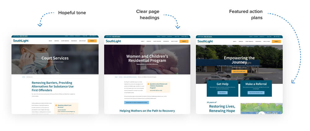
Case Study: Southlight Healthcare
Our client Southlight Healthcare is especially mindful of messaging in order to destigmatize substance use and mental illness. Throughout the site, they write in a calm, focused tone that emphasizes hope, empowerment, and easy access to care.
Interior pages offer detailed explanations of programs using the same progress-oriented voice. This intentional messaging choice can be seen in headings like “Helping Mothers on the Path to Recovery” and “Strengthening Recovery by Building Flexibility.” Southlight additionally guides users to action with expandable FAQ boxes, a guide on what to expect, and an entire resource page dedicated to action plans for those at different stages of treatment readiness.
For more about this project, check out our full length case study: Creating an Engaging Site for a Local Healthcare Provider.
Accessibility Components
We talk about web accessibility quite often, and that’s because it’s essential both for legal reasons and to enhance user experience. Accessibility is particularly important for digital health websites because they’re sharing serious information that all site visitors must be able to access. This doesn’t mean that web accessibility is optional for sites with less important information – it still matters and is required by law – but we can all agree that accessibility should be a top priority when information about healthcare is involved.
If you’re not familiar with web accessibility, it can be defined loosely as measures that allow users of all abilities to consume a website’s design, content, and technical features. Accessible design includes things like high contrast colors. Accessible content means writing descriptive headings, buttons, and links. Technical accessibility goes behind the scenes to ensure that the site can be processed by assistive technologies like screen readers and keyboard navigation.
If you’re working with a professional, reputable designer or agency, accessibility best practices should already be baked into their existing process. You can also look into the current Web Content Accessibility Guidelines (WCAG, the industry standard) if you’re interested in asking specific questions about compliance or learning more about the standards.
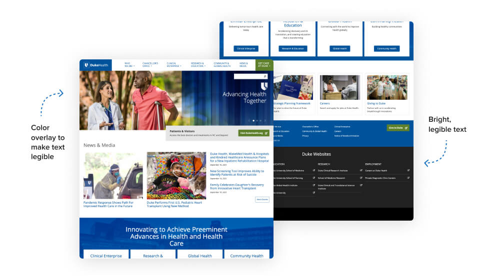
Case Study: Duke University
While all of our websites are accessible, some projects require adherence to higher, above-and-beyond type standards set by the organization. One of those clients is Duke University. For sites like Duke Health and Duke’s Preston Robert Tisch Brain Tumor Center, we worked closely with the university’s team to ensure that all elements meet Duke’s own accessibility guidelines, which are based on those provided by WCAG.
The site’s accessibility features go beyond the surface, but you can immediately see that the design is compliant because it uses elements like high contrast, legible text (whether that’s a white background with dark text or a dark background with white text) and color overlays when text appears on an image.
Easy-to-Access Resources
In order to position your website as a tool for business growth, you need to add value with resources that go beyond your office’s contact information. By including articles and blog posts about topics of interest, your site becomes a touchpoint that patients can visit again and again for reliable and current information.
Depending on your practice area, resources could be overview articles about common medical conditions, tips for helping a friend or family member, ideas for tracking healthy habits, or guidance on what to expect at your first appointment.
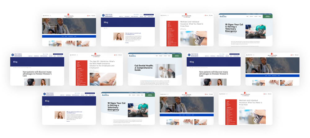
Case Study: Premier Women's Care & InsureOne Benefits
Many of our clients utilize a blog or resource library on their website to add helpful content that demonstrates their expertise. Premier Women’s Care of Southwest Florida’s blog features articles about providers, their approach to care, and thoughts on relevant issues like birth control options and vaccine safety.
InsureOne Benefits is another digital health client that uses a robust blog to add value to their website. On the blog, InsureOne covers various insurance questions and topics like retirement planning and wellness.
SEO Considerations
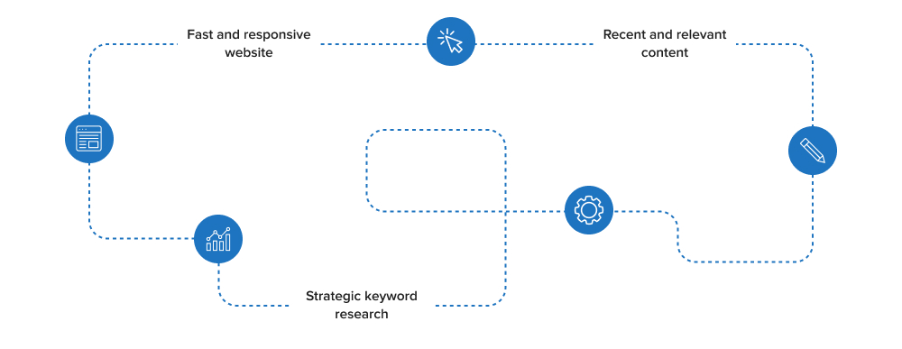
Search Engine Optimization (SEO) is the process of strategically updating site content and features to rank better on search engines like Google. Like some of our other tips, SEO is important for any website, but it’s especially helpful for digital health websites that are looking to attract new patients online.
While SEO does include technical work like making sure your website is fast and responsive, one of the less intimidating ways to tackle it is through content. Enriching your website with blog posts or resources (like those mentioned above!) can help show Google that you’re a reliable and authoritative source that should be displayed in search results.
The most efficient way to optimize your site’s content is by targeting keywords. Keywords are words or phrases that correspond to what people are typing into the search bar on their computer. An example could be “affordable mental health care” or “primary care provider carrboro nc.” Using an SEO tool like Semrush, you can track specific keywords to see how many people are searching for the term (search volume) and how hard it would be to rank well for the term (keyword difficulty). These findings – AKA keyword research! – will then direct what you write about on your site.
How will this help your practice as a whole? If you’re able to rank for unbranded keywords – keywords that don’t include your organization’s name – in addition to keywords that specifically mention your business (like “southlight healthcare appointment”), you’ll be bringing more people to your site who could potentially become patients in the future.
Case Study: Anicira Veterinary Centers
Our client Anicira is a veterinary care practice that does this well. On their site’s resources page, they showcase a wide range of articles about pet care and health. Thanks to this content, they may be able to attract someone who has never heard of Anicira, but searched for a topic that appears on Anicira’s website like “signs of a food allergy in pets.” Once on the site, the new user is likely to explore additional articles and ideally, the rest of the site.
Interactive Map
For organizations that have multiple locations, it’s incredibly helpful to utilize a feature that identifies the offices on an interactive map. Interactive maps are an excellent way to engage site visitors while displaying information visually.
Map design and functionality can vary depending on your organization’s needs and budget. Some interactive maps zoom in when a user clicks on a pin and others open a popup with a description of the location or a link to their page on the website. In terms of looks, the maps can be customized to match the site’s colors, fonts, and general aesthetic.
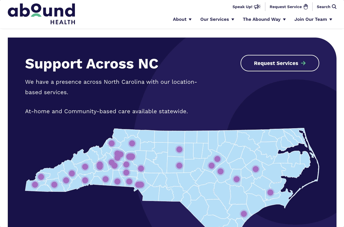
Case Study: Abound Health
One example is the interactive map used by our client Abound Health. Abound is a North Carolina-based organization that offers services to individuals with intellectual and developmental disabilities. Because they have numerous locations throughout the state, they felt that an interactive map would be an effective way to help site visitors identify local care options.
The map is part of a fully custom WordPress block that fits seamlessly with the look and feel of Abound’s website. When a user clicks on one of the location dots, a popup opens that shows the location’s address, phone number, and a button for getting in touch.
For more about this project, check out our blog post: Designing a Vibrant Visual Identity for a Statewide Healthcare Provider
Patient Portal or Online Forms
Last but not least! The best healthcare websites incorporate some amount of digital access for patients – whether that’s a link to a service like MyChart, a link to an online payment processor, or something as simple as downloadable intake forms that patients can complete at home.
Digital access is a big plus because it’s convenient and can boost efficiency if standard tasks or actions can be completed without requiring the user to contact your office. Additionally, offering options for taking action online rounds out your website by making it a comprehensive hub for patients to consult throughout their time receiving care.
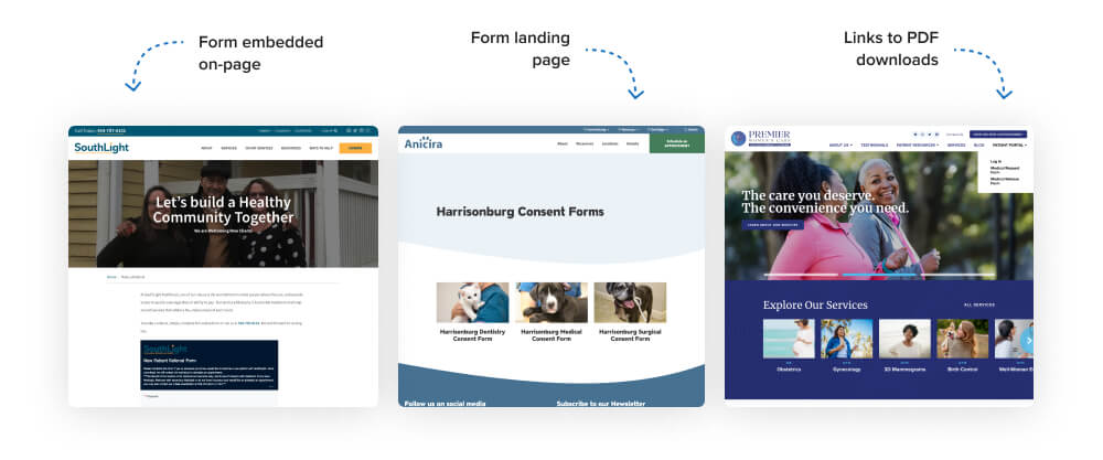
Case Study
Several of the examples that we’ve mentioned add an element of digital access with either a patient portal or online forms. Premier Women’s Care does both – patients can download forms from a link in the main menu or sign into their third-party portal account. Anicira offers digital consent forms for each of their three locations. Southlight similarly uses an embedded referral form that prospective patients can fill out in order to request services.
Conclusion
With technology becoming more and more entrenched in our daily lives, people have come to expect a level of digital sophistication from their healthcare providers. A professional website offers a solid foundation from which to attract new business, re-engage existing patients, and demonstrate your practice’s unique value and approach.
We hope that the tips and examples in this post have been helpful, whether you’re starting a new web project or working on improving what you have already. As always, don’t hesitate to reach out to us with further questions or to chat about how these best practices might apply to your online presence.


Leave the first comment