
Web Accessibility ADA Tips & Best Practices for Content Editors
Here at NMC, we work hard to design and build websites that are in accordance with basic web accessibility standards and best practices. Accessible features, design elements, and structural choices not only make it possible for individuals with disabilities to browse and explore with ease, but they also strengthen a website more generally and offer benefits to users of all ability levels.
Although we design and build each website with web accessibility best practices in mind, the work doesn’t end once a site has been launched by our team. Content managers still have a responsibility to write and update content in a way that prioritizes accessibility and makes use of the tools that we’ve already put into place.
From formatting content to optimizing images, this document will serve as a guide for content editors on accessibility best practices to keep in mind while updating and maintaining a website.
In this guide:
Web Accessibility Overview
Let’s begin with the basics. At the core, ensuring web accessibility means creating a website that allows disabled users to navigate and access content in a way that works for them. That may mean using a screen reader to hear content spoken aloud, moving through a site with a keyboard instead of a mouse or trackpad, zooming in on images and text, or using other assistive technologies to consume information efficiently.
While many of these strategies are supported by a website’s behind-the-scenes setup (i.e. put into place by a developer), there are also steps that content editors can – and should – take to confirm that site content is as accessible as possible to all users. In practice, this means paying a little extra attention to things like formatting, descriptions, and settings in the content management system (CMS). We’ll cover the specifics next.
Formatting Content
While the text editing tools in the CMS likely look fairly similar to the ones in your favorite word processing program, formatting content for your website is a little different from writing an email or a standard print document. In this section, we’ll explain the formatting rules and tools that will make your content accessible for all site visitors.
NOTE: Thanks to its flexible nature and easy scalability, many of our website projects are built on a WordPress base. So, some of the following tips and examples refer to buttons and settings in the WordPress CMS. That said, our suggestions are universal – the particular buttons may just look different depending on what platform you’re using.
Basic Text Setup
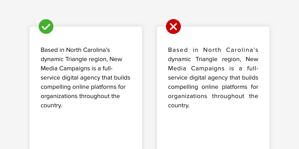
For the most part, body text should be aligned left and typed in the standard Paragraph style. The site’s designers have already made sure that the font, size, and color are legible and attractive, so you’ll want to stick to standard settings that will display the body text as it was intended.
Justifying or centering Paragraph text can be very distracting to readers – and less legible, in most cases – so you’ll want to avoid using either setting as you write content for your site pages. Featured quotes, statements, and statistics can be highlighted in other ways, which we’ll talk about later on.
Heading Structure
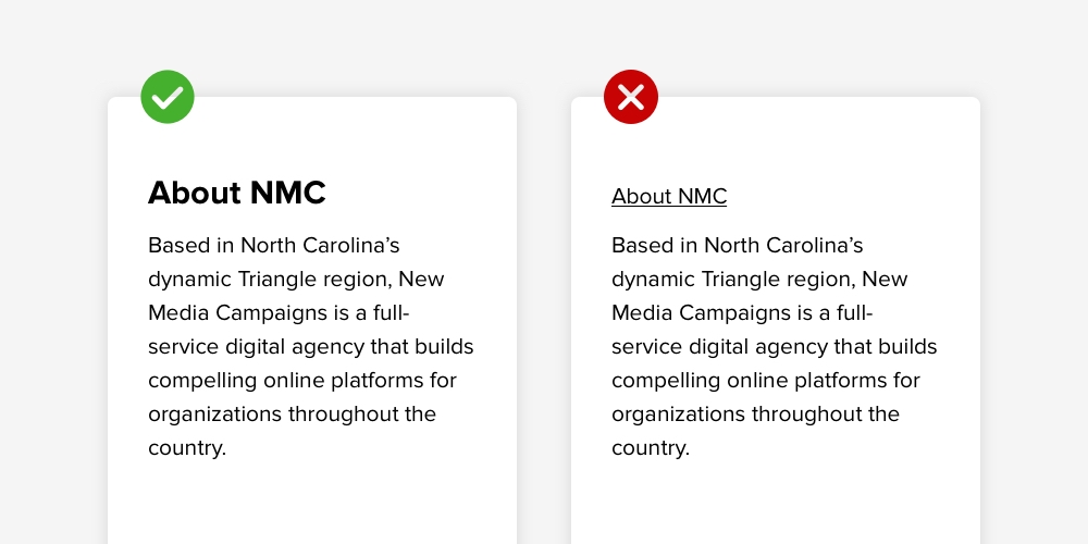
Your site is outfitted with six heading styles – H1 (largest title) through H6 (smallest subheading). These are an important part of your website’s structure, so you’ll want to use them appropriately to frame and break down your content.
Typically, H1 is used for top level page titles like Our Staff, Blog, or About Us. The headings that descend from H2 are the ones that you’ll actually be using in your posts and articles. You should always use headings in the correct order (i.e. don’t skip a size or choose one arbitrarily) and avoid titling sections with bold, underlined, or italicized Paragraph text. The headings are there for a reason!
It can be helpful to think of the heading structure as it might appear in an outline, like the example that we’ve provided below:
- H1 Main Page Title
- H2 Post Title
- H3 Section Title
- H4 Subsection Title
- H3 Section Title
- H4 Subsection Title
- H4 Subsection Title
- H5 Subsection Title
- H6 Subsection Title
- H5 Subsection Title
- H3 Section Title
- H2 Post Title
PRO TIP: In addition to forecasting what each section is about (for traditional readers along with assistive devices), proper headings make it easier for Google to crawl your content and ultimately evaluate how your site pages should rank in search results. Thus, headings are essential for both accessibility and SEO efforts.
Mindful Use of Lists
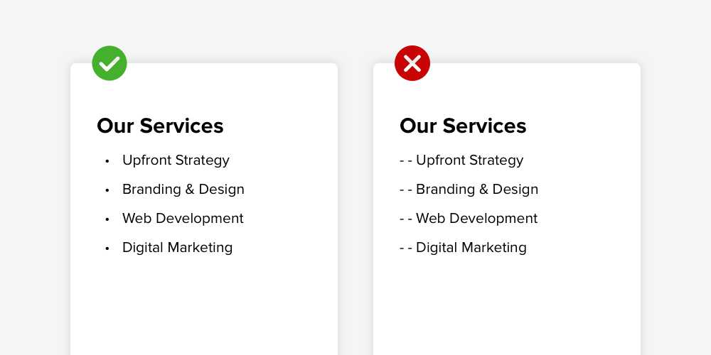
Bulleted and numbered lists are a great way to organize content. Rather than manually entering dashes or numbers on your keyboard, make sure to select the appropriate list tool in the CMS editing bar. This serves two purposes: first that your list will appear consistently across devices and second that the content will be understood as a list by any assistive technologies that your site visitors may be using.
Additionally, pay attention to the difference between a bulleted and a numbered list. Use numbers when your list only makes sense in a particular order (like steps or ranked options) and use bullets when the order of the items doesn’t matter (like product recommendations, services, etc).
Clear Identification of Quotations
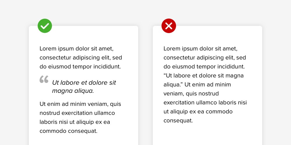
When your content features quotes, be sure to identify them with the Blockquote tool in the CMS (you’ll see it as a button with a quotation mark icon). Separating them out like this will allow assistive devices to differentiate any quotations from standard Paragraph text.
Blockquotes also visually stand out from the rest of the content, making it easy for all site visitors to skim through while capturing the phrases and statements that you’ve chosen to highlight. They may point out a quote with an exaggerated quotation mark, a bold line, larger type, or a colored outline.
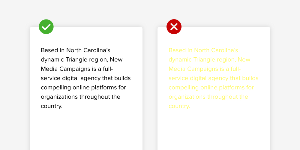
High Contrast Colors
Ideally, your site’s colors have been carefully selected to match your organization’s brand while meeting accessibility contrast standards. That said, we strongly recommend sticking with the default colors when adding new content to your site.
However, if you must change the color of the text for a particular word or phrase, select a new shade that has plenty of contrast against the site’s background color. As a general rule, avoid pastels, light colors, and white (unless the white will appear over an exceptionally dark shade like black). And if you think a color might not have enough contrast – you’re probably right. It never hurts to choose something a little darker.
The same rule applies to charts and graphics. Legibility is always more important than style, so be sure to include labels and captions that stand out from the background color. If you’re working with a designer, you can also encourage them to check contrast with a tool like Stark’s free contrast checker.
KEY TAKEAWAY: When in doubt, use the formatting settings that are baked into the CMS. The colors, fonts, heading sizes, and tools have been set up to perform well and look great, so they offer a clear path to site pages that are professional, polished, and consistent across your digital presence.
Writing Accessible Copy
Formatting is a big piece of web accessibility, but there are also nuanced elements that you should keep in mind while writing new copy. This section will go over two of our top tips for writing accessible website content.
Detailed Descriptions
Details are always a part of strong writing, and they’re especially important for site visitors who may be consuming the information through assistive devices. There are two main things to think about here: acronyms and references.
The first time you use an acronym or abbreviation, make sure to offer the meaning alongside the shorthand. This is a good thing to do in general because it clarifies the expression for all readers. And for disabled readers – who might not be able to easily reread, search, or otherwise infer the meaning – a clear description guarantees understanding and eliminates confusion.
As for references, we mean that you should refer to documents, site pages, and buttons by name instead of using a description that relies on their size, color, or placement on the page. This is especially important when you’re directing site visitors to a next step like signing up or submitting a payment.
Here are a couple of examples:
- Instead of saying something like “You can sign up for a volunteer shift using the blue button,” you would want to replace the color-dependant description (blue button) and say “You can sign up for a volunteer shift using the Volunteer Registration button below”
- Something placement-specific like “For more information, see the sidebar on the left” could be replaced by “For more information, see the sidebar on the left (Volunteer Session Details)”
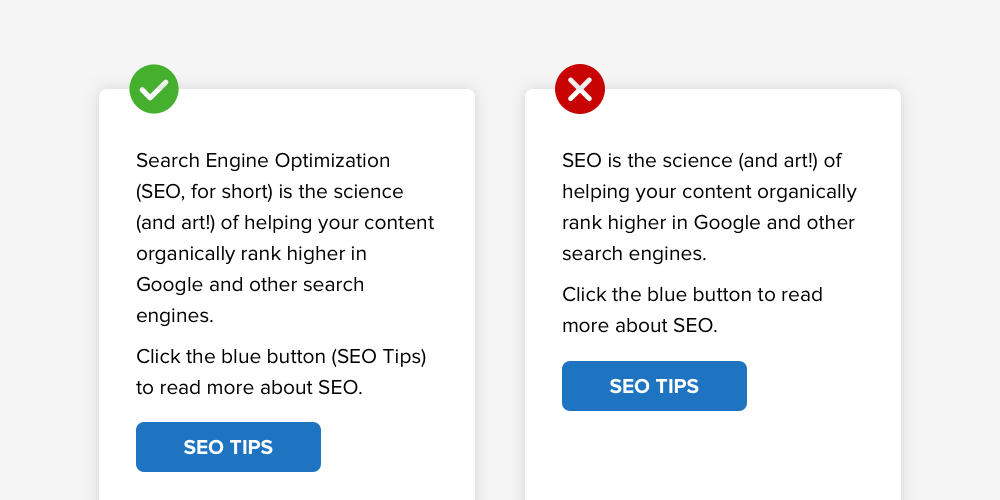
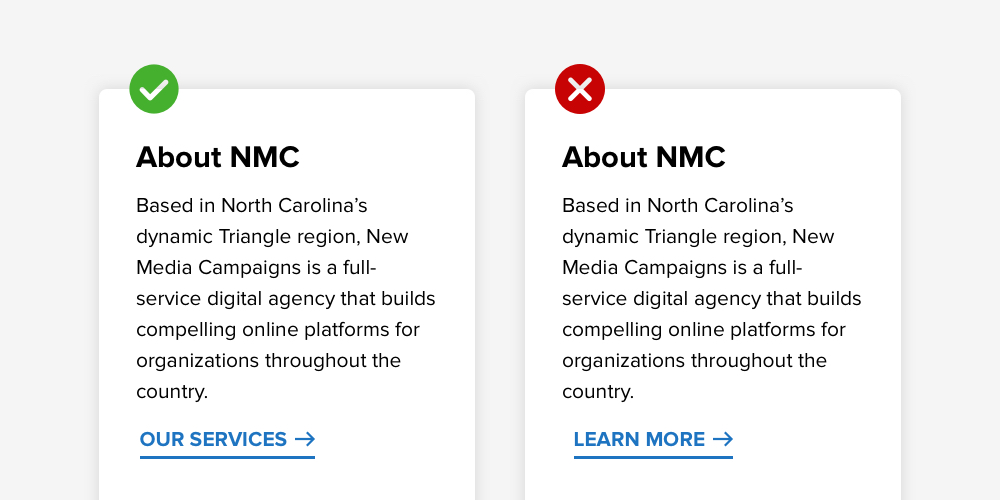
Accessible Buttons and Links
Buttons and links appear throughout your site to connect content and point users towards additional resources and information. When writing them into your content, it’s best to describe exactly where they'll go rather than using vague or general terms (Learn More, Read More, Click Here, etc).
The best links and buttons are clear and informative. Examples include phrases like Volunteer Registration, More About Our Programs, and Request a Demo.
When linking to a file download, you’ll want to specify the document’s name and file type. Doing so will let visitors know what to expect when they click on the button or link. You can also include additional forecasting information if the file is unusually large or will open in a new window. A sample file download link might look like this: 2020 Impact Infographic (PDF download).
Optimizing Media
Images, videos, and animations are an excellent way to engage site visitors and draw attention to important content. When you use them, however, there are a few additional steps to take to make sure that they’re accessible for disabled site visitors.
Images
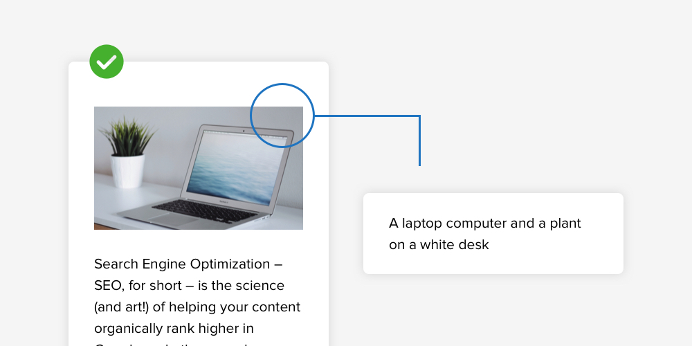
Images can be made accessible by adding alternative text (commonly known as alt text) in the CMS. Alt text is a short description that’s attached to an image or visual asset. It can be read aloud by screen readers, and it also pops up if an image fails to load correctly.
In the CMS, you can add alt text by hovering over the image, clicking on the pencil icon (top right corner), and adding a brief description to the Alt Text field in the popup. Alt text descriptions should be concise and purely informative – no need for complicated language or fluff content. Remember, alt text is meant to help non-sighted users understand the visuals on their screen.
Alt text examples might read like the following:
- A smiling volunteer holds a bag of groceries
- A chef stands next to the stove in a kitchen
- Young children smile and laugh while playing with a ball
Videos
When using video content, it’s important to consider site visitors who may have hearing or sight challenges. Videos should always be accompanied by a play/pause button, an option for closed captioning, and if possible, a transcription of spoken content.
If your site’s CMS accepts video content directly from YouTube, these settings are luckily in place already. There’s no need to do anything else to make the videos accessible. Users can play and pause easily, turn on closed captioning, and adjust the playback speed as needed. Transcriptions aren’t usually provided, but you can always add one below the video if the content is available to you.
If the content is embedded on the site in another way, you may need to work with the video’s editor or creator to add captions that appear as part of the video. Considering that many people turn on captions out of preference or to avoid using sound while watching in public, it’s not necessarily a bad thing to have captions that are always present.
Conclusion
Considering that 61 million adults in the US live with some kind of disability, an inclusive web presence is an essential for any organization that hopes to appeal to a diverse audience. By doing your part as a content editor, you’ll be well on your way to creating an inviting digital space that is accessible for everyone, regardless of ability level.
For those who are interested in learning more about accessibility best practices, we’ve put together a reading list below:
- AcceDe Web Accessibility Guidelines
- WC3 Web Accessibility Initiative – Resources for Content Writers
- Writing with Web Accessibility in Mind – Stanford Online Accessibility Program


Leave the first comment