
Designing a Vibrant Visual Identity for a Statewide Healthcare Provider
A Case Study on Abound Health
For those supporting individuals with disabilities, it’s common knowledge that high quality care can be hard to find. That’s why Janet and Rusty Presson founded their own solution, then known as “A Small Miracle,” over 20 years ago.
Now operating as Abound Health, the organization has grown into one of the largest statewide providers in its niche, with numerous locations and a comprehensive list of programs and services for people with intellectual and/or developmental disabilities. Abound’s approach is driven by person-centered care and the goal of empowering individuals to live positive and meaningful lives.
With a distinctive new look in mind, Abound connected with us to lead the creation of a logo and visual identity and a corresponding B2C website design. Read on for an inside look at the process and a breakdown of what makes the finished product effective and unique.
Reimagining a Healthcare Brand
In the two decades since Abound’s founding, the healthcare space has experienced significant changes both in care philosophy and utilization of technology. Considering this new landscape, leadership led an internal process that resulted in what would become the start of the organization’s next chapter – the name change from A Small Miracle to Abound Health.
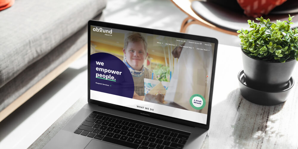
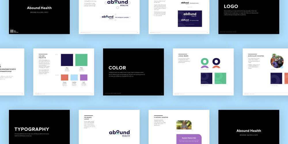
With the name set, we entered the picture to build a brand that would embody Abound’s friendly, approachable, and modern ethos. We accomplished this with an identity that centers on a mix of contemporary sans serif typefaces, vibrant photography, clean lines, and a bold color palette that avoids stereotypical healthcare shades of blue and teal.
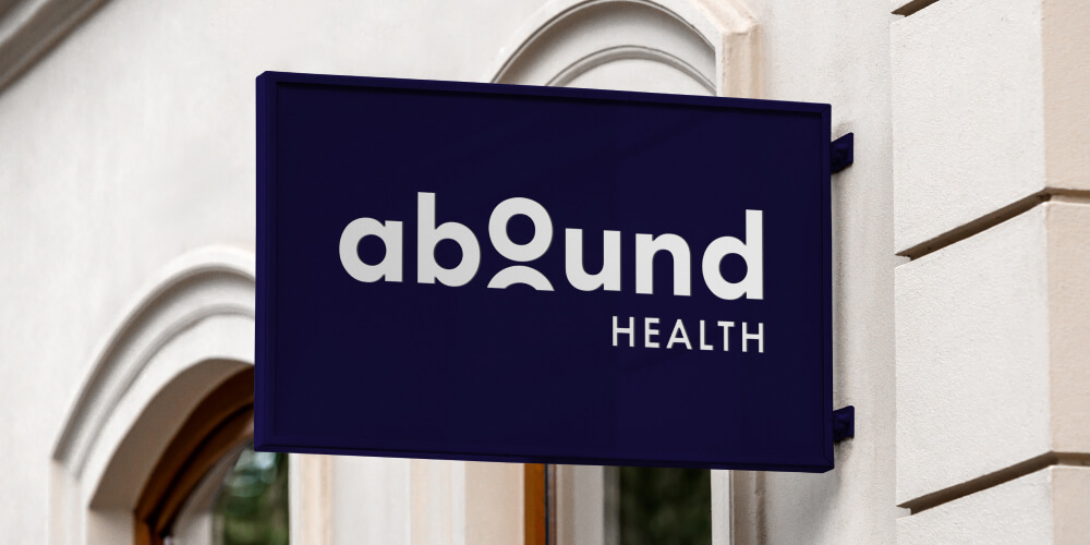
The new identity is anchored by a strong text-based logo. The logo is intentionally different from what one might expect from a healthcare provider – it doesn’t include medical iconography and decidedly rejects the traditional look of a serif typeface. Instead, lowercase letters and an integrated person icon make the logo feel playful, welcoming, and current.
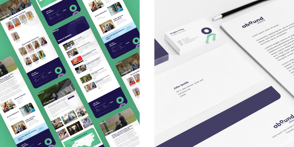
Once the logo and color palette were final, we expanded the identity into core print assets and signage. This culminated in a comprehensive brand guide that will serve as a reference point for Abound to consult as they spin the new look into additional marketing materials, social media assets, patient touchpoints, and more.
![]()
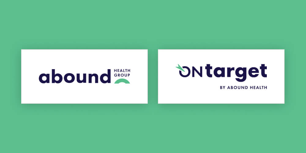
Supplementary Logos for Two Sub-Brands
Organizationally, Abound is made up of three distinct pieces – Abound Health Group, Abound Health, and OnTarget by Abound Health. As we’ve established already, Abound Health is the provider agency of the three. OnTarget is Abound’s EHR (electronic health record) software product, and Abound Health Group encompasses all of the above.
In order to bring the additional brands into the new identity, we led separate design and discovery processes for each one.
Abound Health Group
For Abound Health Group, we adapted the primary Abound Health logo to incorporate the full name and a slightly different look. The final lockup utilizes the curved shape to emphasize the “Health Group” portion of the name and differentiate it from the main Abound Health logo.
OnTarget by Abound Health
The process for OnTarget was a bit more involved. We worked with their team to identify an appropriate mark that would be cohesive with both Abound logos while representing their own goals, values, and product offerings. We settled on an abstract target visual that adds a techy twist with an allusion to the universal power symbol.
The colors and typefaces match those used for Abound Health and Abound Health Group, allowing all three logos to be used together across the brand.
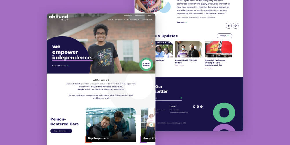
Creating a Dynamic Healthcare Website
With the new brand in-hand, we kicked off the website portion of the project by guiding the Abound team through our standard creative brief. The creative brief is a comprehensive worksheet that helps to identify target audiences, navigation and sitemap preferences, must-have features, and any design inspiration that should inform the site’s look and feel. We transformed all of this information into a series of wireframes that served as the foundation for the site’s ultimate design.
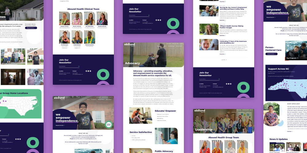
As a whole, the site emphasizes energetic colors, high impact visuals, and fun shapes that bring in the lively feel that came through during the branding process. We also incorporated dozens of custom hover effects, button interactions, and slider blocks that enhance user experience throughout the site.
Key features include:
- Sticky Nav – The site’s navigation strategy is driven by a “sticky” main menu that stays at the top of the page as users scroll through the content. The nav includes four core topics and a smaller utility bar with options for taking action or searching the site. A sticky nav is a great choice because it ensures that users can quickly switch pages or topics without having to return to the top of the page.
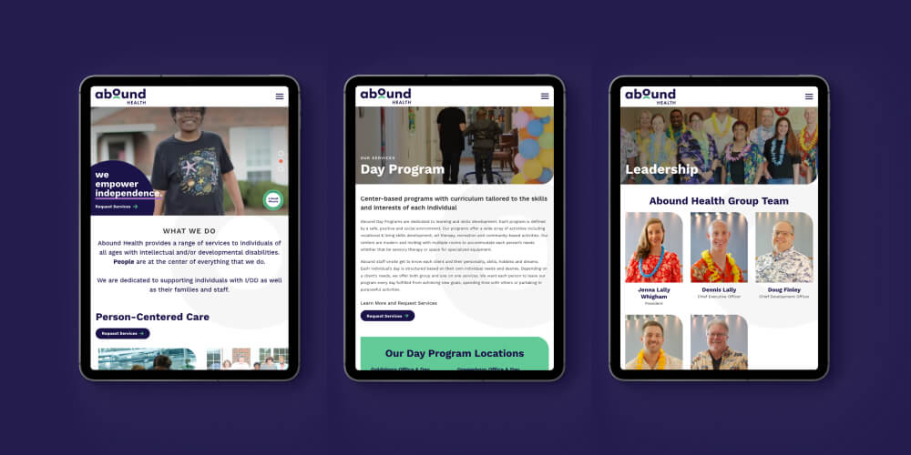
- Scalable Layouts – A flexible WordPress base allows admins to create new layouts using the custom blocks that appear throughout the site. This includes obvious things like text and image elements along with more detailed pieces like forms, people listings, testimonial sliders, calls-to-action, and more.
- Interactive Map – An interactive map on the site’s homepage visually highlights Abound’s reach and makes it easy for users to find services in their community. The map also serves to engage users and immediately drive them towards contacting a local care provider. More about interactive maps for digital health websites.
- Embedded Videos – The site is equipped with an embedded video block that streamlines the process for adding content from Youtube or Vimeo. An additional bonus is that the video is styled in a half-media, half-text block that matches the rest of the site’s design.
- Custom Forms – In order to efficiently collect information, the site incorporates a number of custom forms for purposes like requesting services, sharing feedback, and signing up for the email newsletter. The forms are all managed through Formidable – our go-to WordPress plugin – which allows admins to create an unlimited amount of forms that can be placed on any page throughout the site. The forms are custom-styled to maintain the site’s polish and distinctive branding.
- Calendar Integration – One of the site’s unique features is a calendar page that pulls in events from Outlook via the Events Calendar Pro plugin. This approach to the calendar integration allowed us to set up filtering functionality in the CMS that makes all events sortable by venue and training type. Like the features we’ve mentioned already, the calendar itself is styled to match the site.
- Accessibility – As with any project, we designed and developed the site with accessibility in mind. Design-wise, that meant choosing color combinations that meet WCAG’s 4.5:1 contrast ratio and adding dark overlays to images with text. Behind the scenes, the site prioritizes accessibility by supporting keyboard navigation and adjusting gracefully to zoom (among other things!).
Building a Strong Foundation for Growth
With the launch of the new brand and website, Abound has successfully refreshed their identity across all three arms of the business. The new look now reflects the progress-oriented mindset that defines the organization and visually distinguishes Abound from its closest competitors.
The Abound team is thrilled with the result, and so are we. We loved being part of the branding process, and look forward to offering ongoing support as Abound continues to grow and scale the new identity.


Leave the first comment