
Design Inspiration: Examples of Non-Traditional Masthead Designs
After creating wireframes, our design process always begins with a site’s homepage. Why? The homepage is an essential touchpoint for users that defines first impressions and sets the tone for an organization’s entire online presence.
Once a user lands on the homepage, the first thing that they see is the masthead – also known as the banner or hero. Website mastheads often feature a large image, but as we mentioned in our annual design trends post, the standard full-width image masthead is being pushed aside in favor of layouts that are more creative and visually engaging.
While this shift has certainly been influenced by design trends, it also comes into play for organizations that don’t have access to professional photos or brand assets. A non-traditional masthead can be a great alternative and a unique space to showcase typography, textures, illustrations, or even bold color blocking. Read on for examples and design inspiration!
Examples of Non-Traditional Masthead Designs
Large masthead images are popular because they generally feel very full and immersive. So it’s understandable that many people balk at the idea of a masthead without some kind of image treatment. When you look around online however, you’ll see that a non-image masthead can be very effective when done well.
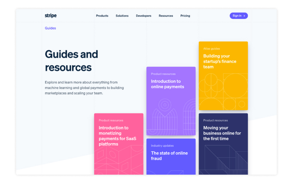
Stripe Guides
Like most people, we love the clean and modern look of the Stripe website. In particular, their Guides landing page is a great example of a layout that uses an alternative masthead design. Instead of a photo, the masthead shows several featured resource tiles with eye-catching colors and distinctive patterns.
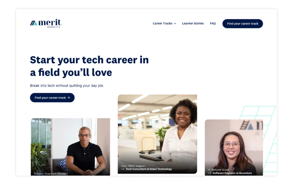
Merit America
Like the Stripe Guides page, Merit America’s homepage uses smaller tiles instead of a single masthead image. This approach is effective because the small images add visual interest and introduce geometric elements that are carried throughout the homepage.
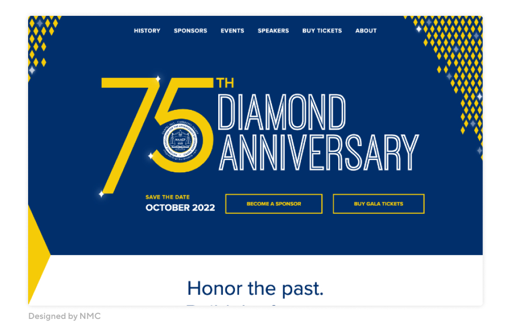
NAACP Diamond Anniversary Gala
The NAACP Diamond Anniversary Gala website features custom typography as the main masthead element. Combined with the subtle diamond animation, the masthead feels full and complete without a single photo.
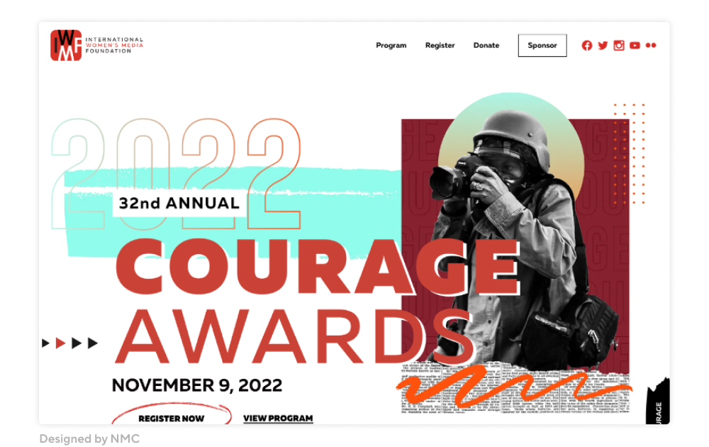
IWMF Courage Awards
For a more maximalist approach, the Courage in Journalism Awards homepage centers on a collage-style combination of typography, graphic elements, and a single cutout image. We think this approach is particularly well-suited to event microsites, where important information like the date and ticket link can be placed in a can’t-miss location.
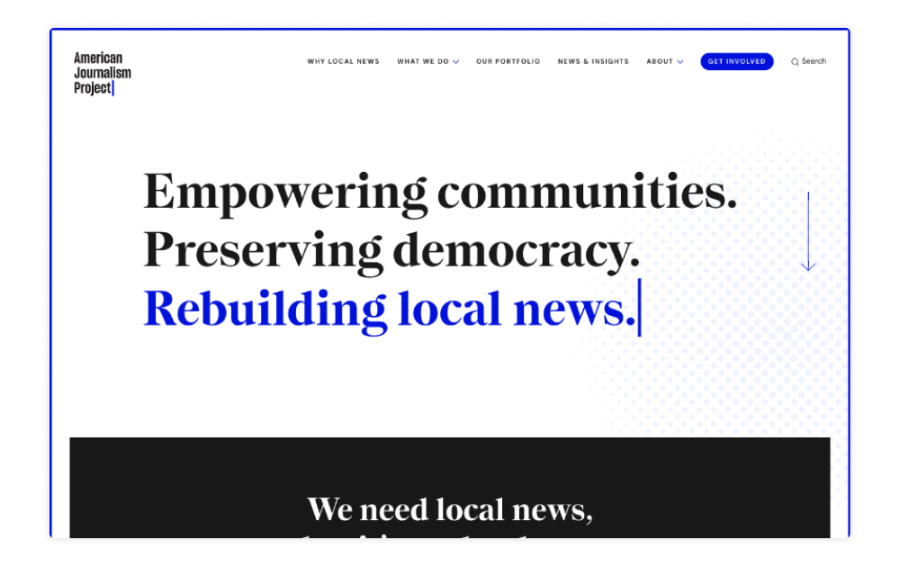
American Journalism Project
We love how the American Journalism Project website closely reflects the subject matter with details like the type animation on the homepage. This is a great example of how a simple approach can be memorable and engaging, even without images or extra features.
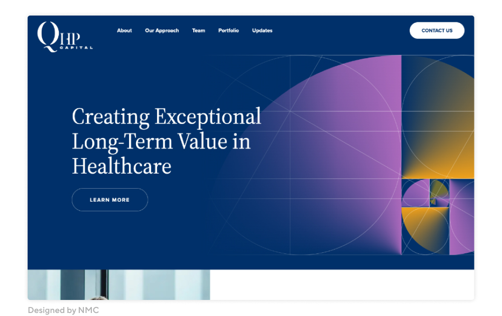
QHP Capital
QHP Capital’s homepage is defined by the golden ratio illustration in the masthead. This polished treatment keeps the site looking professional while introducing the linear and gradient elements that are central to the firm’s brand.
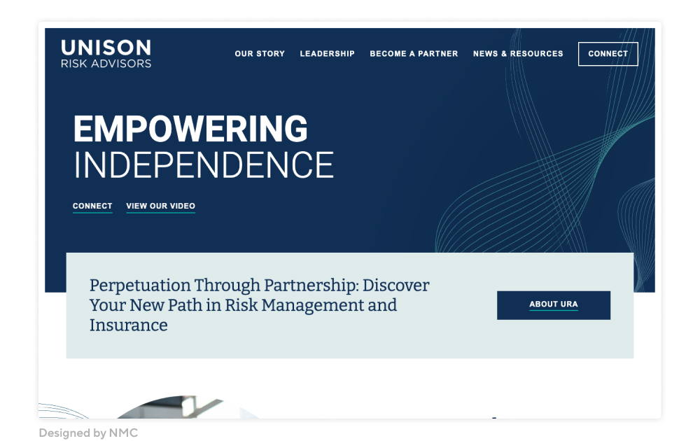
Unison Risk Advisors
The Unison Risk Advisors site also uses a pattern in the masthead for a refined and minimal look. While simple, the curved lines add depth to the design and incorporate some color into the masthead.
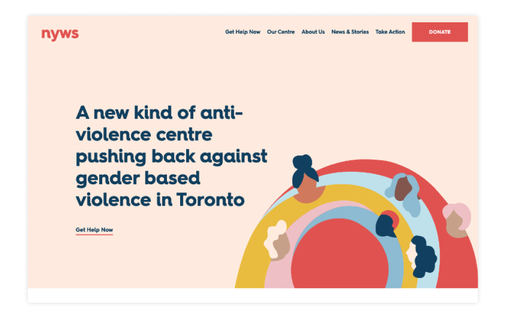
North York Women’s Shelter
The North York Women’s Shelter uses an illustration and a large heading to create a crisp and clean homepage masthead. This is a great approach for organizations that focus on sensitive issues where it might not be appropriate to feature pictures of real clients or projects.
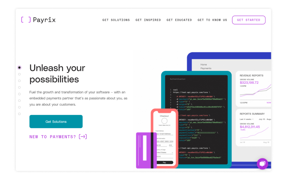
Payrix
Software and tech companies are often quite limited when it comes to photography and assets. Screenshots aren’t always visually interesting and must be altered to remove or change client data. To bypass this hurdle, the Payrix website uses a series of animated illustrations that show their product in the brand’s signature playful style.
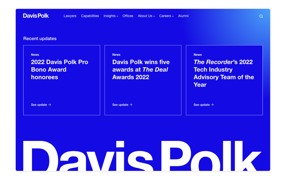
Davis Polk
We love how the Davis Polk site uses color as the main visual element. The homepage doesn’t have a traditional masthead section, but instead flows right into recent news and stories. This bold approach does a great job at setting the firm apart from other law websites.
Conclusion
When you look beyond the traditional image masthead, you’ll see that the space can be an exciting opportunity to incorporate a creative twist that makes your homepage stand out. We encourage you to chat with your designer about a unique approach for your next web project!


Leave the first comment