
Web Design Trends to Watch in 2022
Oh, 2021. Expectations were high, but we found ourselves doing a lot of things that felt eerily familiar – working from home, binge-watching the latest Netflix release, ordering yet another sweatsuit online (...but maybe that’s just me). Some might even call it Deja Vu.
One common factor among all of these pandemic habits – and yes, that includes a daily Wordle break – is the web. We go online to shop, work, entertain ourselves, socialize, and even visit the doctor. Companies have responded to this extraordinary amount of digital attention by taking a closer look at how they present themselves, their products, and their services online.
As a result, we’ve seen website designs that skew more creative and non-traditional than ever before. This means the prevalence of elements like custom illustrations, standout typography, and layouts that put a unique spin on the standard grid. Read on for our thoughts on these trends and others to watch in the new year.
In this post:
- Fun with Typography!
- Custom Illustrations
- Non-Traditional Mastheads
- Scroll Hijacking
- Fluid Layouts
- Visible Borders
- Unique Gradients
- Prioritizing Performance
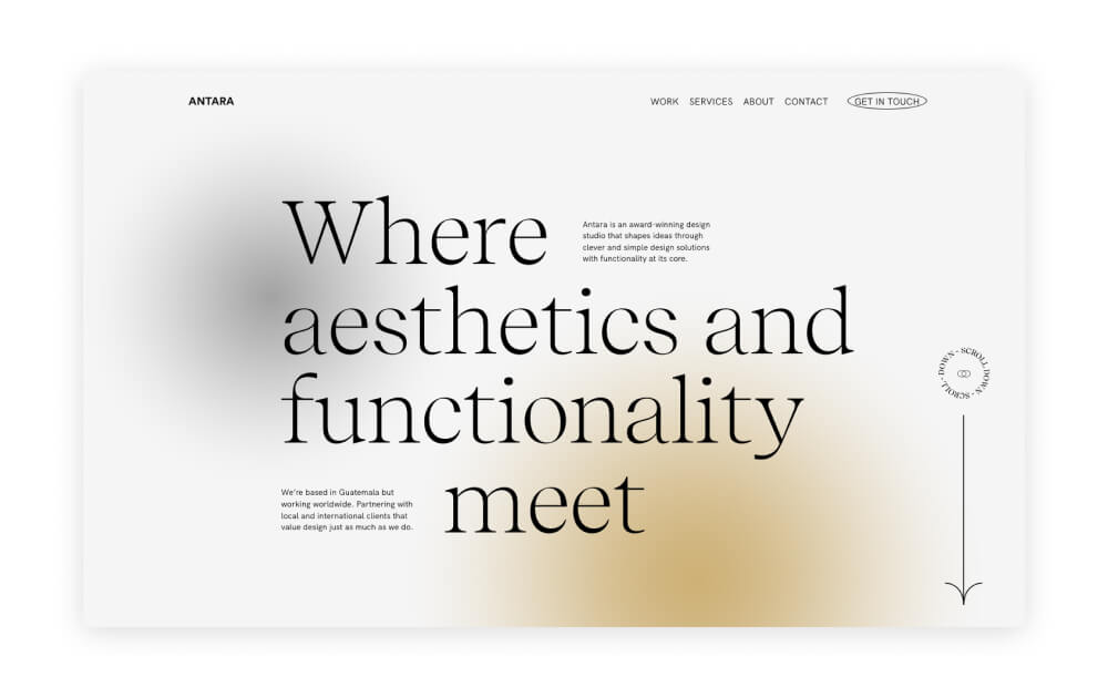
Fun with Typography
Typography has always been an important part of web design; a font can say a lot about an organization’s personality, brand, and overall ethos. In 2022, we’re expecting to see a few trends take hold in this category.
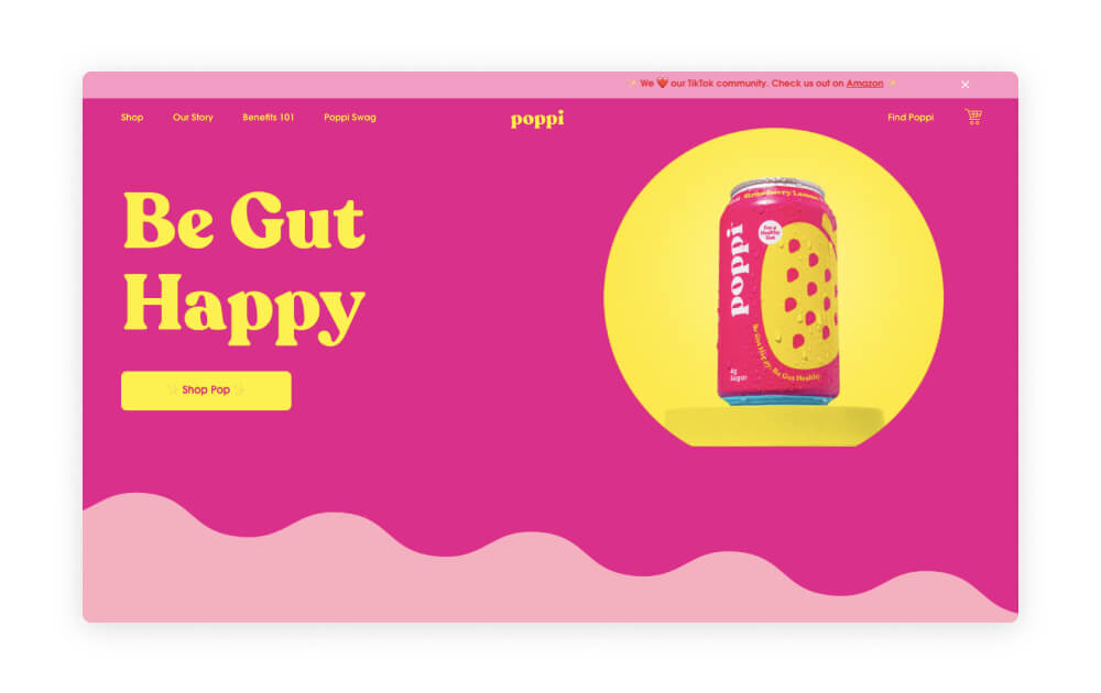
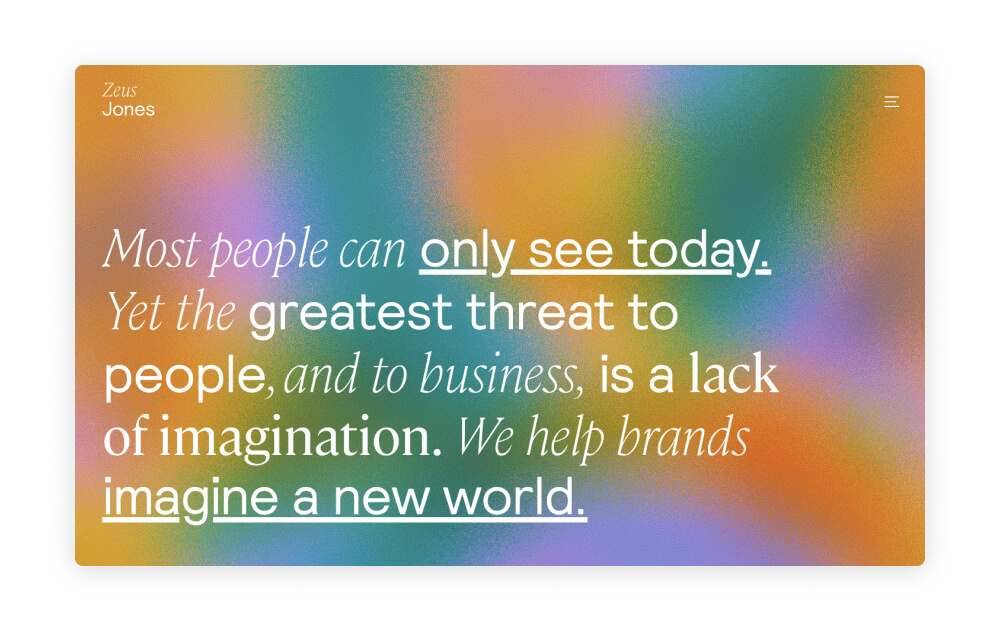
First, oversized text. Masthead styles are changing quickly – more on that below – and some sites have come to favor text as the statement piece instead of an image or video. With so many unique fonts available (looking at you, Chobani!) it’s easy to make this approach visually engaging and fun. Some sites even take text a step further with animations or interactive hover effects.
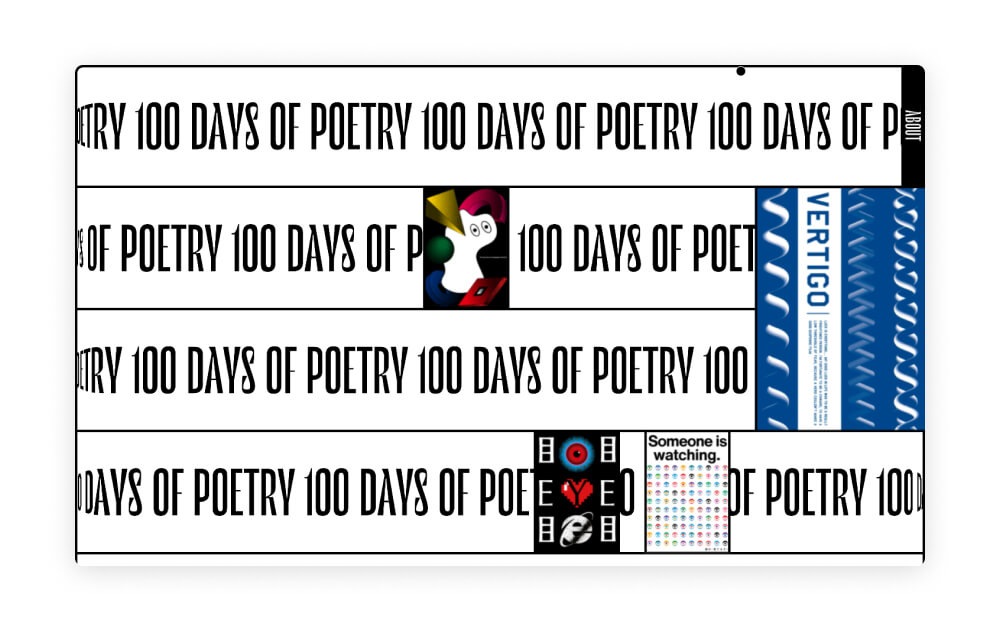
Using text as a pattern or texture is another trend that we’re expecting to see more of in the new year. This use of text is more decorative than functional, but adds a distinctive flair particularly if the site’s topic has to do with reading or language.
Finally – and this should come as no surprise – we’re seeing a major resurgence of nostalgic serif fonts. Serifs were previously cast aside as boring, uninspired, and overly formal. But these days, they’re back as a nod to the popular vintage aesthetic. Serifs are even moving beyond website use into logos, packaging design, and more.
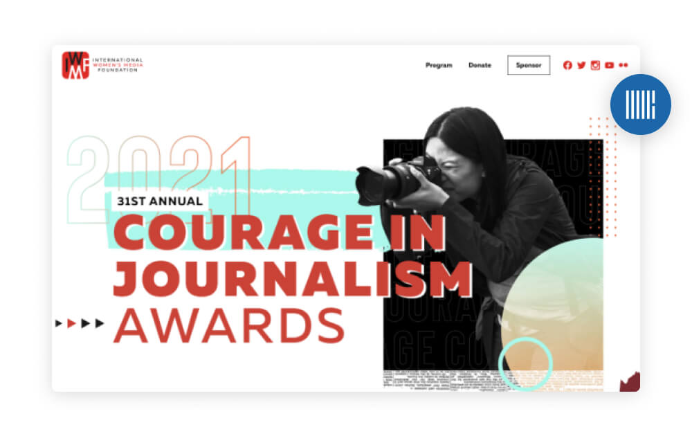
Custom Illustrations
With brands becoming more apt to express a distinctive personality, we’re also seeing an increase in the use of illustrations. These can either be fully custom or modified versions of stock graphics.
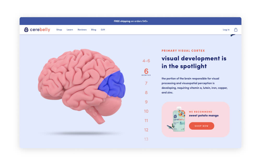
One big trend in illustration is a three dimensional look. Graphics that are 3d quickly grab users’ attention because they stand out from text and flat images. And depending on the designer’s style, they can also make a site feel more futuristic or interactive (if the graphic is animated or dynamic).
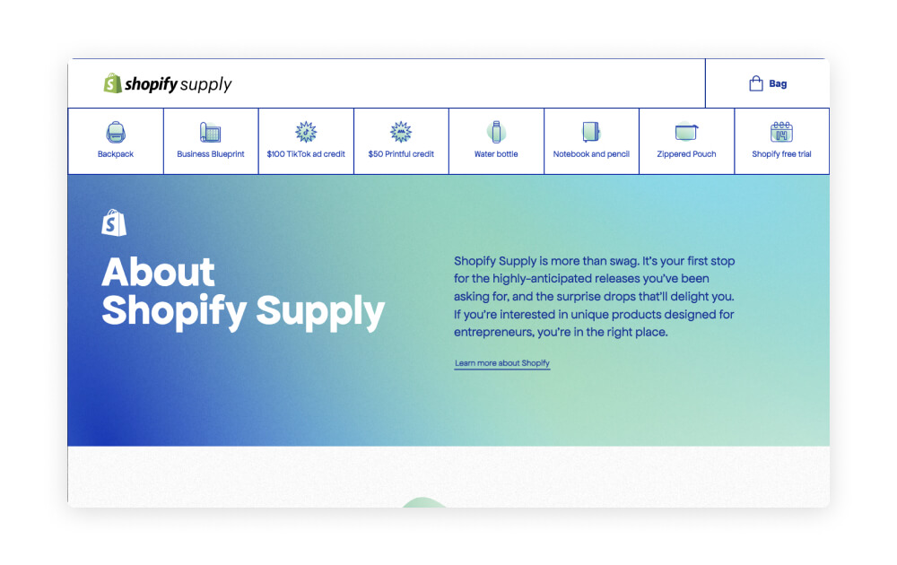
Illustrations are also popular on a smaller scale as icons. Icons have long been used to supplement online content, and we continue to see them growing in popularity across all of our verticals. Law firms use icons to represent practice areas, nonprofits use them to highlight programs or projects, B2B companies leverage them to draw attention to services, and so on.
Icons can either be designed from scratch or downloaded from a library like The Noun Project and customized based on the site’s content.
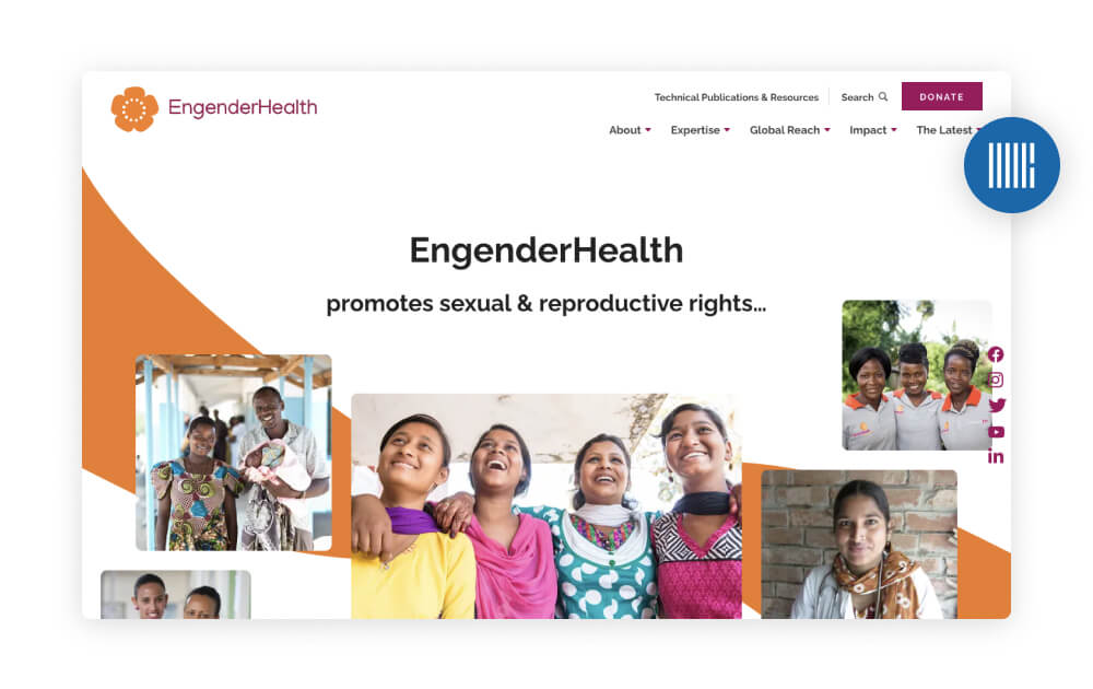
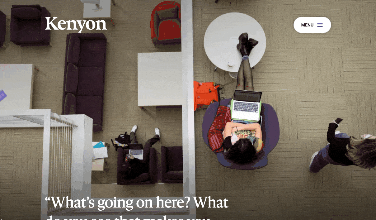
Non-Traditional Mastheads
Everything that we’ve mentioned so far comes into play with mastheads. Overall, there has been a significant departure from the traditional full-width image in favor of a greater focus on open space, typography, or illustrations. And we’re here for it! This approach to the masthead area offers design flexibility and lends itself to the fluid layouts that are a big part of the “clean and modern” website aesthetic.
Looking ahead, you can expect to see text-only mastheads, split designs with text and a visual, and fewer solid color background blocks.
Scroll Hijacking
As websites become more immersive both in design and functionality, we’re noticing more features that guide users towards a desired flow or experience. Enter: scroll hijacking.
Sometimes called “scrollytelling,” scroll hijacking has been used for interactive news stories by the New York Times, the Miami Herald, and others. It has gradually transitioned over to other types of websites, which is an exciting development for those who love interactive designs.
Scroll hijacking can be used for an entire page (like the news story examples), or for a single section with multiple items or topics. It’s not a perfect fit for every website, but we certainly expect to see more of it in 2022.
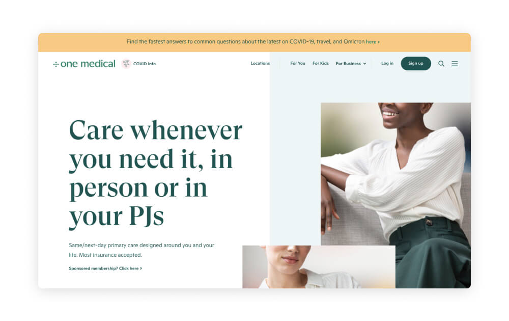
Fluid Layouts
As we’ve mentioned in the past, layouts are noticeably breaking the grid more and more each year. Site designs are taking a freeform approach with subtle gradient or single-color backgrounds, minimal section dividers, and fewer color changes from block to block.
This style is popular because it works well in a wide variety of contexts – it’s just as effective for a law firm as it is for a school or an eCommerce site. The look also offers a lot of flexibility in terms of layout – that is, it can accomodate multi-column elements, images, videos, lists, etc. equally well – which makes it easy to tailor to almost any client's needs or must-haves. And because sections typically flow together without harsh divisions, users' eyes are drawn down the page effortlessly.
Visible Borders
While some sites are emphasizing flow, others are embracing the grid quite literally with visible borders around sections and menus. This look incorporates a retro and vintage sensibility while staying up-to-date with what users are expecting to see on a modern website.
Thin gridlines are the most popular by far – they’re least obtrusive to the eye – but thicker lines can make a bigger statement if that’s on-brand for a company or product. Thicker lines tend to read as more of a hard throwback, whereas delicate lines acknowledge the trend without having it define the entire design.
Unique Gradients
Gradients aren’t a new trend by any means, but we’re seeing them used more creatively in terms of color, style, and placement.
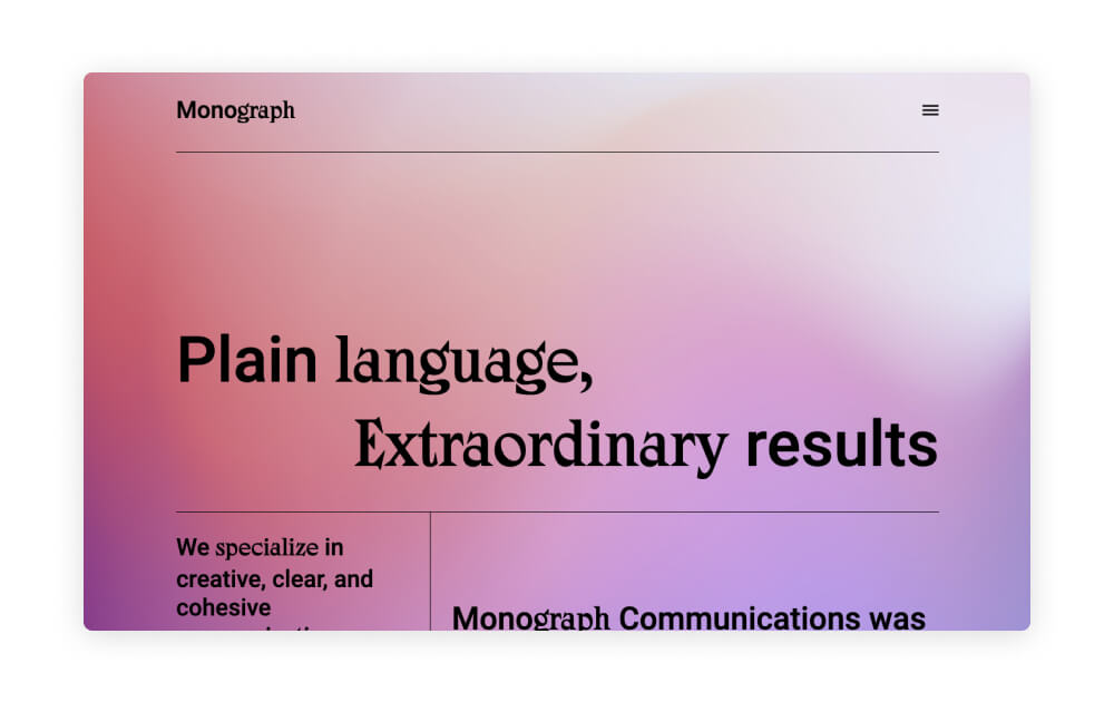
One gradient trend is the use of distortion effects like grain and blur. These two effects are almost opposites – a grainy gradient shows texture and grit while a blurred out gradient is smooth and almost imperceptible. Each approach brings a different look to the table whether the gradient is used as a background, accent, or in an individual graphic.
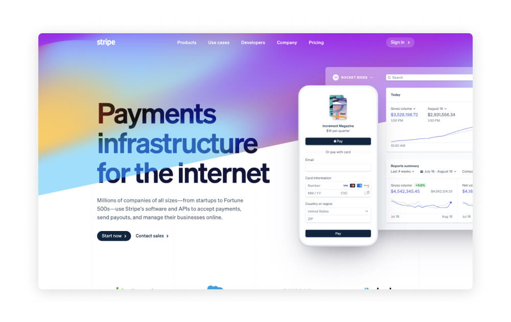
Mesh gradients – where multiple colors flow in different directions – are another trend to watch in this category. These can be animated to include a gentle wave, but imply motion even as a static element. They’re a great way to add depth and color to an otherwise minimal design.
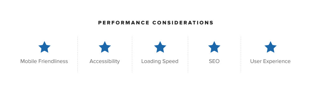
Prioritizing Performance
Last but certainly not least, performance. I know, I know, performance doesn’t count as a design trend. BUT it’s just as important, and it’s becoming more of a focus now that organizations are putting a lot of energy into maximizing their online presence.
Even as early as the creative brief stage, many of our clients are already thinking about how their new site will perform once it’s live. They’re asking about SEO and speed tests and whether the site will work well on mobile (the answer is yes!). Much of this is addressed as a site is being built, but it’s something that our whole team considers during every phase of a project.
In terms of performance as a trend, we really mean that clients will be expecting more from vendors when it comes to new projects. That means incorporating best practices for user-experience, accessibility, and SEO and assessing technical efficiency with tools like Google Page Speed Insights and Core Web Vitals.
Cheers to the New Year!
As designers and creatives, we love to see how our industry evolves each year when new ideas surface and gain traction. We’re looking forward to monitoring the trends in this post and keeping an eye out for other innovative ways to keep our designs fresh.

Comments
Orismar H.
For businesses aiming to establish a strong digital presence, Website design company Dallas are known for their ability to craft websites that not only look great but also perform exceptionally well.Leave a comment