What a year it’s been! Collectively we’ve taken up baking, packed up our workwear, and followed the plight of the Tiger King. More importantly, we’ve learned a lot, grown a lot, and adapted as the world has changed around us. And the web has been a major part of that.
According to preliminary statistics, the COVID-19 pandemic has caused total internet hits to increase up to 70%. And that makes sense – more people are going online for everything from shopping to work meetings to school. The increased emphasis on the web has, in turn, placed a greater focus on the look and feel of each digital experience.
Below are a handful of trends that we’ve seen gaining traction across the web and in our own web design projects. The bottom line: we think that 2021 will bring creative uses of color, plenty of animation and video, and flexible space that breaks the typical grid.
In This Post:
- Reinventing the Hero (Yes, again!)
- Mixing Ambient Video and Content
- Conserving Space with Tabs, Accordions & Sliders
- Highlighting Unique Animation
- Embracing Dark Backgrounds
- Utilizing Pastel Backgrounds
- Returning to Minimalism
1. Reinventing the Hero (Yes, again!)
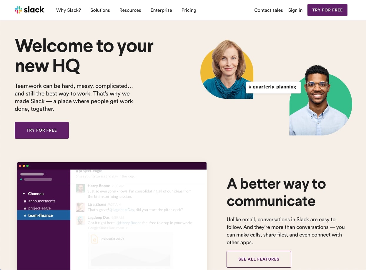
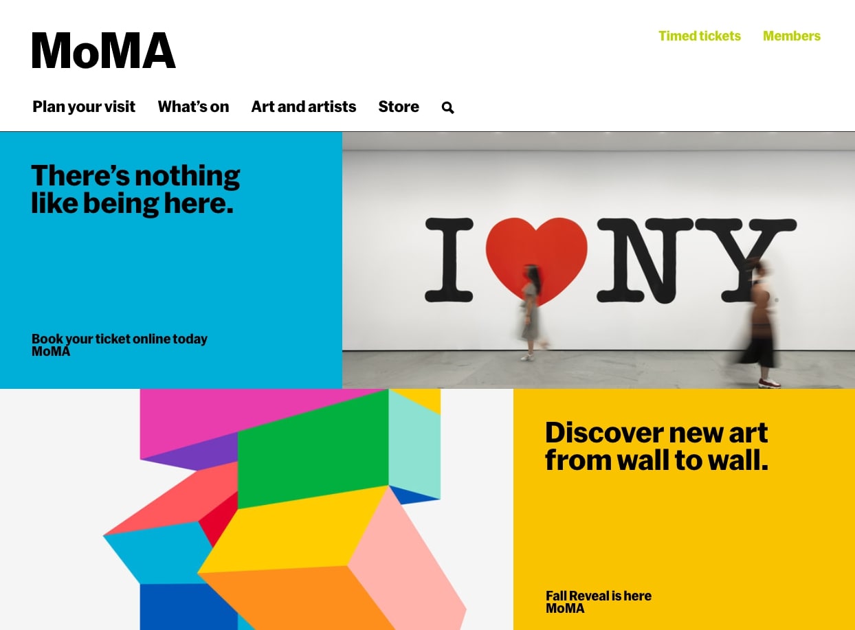
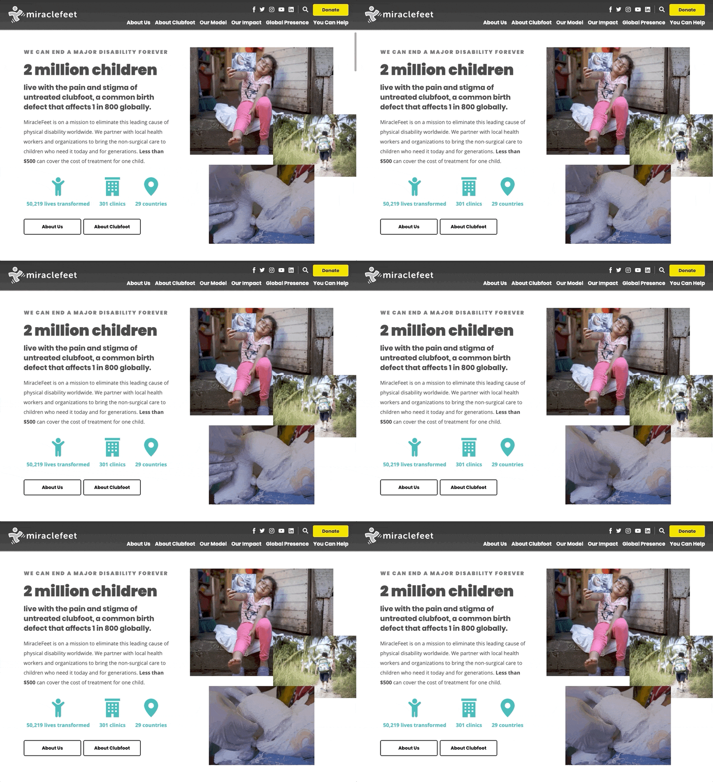
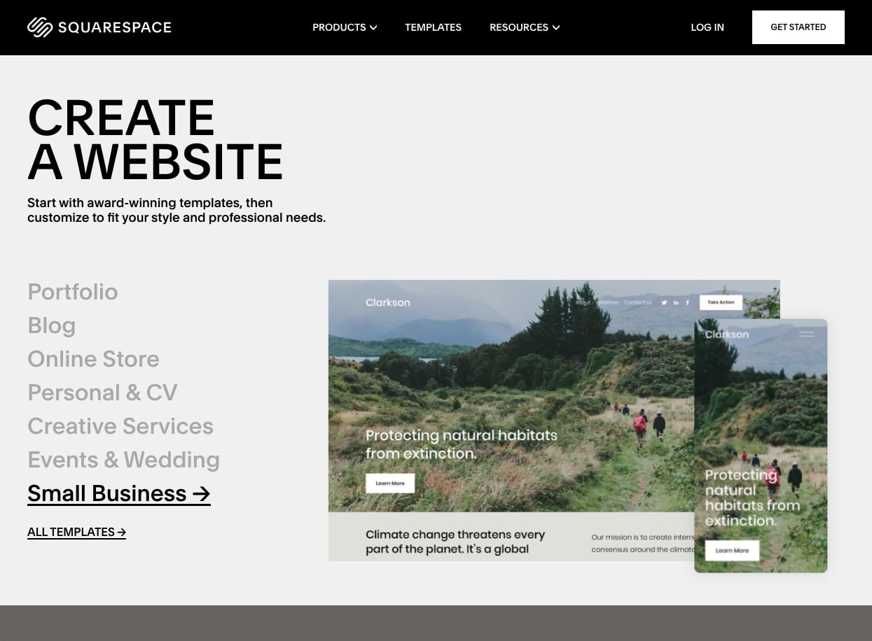
In our post on 2020 Web Design Trends, we kicked things off with a prediction that webpage heroes (the large space at the top of the page) would begin to incorporate things like half-width images, bold graphics, and fun illustrations. Well, our guess was spot on, and we think that 2021 will bring even more experimentation in the hero space.
In addition to what we saw last year, we’re expecting heroes to include more image collages, abstract shapes, and split layouts that include both images and text.
2. Mixing Ambient Video and Content
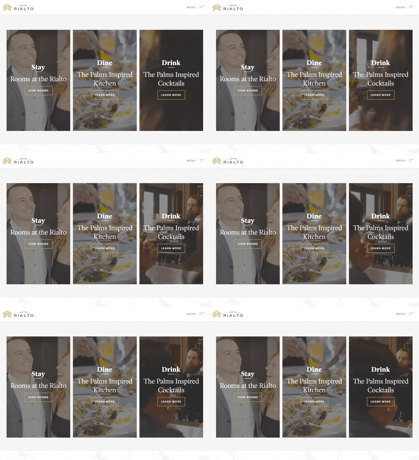
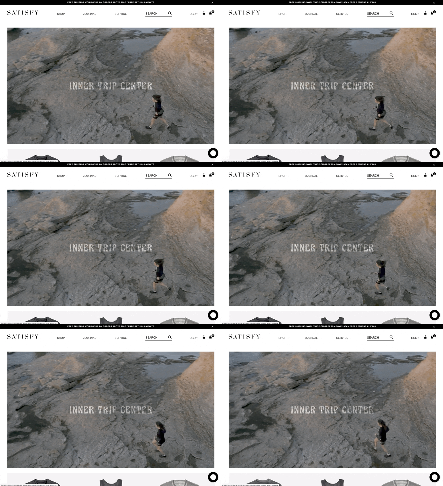
Ambient video has become a hugely popular website feature over the past couple of years. It’s traditionally used in the hero space, but we’ve noticed more and more websites featuring ambient video mixed in with other site content.
We love the look because it carries dynamic energy throughout a page. Particularly in cases where the video plays on hover, it also creates an experience that feels more active and alive than a static design.
3. Conserving Space with Tabs, Accordions & Sliders
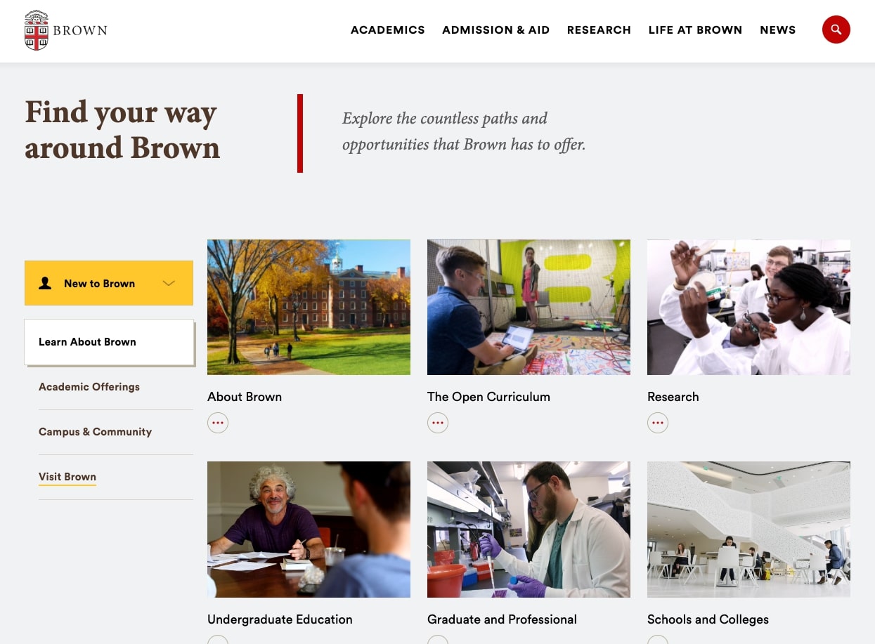
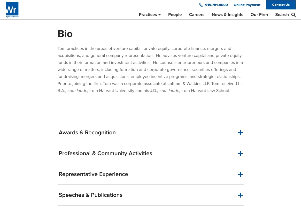
While space on a webpage is technically abundant, users often experience scroll fatigue when confronted with long pages that make it hard to find the content that they’re looking for. To alleviate this, we’re seeing more websites that utilize space-saving features like tabs, accordions, and sliders.
The popularity of these types of elements has fluctuated over time, but they’re making a major comeback thanks to their efficient use of space. Accordions are perfect for expandable FAQ lists, tabs can handle multiple calls-to-action with ease, and sliders create a natural space for steps or process explanations.
4. Highlighting Unique Animation
Animation is another feature that we’ve mentioned in the past – both in our 2020 trends prediction and our 2017 design trends post. So by now it’s old news, but we think that animation is worth mentioning again because it’s a trend that will be with us for the long run. Below are a few examples of different types of animation that we expect to see more of.
Subtle Hero Animation
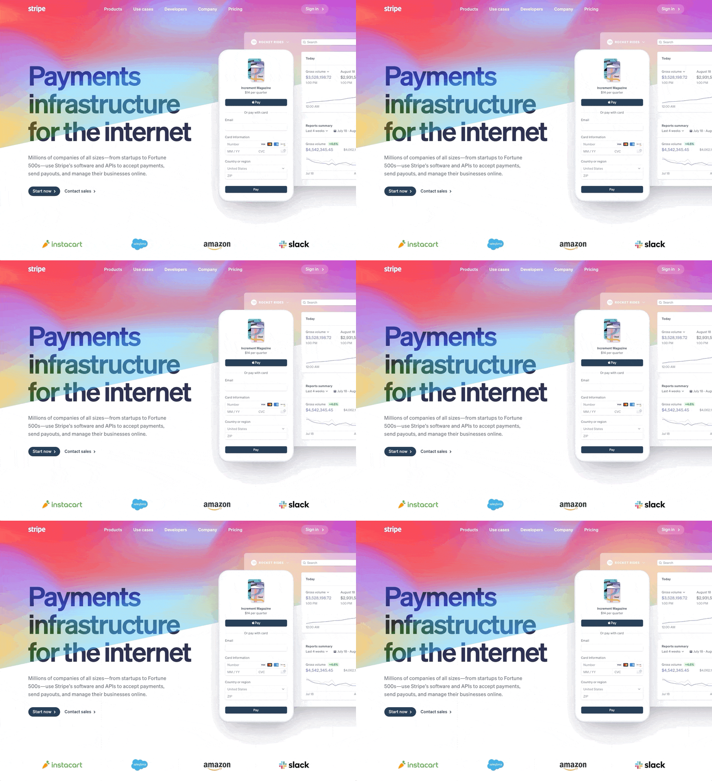
Full-blown animated heroes are awesome, but we’re predicting that 2021 will bring more hero designs that use animation to add a subtle twist instead. Check out this one from payment-processor giant, Stripe. The hero is actually pretty simple – just some text, buttons, and a mock-up – but the animated color overlay adds something special that takes the design to the next level.
Text Animation
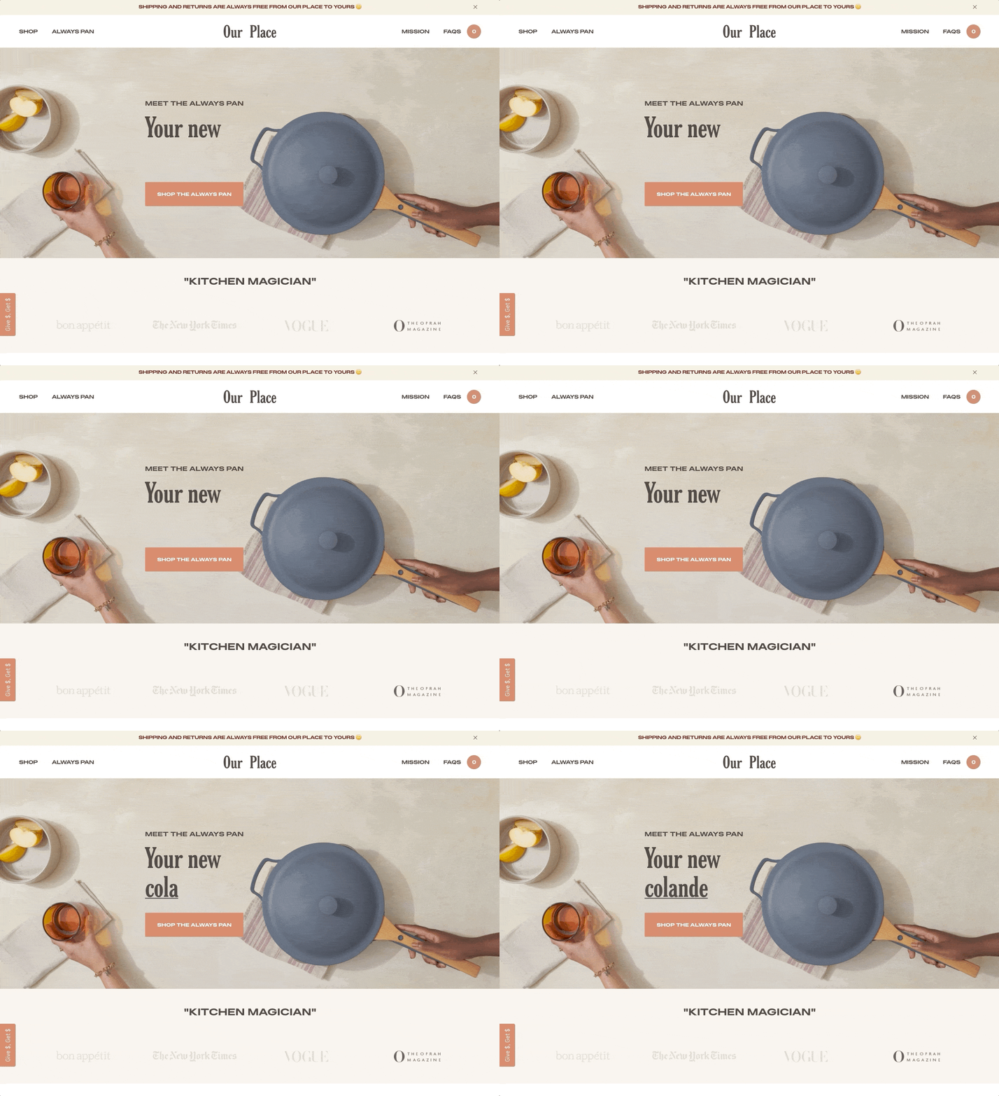
Similarly, text animation adds subtle movement that makes a page more dynamic without overshadowing the rest of the design. We like how Our Place swaps out the heading text to communicate the numerous features of their product.
![]()
Animated Icons
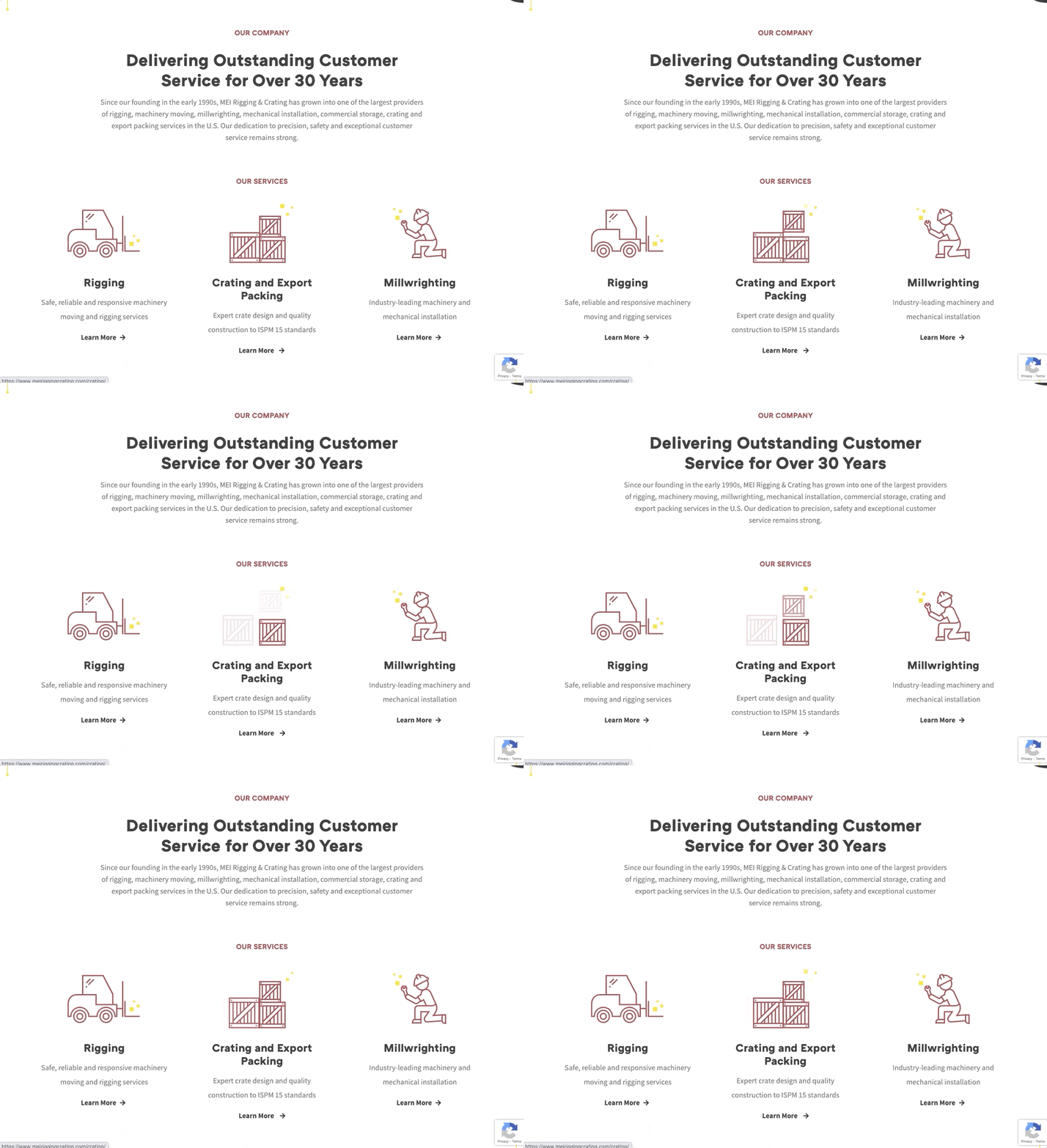
Icons are another place where animation can add some unexpected movement. On the site we created for MEI Rigging, we designed custom icons that animate on a user’s hover. They’re a fun addition to the page and they add a nice interactive element to the browsing experience.
Animated Illustrations
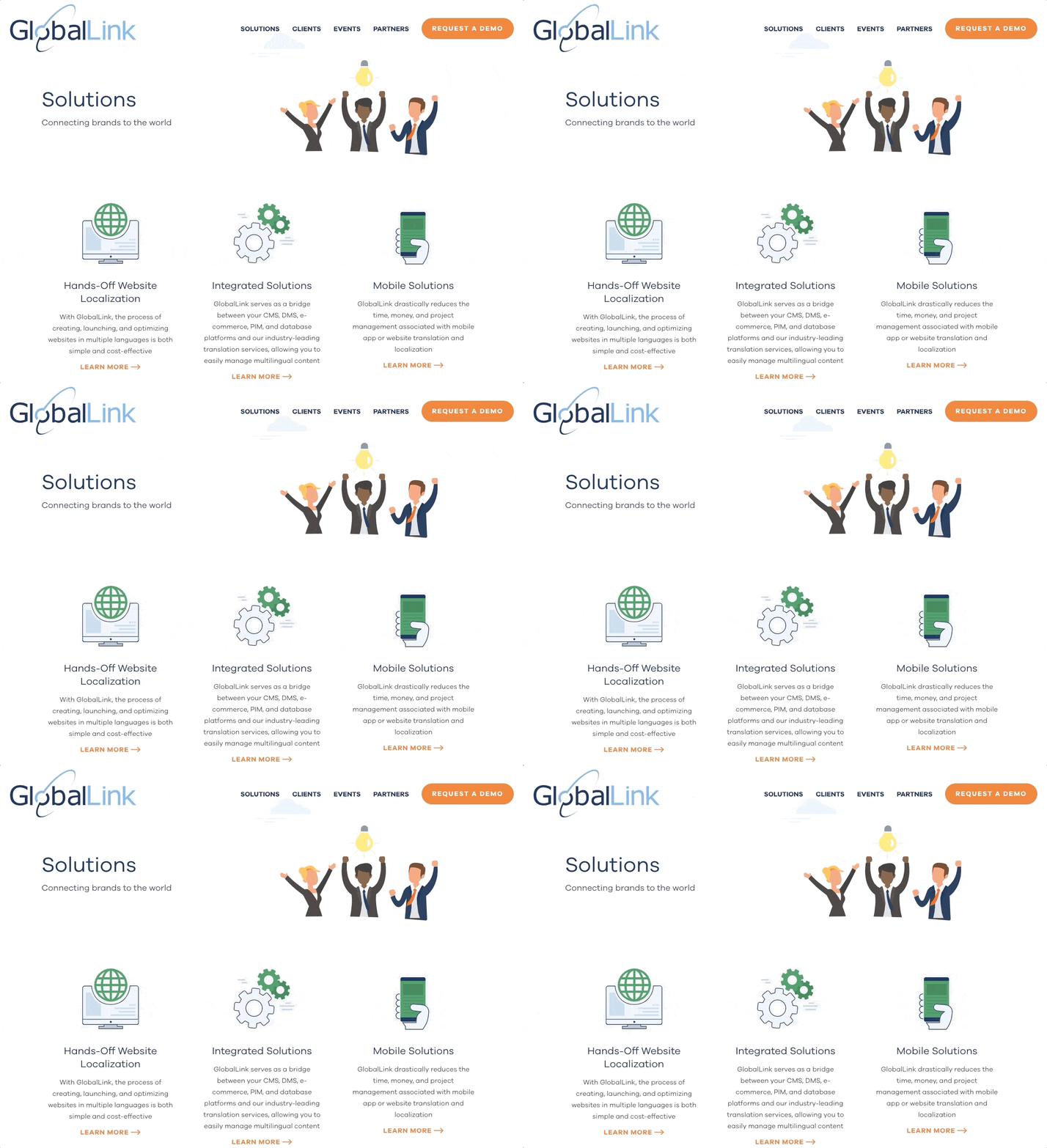
Custom illustrations are popular for their playful appearance and design flexibility. To bring these graphics to life, some sites animate key elements, focal points, or background features, like we did for the clouds on TransPerfect GlobalLink’s site.
5. Embracing Dark Backgrounds
Over the past few years, “dark mode” has become a much-loved (and frequently requested) feature of apps and programs. Some argue that a dark background is easier on the eyes than the familiar bright white, and others prefer it simply for the dramatic and unconventional look.
Likely in an attempt to milk the public’s growing interest in dark interfaces, many websites are employing high contrast color schemes that mimic the “dark mode” effect. This can be achieved in a number of ways depending on the site’s goals, needs, and depth. Examples below.
All Dark
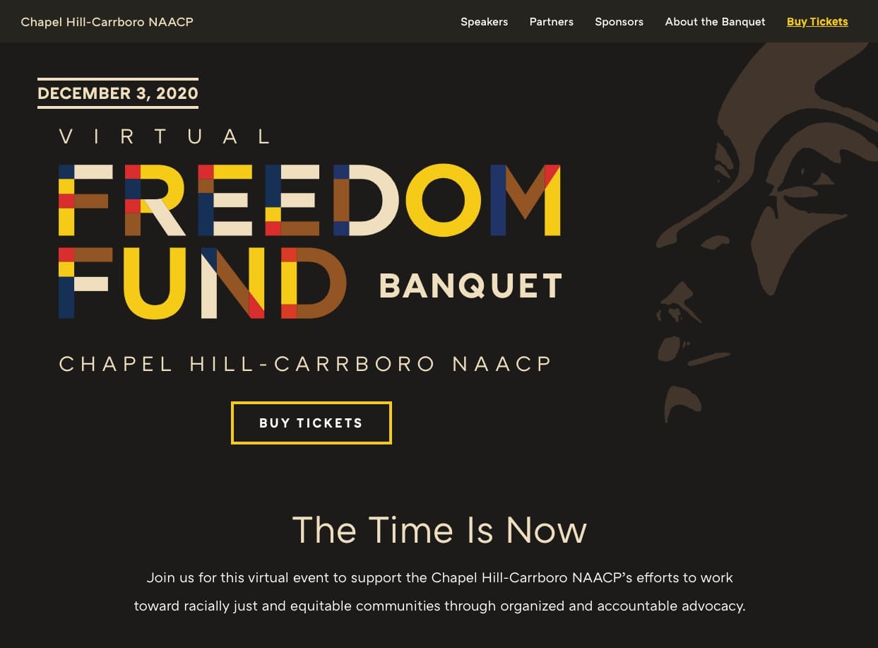
Sites that use dark backgrounds on all pages are undeniably high impact. This bold approach can work especially well for splash pages or single-page microsites, like this one we created for the Chapel Hill-Carrboro NAACP’s Freedom Fund Banquet.
Select Pages
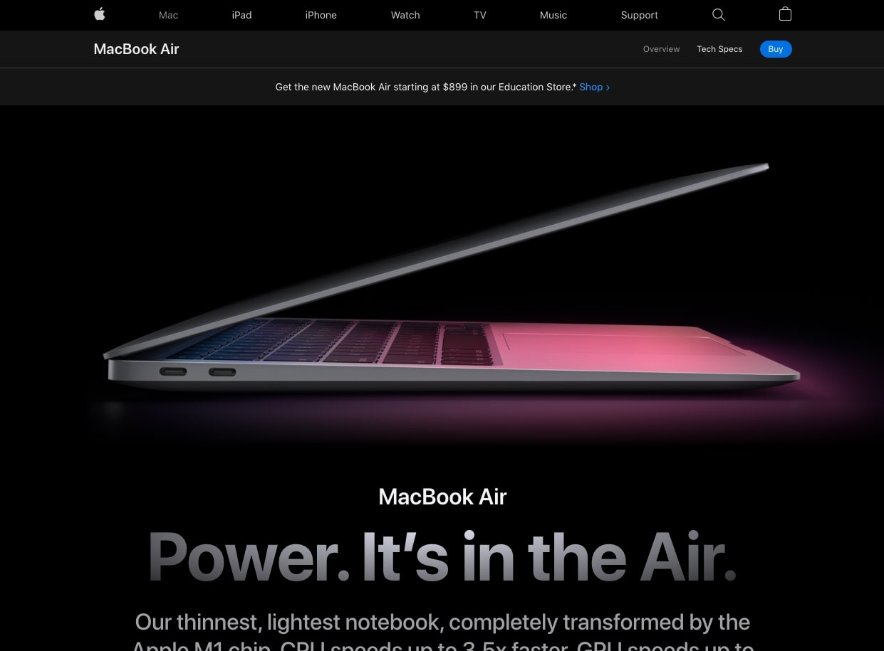
If dark backgrounds don’t fit with all of a site’s content, they can still make a big impact when used on a select group of pages. Apple, for example, uses “dark mode” style design on a handful of their product pages while maintaining light, white backgrounds throughout the rest of their site.
Mixed Blocks of Dark & Light
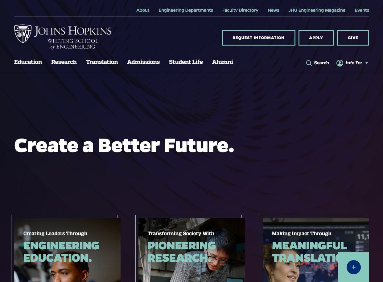
It can be daunting to go dark for an entire site or even an entire page, so mixing blocks of dark and light is perhaps the most approachable way to try out the trend. Johns Hopkins Engineering does this well – they pair a dark masthead with contrasting blocks that outline their programs and offerings. We think we’ll see a lot more of this “mix-and-match” style next year.
6. Utilizing Pastel Backgrounds
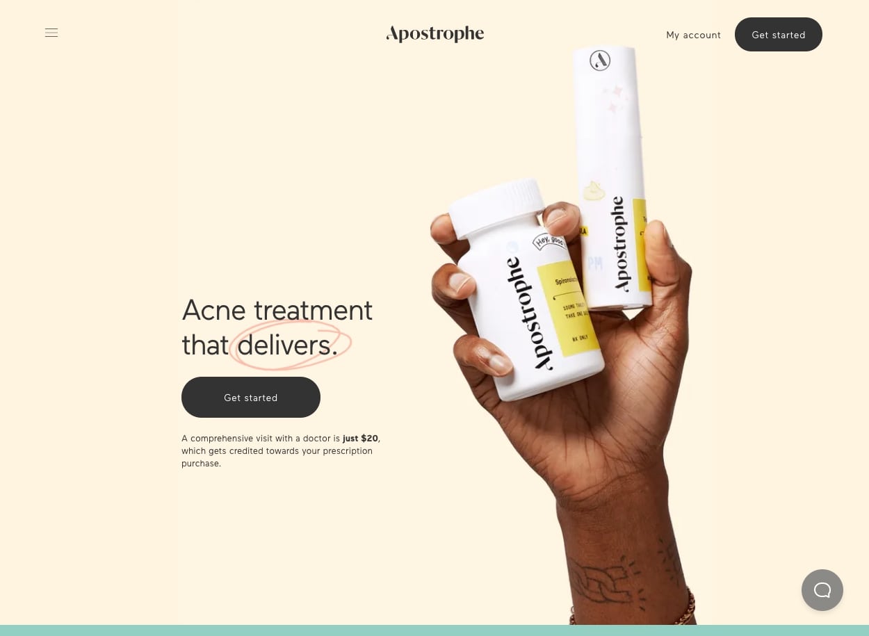
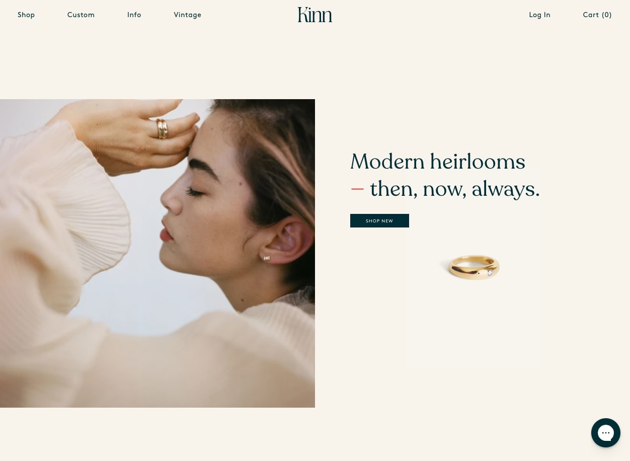
Despite the popularity of dark, intense backgrounds, we’ve also noticed that some sites are taking their color schemes in the opposite direction. We’re hesitant to say it, but soft shades of muted pastels may make a bit of a comeback in 2021.
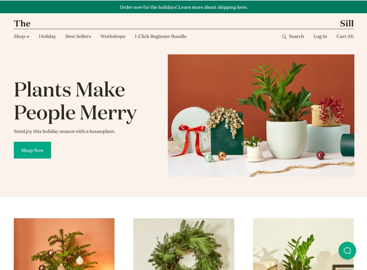
Washed out shades may not be right for everyone, but in the right context, they can create online spaces that are wonderfully calm, nostalgic, and intimate. We like how the examples below pair the pastels with similarly evocative, old school serif typefaces.
7. Returning to Minimalism
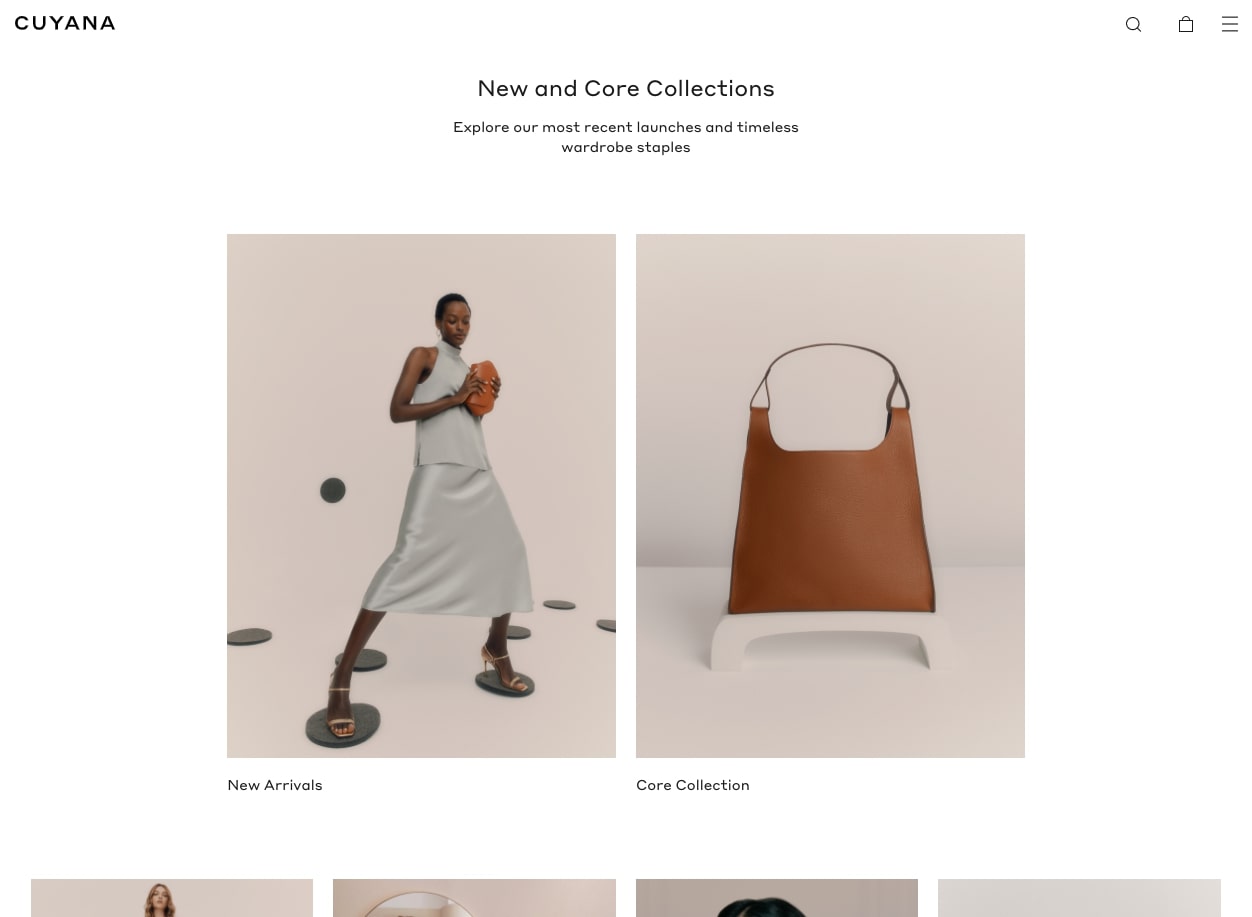
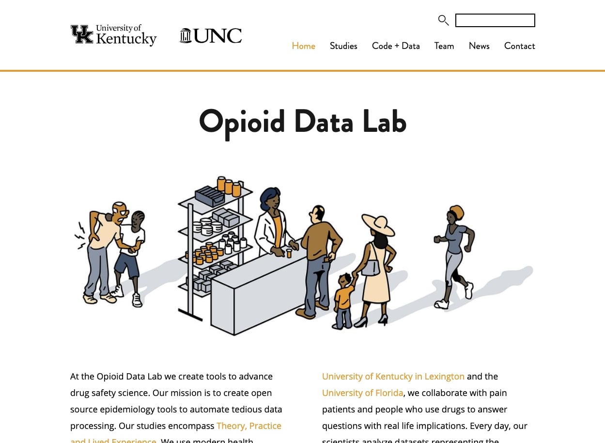
Clean, polished designs are always in style, and some websites are taking that aesthetic further by stripping things back to true minimalism. We’re big fans of plentiful whitespace and uncluttered layouts, so we’re totally here for it!
Since the minimal look meshes well with many of the other trends that are catching on (like video, dark color schemes, animated features, creative heroes, etc) we’ll almost certainly see more minimal website designs in 2021. They’re great for a lot of reasons, but particularly because they allow content and images to shine without any distractions.
Bring it On, 2021
After this crazy year, we’re really not sure what 2021 has in store. But regardless, we feel lucky to be in a space as exciting and fluid as web design. We’re excited to watch as new trends develop and take hold, and as always, we look forward to creating even more great websites for our clients near and far.


Leave the first comment