
Developing a Sophisticated Website for a Fast-Growing Fintech Company
A Case Study on Payrix
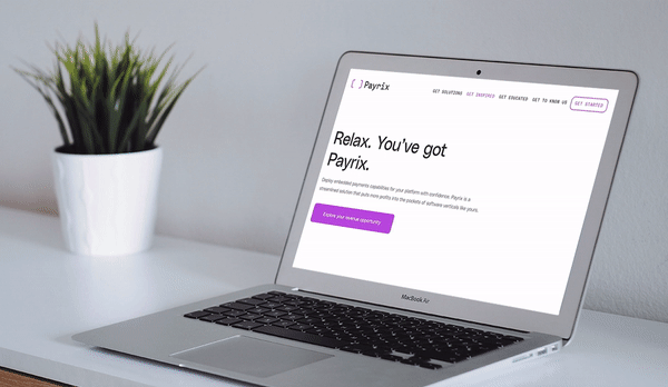
Payrix is a fast-growing, venture-backed fintech company that has established itself as an innovator in the embedded payments sector. The company empowers vertical software providers with pre-built, low-risk payment solutions that integrate smoothly with existing products. After experiencing significant revenue increase and a geographic expansion, Payrix realized that the time was right for a comprehensive rebrand that would better communicate their rising reputation, ambition, and culture.
With the big picture goals in place, Payrix approached Franklyn, a Brooklyn-based creative studio (and frequent NMC partner agency) to craft a new logo, identity, and visual language that would launch the company into their next chapter. We took the reins when it came to the B2B website design and development phase and delivered a website that not only showcases Payrix’s vibrant new look, but makes web content easy to manage through an intuitive WordPress CMS.


About Embedded Payments
More likely than not, you make many – if not most – of your everyday purchases by swiping, inserting, or tapping a credit or debit card. In the United States, this preference for plastic is part of a larger decline in cash usage that coincides with the increased availability of electronic payment options. This is of little importance to the convenience-minded consumer, but for businesses, it’s a serious shift that brings big questions about how to manage payments as efficiently and securely as possible.
For many businesses, the solution is a vertical-specific software platform that takes care of the behind-the-scenes work that would be too cumbersome to handle in-house. But without becoming full scale payment facilitators themselves, the SaaS companies that power these products – think a nonprofit CRM or a gym management software suite – must find an appropriate way to include embedded payments in the solutions that they offer to businesses. The solution? Payrix.
Facilitating a Brand Evolution
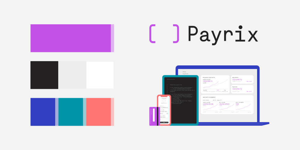
Our work didn’t begin until later on, but we eagerly listened in while our friends at Franklyn led the in-depth branding process. Based on their discussions with the Payrix team, they created a dynamic new look that leverages custom illustrations, lively colors, and stand-out typography that differentiates Payrix from competitors and reflects the company’s fresh approach.
Once the brand was final, Franklyn established a series of style and usage guidelines that offer direction for future projects and design tasks. These rules and examples ensure that all instances of the visual language are intentional and consistent with the brand as it was originally imagined.
As we moved into the web design phase of the project, we consulted the brand guide (and the Franklyn team!) when determining things like logo placement, color selection, and illustration style. More on that next.

Showcasing the Brand Online
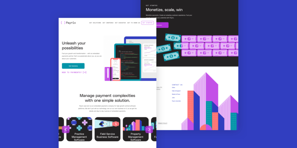
After guiding Payrix’s executive team through a digital-specific discovery process, we kicked off the web design project with a clear goal in mind: To create a standout look that would engage site visitors while prioritizing a smooth and intuitive user experience.
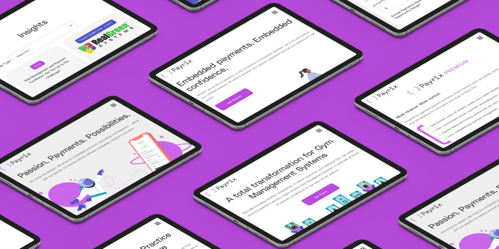
We tackled the first item – appearance – with a distinctive modern design that incorporates playful illustrations, a powerful color scheme, and plenty of movement from GIFs and dynamic load-in effects. These crisp design elements immediately grab attention and highlight important written content about Payrix’s products and value.
All of these whimsical, high-energy elements are balanced by clear and functional UX pieces that help users to quickly segment themselves and explore the content that addresses their needs. This includes a series of strategic components that are carried throughout the site:
- Industry-specific CTAs. On the homepage, users encounter an interactive slider that directs traffic to interior vertical pages. The slider makes it easy for site visitors to find content and solutions that are specific to their industry.
- ROI Calculator. In order to reinforce the value of Payrix’s products, the site includes a custom-developed calculator tool that allows users to explore potential outcomes based on their business’s payment volume. The calculator also serves as an important conversion point where users can connect with the Payrix team.
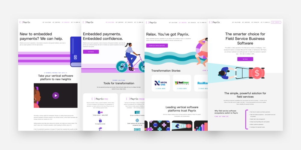
- Case Studies. Case studies and testimonials are a helpful feature for almost any B2B website because they make success stories both tangible and relatable. Payrix includes case studies on their Get Inspired page to show off real life applications for products like Payrix Pro and Payrix Premium.
- Hubspot Integration. Forms on pages like Get Started are powered by Hubspot, which makes it possible for Payrix to track and collect data easily. We often use third-party integrations to connect websites with CRMs, nonprofit fundraising tools, and other programs that clients use regularly.
- Sticky Nav. A sticky nav rounds out the site’s intuitive design by making sure that visitors are never far from a full range of navigation options. The nav is considered “sticky” because it stays visible at the top of the screen as users scroll and explore each page. It’s a helpful feature that boosts browsing efficiency and convenience.
- Accessibility. At NMC, we apply ADA accessibility best practices to each website that we work on. For the Payrix project, that meant paying attention to things like color contrast, button and link design, alt text for images, and behind-the-scenes structures to support assistive devices and keyboard navigation.
Engaging Users With Interactive Features
Throughout the discovery process, the Payrix team emphasized the word “dynamic” as a descriptor for their new brand and digital presence. We ran with this theme by incorporating movement and fun effects wherever it made sense. Our development team was looped in from the start to vet ideas, propose solutions, and let everyone know what would be possible when the site went to code.
Some of our favorite highlights include:
- Homepage Animation. When users land on the homepage, the first thing that they see is a fun illustration that animates with information and data. Not only is this a cool way to capture attention, but it also offers a high-level visual overview of how the product processes a card payment through to a client’s dashboard.
- Scroll Nav. The homepage also includes a helpful dot scroller that site visitors can use to jump through various homepage sections.
- Hero Effects. Interior pages feature a number of engaging load-in effects that enhance the illustrations with movement. Check out Get Solutions for a bike that “rides” onto the page, Get Inspired for a man who floats on an innertube, and Get to Know Us for our personal favorite, a drifting astronaut.
- Videos. Animated videos – like the one on the homepage – bring the illustrations to life and reinforce the site’s messaging by explaining the offerings in a visual format.
Since all of these elements were built on WordPress as flexible “blocks,” Payrix can easily control and add interactive features on new pages as they grow the site.
Moving Fast
Like many of our projects, Payrix came to us with a timeline and target launch date in mind. But since the new site and brand were set to be unveiled together on a pre-scheduled press date, we had to move quickly to ensure that everything would be ready in time for the public reveal.
Early in the branding process, this meant working in parallel with Franklyn to start planning and wireframing for the homepage layout. Franklyn made this possible by sharing assets and design elements as soon as they were approved by the client.
Using the design tool Figma, we were able to collaborate and iterate in real time – both with the Franklyn team and internally. Our designers worked together to turn things around quickly in formats that were easy for Payrix to review and share.
We also relied on daily standups with our project team, a weekly check-in with Payrix, and a Payrix-NMC Slack channel to make sure that everyone was on the same page. Constant and clear communication was a key factor that led to a successful result and an on-time site launch.
Scaling the Site Post-Launch
Several months after the launch of the primary web presence, Payrix began an exciting new chapter when they acquired IntegraPay, a new arm of the brand that would become Payrix Australia. In order to support the expansion digitally, we utilized WordPress Multisite to allow Payrix to launch additional sites from their existing WP instance.
WordPress Multisite is an ideal choice for organizations that require multiple websites for different regions or areas of their business. For Payrix, a WP Multisite meant that they could take advantage of existing blocks from their main site, while also preserving the ability for the Australia site to have some autonomy in look, function, users, etc. Super Admins are able to jump between sites easily, ensuring that all platforms can be managed efficiently and conveniently.
Technically speaking, the Payrix Australia site is set up to detect a user’s location based on IP address. That means that United States users who go to www.payrix.com/au will see a notice to go over to the US site. Similarly, Australian visitors to www.payrix.com receive a gentle nudge to switch to the Aussie site.
Should Payrix grow their reach even more, the WP Multisite feature will streamline the process for spinning up even more sites without the need for additional development work.
Positioning an Innovator for Ongoing Growth
We’re thrilled with the finished website, and so is Payrix. In their words, the redesign took their digital presence “from a 1985 Honda to a 2021 Ferrari” – that is, from outdated and inadequate to smooth, polished, and a cut above the rest.
With the new site in place, Payrix’s outward appearance now fully expresses the passion and innovation that they have worked hard to cultivate within their brand and products. The updated site has already generated excitement and press, and will continue to serve as an important touchpoint for prospective clients as the company surges ahead towards a bright future.
Leave the first comment