
Dynamic Website Search Examples and Best Practices
These days, a typical conversation is interspersed with internet and website searches. A quick Wikipedia check to confirm a celebrity’s age. A newspaper lookup to find an article that you really enjoyed. A peek at an old friend’s social media profile to see where they ended up.
This behavioral shift – we’ll call it “search culture” – has come about in part thanks to the rise of smartphones and devices that are always listening (hello, Siri and Alexa), but also because of a larger societal lurch towards efficiency and speed. People crave the quick, effortless answers that search tools are perfectly primed to provide.
And it’s not a bad thing. For websites, a search functionality offers intuitive access to content, cuts down on browsing frustration, and makes the entire experience more accessible for users with disabilities. Search can look different depending on a site’s depth and type, but it’s undeniably an essential (and expected!) feature that all modern websites should include.
In this post, we’ll go over some site search best practices and offer a few examples of interactions that are particularly unique and effective.
Skip ahead to:
Website Search Best Practices
While having some type of site search tool is better than forgoing one altogether, following a few basic guidelines will make your search experience as user-friendly and helpful as possible.
Many of these tips also incorporate standard web accessibility best practices, which are important to consider when designing and implementing any new website feature.
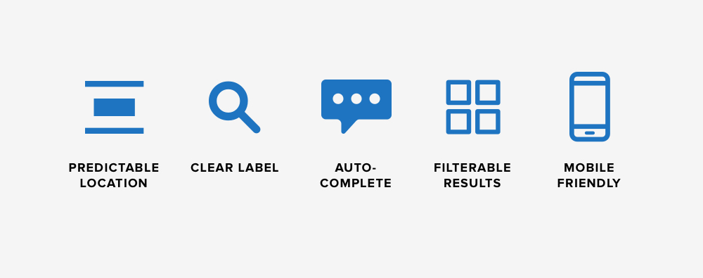
Predictable Location
Location, location, location! Site visitors are accustomed to seeing a search bar or icon at the top left or right corner of their screen. Placing your site search in one of these places will ensure that visitors can quickly find and use the tool.
This isn’t to say that you’re entirely limited when it comes to search, however. Several of our clients incorporate larger search blocks lower on the page (UNC School of Information and Library Science) or as a part of a dynamic header (Fleet Feet). But as you’ll notice, these search features don’t stand alone – each site also includes the standard search option in the top left corner of the navigation bar.
Clear Label
In addition to placing your search bar in an intuitive location, you’ll ideally want to identify it with a clear label and prompt. A label like “Search” is a can’t-go-wrong classic that explicitly points out the purpose of the tool, and a prompt like “Enter your question here…” or “Search our products…” shows visitors exactly where they can type a query.
This seems like a given, we know. But with web design trends leaning towards minimalism, we’ve seen more sites abandoning the traditional label/prompt combo in favor of a site search identified only by a magnifying glass icon. While the icon is recognizable for most site visitors, it’s easy to miss visually and may be inadvertently skipped over by visitors who are using assistive devices like screen readers. Adding a “Search” label is the most effective way to direct users towards your site’s search functionality.
PRO TIP: The same idea applies to labeling other common site elements. Writing specific labels for buttons, links, and form fields is a big part of writing accessible web content.
Pre-Defined Queries & Auto-Complete
Once visitors locate and interact with your site search, help them find what they’re looking for by having your tool utilize auto-complete, predictive text, or common query buttons. This speeds up the search process and may even cause visitors to explore additional topics that pique their interest.
We’ll go into more detail when we get to the examples section of the post – Fleet Feet (an NMC client) and Backcountry do a particularly good job when it comes to predictive and auto-completed search queries.
Categorized Results
For content-rich sites, it can be extremely helpful to break down results by type or topic. This could mean separating categories like blog posts, videos, resources, and news, or for eCommerce sites, offering filters to pull out results that are specific to a particular gender or need.
More on categorized results when we get to the IWMF example below.
Mobile Friendly
Even if you have a great search setup on the desktop version of your website, you’ll need to make sure that it offers an equally great experience on mobile. To make your site search mobile friendly, give the search field a prominent position that isn’t hidden in a menu or at the bottom of the page. The best mobile searches are attached directly to the site’s header.
Examples of Dynamic Website Search Experiences
Now that we’ve covered the features and strategies that make up a great site search, we’ll move next to examples that show effective search functionalities at work online. Some of these are sites that we built, and others are great examples that we’ve come across on other websites.
UNC Kenan-Flagler
Kenan-Flagler is one of our clients, and we love the site search that has become a defining feature of the business school’s website. It can be accessed by clicking on the magnifying glass icon at the top right corner of the screen.
What makes it unique is the way it behaves when clicked. Instead of opening a simple field or a dedicated search page, a click on the icon brings down a full-screen overlay where users can enter their question. Two big benefits to this:
- The overlay makes it possible for users to stay on the same page while searching. They can see what they were looking at and have a better chance at remembering where they left off.
- The full-width dropdown adds a dynamic effect to the site. Since the site emphasizes movement in other ways (think: ambient video, hover effects, and so on), the site search builds on that momentum to create a consistent overall look and feel.

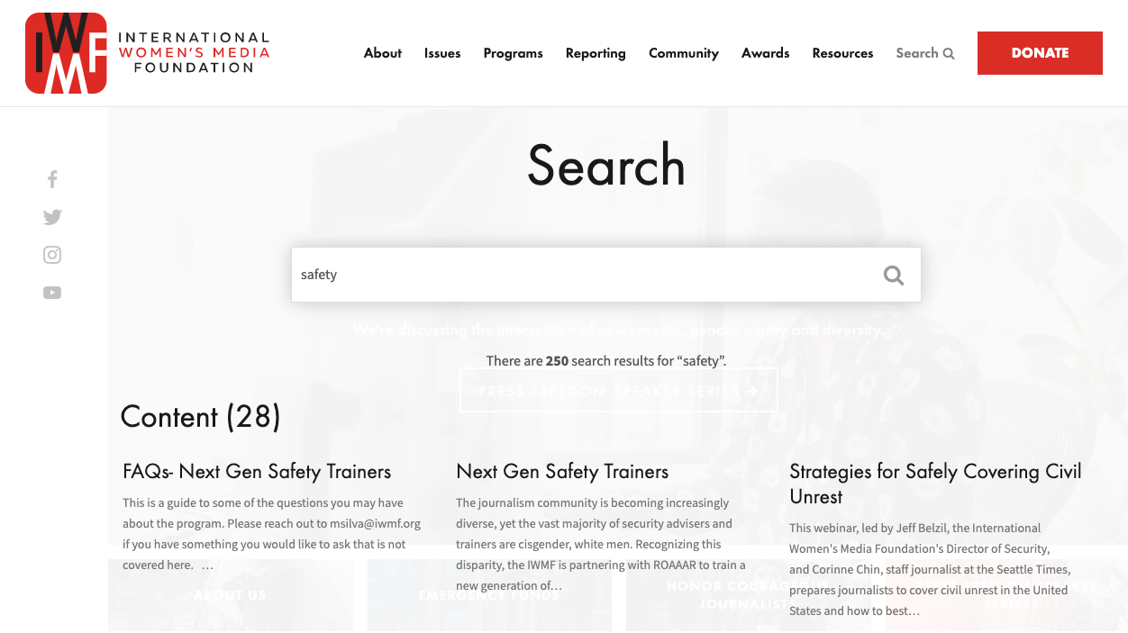
IWMF
The International Women’s Media Foundation is another client that uses a memorable site search setup. Like Kenan-Flagler, IWMF’s search appears as an overlay on any page that a visitor is browsing. The results page is where things get interesting.
Regardless of the query or the number of search results, the results are distributed into five distinctive categories – Content, Community, Reporting, Resources, and People. This way, users can easily evaluate the results and select an item that matches exactly what they’re looking for. The site as a whole houses a lot of content, so the categories also serve to make the search results more approachable and less overwhelming.
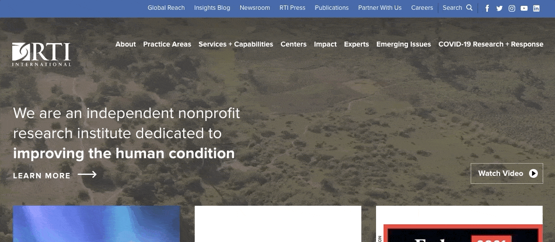
RTI
RTI International (also an NMC client) takes a different approach by placing their site search in the top utility nav. We like this because it keeps the main navigation clean and consistent – which is especially important over an ambient video hero – and frees up room for key menu items about RTI’s practice areas and services.
When clicked, the search button reveals a sliding field where users can enter keywords or questions. Not only does the slider add a fun burst of movement to the page, but it also saves valuable space and allows visitors to continue browsing or reading while thinking of a search term.
A filterable results page rounds out the search experience. Visitors can narrow results by type, year, practice area, service, issue, or RTI Center, which is helpful considering that a broad term could pull hundreds (or even thousands!) of results and resources.
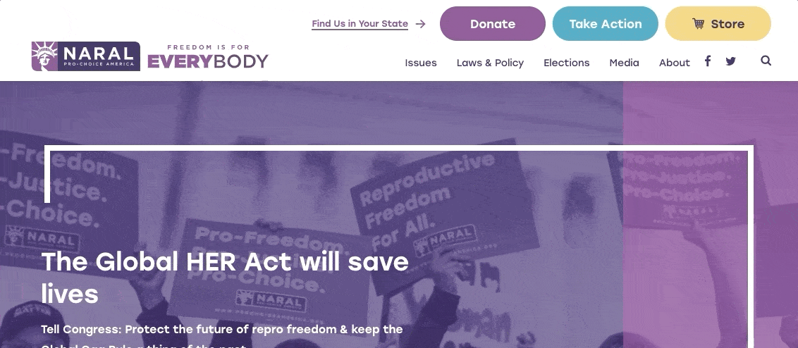
NARAL Pro-Choice America
While we didn’t create it, we love the site search that Pro-Choice America uses to guide visitors towards the resources that they’re looking for. Similar to RTI’s search feature, Pro-Choice America uses a hidden field that drops down from the top of the screen when a user clicks on the magnifying glass icon. The movement again adds a nice effect to the page, conserves space, and allows users to stay on the page that they had been browsing.
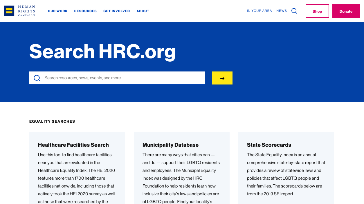
Human Rights Campaign
The Human Rights Campaign is another site that we came across with a notable search functionality. It exists on a separate page – i.e. the search box itself isn’t in the nav like our previous examples – where users are presented with prominent tiles that highlight HRC search tools and popular search topics.
Many of these suggested searches take users to topic landing pages that contain narrower search tools for particular databases or information libraries. We like how the site uses multiple levels of search to guide the experience and direct users towards relevant content.
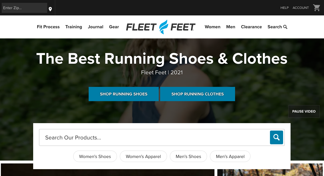
Fleet Feet
Our longtime client Fleet Feet embraces a similarly guided search feel by pairing powerful auto-complete technology with helpful predefined queries like “Women’s Shoes” and “Men’s Apparel.” By offering these options to site visitors, Fleet Feet creates easy starting points that remove the daunting uncertainty of an empty field and a blinking cursor.
The features also improve search efficiency. With so many brands and products on the market, site visitors are likely to forget the nuances of model names and version numbers. But using Fleet Feet’s guided site search, visitors luckily don’t have to remember every detail in order to emerge with a quick and accurate result.
Backcountry
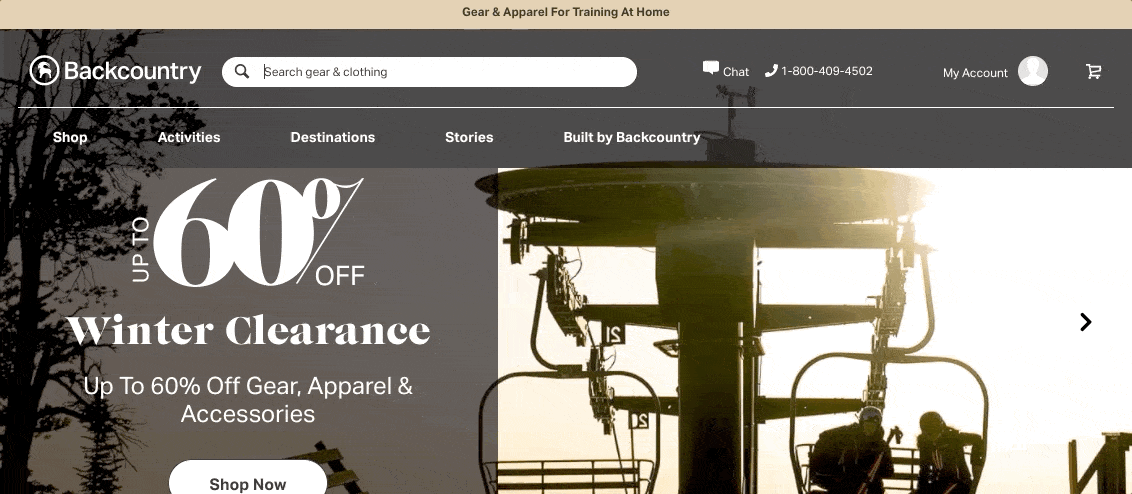
Last but absolutely not least, outdoor retailer Backcountry. Backcountry’s site search is perhaps the best and most robust example that we’ve ever seen. We didn’t create it, but we wish we had!
The search feature combines everything that we’ve mentioned so far – it’s located prominently in the center of the main nav, uses a clear label and prompt, provides highly filterable results, and performs flawlessly on mobile.
Better yet, it takes the guesswork out of the search by pulling up detailed predictive results as a user types their query. And this goes beyond anticipating the end of the phrase. Backcountry highlights their best guesses of what a user is looking for by offering a list of completed phrases, alternative queries within popular categories (things like “Patagonia / in Women’s Hike & Camp Jackets”), and images of products that are relevant to the search. It’s impressive.
This isn’t the right approach for every website, but it’s an excellent fit for a large eCommerce platform that contains thousands of product pages, blog posts, travel guides, and other resources.
Bringing a New Search Experience to Your Website
Whether your organization is large or small, high tech or no-frills, your website will benefit from a user-friendly search functionality like the ones we’ve described in this post. In order to choose a site search that’s a good fit for your needs, consider the following:
- Amount of Content. The amount of content on your site will dictate the level of detail that your site search should include. For example, a small site with a dozen blog posts would be best served by a simple search and a straightforward results page. A larger website with hundreds or thousands of pages, on the other hand, would benefit from a filterable search and a feature like auto-complete.
- Target Audience. It’s helpful to think about your site’s target audience as well. If typical site visitors aren’t expected to be tech savvy, you may want to lean towards an ultra-prominent search experience that avoids complex features and options.
- Industry Best Practices. You’ll also want to think about what your peers and competitors are doing. In the eCommerce sphere, for example, filterable results and predefined queries are almost an expectation. A site without those features might be seen as lacking or technologically behind. Try to assess what’s standard for your industry and develop an approach that matches or exceeds the norms.
As always, feel free to reach out to us for further guidance or specific recommendations for your organization. We’d love to hear from you!


Comments
Charles
For anyone looking to upgrade their outdoor essentials, Camping Gears Philippines has great gear guides and even campsite listings—love the helpful articles!Leave a comment