
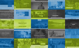
Spotlight 2017 Websites
The end of 2017 marks another great year for our team. We've attended and spoke at conferences, hosted talks, and grown our families. One of the things we're always proudest of though is our work, and this year was no exception. Sites we launched this year included custom interactive content, fun hover interactions, and module based layouts for many amazing nonprofits, higher-ed organizations, politicians, law firms, and more. Check out some of our favorite projects launched this year:
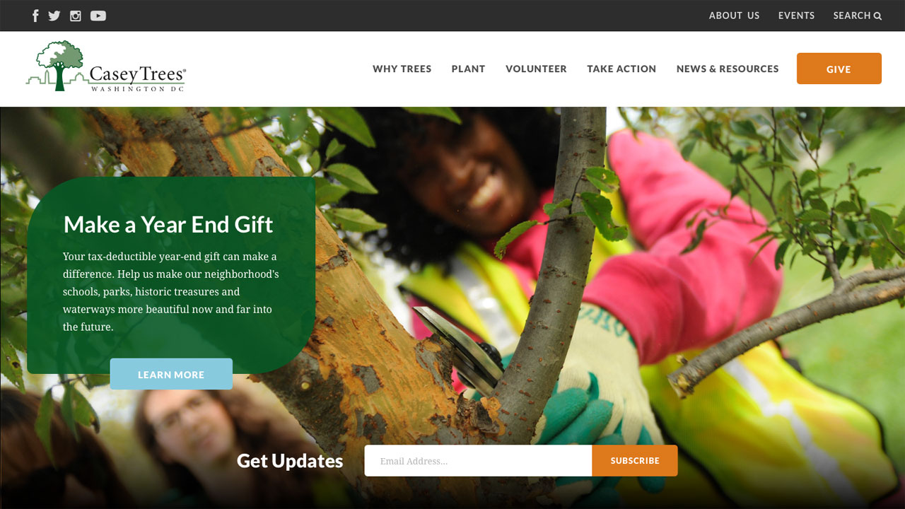
1. Casey Trees
Casey Trees is a prominent D.C.-based nonprofit focused on diversifying and protecting the tree canopy in the nation's capitol. We created a fresh, bold site for them that's action-oriented, with prominent calls to action to volunteer, donate, or attend an event. The site also includes some fun features, such as the Tree Finder, which allows users to find a tree best suited for their yard based on light, size, and other qualities.
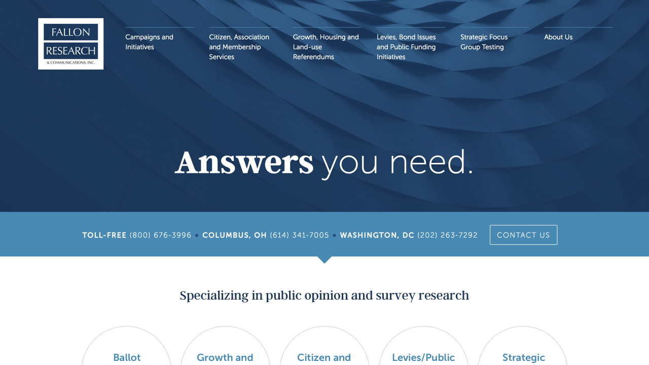
2. Fallon Research
Fallon Research is a firm providing services like phone interviewing, web surveys, ad testing, and more. They came to us in need of a small site that would look great despite few photo assets. So, rather than a big image on the homepage, we used an abstract texture and called attention to their contact information and services.
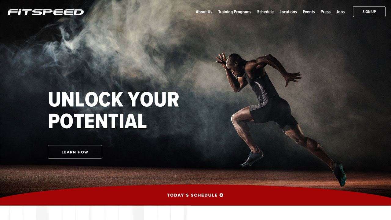
3. FitSpeed
FitSpeed is a small gym focused on professional and athletic training. We loved creating a new high-impact design for them, with cool features such as a schedule calendar, customizable location pages, and an ambient video to draw users into the homepage.
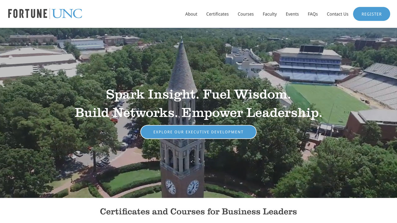
4. Fortune UNC
Several of our team members are UNC alumni, so it's always a treat when we get to create a site for our alma mater! Fortune UNC is a new partnership that brings 6 week course programs to UNC on business leadership. We developed an uber clean design for them that focuses on the course descriptions, information and FAQs, and allows potential students to quickly register.
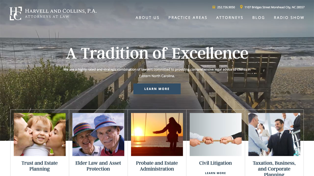
5. Harvell & Collins
We designed the initial site for Harvell & Collins back in 2012, so we were thrilled to have them return to us this year for a full redesign. We created a more NC Coastal-focused look for them with ambinet video, large imagery, and neutral textures throughout the site. We enjoyed using imagery that was a bit unconventional for a typical law firm website design, and we think it really looks great. We also helped improve their content by creating individual pages for their practice areas, and creating a snazzy new look of the media player for their weekly radio shows.
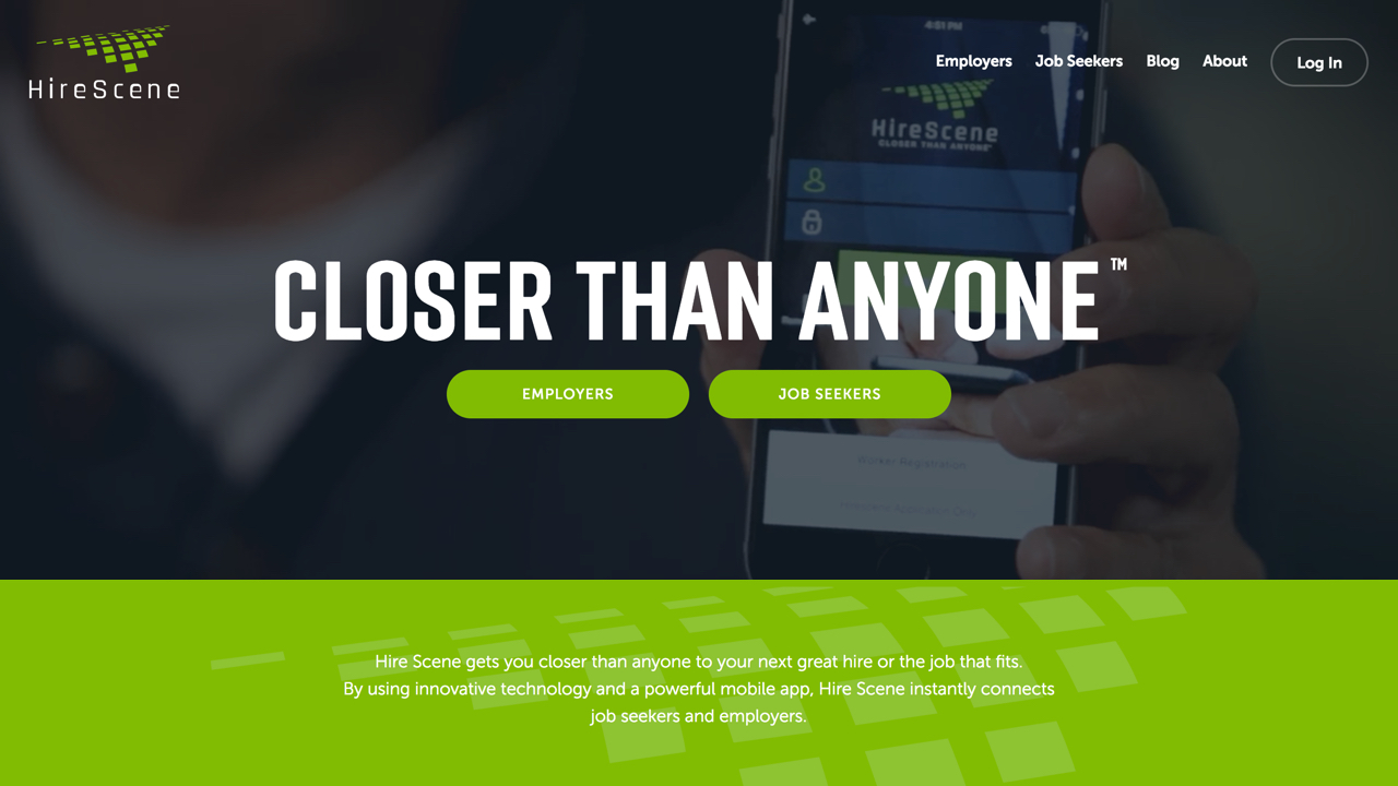
6. Hire Scene
Hire Scene connects job seekers to employment through their mobile app. This type of service required a modern and tech-inspired site that would appeal to their target audience. We created an engaging design for them using bold colors, modern fonts, and an ambient video.
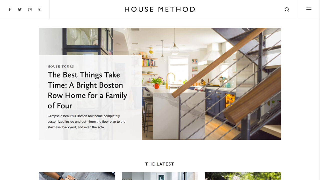
7. House Method
We are big home DIY-ers, so we couldn't have been more thrilled when House Method approached us to create their new identity and website. We designed a fresh, sleek logo and mark to pair with their modern blog site. The site features a unique compenents design with various elements that House Method can add to each article - such as slideshow galleries, collages, and DIY instructions. The site also includes a providers listing - which lists reviews and features for everything from pest control to mattresses.
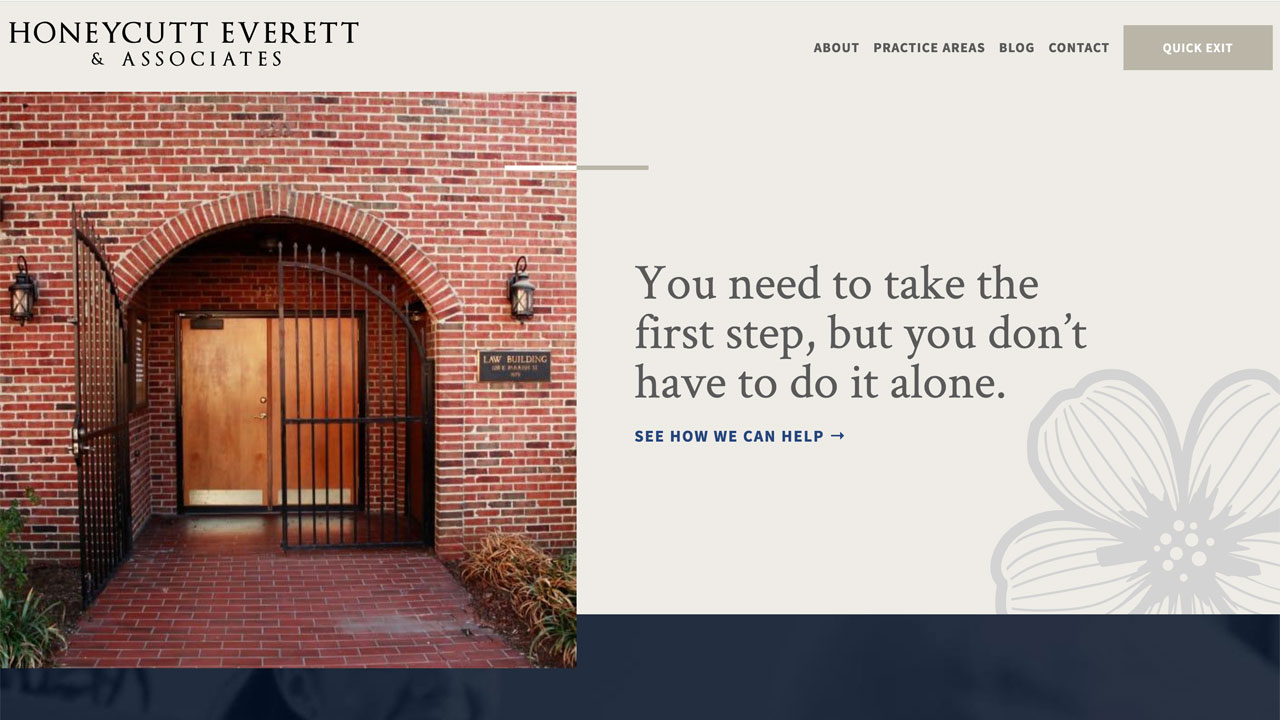
8. Honeycutt Everett & Associates
Honeycutt Everett is a great local firm that works with victims of domestic violence. The site features an innovative design with unique features, such as a "Quick Exit" button, which quickly diverts the site to a Google search page in the event they need to hide the site they're browsing on.
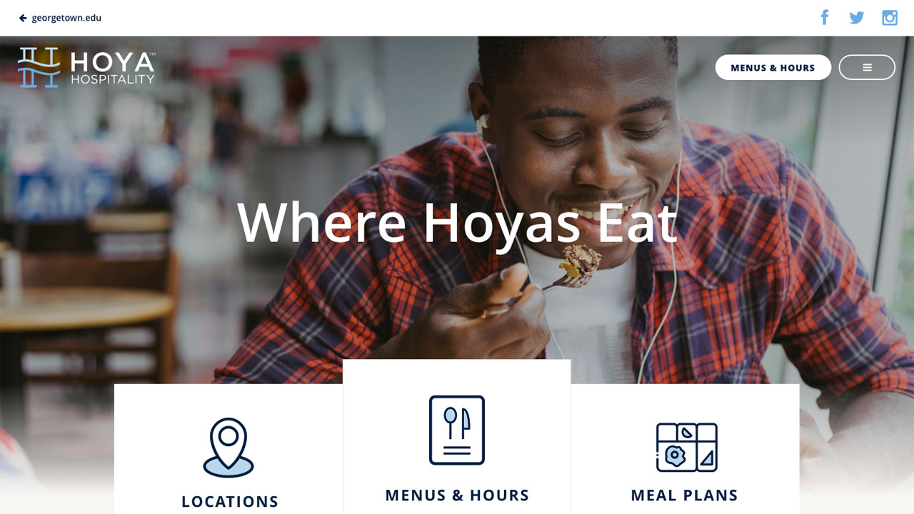
9. Hoya Hospitality
Georgetown University's dining services, Hoya Hospitality, was the first to roll out our new template design created for Aramark student dining halls. The design allows student dining services to have more control over the look and content of their site. Hoya Hospitality shows off these features magnificently - with large calls to action to the most visited pages, full width image blocks linking to interiors, a social media grid, news and events feed, and more. The newly designed Menu + Hours section allows users to quickly see what's open, what's being served that day, and the nutritional and allergy information for everything being served.
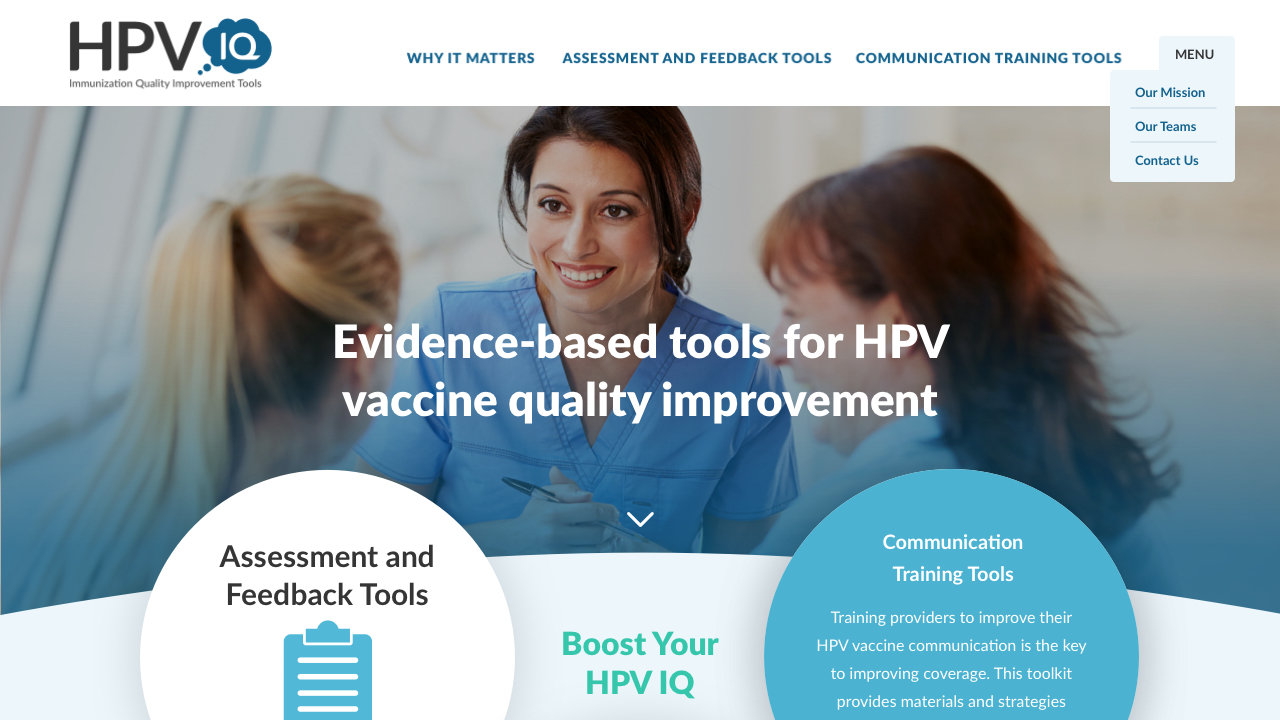
10. HPVIQ
We had the opportunity to create both a logo and website design for HPVIQ, which is always a treat! We designed a logo that literally gets you thinking about HPV with the use of a thought bubble icons. For the site design, we carried over the logo styles with color and curved shapes to create a solid brand for the organization. The website uses bold calls to action and a clean layout to provide users with all of the tools needed to educate themselves about HPV.
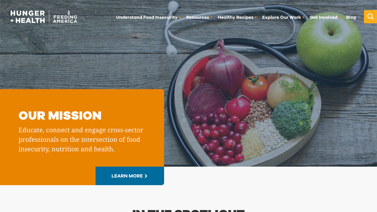
11. Hunger and Health
We worked with Feeding America to create a new, fresh brand and site design for their Hunger & Health initiative. The site aims to connect professionals on food insecurity and nutrition, while also providing a database of healthy recipes. The site features a clean, tile grid design and a robust search feature, which allows users to find resources based on their position and type of information they are looking for. Adding Feeding America and its important work to our list of prominent nonprofit website design clients was a real honor for us.
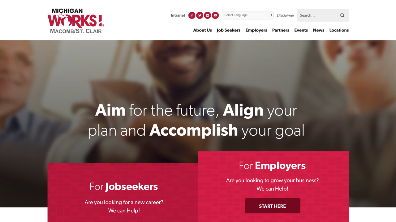
12. Michigan Works! Macbomb/St.Clair
NMC works on a lot of economic development website design projects, and it was exciting to take that expertise north to Michigan. This workforce development system needed a easy-to-use website that connects their customers in the Macomb/St. Clair counties of Michigan to opportunity. For their site we designed custom blocks that can be combined to create various unique layouts depending on the content needed. Because of this, any information a user may need is never far from reach.
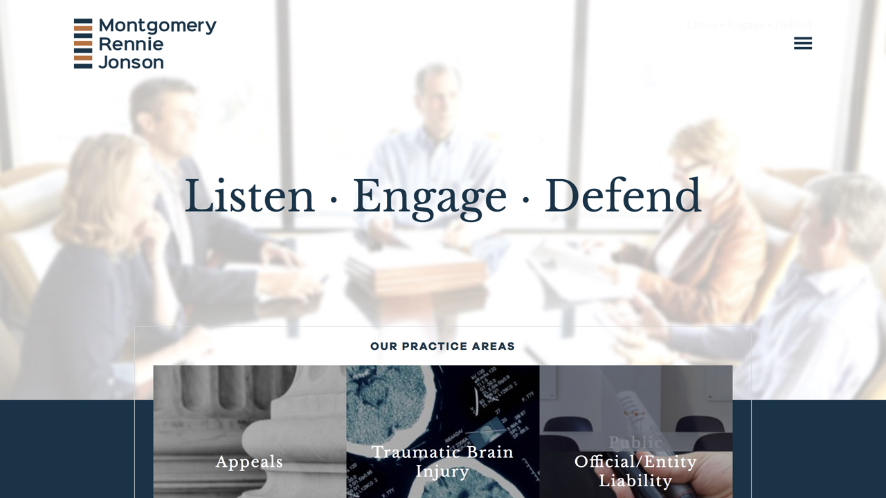
13. Montgomery Rennie & Jonson
One of our favorite law firm launches this year, Montgomery Rennie & Jonson came to use for a new site focused on their expertise. The site includes several modern features, such as an interactive facts map, a full-screen overlay navigation menu, and a large grid detailing their practice areas.
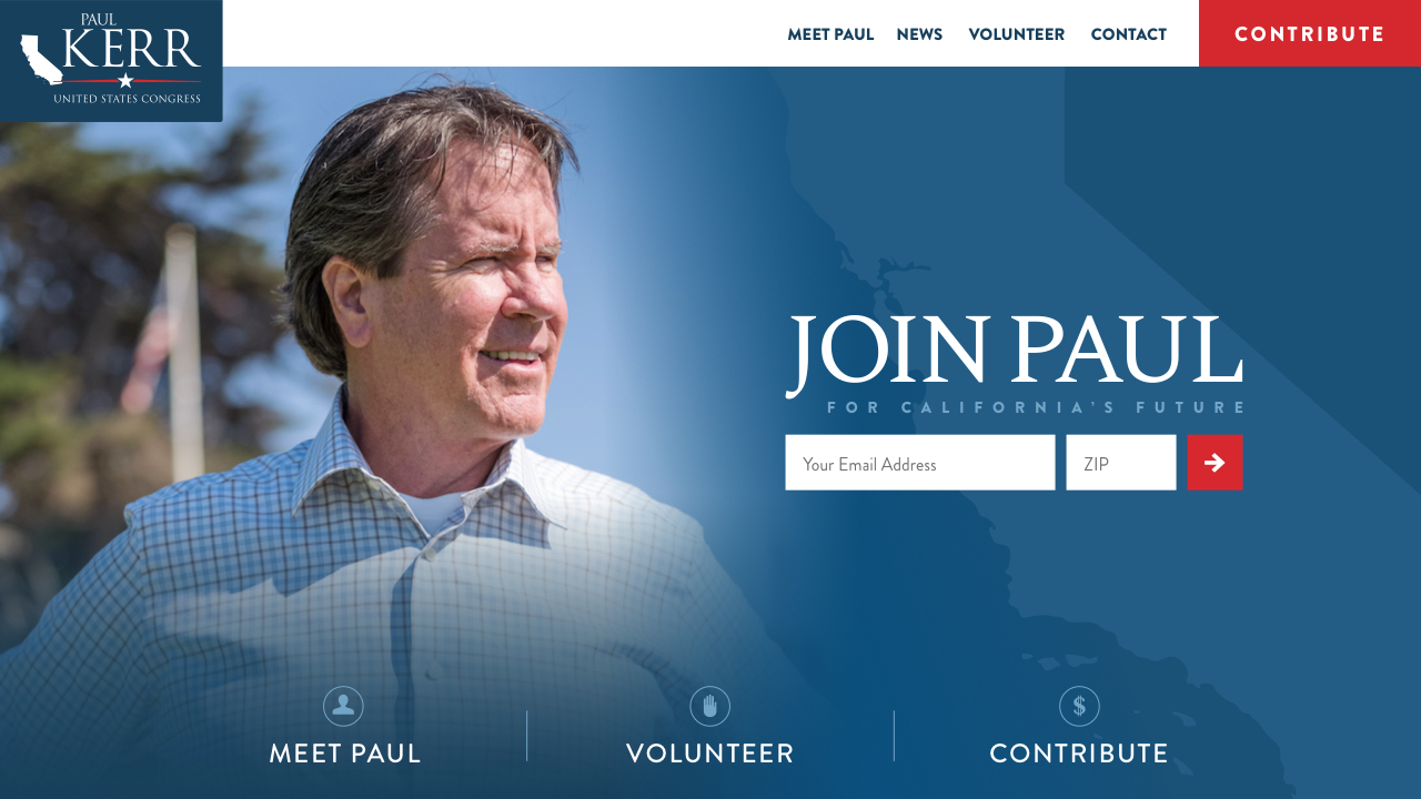
14. Paul Kerr for Congress
We always love creating campaign sites, so when Paul Kerr came to us in need of a new site, we were ready to design a site that would present his mission well. The main goal of the site is to push users to join his email list, donate, and volunteer, so we included multiple call-to-action buttons throughout the site.
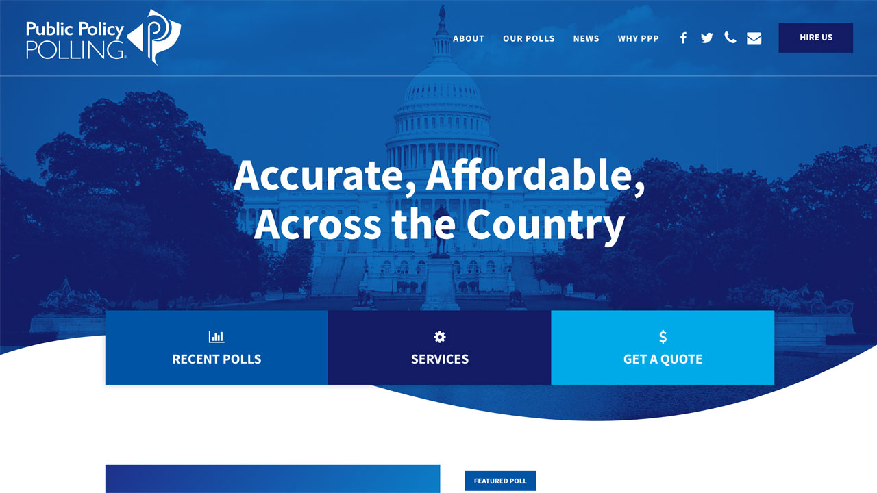
15. Public Policy Polling
Public Policy Polling is a local firm that conducts nationally recognized political polls. We had a lot of fun creating a modern, sleek site design for them. The site's most unique feature is it's poll and news listing pages, which links to research conducted by them and used in prominent publications, such as NPR, The New York Times, Newsweek, and more.
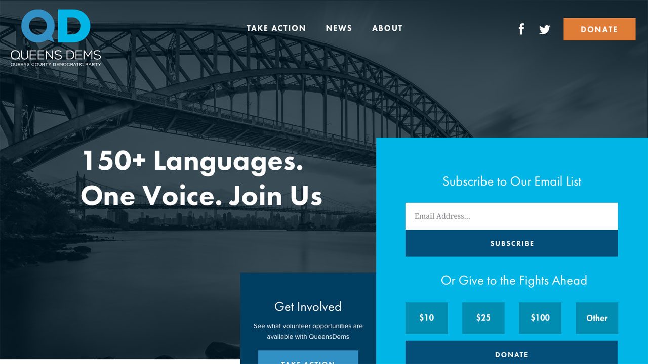
16. Queens Dems
We design and build a lot of campaign and political sites, but this has become one of our favorites to work on! Queens Dems is a democratic group based in Queens County, New York. The site features a truly unique tile grid layout, dark imagery, and action oriented interiors that make this site stand out from the rest.
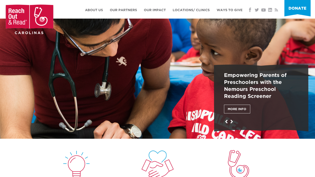
17. Reach Out and Read Carolinas
RORC provides books to healthcare clinics in order to educate parents about making reading an everyday activity for their child. They needed a site that was fun, engaging, and encourages parents and healthcare providers to get involved. The site features custom icons and fun colors throughout, and we love the animated Donate ribbon in the header.
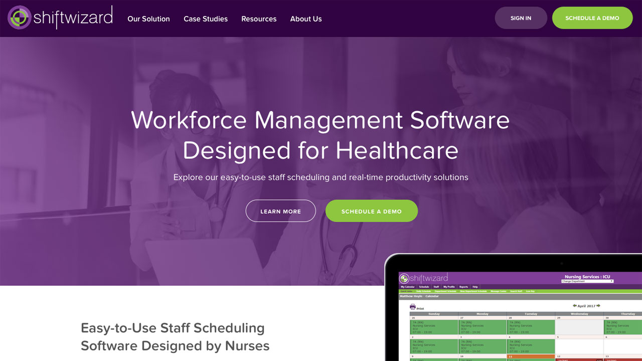
18. Shiftwizard
We love getting to work with startups as they provide the opportunity for unique and innovative designs - and ShiftWhizard was no exception! ShiftWizard is a scheduling software solution for healthcare professionals. The modern design features an ambient video, animated landing pages, and a robust listing for case studies and resources.
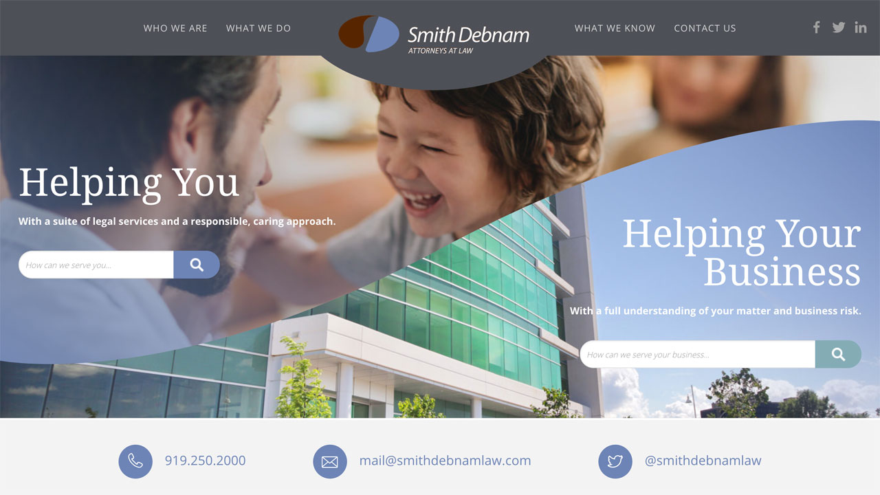
19. Smith Debnam Attorneys
Smith Debnam is a Raleigh-based firm with a wealth of expertise in both business and personal matters. We aimed to really reflect their brand in their new site design through a unique curved feature area and header, and light, calming colors, and large imagery. The site puts a large emphasis on how the firm can help their clients, through a practice area grid, individual practice area pages, and a wide resource section featuring insights, news, and events.
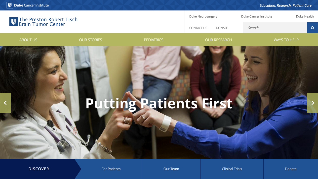
20. The Preston Robert Tisch Brain Tumor Center
The Preston Robert Tisch Brain Tumor Center approached us to redesign their content heavy site. Packed with information and a deep site tree, we created a clean design that include all of their research and information, but wasn't overwhelming to the user. The site features an informational homepage and custom interiors with inspirational quotes. We loved working for a research center that is doing so much good for their patients.
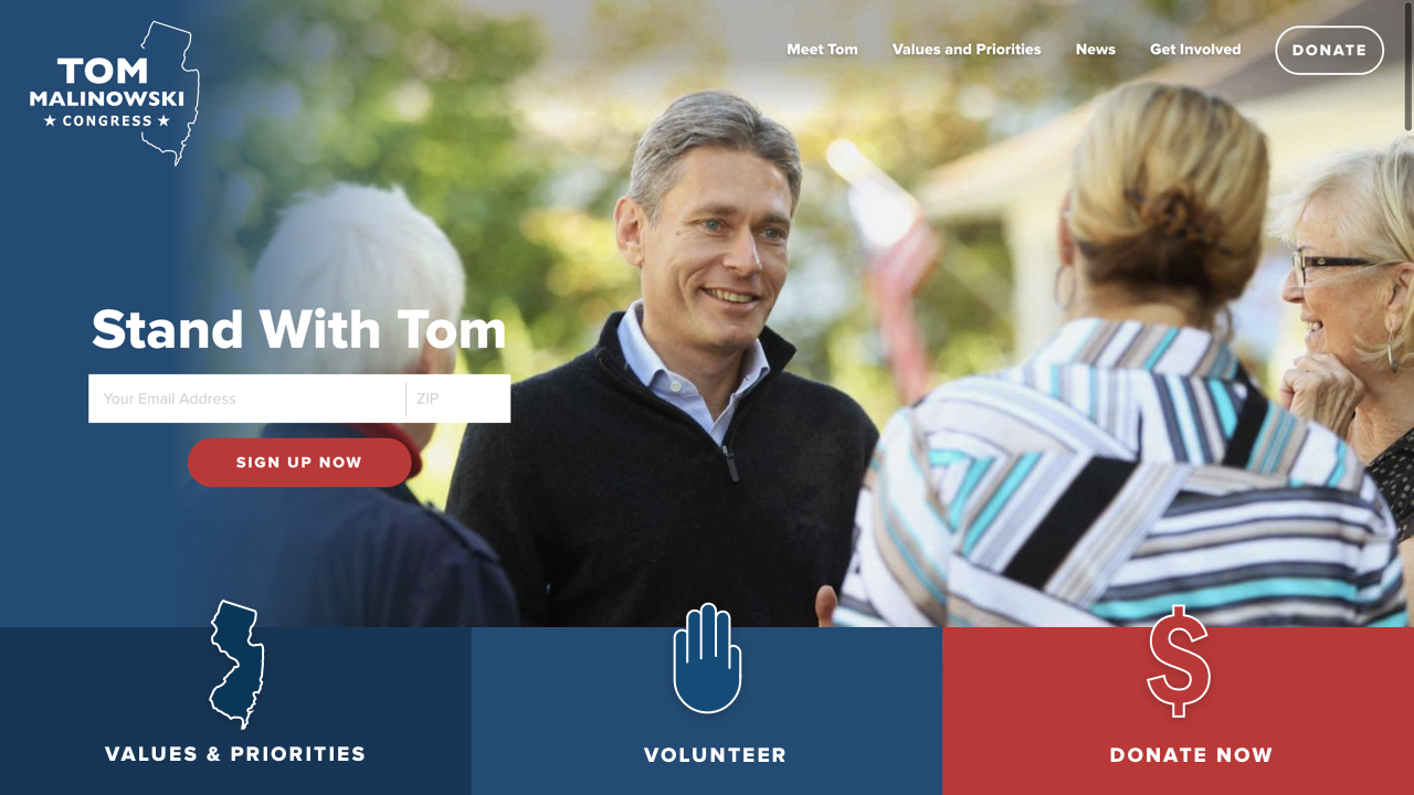
21. Tom Malowinski for Congress
Another campaign site, Tom Malinowski for Congress, features great imagery and eye catching call-to-action buttons front and center on the homepage. We brought a little something extra to the site by adding in fun interactions and loading effects on various elements like icons and the email sign-up form.
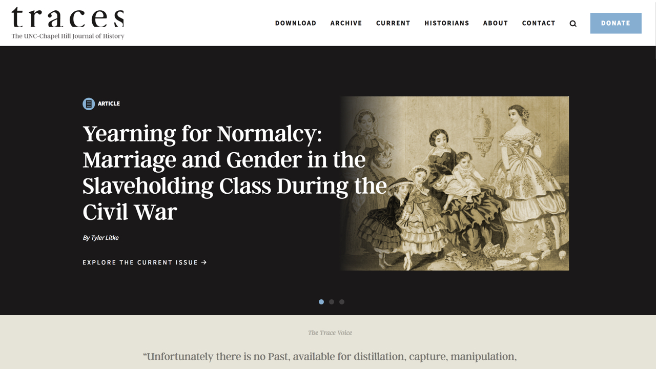
22. Traces
Traces came to us to design a online presence for the articles from The UNC-Chapel Hill Journal of History. We used a sepia tone in both the color scheme and photographs to give the site a historical aesthetic and unique look.
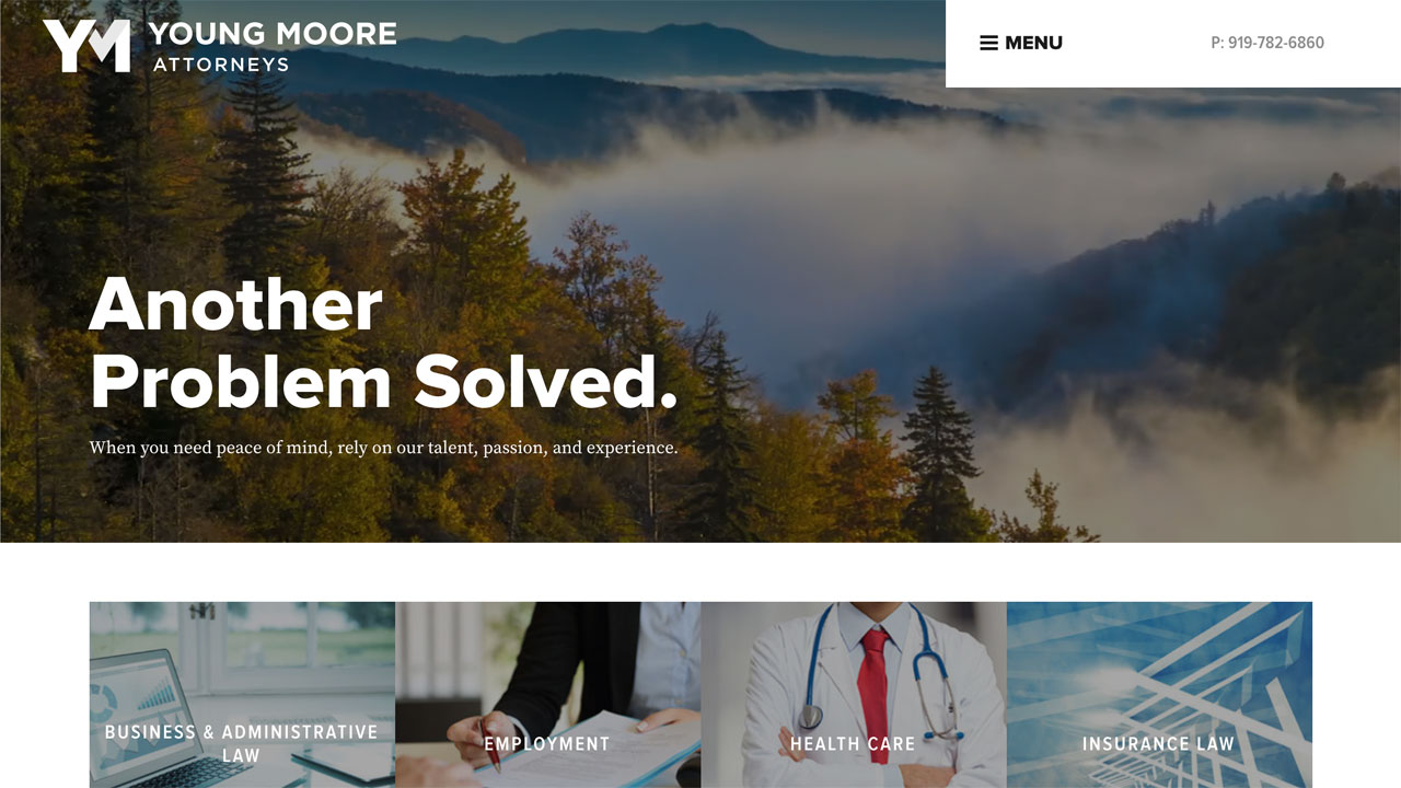
23. Young Moore
Young Moore is a Raleigh-based law firm that approached us to develop their brand identity. The rebrand included a name change, new tagline, logo and symbol, brand guidelines, and eventually a slick, modern website. The firm wanted to appeal more to potential clients than to other law firms, so the entire site is designed around the client. The site features such practice area verticals, client testimonials, and language revolving around how they can help - truly making them stand apart from other NC law firms.
24. Villlari Foods
We don’t often work in the food industry, so we were excited when Villari Foods reached out to us to redesign their website. Armed with great photography, we created an appetizing site to increase Villari pork sales and provide information about their products. The images, textures, and branding throughout the site made for one of our favorite designs of the year.

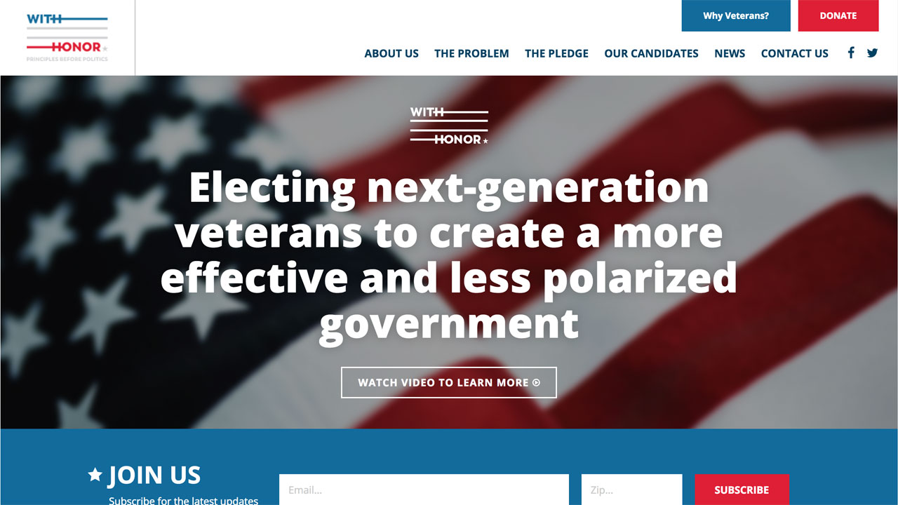
25. With Honor
With Honor is an organization aiming to get more veterans in Congress. They initially approached us to develop a design that that they weren't completely confident fit their brand. We ended up creating a complete redesign with a more modern, flat look that better highlights their calls to action and they couldn't have been more thrilled!
Related Posts
Spotlight 2016 Websites
Leave the first comment