
Examples of Content Heavy Editorial Website Designs
Updated 8/10/26 - This post was recently updated with new examples of content-heavy website design, expanded best practices for organizing large content libraries, and additional guidance on structuring websites for today's search engines and AI-powered search experiences.
Designing a beautiful website is never an easy task, but with large amounts of content, it becomes significantly more complicated. Magazines, consulting firms, nonprofit website designs, and other similar organizations tend to have large amounts of written content, making it more difficult to lay out the website in a manner that is both appealing and intuitive.
These organizations are tasked with organizing thousands and thousands of pages for a diverse target audience with users wanting content specific to them. It’s on the organization to enable the site to engage visitors and draw them in while creating an intuitive experience that doesn’t overwhelm them. This isn’t an easy task, but there are four main elements we find that can help a good bit when trying to make a content-heavy editorial website a straightforward and pleasant experience for the majority of visitors.
Tips for Designing Websites with A Lot of Content
Organize Content
In order to ensure a content-heavy site is not overwhelming for users, brands should consider their audience’s needs. Once these needs are understood, brands can separate the most relevant content into groups based on what they know their users will be searching for on the site. By bucketing the content into larger groups based on different target audience groups and/or actions the site becomes significantly easier to organize. Instead of having an excess of content laid out randomly, users only have a handful of topics to search through in order to find the information they’re seeking, and the topics become more relevant to each user.
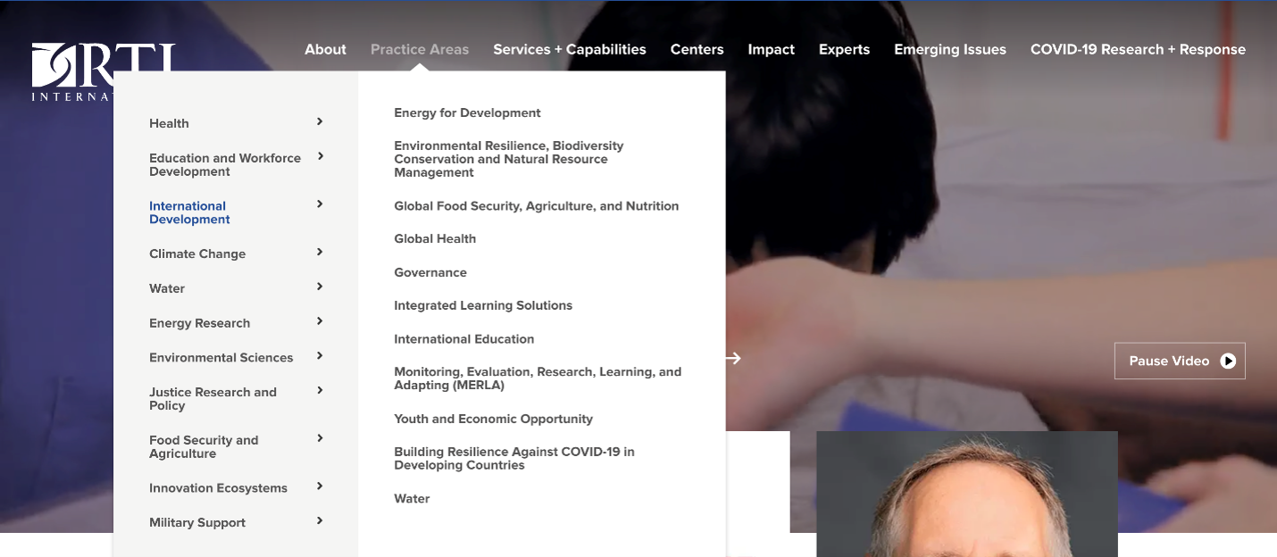
An example of this organization would be creating a grid of Focus Area topics, such as Climate Change and International Development, on a think tank or nonprofit site. Visitors would then have quick access upfront on the homepage to segment themselves based on their specific interests and enter a funnel of relevant content.
Mask Complexity from Users
A complicated site is more likely to push prospects away than draw them in. If a site isn’t straightforward or seems overly complicated, users are more likely to search elsewhere. With organized content, the page feels significantly less cluttered, and it will be easier for customers to locate where they need to go. Having too much text, competing elements, or an overwhelming amount of options can make a website feel more complex than it actually is and cause visitors to quickly bounce away. By organizing content like noted above, visitors can then more quickly get into “their world” and not be distracted by competing topics and content.
Provide Visitors Easy Wayfinding Mechanisms
Users will not spend much time on a site if they are unable to locate the topic they’re searching for. As we talked about previously, dividing your site into different buckets with similar information allows users to more easily locate the page they’re looking for. A lot of this organization and heavy lifting can be done through thoughtful main menu organization, as it provides an easy way to divide up content and give users a support system as they navigate the site. The navigation structure of the site, known as either a sitemap or information architecture, can quickly become a project on its own to work through a plan to prominently display the most important content and link different sections together. However, getting it right will pay dividends as it not only clearly tells visitors how to navigate, but can also accomplish some of the storytelling and narrative by highlighting the organization's priorities in the menu. We've detailed some tips on designing a sitemap strategy for optimal website organization.
Give Visitors Ways to Find (Not Just Browse) Your Content Stand Out With a Beautiful Design
Menus and wayfinding help visitors who are exploring, but on a truly complex website design with thousands of pages, many visitors arrive knowing roughly what they want. For them, the fastest path is search and filtering, and this is where a lot of content-heavy sites fall short.
A few features we build into nearly every content-heavy project:
- Site search that actually works. Not an afterthought in the corner, but a prominent, fast search with well-structured results. On sites with several content types (articles, resources, people, events), grouping results by type helps visitors orient instantly.
- Filters and facets on archive pages. A library of hundreds of recipes, publications, or resources becomes genuinely useful when visitors can stack filters (topic plus date plus format, for example) to narrow it down. Carolina Country's recipe library is a great example of filtering turning an archive into a tool.
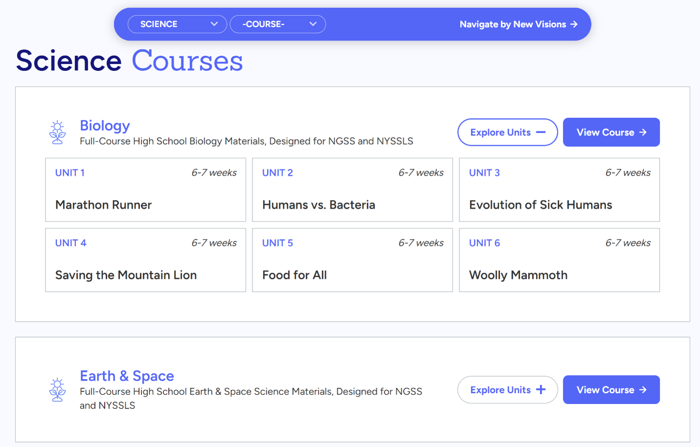
- Consistent content structure. Predictable page patterns, like New Visions' identically structured curriculum libraries, teach visitors how the site works. Once they've navigated one section, they can navigate them all.
Why it's important: every extra click or moment of confusion sheds visitors, and on a content-heavy site, those moments multiply fast. Findability features are how a large site stays a helpful resource instead of becoming an intimidating archive.
Structure Your Content for Search Engines (and Now AI)
Here's a shift we're watching closely: more and more of the questions people used to type into Google are now being answered directly by AI tools and AI-generated search summaries. And where does that AI-generated information come from? Deep, well-organized, authoritative content, which is exactly what content-heavy websites have in abundance.
That makes structure more valuable than ever. A clear heading hierarchy, descriptive page titles, thoughtful internal linking between related content, and well-organized archives all determine whether search engines and AI systems can understand your content and, crucially, whether they cite you as the source. Organizations that invest in structured, interconnected content are the ones being surfaced in this new landscape; sites that treat their archive as a dumping ground get skipped. We've written before about how focusing your content around your areas of expertise pays off, in our look at vertical content specialization, and that advice has only grown more important as AI reshapes how people find information.
The encouraging news for content-heavy organizations: you already have the raw material. The opportunity is making sure its structure works as hard as its substance.
While the organization of the site helps users navigate the site with ease, another aspect that is very important is a beautiful design. Even if your site is perfectly organized, without an appealing landing page, most people won’t bother to spend time on your site. There isn’t a one-size-fits-all option for this, as your site should reflect brand values and goals, and have a color scheme that matches your company. Also, with content-heavy sites, it’s essential to not forget about maintaining a visual hierarchy throughout by highlighting different sections with gradients, accent colors, images, etc. You want to give visitors clear visual direction on where to look and just not have everything dropped onto the page with no hierarchy or sense of design. Aesthetically pleasing websites are more appealing, and may even encourage longer times spent on your website.
Now that we’ve covered what makes a content-heavy website more appealing, we’re going to highlight 6 websites that do an excellent job of condensing complicated information into a visually appealing, well-organized website that effectively helps users navigate the site.
Content Rich Editorial Websites with Great Design
Carolina Country
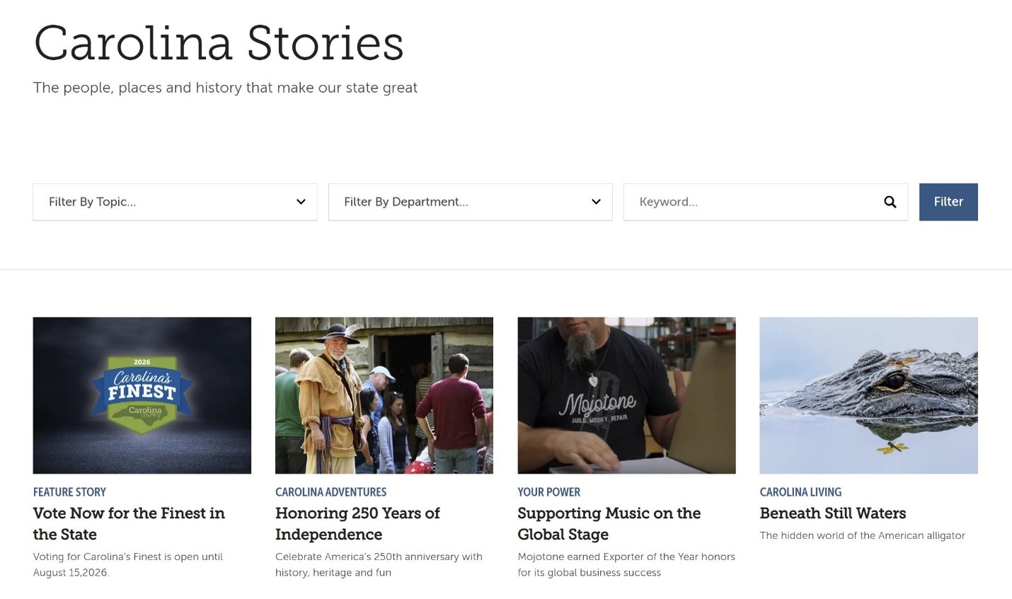
Carolina Country is the magazine of North Carolina's electric cooperatives, and its website carries thousands of past stories and recipes, a true test of content-heavy design. We had the privilege of rebuilding the site, and the organizing principle was to make an enormous archive feel browsable rather than bottomless. Content is grouped into clear topic hubs (stories, energy, food, travel, and gardens), and the mega-menu previews featured stories in each section so visitors always have a visual entry point instead of a wall of links. The recipe library deserves special mention: filterable browsing lets readers narrow thousands of recipes down to exactly what they're hungry for in a couple of clicks.
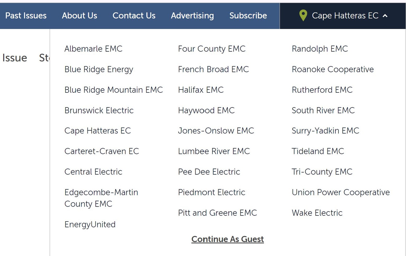
Our favorite touch is personalization, as readers can select their local electric co-op and see content tailored to their community. It's a great reminder that on a content-heavy site, helping each visitor find their content matters more than showing everyone everything.
RTI International
The RTI International website successfully organizes thousands of articles and information about the nonprofit research institute in a way that makes it straightforward for anyone to navigate. With decades of research, tens of thousands of experts, projects, publications, and news stories, the site manages an enormous amount of content while still making it easy for visitors to find the information most relevant to them. We've partnered with RTI on its website for years, continually evolving the platform to support its growing library of research and resources.
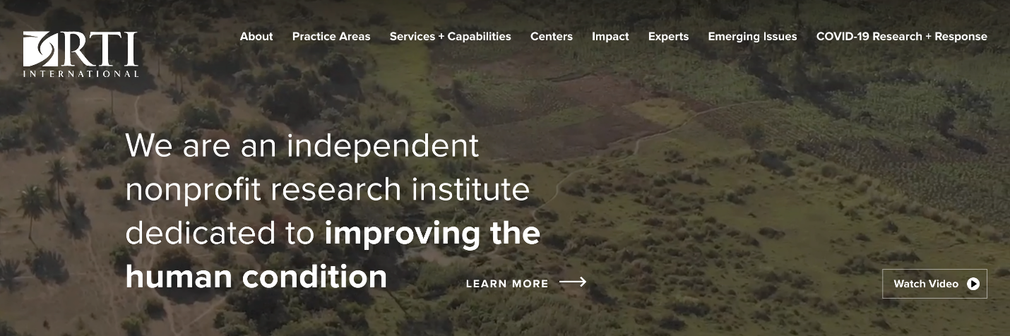
Despite the sheer volume of content, RTI simplifies the user experience through thoughtful navigation and clear content organization. Visitors can quickly locate the information they're looking for through the main navigation, while engaging visuals and featured content create an aesthetically pleasing experience that encourages deeper exploration.
New Visions for Public Schools
The New Visions for Public Schools nonprofit website design supports hundreds of NYC public schools, and its site has to organize some of the deepest content of any project we've worked on: complete, course-level curriculum libraries (Biology, Earth and Space, US History, and two Global History courses), each containing full units of instructional materials, alongside a suite of tools for educators. The design succeeds by treating structure as the star.
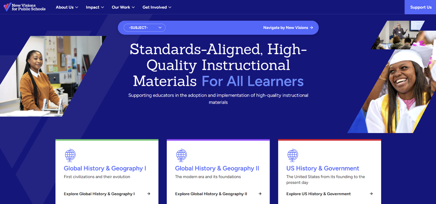
Every course follows a consistent, predictable architecture, so a teacher who has used one curriculum can immediately navigate another. Clear audience pathways route educators, school leaders, and supporters to different corners of the site, and a simple registration system gives teachers free access to downloadable materials while helping New Visions understand who's using them. When your content is this deep, consistency and predictability are what keep it from becoming overwhelming, and this site delivers both.
International Women’s Media Foundation
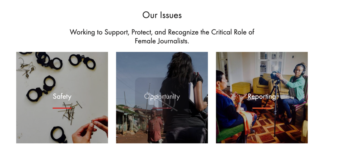
The International Women’s Media Foundation establishes its most relevant information from the start, with a homepage that features visual blocks linking to the programs, resources, and initiatives that best represent the organization. This allows new visitors to immediately discover the content IWMF wants to highlight, while a thoughtfully organized navigation with multiple levels of grouping makes it simple to explore the site's extensive collection of resources.
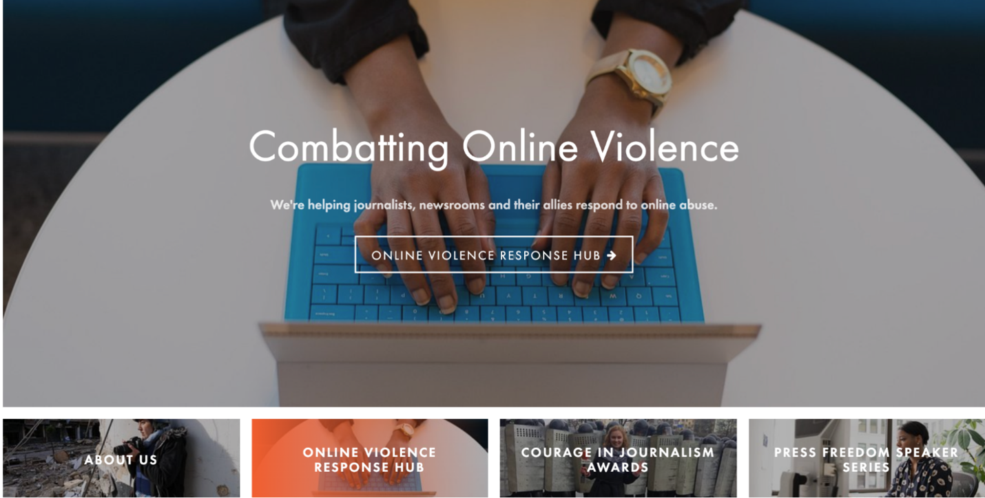
Along with presenting key information on the homepage, IWMF organizes its content in a visually engaging way. Strong photography helps tell the organization's story while guiding visitors toward deeper content about its mission, programs, and impact. The result is a website that balances a large amount of editorial content with an experience that feels welcoming and easy to navigate.
Bain & Company
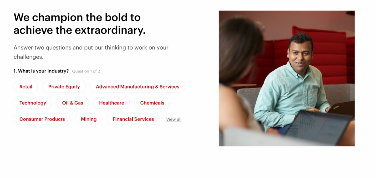
Bain & Company features interactive questionnaires on their homepage where clients can enter their industry, as well as the consulting services they’re seeking, and Bain can respond directly to that. This makes the site extremely user-friendly and encourages users to search for their specific needs, taking them right to the resources that can support their needs. On top of this questionnaire function, the menu is split up so users can search the specific function they’re seeking from the company.
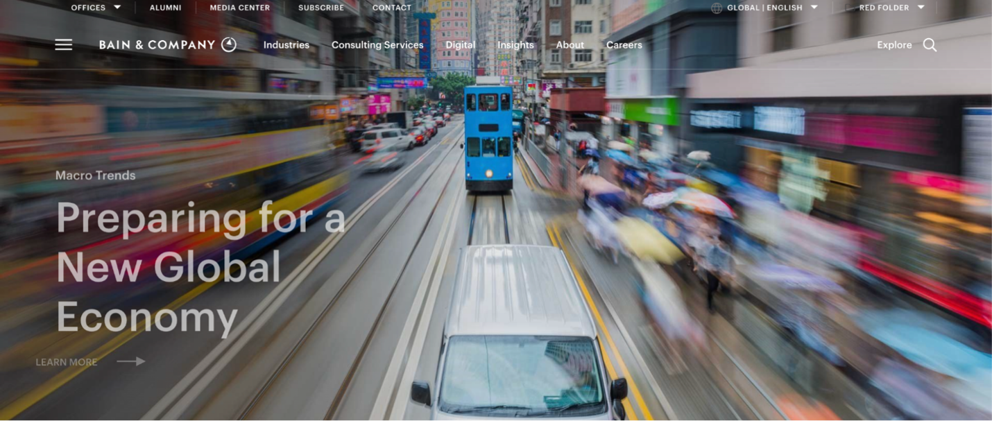
Beyond its organization, Bain does an excellent job of creating a visually engaging experience. Large imagery, featured reports, and consistent branding help break up long stretches of content while drawing attention to the firm's latest thinking. The result is a website that makes an extensive collection of articles and research feel approachable rather than overwhelming.
Conclusion
Designing a content-heavy website is a balancing act: organizing enormous archives, guiding many audiences, keeping the design beautiful, and now making sure your structure serves both human readers and the AI systems increasingly summarizing the web. The sites above prove it's very doable, and honestly, it's some of the most rewarding work we take on. If your organization is sitting on deep content and wondering how to turn it into a site visitors love, we'd be happy to chat about it. Get in touch and let's talk about your project.

Comments
Reece Burrows
FuturByte is a forward-thinking digital solutions company that specializes in building custom software for diverse industries. We have a strong understanding of technical intricacies and we dig deep to propel your company into the future.Godwin
Thank you for sharing this insightful article on designing content-heavy websites! The tips and examples provided are incredibly helpful for creating user-friendly and visually appealing sites. Great read!maarkgraf
Wow, these examples of content-heavy editorial website designs are truly impressive! Each website showcased here demonstrates a brilliant balance between informative content and stunning visuals. The attention to detail in organizing and presenting such vast amounts of information is commendable. It's inspiring to see how these designs not only enhance readability but also engage the audience through captivating typography, intuitive navigation, and immersive multimedia elements. These websites serve as a testament to the power of effective design in delivering rich editorial experiences. Kudos to the designers for their exceptional work!Leave a comment