
Best Practices and Examples of Annual Report Websites and Impact Report Microsites
Annual reports that outline, highlight, and justify the impact of nonprofit groups have been a staple of communication efforts for decades. With the rise of digital, many nonprofits have started pairing their printed report with a website, and many groups now primarily publish this information online. Working on a lot of nonprofit website designs, we’re often approached about creating microsites to publicize an organization’s impact and good work along with a general status update that summarizes the organization's year.
The web offers some unique opportunities with annual report and impact websites to highlight the organization's good work around the region, country, or world. What we often find is that these microsites are also an opportunity for an organization to stretch their creative legs and do something a bit different from their main site by choosing a theme and bringing it to life through some special interactions and effects. Since annual reports are timely, meant to exude excitement, and focused on people already familiar with the organization, we find there’s typically some latitude to push the design and concept farther than the organization’s main website.
While some organizations consider uploading their PDF and linking to Issuu as “bringing their annual report online,” we’ve seen a growing number of organizations embrace the opportunity to do something different, exciting, engaging, and accessible by dedicating resources to making the digital version a fully interactive microsite. We think it makes a difference, but we’re also a bit biased.
Below are a few examples of annual report and impact report microsites, both from our team and others, that highlight some of the best practices and strategies to embrace for your own annual report microsite.
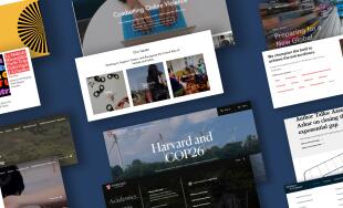
Pick a Theme
We find it especially helpful to choose distinct themes from the main site and express those visually and in text, helping provide focus and autonomy to the report. Identifying the theme upfront can help set the tone for the rest of the report and immediately enforce the lens through which visitors should be consuming the information and data. A lot happens in a year (especially if that year is 2020!), and an annual report microsite can immediately set the tone for what an organization wants to be the main takeaways.
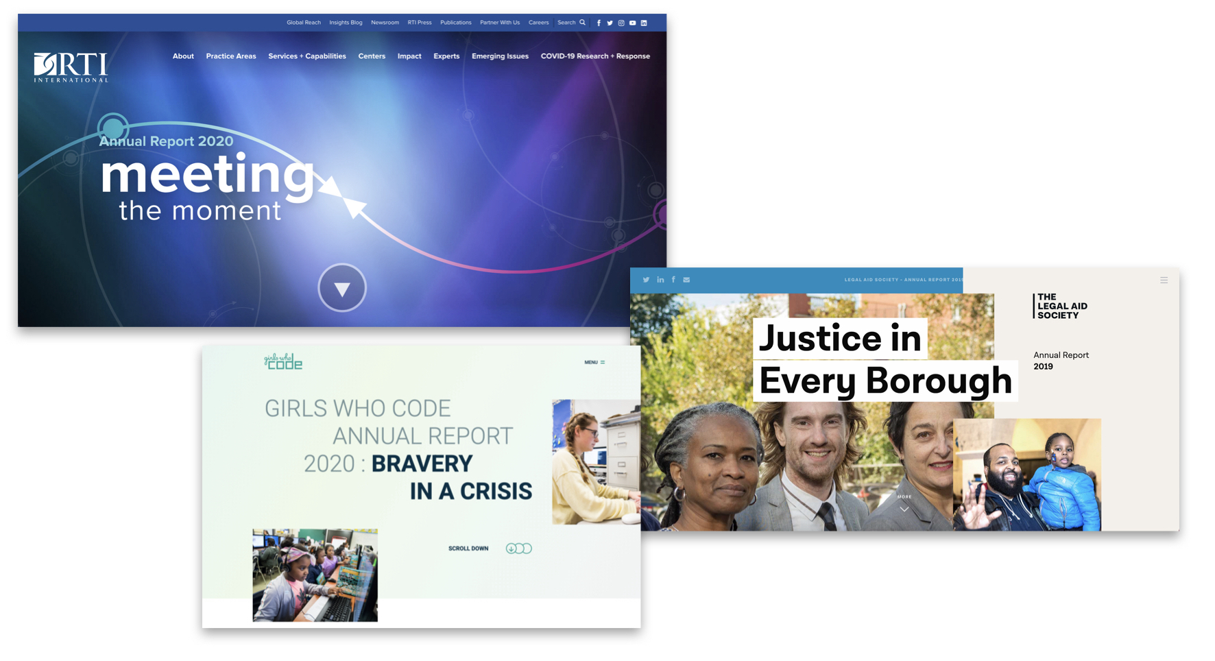
Looking below at the reports for the NYC Legal Aid Society, Girls Who Code Annual Report, and our 2020 RTI Annual Report, you’ll see each features the theme upfront in bold text to solidify the overarching theme of the report and the past year. The RTI report even goes a step further by involving the interactive graphic behind the text to show the two arrows literally meeting and even further drive home the theme.
Opportunity To Be Extra Creative
With diverse stakeholder groups looking at a site for different purposes and many different internal audiences wanting their information prioritized, even the most visually exciting nonprofit sites tended to get diluted a bit in order to appeal to the different groups and highlight a lot of different information for different audiences. This is not a bad thing, as it makes sure the sites to their job by engaging wide swaths of people and directing them to their relevant content. However, an annual report or impact microsite offers an exciting opportunity to turn the creativity to 11 and do something that pushes the boundaries a bit more.
These reports are often meant for an audience that’s already very familiar with the organization – their primary purpose is to excite and inspire visitors about the nonprofit and its impact. For these reasons, in addition to the fact that most reports have their own theme, the design be quite distinct from the main brand, focus on novel interactions to excite stakeholders without fear of overwhelming unfamiliar visitors, and leverage rich creative media to tell the story.
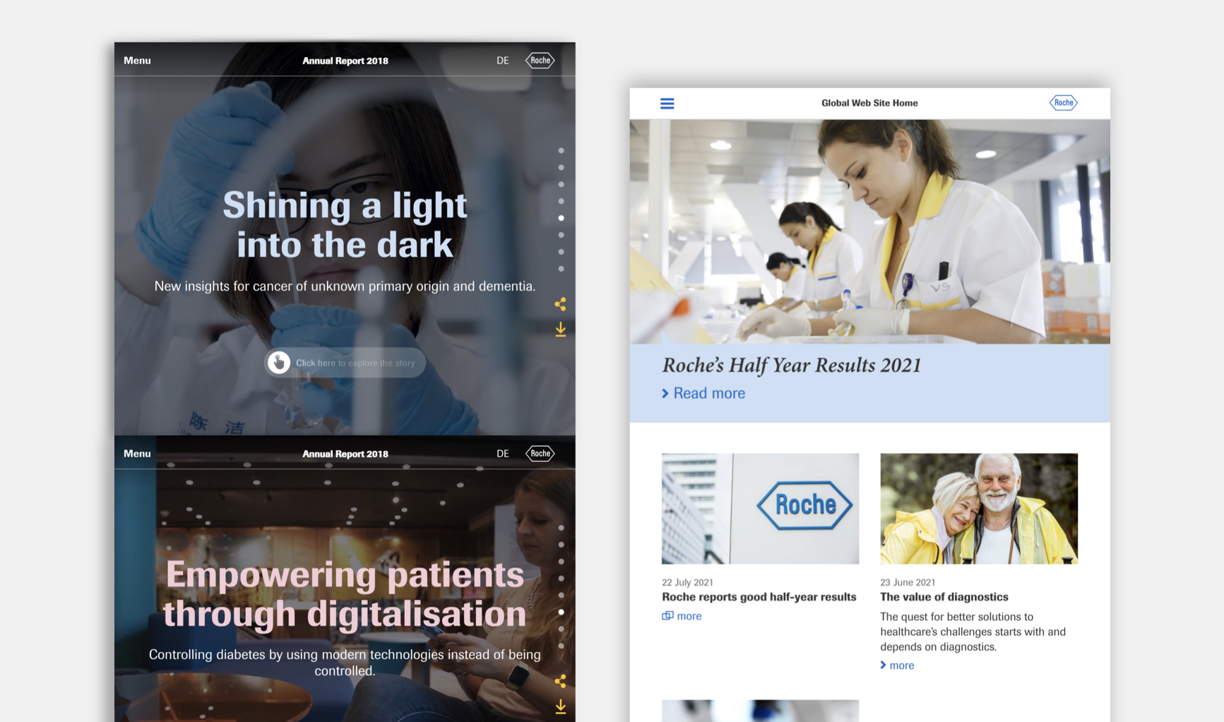
Roche’s annual report takes a great departure in the creative interactions and design from its more conservative homepage.
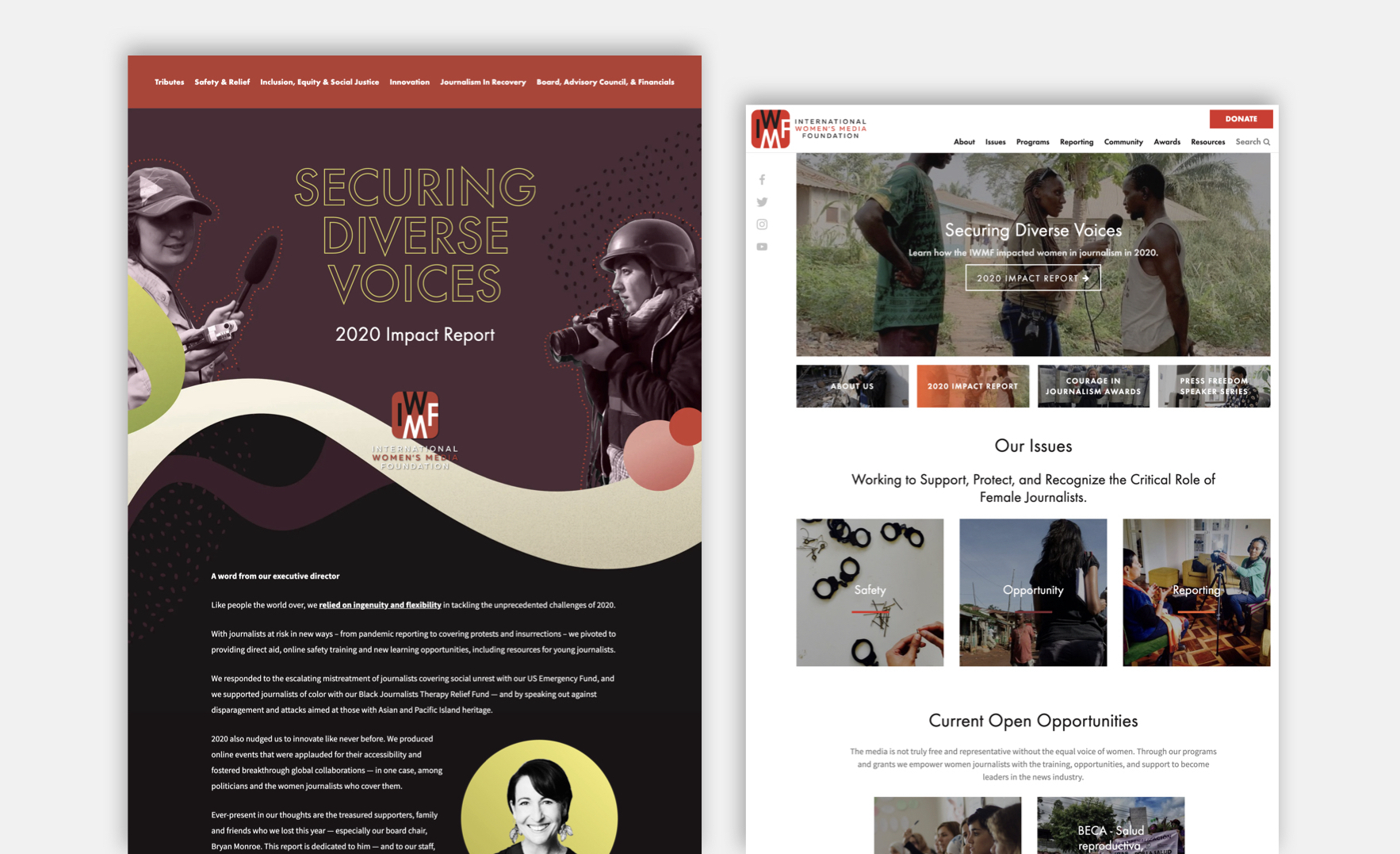
Compared to the main website, our IWMF Impact Report leverages brighter colors and integrates more custom illustration to help the report stand on its own and create its own identity.
Highlight Impact
Visitors to the annual report or impact report want to know what you’ve done, and they need hard data to justify future gifts and involvement. This creates an excellent opportunity to highlight data on the annual report.
There are different ways to do this – traditional graphs, infographics, pull out stats, and more. One thing we recommend is to follow the advice above and go a bit farther to make the data interactive. If it’s going to be a graph, pair it with a dynamic load-in effect. For icons and illustrations, try adding fun and subtle hover effects. Stats can count up as people scroll to them. The examples below do a good job of highlighting data and letting it stand out visually.
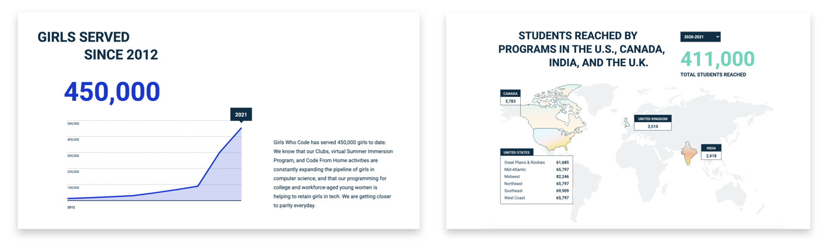
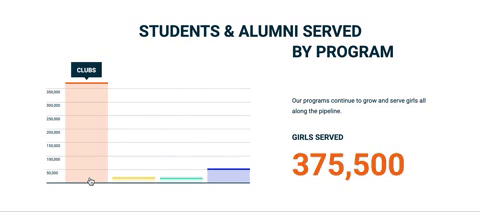
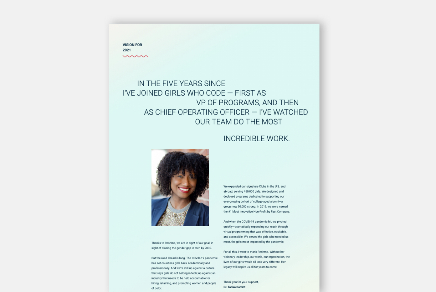
The Girls Who Code report does a great job of showing the data, and if you visit the site, you’ll see each element has its own special effect where it draws or builds when you interact with it to add excitement to the design and further call attention to the impact.
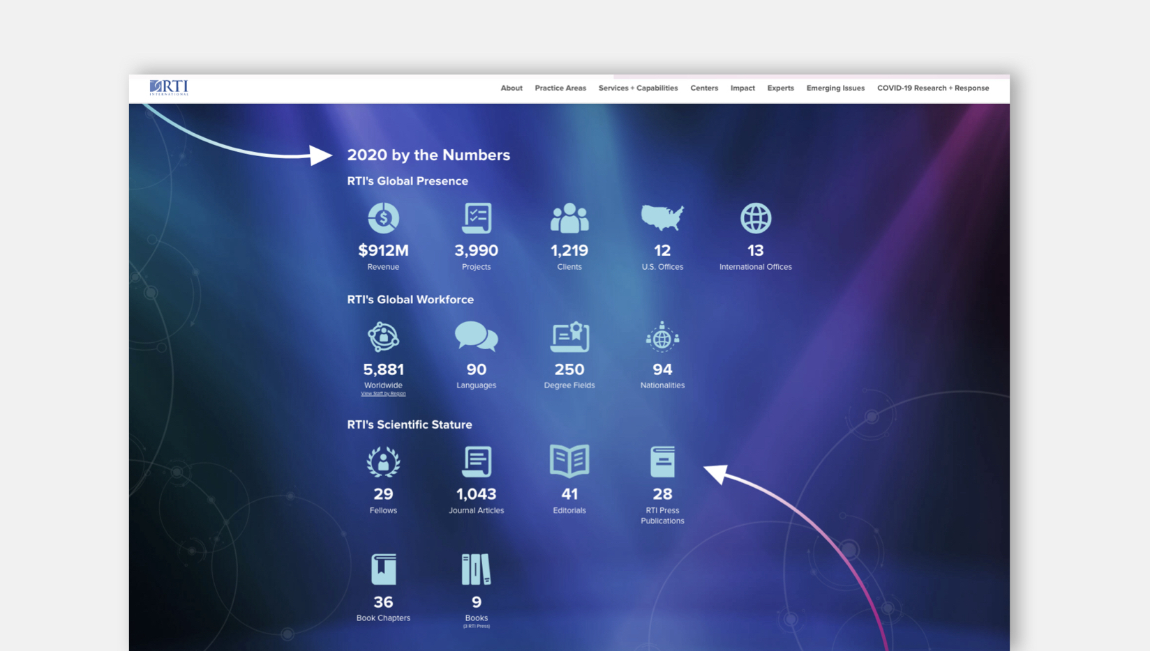
Our RTI 2020 annual report incorporates a full stat grid with iconography to highlight the organization’s impact across the world; the stats climb as you scroll to them and the arrows animate from off screen to continue the “meet the moment” theme.
Outline a Path Forward
While the annual report is ostensibly meant to promote the impact and progress of the past year, it's also an opportunity to point out that there's still work to be done. These reports always have a lot of engaged eyeballs on them, so they allow you to clearly spell out priorities for the coming year and also place calls to action for how others can help. Don't miss the chance to use the annual report as a springboard toward your next year's goals and fundraising efforts.
Conclusion
The annual report microsite is an excellent opportunity to present a refined and focused message in an extra-creative way to highlight your organization's impact and the path ahead. While not every organization has the time, money, and team to do something fully custom for their annual report, we've seen it as a good use of resources and a very functional transition from a one-time print exercise to an evergreen digital asset that can be referenced online forever.

Comments
Grayson Brown
The best annual report and impact microsites use clear layouts, engaging visuals, and easy navigation to tell a brand’s story. They highlight achievements with interactive features, clean typography, and mobile-friendly design. These websites focus on trust and transparency, helping businesses connect with stakeholders more effectively.Just like a well-crafted report, quality matters in fashion too. Brands that care about how they present information often reflect the same care in what they make. For example, those offering natural linen clothing dresses focus on clean design, comfort, and lasting quality—values that align with honest, thoughtful storytelling online.
เสื้อคอปก
เนื้อหานี้ดีเลยครับ เรื่องขอบคอของเสื้อโปโลมันน่าสนใจจริงๆ จนเจอบทความนี้ข้าถึงเห็นว่าปกเสื้อมันกำหนดสไตล์ได้มากมาย ถูกใจที่ผู้เขียนเล่าให้ชัดว่าเลือกปกยังไงถึงจะลงตัวกับเรา
rtser
Anchor Textevelyn jonas
In the evolving landscape of nonprofit communication, the synergy between traditional and digital mediums is crucial. Annual reports, once confined to print, now find a dynamic online presence. As we immerse ourselves in designing nonprofit websites, the narrative extends beyond impact to include the organization's journey. It's akin to assembling computer parts a seamless integration of elements, where microsites become the connectors, showcasing the impactful work of nonprofits while providing a comprehensive status update. This digital transformation amplifies their reach and influence, much like the interconnected components of a well-designed system.Ava paul
In the evolving landscape of nonprofit communication, the synergy between traditional and digital mediums is crucial. Annual reports, once confined to print, now find a dynamic online presence. As we immerse ourselves in designing nonprofit websites, the narrative extends beyond impact to include the organization's journey. It's akin to assembling computer parts a seamless integration of elements, where microsites become the connectors, showcasing the impactful work of nonprofits while providing a comprehensive status update. This digital transformation amplifies their reach and influence, much like the interconnected components of a well-designed system.evelyn jonas
Absolutely, annual report websites and impact report microsites are powerful tools for transparent communication. Much like a well-optimized website showcasing the best practices in design and content, businesses in the computer parts industry can leverage these platforms to highlight their achievements, innovations, and sustainability initiatives. Integrating engaging visuals and interactive features can provide stakeholders with a comprehensive understanding of the company's performance and commitment to excellence in the dynamic realm of PC parts.IT INNOVATION INC
Writing a blog must take up a lot of your time. This is my first time writing a blog, but it seems like it would be relatively easy to maintain one. jl253a Thanks for sharing all of this valuable information with us.Leave a comment