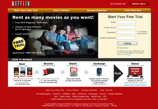
Example of a Great Landing Page Design: Netflix.com
A landing page is an important component of your online marketing campaign strategy. They are the pages that your online ads and some SEO terms will drive visitors to.
The number one goal of a landing page is to convert a prospect by having them register information with your site. That information could be for a free whitepaper, an online newsletter, free demo, or another call to action.
Many online products company have their homepage function as a landing page. These companies succeed by having people signup for their products/services and pay monthly subscriptions.
I recently came across one of the best landing pages I've seen at Netflix.com. Netflix business model relies on converting visitors into subscribers that will pay them a monthly fee, and their landing page is optimized to do just do that.
Here are five quick takeaways from the Netflix.com that you can use on your own landing page, whether it's your site's homepage or an interior page that people are driven to via ads.
- New visitors are critical. Your landing page's goal is to sell new visitors on your company, not to help current customers use the service. The Member Sign In is a tertiary concern on the Netflix page, after the trial signup and how it works graphic.
- Offer something in exchange for the signup. Netflix achieves this point by offering a free trial, it's a lot easier for someone to turn their information over to you when they're getting something in exchange. Other popular offers in exchange for signups are whitepapers, podcasts, and free consultations.
- Optimize for small monitor resolutions. Make your information and call to action available to as many people as possible, this means optimizing for even laptops. By not forcing even the smallest screens to have to scroll, Netflix is minimizing the necessary effort to learn about and sign up for their service.
- Keep the main navigation simple. Don't overwhelm visitors with menu options that encourage them to leave the landing page and registration form.
- Less is more. Minimize the amount of text on the page. Make it easy for visitors to quickly get an understanding of your product or service and the offer you're making to them. Netflix does this by using graphics and very little text, making it easy for new visitors to quickly understand the service.
The overarching theme of the landing page is to make the page simple yet enticing. Woo the visitor with graphics and powerful offers, but don't overwhelm them with information and complicated processes. What are some other good landing pages out there? Any good stories about signing up on a landing page because it was just that enticing?
_______
Learn more about building landing pages from this post on Better Web.


Comments
Josh Ledgard
Love the advice of offering free advice to people that signup. I've had this work on me before and it's something we're considering offering for http://www.kickofflabs.com as encouragement to get people to sign up.BTW - If people want simple signup landing pages a service like ours could be perfect for people.
Leave a comment