
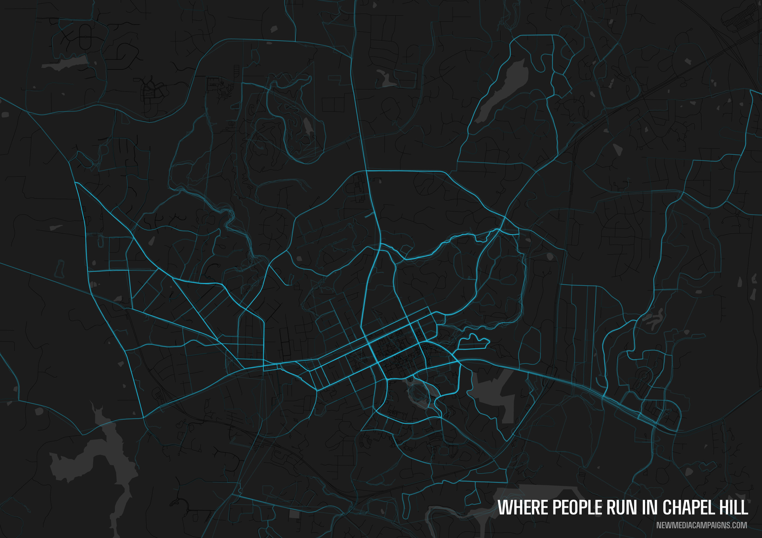
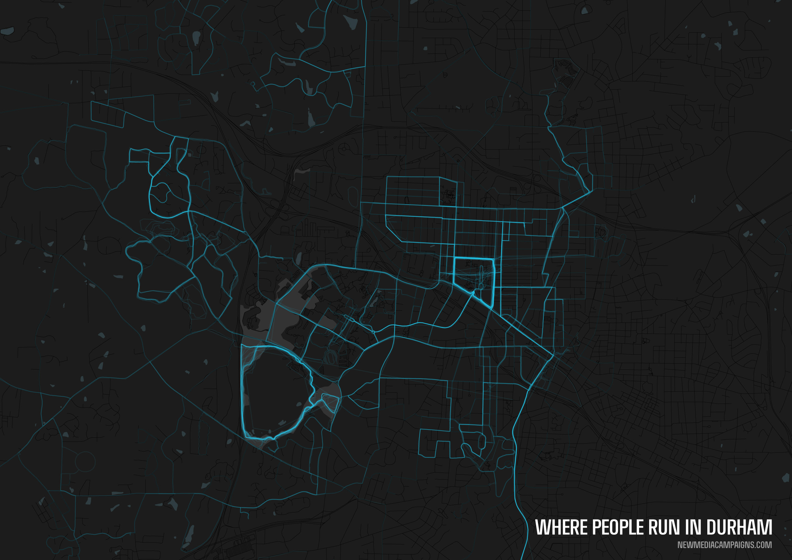
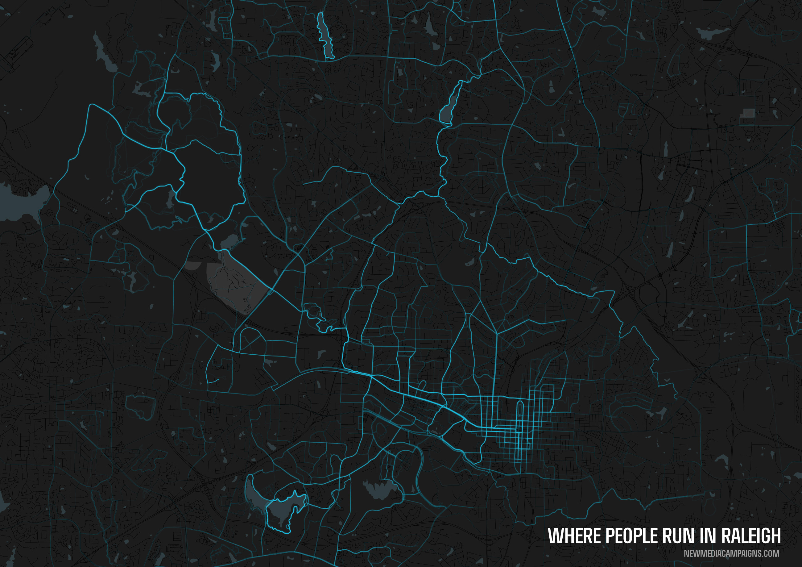
Visualizing where people run in Chapel Hill, Durham, and Raleigh
Late last week a post popped up on one of my favorite spots on the web, /r/dataisbeautiful, that showed the popular routes for runners in various major cities across the world. With many members of the NMC team being avid runners, I thought it would be fascinating to see similar visualizations for Chapel Hill, Durham, and Raleigh, the cities that we live – and run – in.
Using publicly shared runs on RunKeeper, I was able to collect a few thousand running routes people had followed during the last few years in the Triangle. The dataset was gathered and formatted with Ruby, the visualizations were created with QGIS and Adobe Illustrator, and GIS map information is from OpenStreetMap.
Below are the visualizations for where people run in Raleigh, Durham, and Chapel Hill. Click each below to see the un-cropped, high-resolution version. Individual runs were overlaid with a transparency of 95%, so the stronger a route is on the map, the more it's been traveled.
Interactive maps for Chapel Hill, Raleigh, and Durham can be viewed on Github.


Leave the first comment