You know the feeling: staring at an empty screen, hoping design inspiration will strike you like a lightning bolt from a clear blue sky. Fortunately, there’s an easy way to kickstart the right side of your brain: focus on your type! After all, web design is 95% typography. Do away with your templates, palettes, shortcuts, and frameworks and just ask yourself: am I communicating my message well? Do I show respect for my reader by making it easy and enjoyable to find what she’s seeking?
Everybody gets stuck and these are my go-to sources for typography and font pairing inspiration. Or maybe you’re just getting started and need to refresh the typographic basics? Either way, starting with the design of the words means you’ll also have to consider what they say, and that always means a better product.
Examples of Font Pairing & Combining Fonts
Let's be honest: pairing fonts is hard. Here are some examples of pairs that work really well together for inspiration.
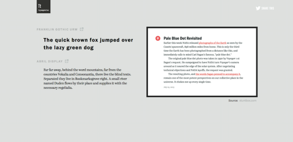
1. Typewolf
Description: Web Fonts in the Wild & Font Recommendations
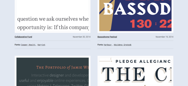
Typewolf features a lovely gallery of web screen shots cropped to highlight unusual or visually interesting pairings. The home page features a handful of recent entries ("Sites of the Day"). It also includes blog articles on the topics and some useful all-time lists, including Top 10 Humanist Sans-Serif Fonts, Top 10 Helvetica Alternatives, Top 10 Favorite Fonts That Are Underused, and quirky collections like Top 10 1970s Album Cover Fonts.
2. Typ.io
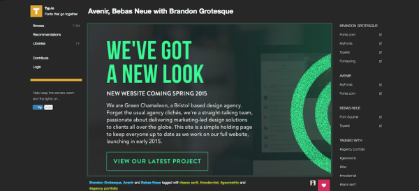
Description: We're revealing designers' decisions for all to see; peeking under the hood of beautiful websites to find out what fonts they're using and how they're using them.
Similar to Typewolf, Typ.io features examples of excellent or interesting font pairings. Usually this means pairs of headlines and body copy, but sometimes include examples of 3 fonts used together well.
3. Just My Type
Description: A collection of font pairings from Typekit and H&FJ
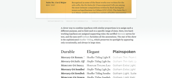
With hundreds of options from excellent services like Typekit and Cloud Typography from Hoefler & Co., it can be overwhelming to parse through them all to choose for your next project. Dropbox Designer Daniel Eden has collected some of his favorites in a site called Just My Type that features 3 categories: font pairings from Hoefler & Co. (formerly H&FJ), pairings from Typekit, and Typekit "Twins", or fonts that have both a serif and sans serif version that go well together.
4. Beautiful Web Type
Description: A showcase of the best typefaces from the Google web fonts directory
Can't afford Typekit or Cloud Typography? Google's web fonts directly is free to all and there are some lovely, professional typefaces among the rabble. Beautiful Web Type collects and provides spectacular examples in use of some of the best Google's directory has to offer, including some of my absolute favorites such as Abril, Open Sans, Volkhorn, Merriweather, Lato, and Playfair.
5. Type Genius
Description: Find the perfect font combo for your next project
You can browse through examples as in the previous 4 links or you can let a computer do it for you! Type Genius allows you to select a pro font from a dropdown and then returns matches that use it. The results page returns several examples; click the pager to see the other matches as a slideshow. (This was totally non-obvious to me.) It's similar to #2 above (Typ.io), in which clicking the font name to see all entries with the same tag returns other paired examples.
6. Fonts in Use
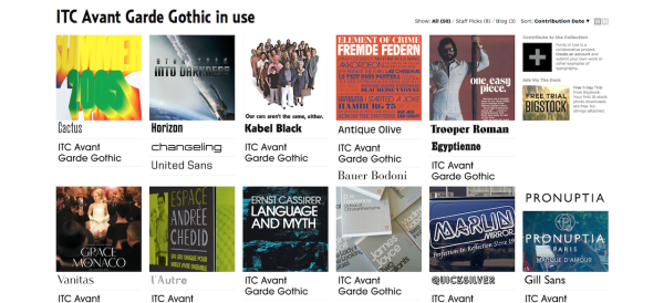
Description: An independent archive of typography
One of the oldest galleries (and by far the most comprehensive in this list), Fonts in Use shows exactly that. In the main "Collection" section, you can browse by Industries ("Activism", "Institutional", "Politics"), Formats ("Advertising", "Newspapers", "Packaging"), or the typefaces' names themselves. Fonts in Use extends well beyond just use on the web, which most of the previous examples focused on and instead includes a broad historical range across a variety of medium. Anyone can contribute, but The Staff Picks collection includes some of the most outstanding examples. For commentary, context, and reviews of modern use (such as the opening title sequence to Snowpiercer), visit the Blog.
Resources to Learn Typography
Typography means an awful lot more than simply "picking fonts": your reader is actively looking for reasons to stop reading, and it's your job as a designer to consider the gift of their finite attention to make your point. Here are some of the web's best resources for teaching yourself the basics of typography and layout.
7. Butterick’s Practical Typography
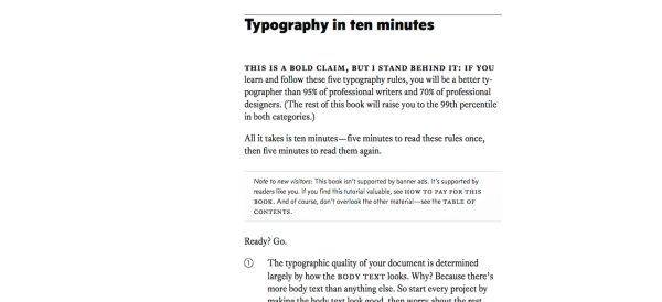
New to typography? Or maybe a bit rusty? Matthew Butterick's pithy, valuable guide offers practically everything you need to know in 10 minutes to be "a better typographer than 95% of professional writers and 70% of professional designers". Read the rest of the informative & highly detailed book for a near-complete typographic education.
8.Typekit
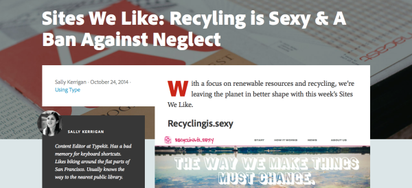
Typekit isn't just a web font delivery service, it's also a rich collection of resources for learning to use them well. The Typekit blog features valuable tutorials about best practices for using fonts, such as Setting Type for User Interfaces and Pairing Typefaces. There's also a weekly series called "Sites We Like" that highlights web sites that use Typekit fonts in exceptional ways (and which we're pleased to note featured one of our nonprofit web designs). Beyond the blog, Typekit created a separate mini-site called "Typekit Practice" which includes a growing number of lessons on typographic practice, such as Selecting Typefaces for Body Text.
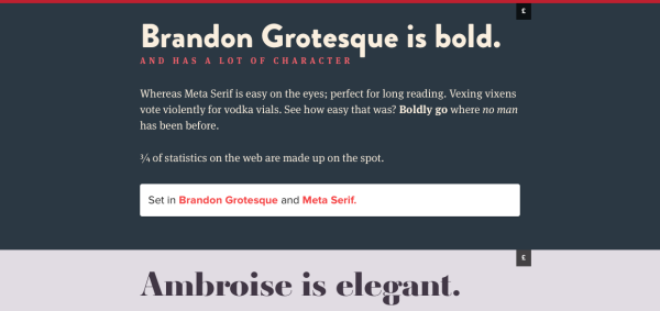
9. Techniques for Combining Fonts
It's one thing to browse awesome collections of font pairings, but how do pro designers arrive at their decisions? What are some of the thought processes involved in making the selections they do? Hoefler & Co. produced a timeless (and very short) guide for mixing font families. From their introduction:
Building a palette is an intuitive process, and expanding a typographic duet to three, four, or even five voices can be daunting. Our approach for mixing font families is to keep one quality consistent, and let the others vary.
H&Co. describe font pairings as "palettes" the way other designers refer to combinations of colors. Naturally, they feature their own commercial fonts as examples (which are for sale! and the best in the world) but the best sales approaches always involve education. Learn how to create typographic palettes with "Wit", "Energy", "Poise", and "Dignity". Also, don't miss their newly-created feature "Discover Typography": a spectacular, interactive tool for using type based on common design themes such as Weddings, Travel, and Restaurant Menus.
10. Know Your Type
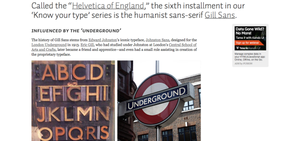
If you've ever seen an Apple ad, you'll recognize Myriad. If you've ever traveled on the London Underground, you've seen Gill. And if you've ever read the New York Times, then you're familiar with Cheltenham. You may have even used these in your designs but how much do you know about them? Like a song, every typeface has a story and tells a story, rooted in a historical moment, designed by a real person for a specific purpose to evoke a particular mood. IDSGN's terrific Know Your Type series examines each of these famous typefaces and provides in short profiles a bit of this background, such as who designed them and their changing influence and perceptions over time. Trivia perfect for impressing your type nerd friends at parties!
For example, did you know that Gotham -- most famous as Obama's presidential campaign font and used for headlines on this very site -- was originally commissioned exclusively for GQ magazine and was inspired by NY City's Port Authority Bus Terminal's postwar exterior signage? It's a font we can believe in.
11. Fontology
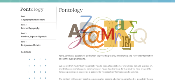
Fonts.com sells fonts from dozens of the world's best foundries, but they also want you to know how to use your purchase! No doubt this is why they've compiled an excellent four-part course on learning typography called Fontology. It covers a bit of history, type anatomy, the difference between text and display (headlines), web typography considerations, using symbols and ligatures, as well as the distinction between legibility and readability, among other things. The lessons are split into chapters that split again into modules, so they're easy to browse for whatever you're interested in and don't require investing a lot of time. Together with Butterick's guide from #7, it's a free professional education in typography.
Everything You Ever Wanted to Know about Typography (But Were Afraid to Ask)
So there you have it: the web's best resources for design inspiration and learning about type. Whether print or web design, the practice of great typography is about much more than just choosing different fonts: it's about decisions we make to serve the reader well by communicating worthwhile ideas with clarity and vigor (which, really, is as good as any a definition of graphic design). Naturally, it all starts with words.
I wrote this post partly because all these links were scattered around my bookmarks and I wanted to collect them all in one place to refer to later but also partly because I was inspired by our very own Ashley's recent presentation on web typography for our local AIGA chapter's Web101 series. It seemed to me there's plenty of interest in becoming a better designer by learning to use type better but knowing where to get started can be tough.


Comments
Alex R.
Hi Douglas, thanks for the great recap. I would recommend Type We Like http://typewelike.wirsindsmyk.de/, which is a great recommendations of choosing fonts pair.Jimmy Potter
Found your blog. This is a very good blog on best fonts. I would like to thank you for all the information you give. Its really important to choose the best designer fonts for the graphic design and much more. Thanks for sharing this.Daniel
Thanks for this awesome post!F Michael Hemmer
Excellent resource. Thank you for putting this together.Nathan
Thanks @Douglas! That's a terrific resource.Douglas
Nice collection - I'll add a few to my list: http://bonfx.com/14-top-typeface-and-font-combinations-resources/. Very helpful. You might also take a look at http://bonfx.com/the-big-book-of-font-combinations/ which is more focused on print. We have 2 more coming out shortly focused on Google and other free fonts, with over 1000 examples combined.Leave a comment