4/25/19 Update: We recently wrote a post on how to more easily include animation in your own designs with a guide on how to animate icons with CSS.
Of the trends I identified in our recent post on what to expect for the web in 2015, animation is among the most important. But the purpose of the post was a high-level overview of what’s next in web design — more about the what than the why — and this topic deserves a little more attention.
Animating elements of an interface serves both a functional and aesthetic purpose: when applied thoughtfully, it can increase a user’s delight and make an interface easier to use by providing context. When I tap a menu item and the screen “slides” to the left, for example, my expectation is that by hitting “back” I’ll slide in the opposite direction. That context helps me figure out how to get around the the screen reliably and, when an interface meets my expectations, I feel more confident using it.
Nearly all NMC projects use animation for both small aesthetic flourishes, such as the fading-in buttons on our Pacify web project, as well as larger scale interactions, such as the Tryon Palace tour map. We’ve long championed JavaScript over Flash which, though originally a decision made simply as a matter of resources (both human and computational), has served us well now in the age of mobile devices that don’t run Flash.
Beyond the rise of smartphones and tablets, the online tools for prototyping interactive animation such as Marvel, InVision, Framer, Pixate — as well as traditional desktop apps like Origami / Quartz Composer, After Effects, Form, and even Apple’s Keynote — have become so sophisticated that even casual users can learn them. This means that developing working animation demos is easier than ever and simplifies the process of implementing them in our user interfaces. Below are some examples of websites using animation not just for a logo’s whimsical hover state but more and more as a central storytelling part of the sales process.
A Few Recent Examples
Websites we’ve been watching recently use animation in two ways: as subtle, non-essential aesthetic flourishes or as direct, essential animations for describing the features of a product or service. First, some flourishes:
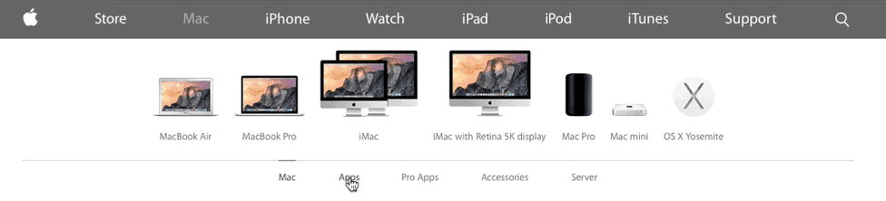
Apple.com
Apple.com’s navigation is the essence of whimsy: click one of the options in the menu and watch tiny versions of the products slide in at different rates.
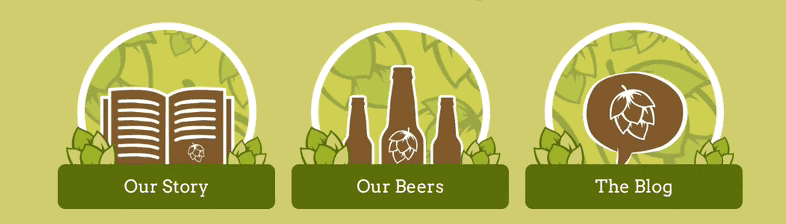
The Hop Yard
A recent NMC project for Raleigh beer study The Hop Yard features a little surprise when you mouse over the central hop icons.
Humaan

Design services firm Humaan plays a little with the standard convention that clicking a logo will take the visitor “home” by making it explicit.
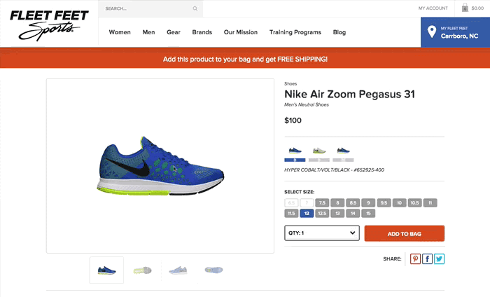
Fleet Feet Sports
For Fleet Feet Sports, a national athletic gear retail chain, try adding a product to the cart and watch what happens. (Full disclosure: recent NMC project!) My favorite part is how the bag itself "bounces" as though the shoe landed inside. Besides looking cool, the animation serves an important purpose in providing feedback to the user that clicking the "Add to Bag" button had its intended effect.
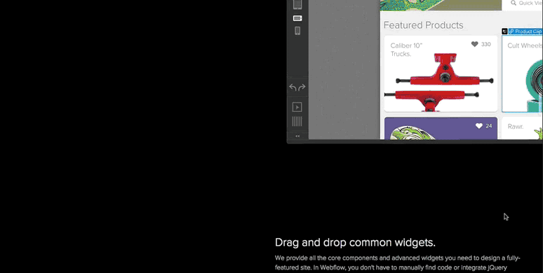
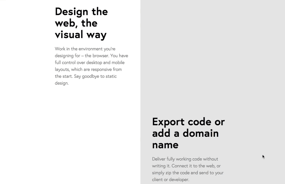
Webflow
Scroll down the marketing home page of Webflow, a lovely drag-and-drop website building app, and you’ll see screen shots zoom and fade in. This also has the additional benefit of making the page load faster: when the images are lazy-loaded, the web server doesn't fetch them until they scroll into view. (Be sure also to check out their superb ”interactions without code” page for concrete examples of how you can use animations yourself.)
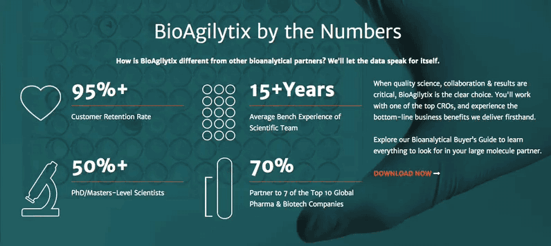
Bioagilytix
For another recent web project of ours, biochemical lab services firm Bioagilytix, NMC employed some subtle animations to bring life to the central “by the numbers” graphics.
Animations That Sell
Beyond subtle, non-essential animations are some examples of animations at the core of the sales process: animations and animated movies that do the selling. If a picture is worth a thousands words, how much is a moving picture worth?
FROONT
Similar to Webflow, FROONT is an online website building app that uses lovely animated GIFs to accompany the principal selling points of the services main features. (Not content with merely excellent home page animations, one of the FROONT co-founders illustrated a post of 9 principles of responsive design, each with its own mini-movie!)
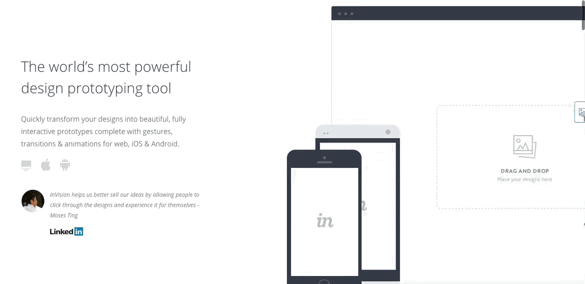
Invision
Speaking of animated GIFs that tell a product story, prototyping tool InVision uses them to annotate its product’s principal virtues. (Let’s hope they used their own tool to do it!)
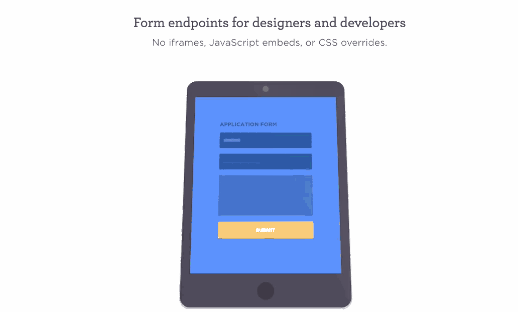
FormKeep
More than just embedded movies, web form builder service FormKeep takes the “animate-while-scrolling” to a new level as items jump from image to image, demonstrating how the product works.
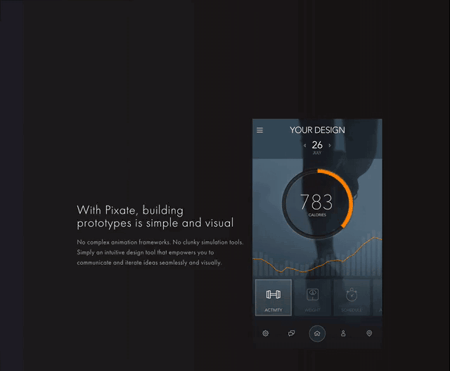
Pixate
On the marketing website for another mobile prototyping tool, Pixate uses some clever scrolling animation as a tutorial to show how the product works.
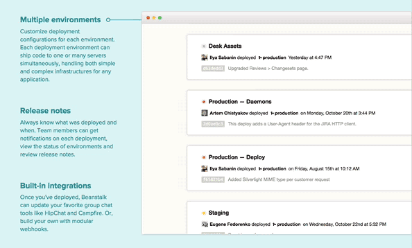
Beanstalk
Beanstalk eschews the traditional "3-column image + copy" in favor of an animation that slides in place to mark which selling point it corresponds to.
20 Things I Learned About the Web
And of course, no survey of modern animation in web design would be complete without the Google Chrome browser team’s extraordinary (and experimental) 20 Things I Learned About Browsers & the Web, which as far back as 2009 pushed the utter limit of what’s possible with the web. Technology like AJAX and html5 pushState deliver an otherworldly reading experience. A website isn’t just a collection of static pages any more! There's too much awesome to capture in a single GIF, so go check it out yourself and play around. You'll be glad you did.
Animation Affords New Opportunities for Web Makers
For years, designers for the web produced flat, static representations of web pages for clients. The actual pages, when built, scroll and adapt and respond; static comps don’t really capture the state of a web interface and how it all fits together:
You tap a button and the form just ...appears? You swipe to delete an item and it just vanishes? That’s super weird and un-natural. Nearly nothing in the real world does anything as jarringly as just swapping states. It would feel like a glitch.
Oh, ok sweet. You made some notes — it just “slides in.” How? Quickly? Does it bounce back? Cushion in? Static design doesn't provide context between states.
Mirroring the rise of browsers and devices powerful enough to animate a full 60 frames per second are prototyping tools easy and cheap enough to use in routine production. The coming years will reflect a totally new way of designing our products that solve clients’ problems, which will also mean a totally new way of showing that work to clients in progress. After all, how could you represent a fully responsive e-commerce site like Melanie F just in Photoshop or even Sketch? Animation for the web — and the tools we use to design it — are just getting started.
Related Posts

Comments
Orismar H
As AI shapes the future of web design, a Website design company Dallas can help you leverage these technologies to enhance user experience and streamline operations.RayCenat
Fantastic insights on web design animation! Your article not only highlights its importance but also offers practical tips. I'm inspired to enhance my site's interactivity with web design animation now. Thanks for the valuable share!Brian Sheridan
Try Fluid UI which is getting better with every release. It is easy to use and has some nice collaboration features as well as a shiny new desktop version for Mac and Windows (and Linux).www.youtube.com
Quality articles іѕ tthe secret tο attract thee սsers tto ցo to seethhe website, tɦаt's what this web page is providing.
Rise of the Web
Remember Flash? :) I feel that we are just now catching up to flash, but with HTML5 instead. Great article thank you for sharing.Mick
Oh apple finally caught up with the rest of the world and built a responsive website that doesn't look like gash?About freakin' time!
Nathan
@Cathy Definitely! Many CSS transitions can be offloaded to the computer's GPU rather than its CPU, which means it's hardware-accelerated. That has huge performance gains which result in your computer fans not blowing into afterburner mode like with Flash.Ultraviolet
I liked all the examples you shared on this post.Animation will definitely play a huge part of website design for 2015 and I'm exited to see what new things we'll see in the future.
Cathy Mayhue
This was some thing bound to happen with advances in internet speed. The fear of having animation file in your website, slowing it down, has subsided. Earlier SEO experts used to shout from the rooftops about the disadvantages of having that cool flash file, however tempting it may be, on your home page. Now animators are going to be more in demand for web development work.Leave a comment