
How We Convinced A Client To Stand Out Using Illustration
It’s pretty rare that we are approached by a client with a site that easily lends itself to visuals that are not photographs, so when the American Association for Netherlandic Studies came to us to redesign their site I was immediately ecstatic. Imagery of tulips, bright colors, windmills, and the streets of Amsterdam were racing through my head as I read through their creative brief. I knew instantly that I could create an awesome illustration for them as the main visual on their homepage. The only problem? AANS was dead set on having an image rotation at the top of the homepage.
So how did we switch from the standard image slider to the brightly colored illustration that’s splashed across the homepage today? Here is the process we used to convince our client:
Surprise them
While I knew doing an illustration would be best for this site design, I knew the client would not go for it without being able to see something in front of them first. I also knew there was a chance they would absolutely hate it and still want an image rotation to display their latest news.
With that, I let my project managers know that I would need some extra time to create two mockups (it helped that this project was not on a tight deadline). I then set out to make this first mockup with the image rotation they suggested.
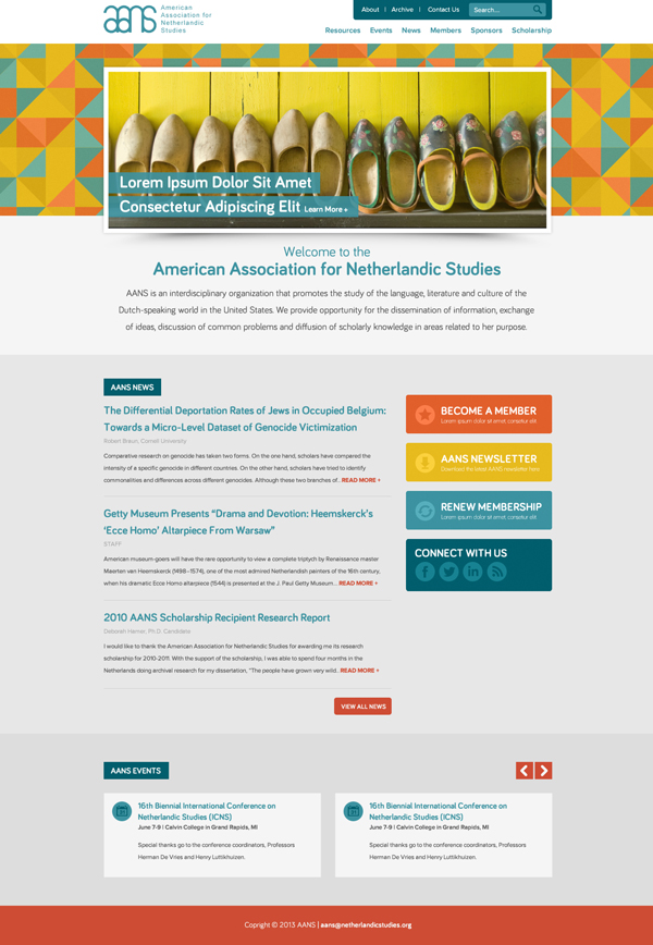
Doesn’t look too bad right? I could have easily stopped and just sent off this mockup, however two things were holding me back:
- They had no images and were planning to rely on stock photos. While the image above worked perfectly with the design, there was no way I could guarantee that the images they chose on their own would fit the design and crop as well, as often happens with image rotations on the sites we build. Also, since their news content does not require frequent updating, there’s a chance the slider would look out of date and stale after a few weeks.
- While the image rotation looked good, it caused the site to look like any run-of-the-mill template, and not the custom site design AANS was coming to us to create.
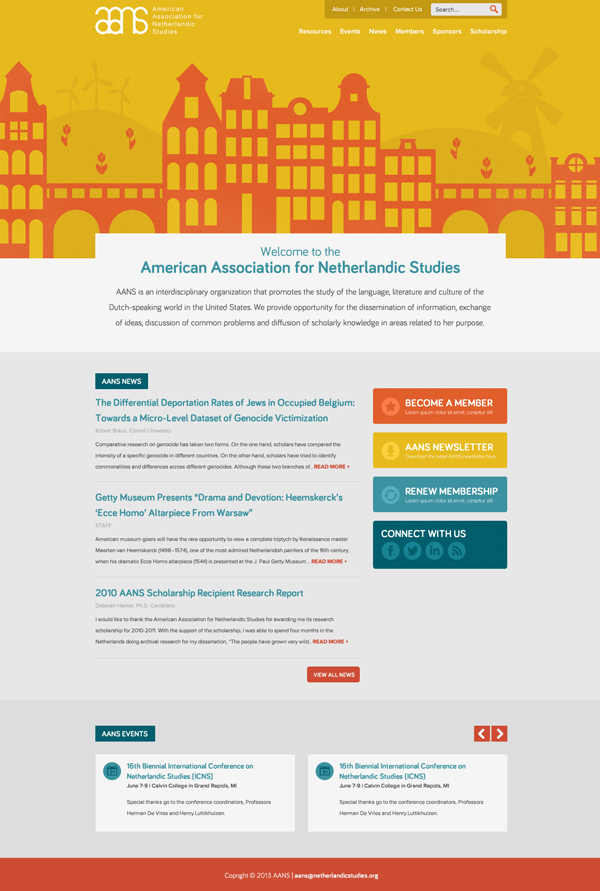
After finishing the first version of their homepage design, I got to work on the illustrated version that we would “surprise” them with. Since there was still a chance they may not go with this version, I did not want to create a fully fleshed-out illustration. Instead, I created a flat mock-up of the illustration that I knew could be enough to impress the client, but still leave enough room for improvement. Here’s the second mockup we sent to AANS:
Convince them, then convince them again
When we first sent the mockups to the client, we initially told them that both options would work well for them, but we thought the illustrated version would work best. However, AANS instinctively gravitated toward the more familiar layout with the slider they originally planned on.
When attempting to convince the client that your decision is what’s best, it’s important to not only say what you prefer as a designer, but WHY the decisions you made will work better for them. With that, we spoke with them again and gave them a more detailed explanation of why we thought the illustrated version was the best choice overall. We explained to them that the illustrated version was more unique and would help them garner more attention not only within their industry, but in the web design community. We also let them know that the rotation may not meet their content needs as well as they thought, as image rotations are often ideal for clients that are changing out their content often, or have really strong graphic elements for each piece. We were clear to them that we would respect whatever decision they made, but we just wanted to fully lay out the case for our preferred option.
The additional convincing worked! In the end it was just helpful for AANS to be a little more informed on how the illustrated design would help them out in the long run.
Ensure the design still meets their needs
Prior to starting any of my design work for this site, I first needed to find out exactly why AANS wanted the image rotation on their homepage. It turns out, they just wanted a prominent place on the homepage to feature fresh news content. I ended up creating a clean newsfeed section for them close to the top of the page, which has ended up working perfectly for them. I also added three eye-catching call to action buttons that provide a better and more permanent solution for things they may have linked to in the image rotation.
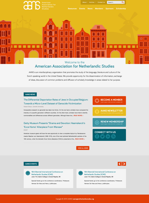
Finally, after the first mockup was approved, I got back to work on the original illustration. I added more colors and depth, as well as another interior illustration to ensure that they would truly stand out and have a unique design.
Thanks to a bit of persuasion, we ended up with a design that AANS is happy with and meets their users needs! You can view the live site here: www.netherlandicstudies.org
Have you had a similar experience when designing a site for a client? Do you have any tips for persuading clients to go with something a bit out-of-the-box for their industry? We’d love to hear them!
Comments
Cameron Gawley
Good article on proactively designing out what you think would be best for the client. The reality is that neither you or your client know truly what is best when it comes to which design actually works or converts the best. This is why it is best to always build simple experiments through A/B and Multivariate testings. This way we test our assumptions through data driven marketing experimentation.Leave a comment