Building a Mobile Site with Clever Navigation

We recently built a mobile website for YourTown CMS in partnership with Liaison Design Group. We've had increasing demand for mobile web development lately, and we're particularly excited to show off our success on the YourTown CMS mobile website.
Mobile-Friendly Navigation
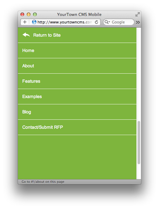
We were inspired by an example we saw in "Mobile First Web Design" recently released by Luke Wroblewski through A Book Apart. A simple "Navigation" hyperlink resides at the top right corner of each page. When you click the link, the page whooshes upwards revealing the site navigation. The navigation links allow you to jump to another page or return to the current page. It's a simple but effective — and really cool — way to implement mobile website navigation while still keeping content front and center.
Screenshots
Here are a few screenshots of the YourTown CMS mobile website.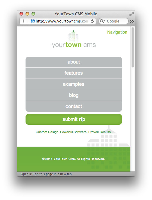
Mobile Javascript Framework
The website is driven by a simple, light-weight Javascript mobile framework created by our own Joel Sutherland. The framework routes hash-bang paths to appropriate jQuery templates populated with data pulled down from the HiFi API. It's a brilliant bit of code and is still getting some polish before it's public release. Look for this soon.
Related Posts


Comments
Joel Sutherland NMC team member
Ben,The answer to that question is worthy of a whole post! I'll try to answer quickly as best as I can.
The upside to using a responsive technique is that you're serving everybody the same markup and styling it to match their device screen size. This potentially simplifies things as you only have one markup base to deal with.
It also creates complications. Your markup will often contain things that simply aren't needed in a mobile context or things like desktop-sized images that require additional cleverness to deal with. Also, when it comes to maintaining a site, you need to keep ALL resolutions in mind when you make markup adjustments because they will cascade everywhere.
With this site we had two things going for us:
1. We knew our visitors would be using dominant mobile platforms, not long tail ones. We could count on mobile webkit.
2. We built it on HiFi which made all of the content available through a simple API.
What this means is not that we've developed a separate mobile site. We DON'T believe that is a good approach. What we've done is developed a mobile version of the site that doesn't intersect with the desktop version at the markup, it instead intersects at the CMS. It's not mobile-first responsive web design; it's content first web design.
The net result of using this method is a site that will perform dramatically better on a modern phone than a responsive design reasonably could. On first load you download the minimal template information and on every other page request you are simply downloading JSON content. This makes it FAST. It also makes it super simple to develop for.
That's just scratching the surface of the issue. Responsive web design is great, but unless you are up-to-the-minute on best practices and follow through on every one of them, you're going to put out a bad product. http://hicksdesign.co.uk/ sends my phone almost 3MB.
Hope that explains it some -- let me know if anything doesn't make sense.
Ben Requena
Curious why you guys didn't go with a responsive approach?Leave a comment