2008 Political Web Design Trends
The 2008 political cycle was absolutely huge for web design. With Obama leading the charge, political campaigns finally began to embrace the internet as a critical aspect of a complete campaign strategy. This change in mindset could be seen in all levels of elections.
Here at New Media Campaigns, we had the wonderful opportunity to look closely at hundreds of campaign websites through our own work as a political web design firm and while building our successful microsite Vote the Site. This site matched up every U.S. House or Sentate candidate with their rival and allowed people to vote on the better campaign website. As we looked at the voting results for that project as well as the many sites themselves, design trends began to pop out at us. Below is a list of the key trends that emerged during the 2008 cycle.
Landing Page for Email Signups
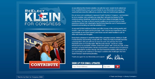
As designers and enthusiastic users of the web, it is easy to be offended by a Flash intro page or interstitial advertisement. What is clear though, is that having an introduction page to a political site that called for email registration is now standard practice because it is so effective. The best registration landing pages are well tuned to match the design of the rest of the site, make an email signup as painless as possible, and introduce the candidate through a high quality photo and brief message.
Web 2.0 Style Principles and Politics are a Perfect Match
No, this doesn't mean that pastel gradients , bubbly fonts and vowel elimination should be used in political web design. Rather, campaigns are embracing the core principles of the web 2.0 design movement on their campaign websites. These key principles are Simplicity above all else, Fewer Columns and a Distinct Header that has Simple Navigation. Naturally these are also principles for good design in general, but their emphasis in the Web 2.0 movement has made the ideas much more mainstream. As recent as just two years ago it was rare that one of our clients would specifically ask for "simplicity" to be a component of their web design, but we now get that requirement on nearly every project.
These principles are especially beneficial in politics for two big reasons:
- Campaign websites must reach everyone. When web pages are implemented with standards as well as all browsers in mind, they can reach the widest audience, a critical requirement for a campaign website. Even voters who live in areas without broadband access need to be able to comfortably browse a candidate's website.
- The best campaigns have a clear message. With simplicity as a design goal, a candidate's message can be strongly featured throughout a website. The most important messages and announcements can be made front and center, without the chance of being missed.
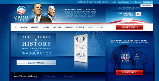
The Action Center
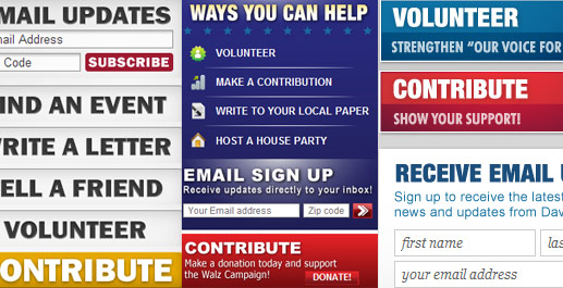
As campaigns learned that they could leverage the internet to engage people online, they also developed the 'Action Center' as a standard way to quickly show people how they could get involved. Our internal analytics show that this is an extremely effective way of calling attention to registration pages and social media pages. We expect this to be used even more frequently in future cycles.
Central, Rotating Announcements Box
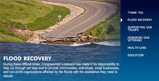
Another design element that has become commonplace in campaign websites is the announcements box. This is usually updated at least weekly in larger campaigns with a news story or announcement. It also typically includes a photo or custom designed graphic to call attention to the announcement. This box is typically the first things visitors see when they head to the site. Again, with standards in mind, this box is usually best achieved through JavaScript rather than Flash.
Blue (the color)
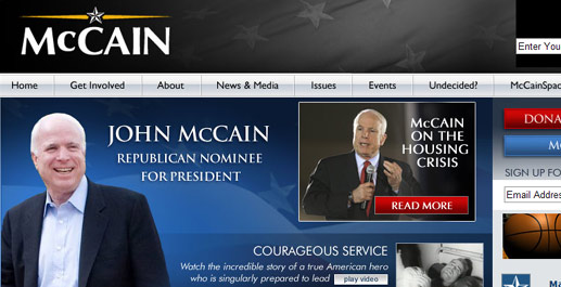
Since the 2000 and 2004 election cycles, the county has been obsessed with the notion of "Red States" and "Blue States". Even as Republicans have clung closer to red in print advertising and general themes, the color blue has dominated web design. It is probably for this reason that the color blue has been extremely popular with candidates of both parties. Even John McCain's website had a strong blue background.
So there are the five big design trends that we saw for the 2008 cycle. We're sure there are many more out there -- if you've spotted one be sure to leave it in the comments.
To see our work, visit the Political Web Design area of our website.
Leave the first comment