
Design Predictions for 2016: The Rise of Custom
I love reading through all of the “design trends of the year posts” when January rolls around. This year promises a lot, from less grid-based layouts to more tiled designs, the return of drop shadows, and more use of motion through video and animation. While I have no doubt these predictions will all be big this year, I’m seeing a much bigger pattern between these trends: we’re shifting towards less templated, more custom designs.
Wondering what I mean? In the early days of web design we’d design a unique site that couldn’t be updated by the client at all, or at least not without some help. Then CMS’s rose in popularity and made websites easily updateable, but they lost that personal touch. Suddenly everyone can grab a decent looking template with a homepage rotation and horizontal strips for as much content as the client would like to add.
Now in an effort to make a website stand out from the crowd, I think we’re going to move back toward that original, less-editable design process. Here’s a few examples of ways I think we’re going to make sites more custom in 2016:
Playful, large type
Think big bold type, overlapping images, and rotating text. Improvements in browser support for CSS and SVG are making this all more possible. While these effects often mean less room for text, it also means the headlines will be more attention-grabbing.
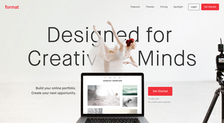
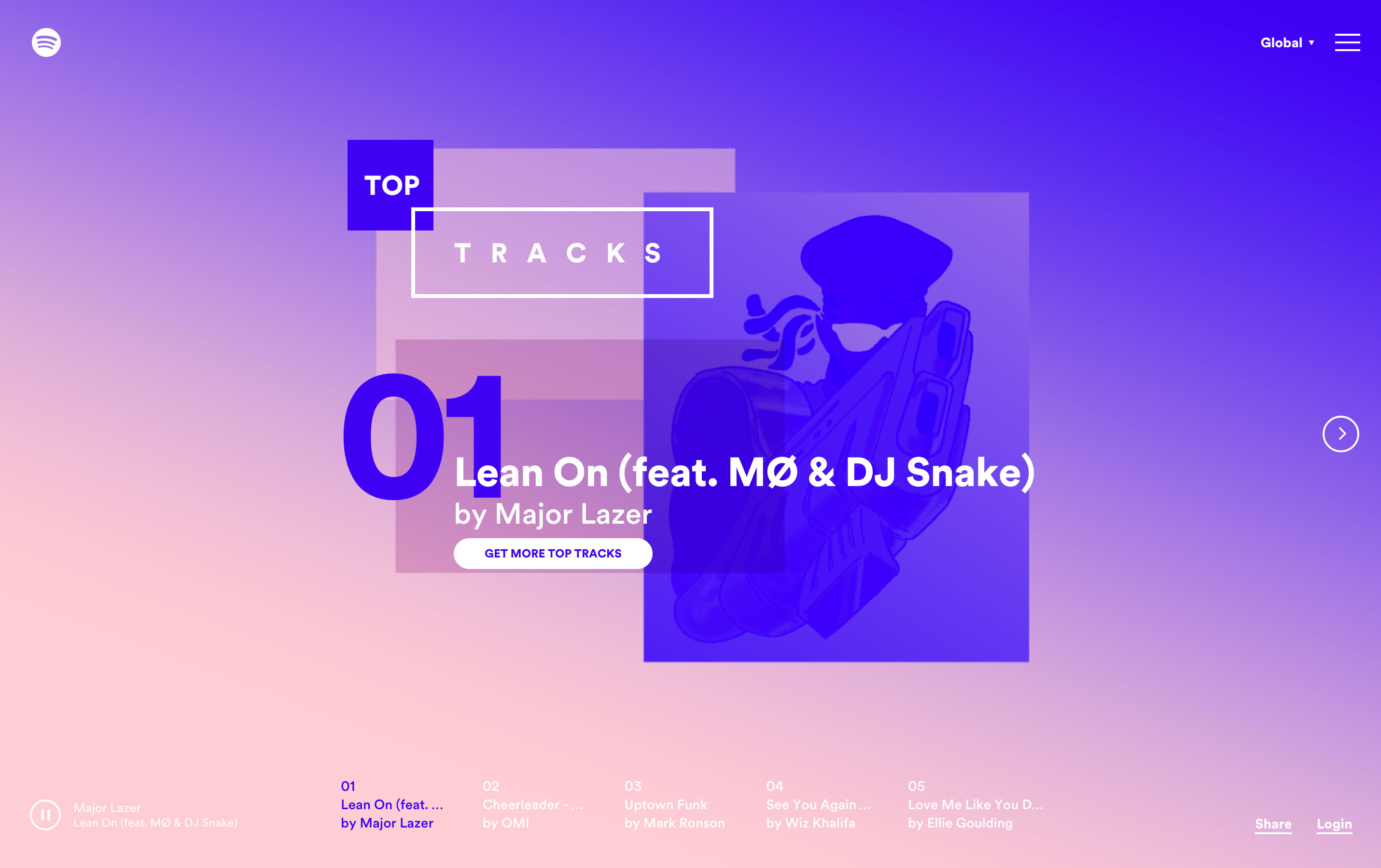
Sites like Format and Spotify's Year In Music utilize the overlapping of images and text to make their content stand out.
Multi-functional feature areas
The days of the homepage requiring a large slider at the top and caption are coming to a close. Instead, I think we’ll see static banner images that get updated with more frequency, grid-based layouts at the top, and sites that switch their feature area for functionality. Take for example Fleet Feet Sports: their homepage feature area changes between image and ambient video for each season.
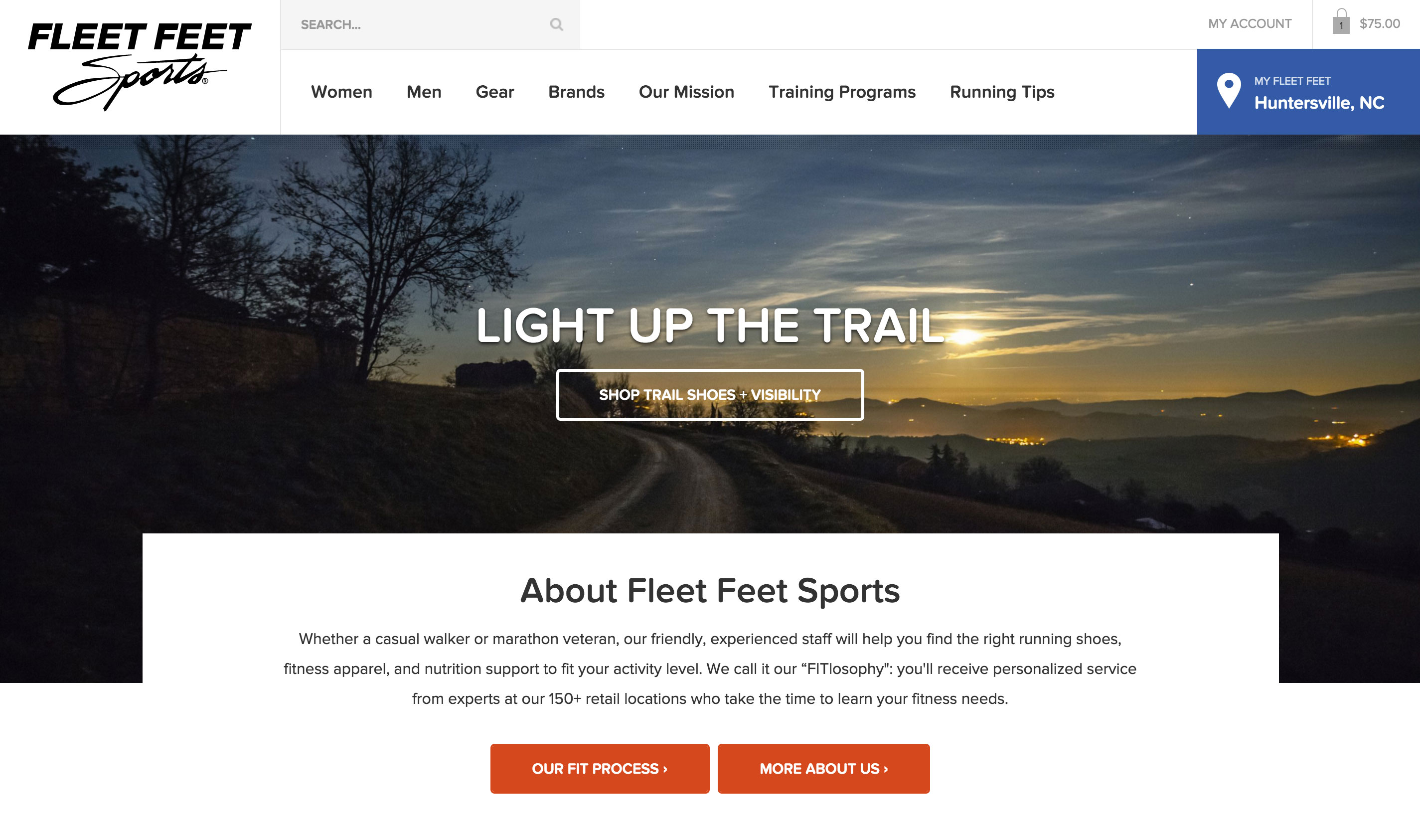
The Fleet Feet Sports homepage feature area switches between ambient video and image depending on the content they have for that season.

The Daschle Group's homepage includes a tile-based feature area rather than a slider. Unlike a standard slider, this grid layout allows them to show important news items and links all at once in a unique way.
Curated, more highlighted content
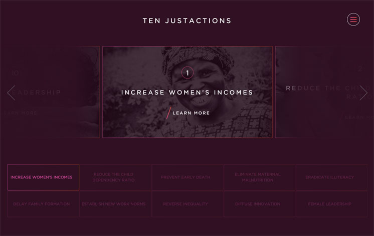
Rather than designing sites that can handle various lengths of content, I think content will start adapting to fit the layout more often. Think grids of photos and content where the text is split into more digestible chunks, carousels featuring a snippet of services offered rather than just a basic listing, or shorter, bolder image captions. While layouts may start accomodating for less content, I think this we'll start seeing improvements in quality and readability in the content that is there.
Custom photography
I’ve seen clients are taking notice to the overabundance of stock photography across the internet (and how bad it is). While sites like Stocksy, Death to Stock, and Unsplash have popped up to combat bad stock photography, sites still lose that personal touch when using them. I think 2016 will be the year many sites start requesting custom photography. Paying for an entire site’s worth of stock photography is not much cheaper after all, and custom photographs make a world of difference in the design. Take Fleet Feet Sports for example, who did a custom shoot of their running groups and stores. The photos appear more unified, and more persuasive and believable to users than stock running photos would.
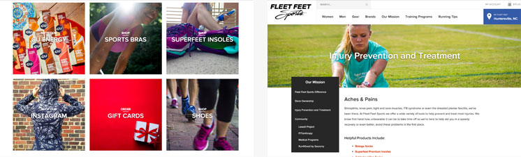
Instead of using stock photography, Fleet Feet Sports did a custom photo shoot of some of their stores, models, and their running groups. The images flow with the site and add a much more personal touch than a stock photo could.
More custom illustration
Sites like iStock, Noun Project, and Icon Monster make it easy for anyone to grab an illustration or icons for their site. With everyone having access to quality icons, I think we'll see more sites going the custom illustration route this year to differentiate themselves. Think site-wide illustration work like on Haw River Ales, to just custom banner images or icons like on the Mayor's Challenge site.
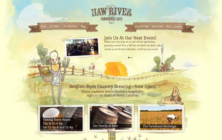
Haw River Ales includes custom illustration site-wide, from banner images to menu hovers and icons. The illustrations help the site stand out in the booming craft brewing scene in NC.
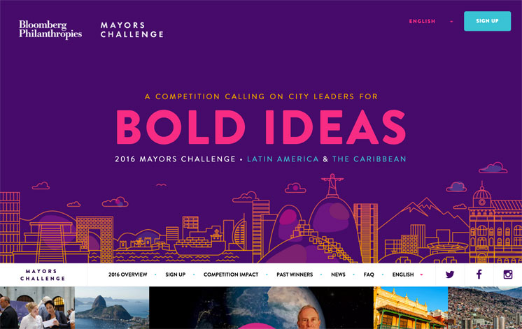
From their banner image to their social media icons, the Mayor's Challenge site has custom illustrations sprinkled throughout their site. The site could have easily utilized a photo in the banner and standard icons throughout the site - but the custom work helps it stand out and draw attention to their content.
While it will certainly take more effort to apply these custom elements to our web designs, the additional energy is worth it to make your design stand out from the crowd. So what do you think, will 2016 be the year of custom? What trends have you been seeing or applying to your site designs this year?
Need Help with Any of These Trends?
NMC is for hire! If you're curious about doing things a little differently with your website and want to take it into 2016, NMC is happy to oblige. We know a thing or two about the custom work mentioned above and would love to help your business or nonprofit succeed online. Get in touch and maybe your site will be featured on a "Best of 2017" list next January. Here are a few links to get you going:
- Need help getting started? We wrote a guide to help you write a great website RFP.
- Still not convinced? Check out the 10 best reasons to hire NMC for your next web project.
Related Posts
Web Design & Development Trends You'll See in 2015

Leave the first comment