CSS Folded Ribbon
I recently worked on a website featuring a folded ribbon on the home page. It could have been done with an image, but since this site is responsive I felt that a CSS solution would be best. It provides easy scalability, doesn't require the browser to download another image, and reduces page size -- which is an ever-present factor when developing for the mobile environment. The risk of markup bloat is something to consider, but now that we have the ability to confidently use the pseudo elements :before and :after, the risk is lower.
The Markup
<div id="banner" style="background-image: url(http://ui.jillmillerzimon.com/images/banner-home.jpg);">
	<div class="container">
		<h1 class="page-title">Jill Miller Zimon <span>for</span> State Representative</h1>
		<aside class="sidebar">
			<!-- Sidebar Content -->
		</aside>
	</div>
</div>
And the CSS
/*	The border on this element acts as
	the "back" portion of the ribbon
=============================================*/
#banner {
	border-bottom: 80px solid #0DB3F4;
}

/*	This element contains the content to
	a max-width in the center of the wrapper,
	allowing it to be responsive. The white
	bottom border acts as the empty area
	below the "front" portion of the ribbon.
=============================================*/
#banner .container {
	position: relative;
	z-index: 0;
	margin: 0 auto;
	width: 92%;
	max-width: 902px;
	height: 100%;
	border-bottom: 80px solid #FFF;
}

/*	The "front" portion of the banner
	is positioned in place and given
	a background.
=============================================*/
#banner h1 {
	position: absolute;
	bottom: -65px;
	left: 0;
	margin: 0 0 0 -19px;
	padding: 0 19px;
	width: 100%;
	height: 80px;
	background: #0DB3F4 url(../images/strip-background.png) 0 0 repeat-y;
	background-size: 100% 4px;
}

/*	:before and :after pseudo elements create
	the fold illusion using CSS triangles
=============================================*/
.home #banner .page-title:before,
.home #banner .page-title:after {
	content: '';
	display: block;
	position: absolute;
	left: 0;
	bottom: -14px;
	z-index: -1;
	width: 0;
	height: 0;
	border-right: 19px solid #0171D0;
	border-top: 14px solid rgba(0, 0, 0, 0);
	border-bottom: 14px solid rgba(0, 0, 0, 0);
}

.home #banner .page-title:after {
	left: auto;
	right: 0;
	border-right: 0;
	border-left: 19px solid #0171D0;
}
Here's a screenshot of the final outcome with overlays to highlight the various markup elements:
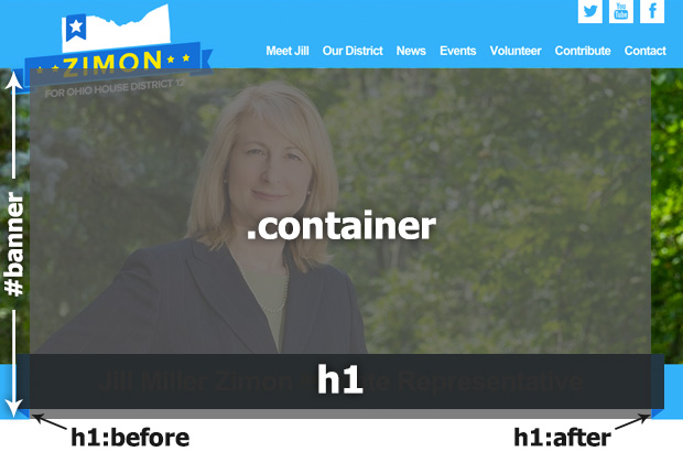
All I've done is use a combination of borders and absolutely positioned elements to create the effect of a folded ribbon. One drawback of using borders, especially on the container class, is if the underlying element was not a solid color (texture or gradient), then it wouldn't work.
This is a pretty solid method for generating this visual element. On this specific example there is one image involved, the shading on the left and right sides of the h1. The image is much smaller image than one of the entire ribbon. Because the containing elements have maximum widths set using percentages, this works well without much tweaking for responsive. At smaller screen widths I removed the fold effect to save screen real-estate by stretching the banner all the way across.


Leave the first comment