
Choosing Great Images for Your Website
A guideline for selecting images that fit your online presence
What’s one of the biggest hurdles we see clients struggle with after site launch? Updating the site with images that fit their shiny new online presence.
And we get it. Our designers spend a lot of time searching for, creating, and placing the images used in our site mockups and for site launches. It’s also nearly impossible to always have a budget for new custom photography to keep your site updated. Both of these things make selecting new images tough. That said, it’s not impossible to find images that will work for your brand. Here’s a few tips for selecting images that will work great on your new site:
Make sure your images are clear and focused on the subject
Whenever we start a new site design, clients almost always tell us they want the new site to look “clean” and “not busy”. These same adjectives can and should be applied to the images you select for your site too.
This guideline is primarily ideal for large feature or banner images on your site - where you want the user to immediately see the image, get a clear feel of the image’s message, and immediately look for the next desired action on the site. If the image you’ve chosen is too busy or doesn’t have a clear focus, it’s likely the user won’t read the text or click on the intended button that they need to since the eye gets lost.
An area we often see this get overlooked is for event photos. Take the image below for example:
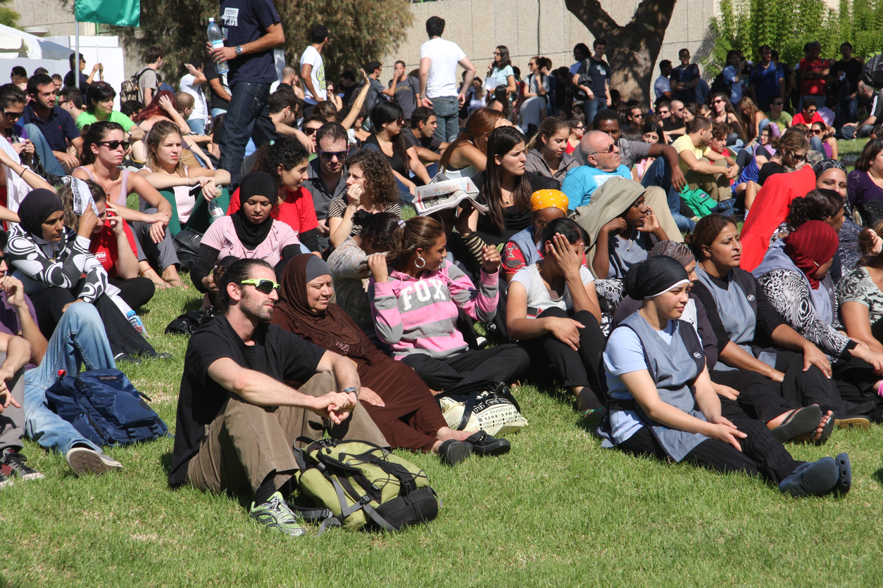
This image may work well within a news post for an event, but on it’s own as a large feature image, there’s nothing for the user to focus on. Instead, you should aim to find images like the following:
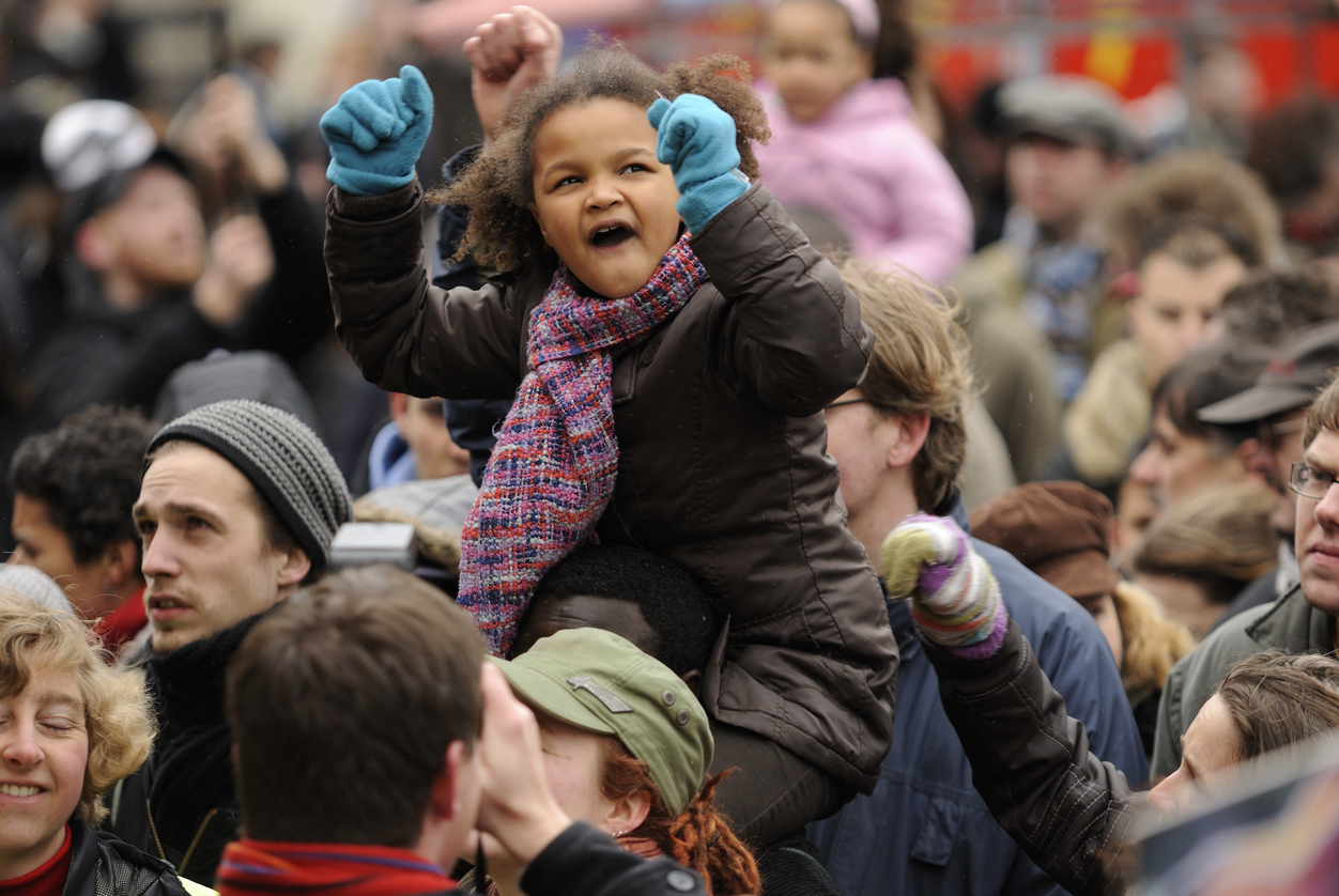

Each of these images are of large groups of people, but focus in on a particular subject - giving the user clear understanding of what they should be looking at and gaining from each image. Not to mention, focusing in on a human face allows the user to relate to your content more.
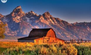
Regardless of subject matter though – whether your image is of an event or a field of flowers – choosing an image with clarity and focus will ensure users gain the most impact from the design.
Avoid using event flyers and graphics
 Your organization has an event coming up. You paid a designer to create a beautiful flyer for the event, so you should definitely use this in your site’s slider, banner images, or calls to action, right? Wrong!
We often see sites get updated with graphics and flyers, and while they probably look great on social media or in print, they rarely flow with a site’s brand. Often there’s a lot of text on the flyer image, along with text automatically overlaid by your site or sitting beneath it that creates a look that’s jumbled and confusing for the user. Instead save these graphics for facebook or within a blog post, and choose a static image or have a designer create a simpler illustration without text to promote the event.
Steer away from posed stock images
As people spend more and more time online, the better they get at spotting posed, fake stock images on your site. These images have been used so much that they immediately make a site feel inauthentic - not what you want for your brand! Some examples of overly posed stock images include those from meetings or events where everyone is smiling and looking at the camera. A good rule of thumb is if the image feels unnatural to you, it is going to feel unnatural to the user as well.
When searching for images on large stock image sites, try to only search under the “Signature” or “Best Quality” images. Those often look more natural than the cheaper versions. Sites like Unsplash or Death to Stock are also great resources for (free!) images that feel more candid.
Look for images that match your brand colors
This is certainly getting more nit-picky, but can go a long way in ensuring images look great on your site! If your brand colors are on the cooler side - look for images that contain cool tones as well (think blues, greens, etc.). If your site contains more reds, oranges, or browns, look for images that contain more warm tones.
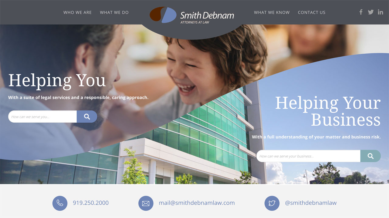
A great example of this is the banner for Smith Debnam Law. Their brand colors contain a lot of purples, blues, and teals. This is reflected in their banner images (in particular the bottom one of the building), which contains similar colors and helps the area feel seamless with the rest of the site.
Ensure images properly fit the space on your site
If you need to update a large horizontal banner image on your site, be sure that the image you’re selecting is a horizontal orientation - not vertical or square or some of the action will likely get cut off.
You also want to take into account the other elements interacting with the image. Is there text overlaying it? If so, you’ll want to make sure you select an image where the action or subject in focus is on one side, and leaves some negative space on the other side for text.
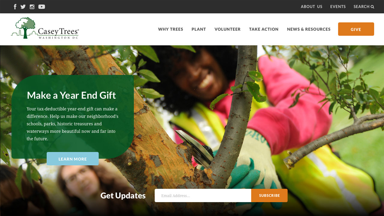
A great example of this is in the Casey Trees’ banner image, where more of the color and focus is on the right side, leaving the left side free to focus on the overlaying text box.
Ask for help
With so many options to choose from, selecting new images for your site can be daunting and overwhelming. Don’t be afraid to ask for help!
We love to put together guidelines for our clients for everything from site banner images to effects for print materials, and have found this helps take the burden off updating materials in the future. Feel free to reach out to us if this is something that may help you with future site updates.
Leave the first comment