
Examples of Website Features for Pages with A Lot of Content
Clever interactions that help you engage visitors on their terms with longform content
We’ve previously detailed beautiful content heavy and editorial website designs and how some sites loaded with content can smartly and attractively present the information to their visitors. This post goes to a more article-specific level to look at a couple novel ways of providing visitors options for the way they want to read and interact with content.
First, the background on why you may want to provide users these options.
It is a relatively accepted truth that online readers tend to skim more or have shorter attention spans than offline, and they like to consume content in more digestible bits: bulleted lists rather than paragraphs, clear headlines over dense summaries, intuitive calls to action over complicated next steps, etc. It could be a fundamental reshaping of our brain or more likely just that we’re now bombarded by so many alerts, slacks, other screens, and distractions when online. This fact has only been exacerbated by the continuing compression of our attention spans due to phones and quick hits like TikTok, Reels, Video shorts, etc. We want to get to the pay off fast!
However, the above idea also has to be balanced with the fact that online is where we do much of our reading now, both longform and shortform. So, while it’s largely true that people want their web content to be pithy and pointed, there are plenty of times where visitors are eager to dig into a meaty and deep article or topic.
While you can work through sitemap and information architecture planning to try and determine which target audience groups and areas of your site may be better for the shorter copy and which may need to support the desire for deeper content, there will likely be times where you don’t know what the audience wants. Do they want this article to be a deep dive or just a list? It can even vary by the visitor’s situation (are they on the go or sitting at their desk?). So, it can make sense to give them both options and let them choose. Two things at once!
As this Google article notes, “the key isn’t just cutting down everything and force-feeding people an eyeball-busting six second sensory overload, it’s offering the audience options on when to choose to immerse, when to be brief, and when to be gone.”
And now a look at some of the examples and how these sites have devised clever interactions to put visitors more in the driver’s seat in determining how they want to engage with the content.
Skim, Peruse, and Deep Dive Toggles
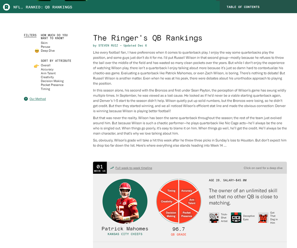
The real inspiration for this post was seeing The Ringer’s QB Rankings interface. This is where I admit that I’m a sad Cleveland Browns fan and on our third quarterback of the year (one week before the fourth qb), I found myself in the pathetic place of looking at where our latest “project” ranked. But the guide’s functionality triggered my nerdiness and transformed my despair to delight.
The guide lets visitors toggle between Skim, Peruse, and Deep Dive. Below you can see the difference between the Deep Dive and the Skim. The latter hides the narratives and details, just giving you the list. It’s a thoughtful feature that gives the user control to interact with the content on their terms. We often think about hiding superfluous content or functions on mobile, but giving the user the choice creates a consistent experience between mobile and desktop while also meeting the user where they are. I love this feature!
Deep Dive Filter:
Skim Filter/List View:
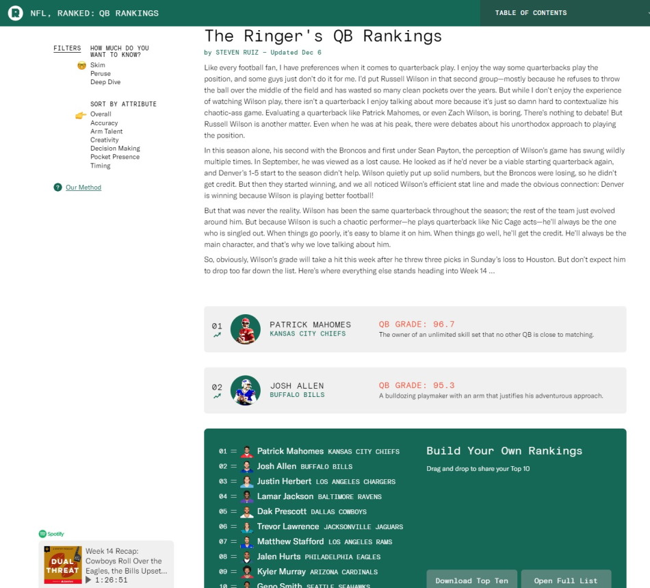
It seems tailormade for things like ranking lists, how to guides, or recipes where some people may just want the quick steps and others want the details, but it could also be carried into all sorts of content where you want to empower visitors and know that they may be coming to page for a quick hit.
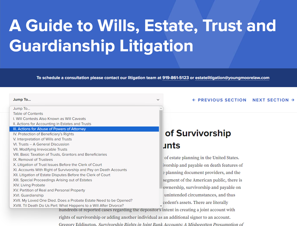
Using a Table of Contents on a Web Page
Everything old is new again. Table of Contents are obviously a staple of the offline world, letting people hop around in books to their desired content and seamlessly navigate to where they want to go. Long articles or dense content areas can have Table of Contents setup to let visitors first see a snapshot of everything on the page and then second hop to whatever is most helpful to them.
One of our law firm website design projects has some very detailed and thoughtful content in a guide to wills, estate, trust, and guardianship litigation. With such a large topic that has a lot of details, we knew that there would only be certain sections that were important to different groups. So, we setup a Table of Contents for the section that let people hop around; additionally, in this example, we broke each section into its own page to both help the pages be more digestible and buoy their rankings for specific topics in search engine rankings.
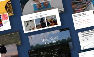
Some sites (recipe sites!) can hide the table of contents in links farther down the page, but those are trying to generate more scrolling for ads; we recommend having it be present high on the page and sticky to the nav if possible. Another example, this one for a nonprofit website design, can be seen at the Aspen Global Change Institute and how they let people hop around from the top of the page that sticks with you on the page.
A table of contents can let visitors see what content is on the page and choose for themselves what they are looking to dive into it or allows them to skim and hop ahead easily.
Giving Visitors Options
The above ideas and examples all strive to accomplish the same goal of giving visitors options for how they engage with longer content. In addition to these ideas, things like high level summaries with anchor links at the top and other tactics, can also help give visitors an idea of what they’ll be getting into with an article and let them easily hop around and get to the content that matters most to them. We all want to engage visitors with our digital experiences, but engagement can be sparked by differing levels of depth depending on the user and situation, and by working to structure your content with options, you’ll be giving yourself your best shot at achieving that engagement.


Leave the first comment