
Examples of Content Heavy Editorial Website Designs
Designing a beautiful website is never an easy task, but with large amounts of content, it becomes significantly more complicated. Magazines, consulting firms, nonprofit website designs, and other similar organizations tend to have large amounts of written content, making it more difficult to lay out the website in a manner that is both appealing and intuitive.
These organizations are tasked with organizing thousands and thousands of pages for a diverse target audience with users wanting content specific to them. It’s on the organization to enable the site to engage visitors and draw them in while creating an intuitive experience that doesn’t overwhelm them. This isn’t an easy task, but there are four main elements we find that can help a good bit when trying to make a content-heavy editorial website a straightforward and pleasant experience for the majority of visitors.
Tips for Designing Websites with A Lot of Content
Organize Content
In order to ensure a content-heavy site is not overwhelming for users, brands should consider their audience’s needs. Once these needs are understood, brands can separate the most relevant content into groups based on what they know their users will be searching for on the site. By bucketing the content into larger groups based on different target audience groups and/or actions the site becomes significantly easier to organize. Instead of having an excess of content laid out randomly, users only have a handful of topics to search through in order to find the information they’re seeking, and the topics become more relevant to each user.
An example of this organization would be creating a grid of Focus Area topics, such as Climate Change and International Development, on a think tank or nonprofit site. Visitors would then have quick access upfront on the homepage to segment themselves based on their specific interests and enter a funnel of relevant content.
Mask Complexity from Users
A complicated site is more likely to push prospects away than draw them in. If a site isn’t straightforward or seems overly complicated, users are more likely to search elsewhere. With organized content, the page feels significantly less cluttered, and it will be easier for customers to locate where they need to go. Having too much text, competing elements, or an overwhelming amount of options can make a website feel more complex than it actually is and cause visitors to quickly bounce away. By organizing content like noted above, visitors can then more quickly get into “their world” and not be distracted by competing topics and content.
Provide Visitors Easy Wayfinding Mechanisms
Users will not spend much time on a site if they are unable to locate the topic they’re searching for. As we talked about previously, dividing your site into different buckets with similar information allows users to more easily locate the page they’re looking for. A lot of this organization and heavy lifting can be done through thoughtful main menu organization, as it provides an easy way to divide up content and give users a support system as they navigate the site. The navigation structure of the site, known as either a sitemap or information architecture, can quickly become a project on its own to work through a plan to prominently display the most important content and link different sections together. However, getting it right will pay dividends as it not only clearly tells visitors how to navigate, but can also accomplish some of the storytelling and narrative by highlighting the organization's priorities in the menu. We've detailed some tips on designing a sitemap strategy for optimal website organization.
Stand Out With a Beautiful Design
While the organization of the site helps users navigate the site with ease, another aspect that is very important is a beautiful design. Even if your site is perfectly organized, without an appealing landing page, most people won’t bother to spend time on your site. There isn’t a one-size-fits-all option for this, as your site should reflect brand values and goals, and have a color scheme that matches your company. Also, with content-heavy sites, it’s essential to not forget about maintaining a visual hierarchy throughout by highlighting different sections with gradients, accent colors, images, etc. You want to give visitors clear visual direction on where to look and just not have everything dropped onto the page with no hierarchy or sense of design. Aesthetically pleasing websites are more appealing, and may even encourage longer times spent on your website.
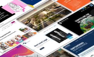
Now that we’ve covered what makes a content-heavy website more appealing, we’re going to highlight 6 websites that do an excellent job of condensing complicated information into a visually appealing, well-organized website that effectively helps users navigate the site.
Content Rich Editorial Websites with Great Design
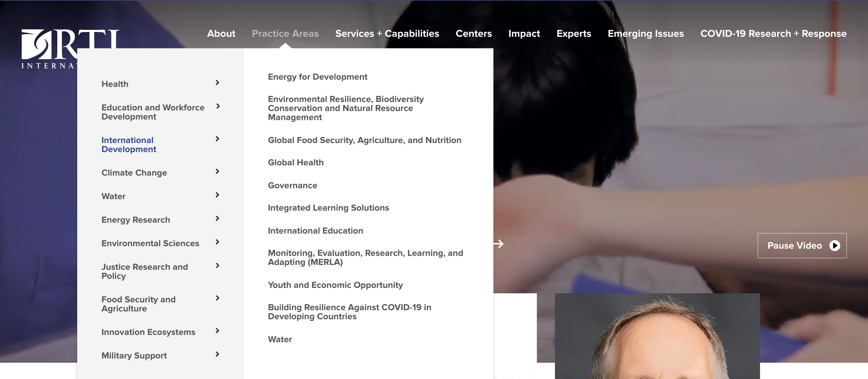
RTI International
The RTI International website successfully organizes thousands of articles and general information about the nonprofit organization in a way that makes it straightforward for anyone to navigate. With a video on the homepage that changes every couple of seconds, users will be drawn to stay on the site and look further into the other information that’s mentioned in the menu.
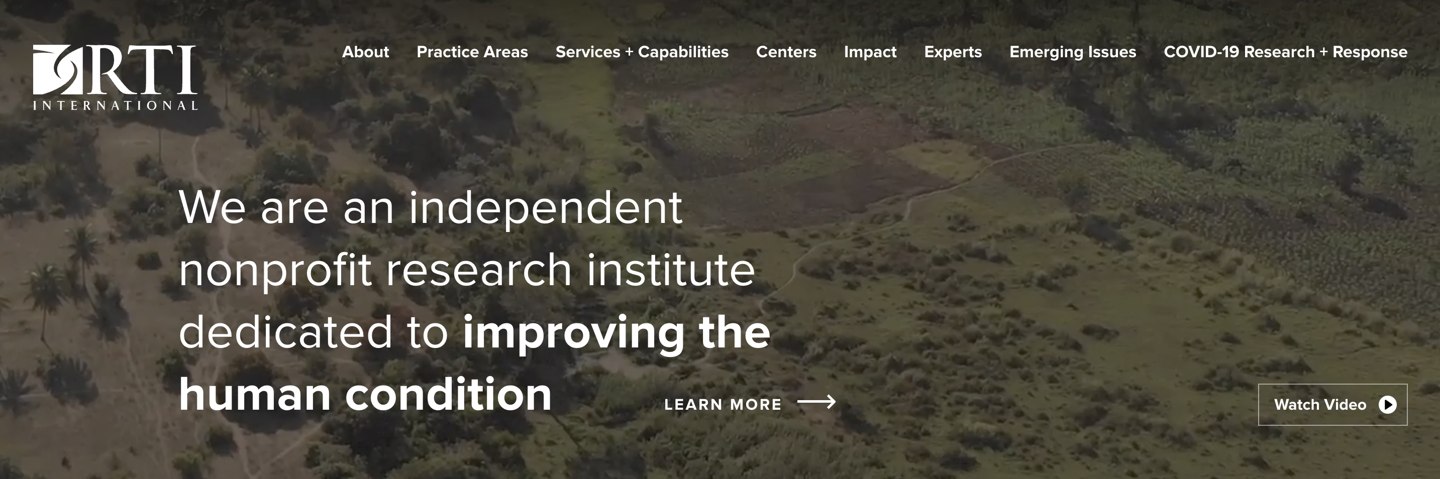
Despite having large amounts of content and information on this site, RTI is able to simplify their site in a way that benefits their stakeholders. The information is organized so that users will be able to quickly locate the space they’re looking for through the main navigation, and they have enough visual aspects to create an aesthetically pleasing site experience and guide visitors to relevant content.
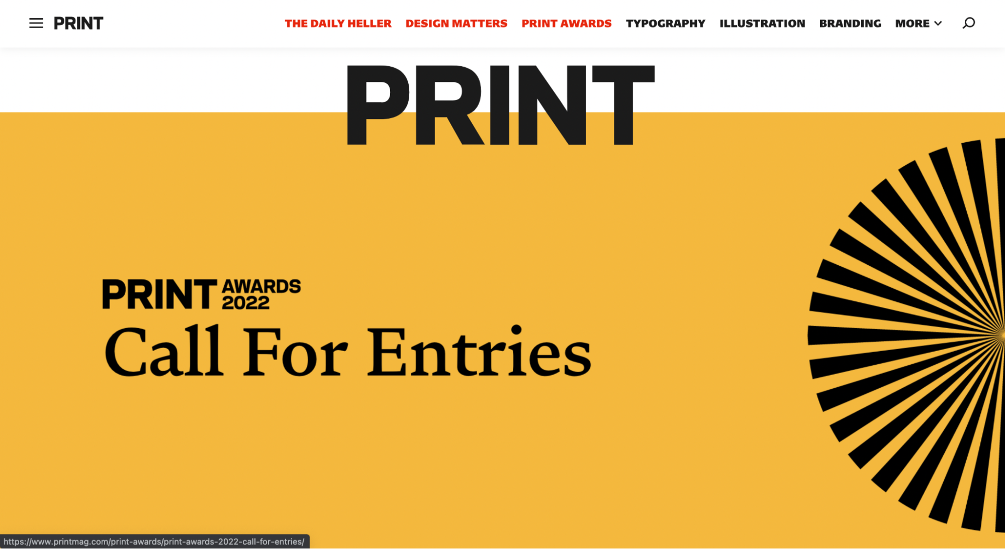
PrintMag
PrintMag is able to take thousands of articles from a range of magazines and newspapers and organize them in a visually appealing way that simplifies the search for relevant content. They present the main magazines they hold at the very top, making it easy for people to find the specific brand they’re looking for. Along with this, they highlight the most popular topics in the menu, as they know their audience and assume these will be the top three most common topics searched for. They also have a “more” section with more specific topics for articles, which allows the website to remain clean and organized.
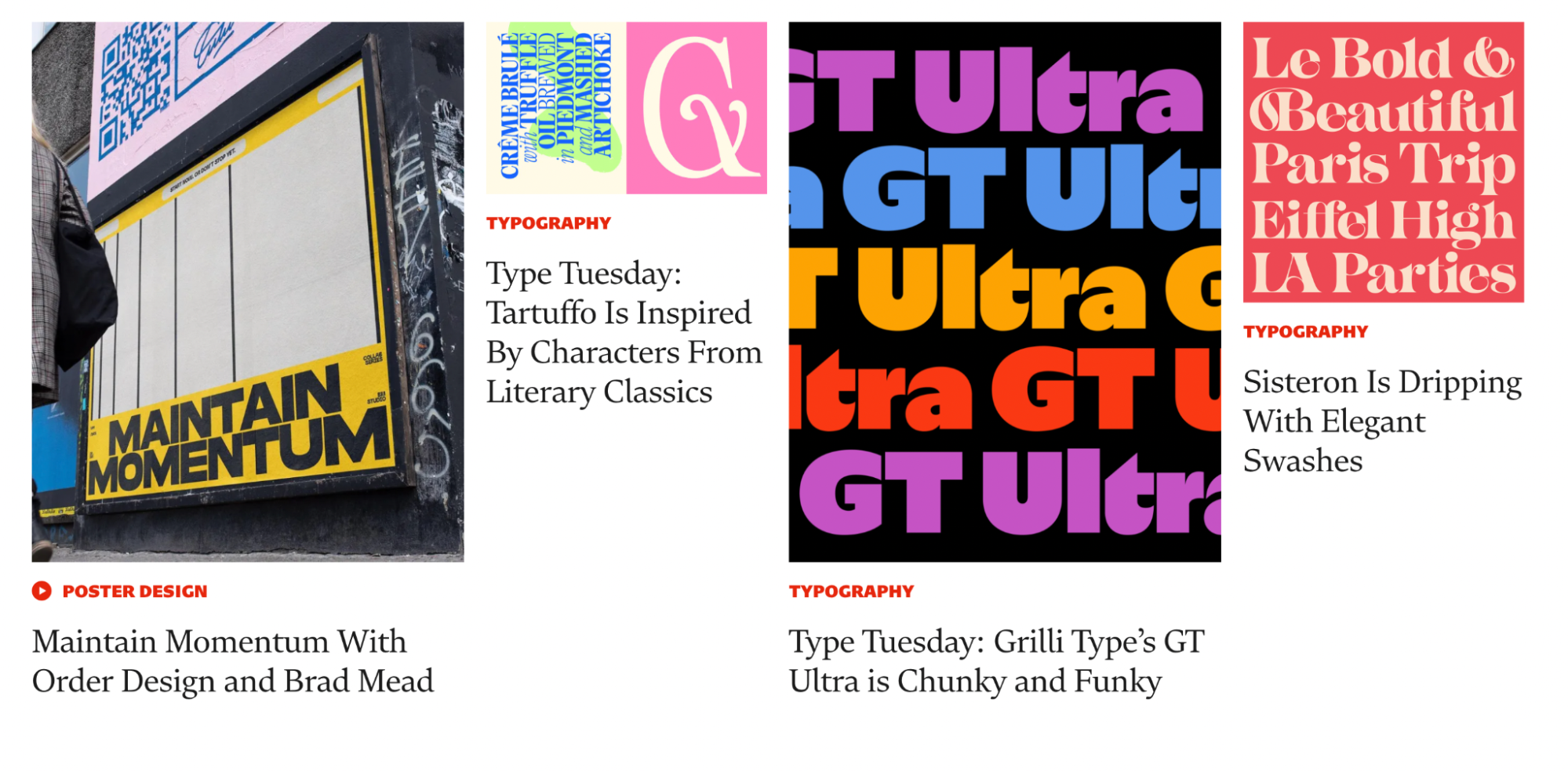
When highlighting articles, Print uses the title, topic of the article and a colorful picture. They will occasionally feature a snippet of the article at the bottom, but for the most part they prioritize the aesthetics of the page, which is especially relevant for a website that is essentially purely written content. Instead of including enough information to fully understand the article, they pull users in through appealing images and exciting titles, leading to more time spent on the site. Through these pictures, Print maintains their stunning website, despite the large amount of written content they have on the site.
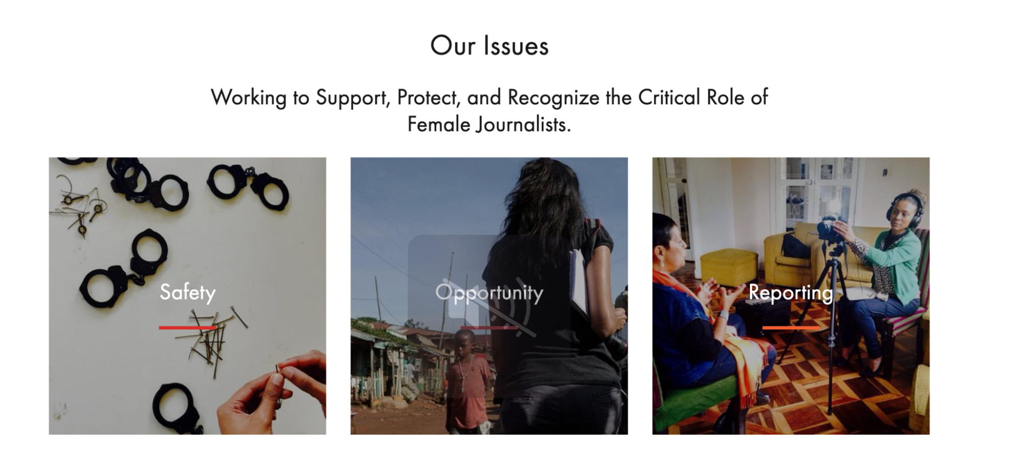
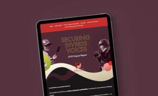
International Women’s Media Foundation
The International Women’s Media Foundation establishes their most relevant information from the start, with a homepage that features visual blocks right at the top of the page linking to pages containing the information they believe represents them best. This allows new users to immediately discover the most important information, and learn the facts that IWMF wants to highlight. On top of these blocks, the information is organized in a header with more than one level of grouping, making it simple to navigate.
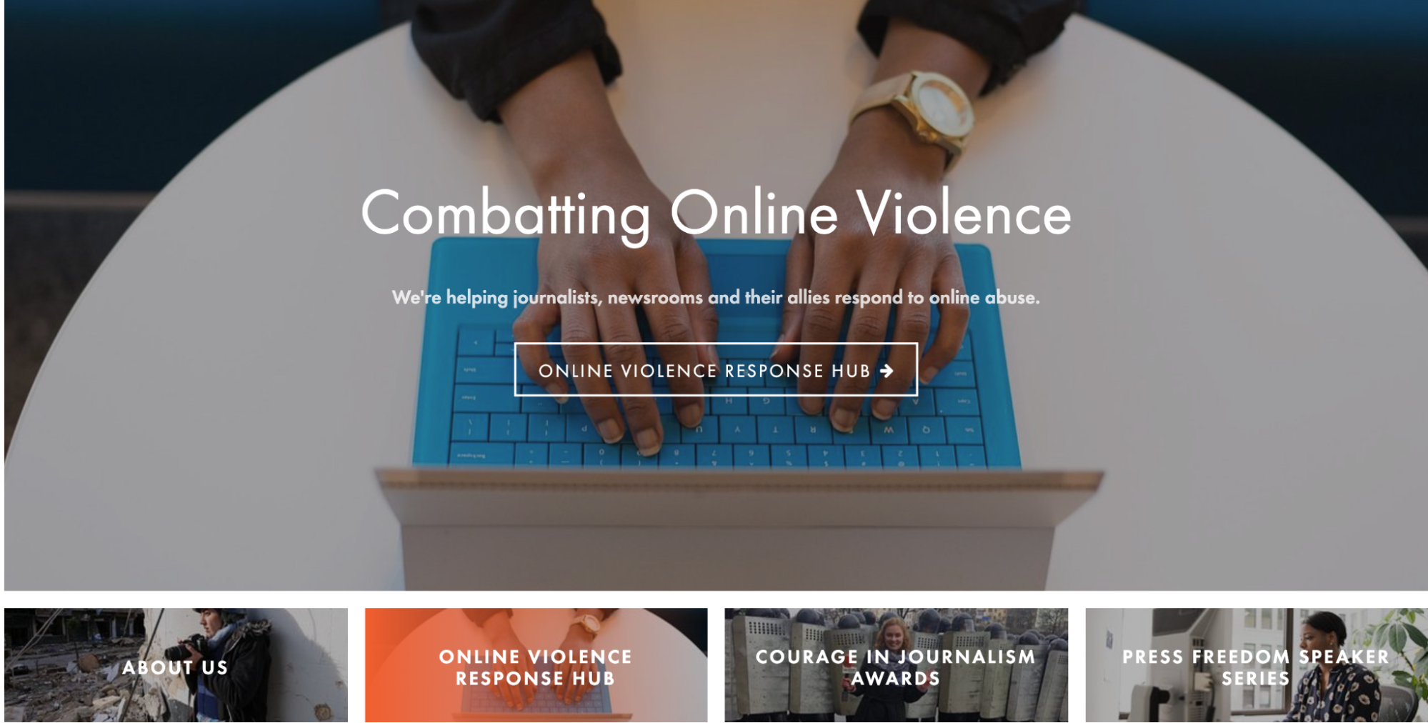
Along with presenting the relevant information right on the landing page, International Women’s Media Foundation organizes their content in a visually appealing way. They allow their images to tell the story of the nonprofit organization, and use those images to push users towards more information about the organization and what it does.
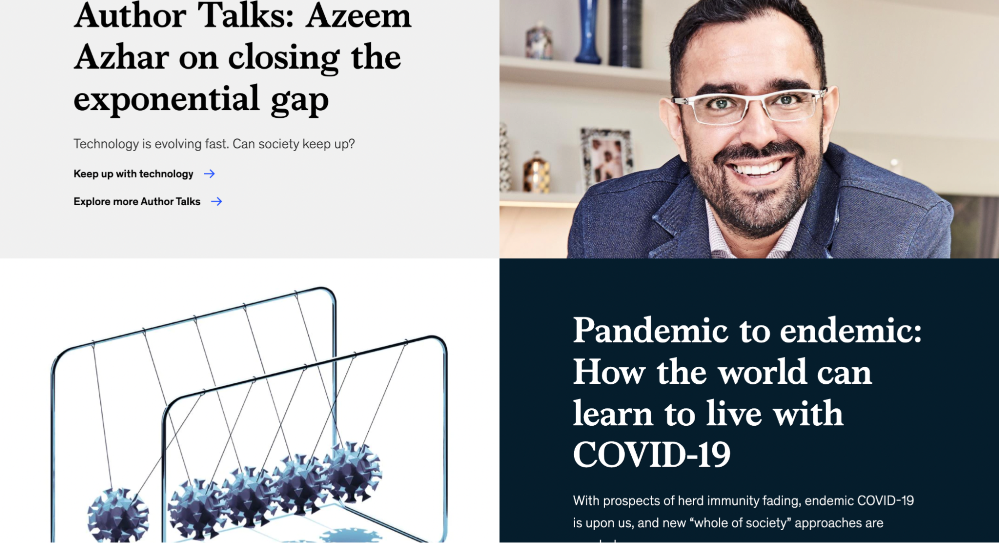
McKinsey & Company
McKinsey & Company has such a wide reach in consulting services, they had to divide their website between different industries they’ve worked with, and different functions they can support. Whether you’re searching specifically for an industry, or want McKinsey to perform a particular business function for you, the site makes it simple to locate this information.
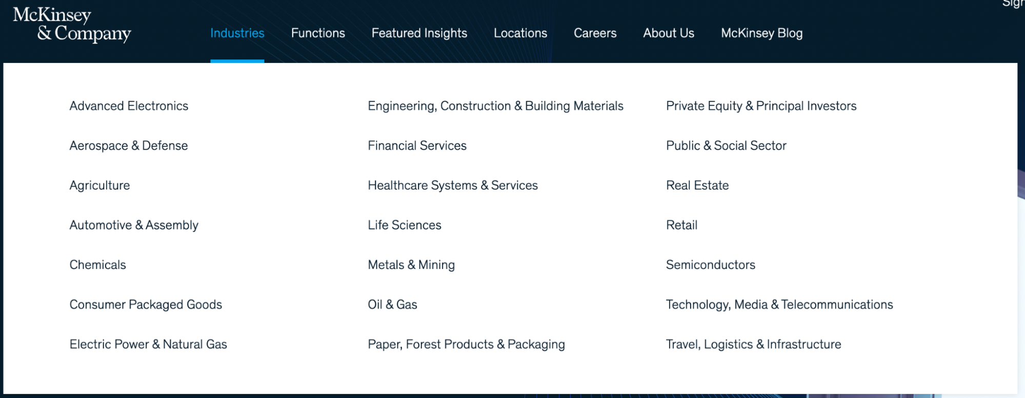
Along with their well-organized header, McKinsey does a great job of formatting their content in a way that makes it appealing and easy to find. They feature articles, but do so with plenty of images to create a more interesting layout. Scrolling through the site, you’re not likely to find words that aren’t associated with an image. By removing large amounts of text, McKinsey is able to draw attention to articles that would have otherwise been ignored.
Harvard University
Like many higher education website designs, Harvard is tasked with providing a ton of content to a wide array of stakeholder groups. Harvard University’s website is designed to appeal to prospective students, current students and alumni alike. In order to attract all three groups of people at once, Harvard laid out their site in a way that keeps everything in one place. With a search bar as well as a drop down menu in the right-hand corner, the site appears to be very simple, but holds a lot more information than immediately appears.
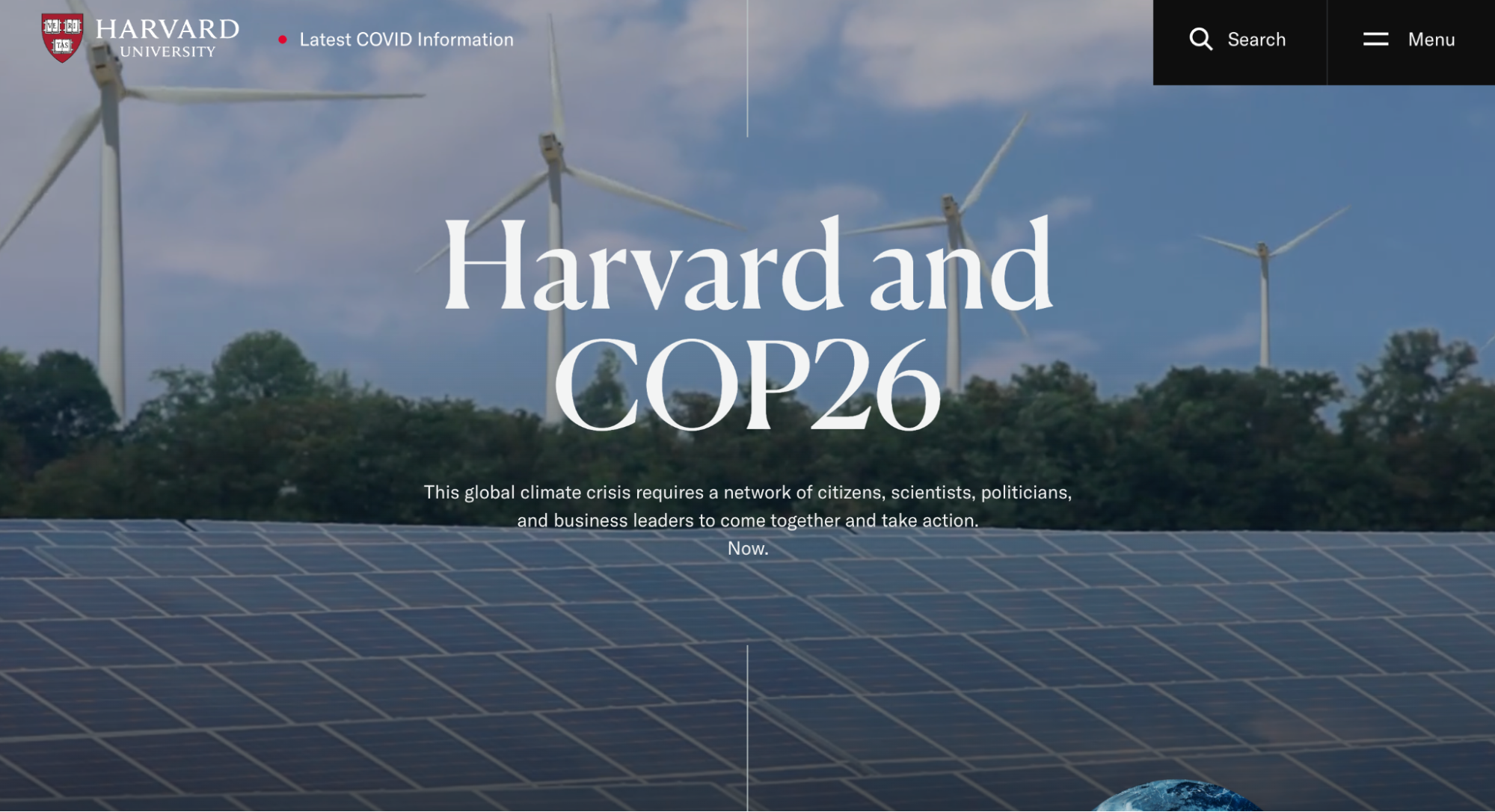
Using the drop down menu as seen below, the site is divided into several sections. This allows the user to find the section of the website where the information they’re seeking is stored. While an alumni won’t necessarily need to know about the academic buildings, they may want to stay updated on news, so Harvard separates their website in a way that separate target markets will have their own space on the site.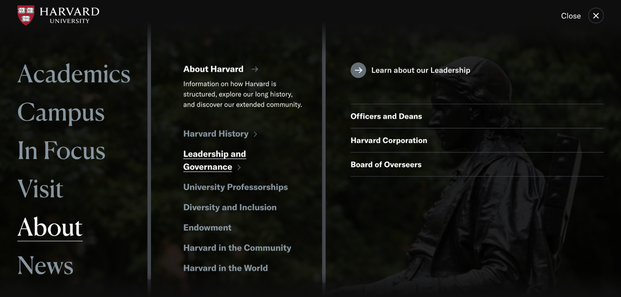
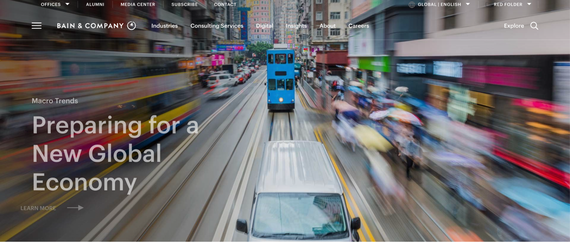
Bain & Company
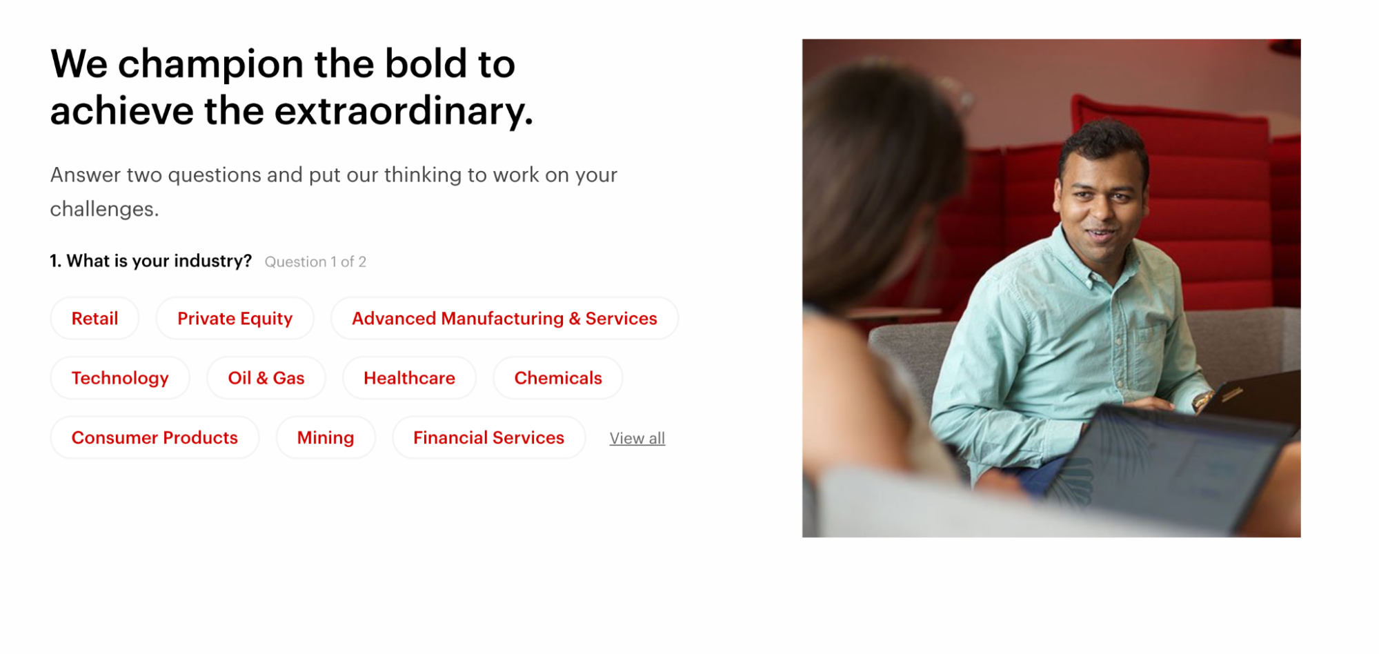
Bain & Company features interactive questionnaires on their homepage where clients can enter their industry, as well as the consulting services they’re seeking, and Bain can respond directly to that. This makes the site extremely user-friendly and encourages users to search for their specific needs, taking them right to the resources that can support their needs. On top of this questionnaire function, the menu is split up so users can search the specific function they’re seeking from the company.
Along with the incredible organization, Bain & Company does a great job of making the site visually appealing. The homepage features shifting images, which encourages users to stay on the site longer to get a glimpse of all the different pictures they chose to represent. The themes of red, black and white are consistently carried throughout the site, giving the site a sense of unity and making it clear it all belongs to the same space.
Conclusion
Voluminous content can feel like a blessing and a curse, but it ultimately is one of the greatest assets that a site can have. The content will help make your site more relevant to more people, enable you to rank better in search engines for specific terms, and create a valuable resource to share with others. To maximize all of these outcomes and more, the site needs to be designed and structured in a way that engages visitors and makes it easy for them to find the content most relevant and helpful to them. Following some of these best practices and applying an analytical approach to building your sitemap will yield benefits for the site for years to come!
Comments
Cristian T
Unleash the power of unconventional layouts to redefine your online presence. Collaborate with the best website agencies designing in Las Vegas to push boundaries and captivate audiences with layouts that defy convention, leaving a lasting impression.maarkgraf
Wow, these examples of content-heavy editorial website designs are truly impressive! Each website showcased here demonstrates a brilliant balance between informative content and stunning visuals. The attention to detail in organizing and presenting such vast amounts of information is commendable. It's inspiring to see how these designs not only enhance readability but also engage the audience through captivating typography, intuitive navigation, and immersive multimedia elements. These websites serve as a testament to the power of effective design in delivering rich editorial experiences. Kudos to the designers for their exceptional work!Josh Lockhart NMC team member
This is another comment to test out redirection.Leave a comment