
Creating Your Website's Sitemap and Main Navigation Strategy
Tips, Examples and Resources
One of the most important parts of planning how to prepare for a website project is organizing your website’s content and structuring it along with your site's main navigation. The main navigation should be defined during the discovery process of the project before any design takes place because the content structure is often pivotal for informing the design of the site.
There are a number of reasons your website sitemap and navigation deserve so much attention. First, from a user experience perspective, you want to make it as easy as possible for visitors to quickly find the information most relative to them. Our attention spans are continually shortening, and any amount of friction you introduce to a user's experience could cause them to bounce off your site.
Additionally, visitors are increasingly entering a site through interior pages via Google searches and referrals, meaning they'll never see your homepage and the main naviugaton needs to educate them on who you are, how you can help, and what they can do to take a next step. Finally, search engines greatly value pages and content in the main navigation, so being strategic about which pages are included and what they're named can help you increase your own visibility in search results and increase your traffic.
This post will help you determine your website's main navigation by:
- Defining the questions your website should answer
- Highlighting your Unique Value Proposition
- Prioritizing your most important content
- Examining common website main navigation mistakes
- Bonus: Sitemap Resources and Tools
We think this process is not only helpful after you've kicked off the website process, but even as early as when writing a website design RFP for your new project. If you're looking for someone to help you think through the main navigation strategy for your website, feel free to reach out and we would be excited to have a conversation about what makes the most sense for your organization.
Define the questions your website should answer
A website’s navigation structure should clearly lay out:
- What you offer
- Why visitors should want to engage with you
- How visitors can take the next step
Before putting together your site map, you'll want to lay out the answers to those questions since they will largely guide how you’ll want to set up your site’s structure and main navigation in particular.
What an organization offers will vary from one industry to the next, but will likely be the easiest of the three questions to answer. For a nonprofit website design, it could be the organization’s mission or programs, for a law firm website design, it could be the firm’s practice areas and capabilities and for a product-focused company, it would be selling that product.
Why visitors should take the next step with you is the question that will likely necessitate the most thought as there could be many different reasons why a user should choose you, but your website needs to prioritize the most important and compelling reasons.
How visitors can take the next step will establish the call(s) to action that your website should showcase. Whether that’s contacting you, donating, volunteering, purchasing a product or signing up to receive email updates, a key focus of the structure of the website will be presenting the next action users can take clearly and conveniently.
Highlight Your Unique Value Proposition(s)
What makes your organization different? What do you offer that your competitors don’t? What makes you the best fit for a visitor’s money or time? Once you know what makes you stand out, that should be featured prominently in your website structure.
Below are a few good examples of organizations that do a good job of highlighting their unique value proposition:
Hunger + Health

The driving issue behind Feeding America’s Hunger + Health is tackling food insecurity. That phrase may not be familiar to everyone that lands on their site so they devoted one of their six main navigation items towards making it super easy for any visitor to learn about why it's important that Feeding America fight the problem.
Warby Parker
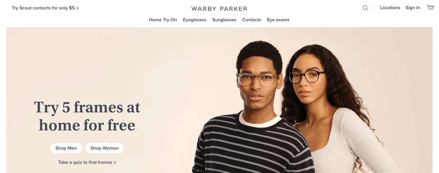
Warby Parker is known for being able to try on their glasses at home. While that's clear in the masthead of their homepage, they also reinforce it in their main navigation so no matter where a user lands on their site, they can quickly find Warby Parker's unique value proposition.
Chipotle
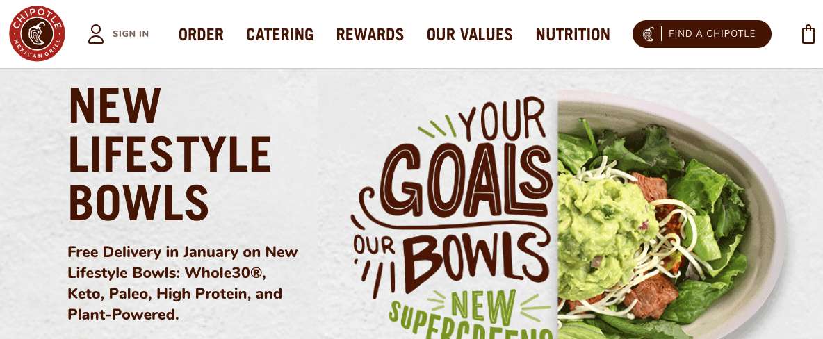
Everyone knows that Chipotle sells (in my opinion, delicious) food. What many people may not know, however, is what Chipotle’s core values are. Chipotle promotes that information explicitely in their main navigation, choosing to show that over information like Gift Cards or downloading their app.
Allbirds
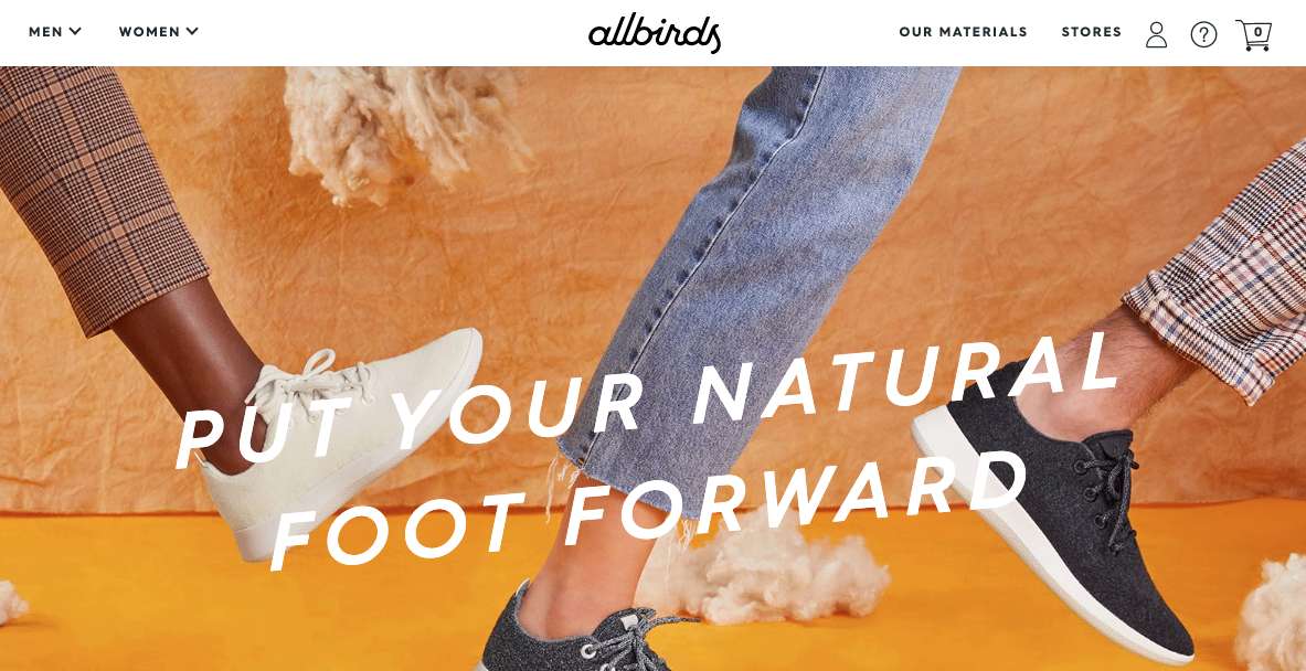
Allbirds includes “Our Materials” in their main navigation, one of only four menu items, to highlight the eco friendly nature of their products. They reiterate the importance of that message by the language in their homepage masthead, similar to Warby Parker and Hunger and Health.
Fleet Feet
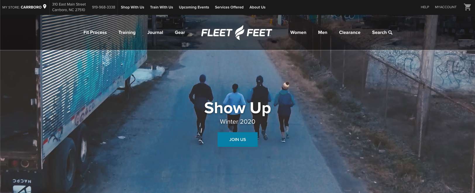
Fleet Feet is more than a place to buy shoes. Their Fit Process and training programs ensure that their customers have the perfect pair of shoes and a community of people with whom to run. That comes across loud and clear in their navigation.
Whatever differentiates your organization or company, it's crucial that information comes through in the main navigation of the site.
Prioritizing Your Most Important Content
In 1956, Cognitive Psychologist George Miller determined that at any given time, the average human can hold about seven items in their short-term memory. For that reason (and plenty more), you generally want to present no more than seven items in your main navigation.
Additionally, the fewer items that your navigation shows, the more visitors will focus on the items that are there.
Your site will likely have multiple navigations on it – it could have a main navigation at the top, a navigation in the footer, a dropdown menu, a mega menu – there are a lot of options. But the main navigation should prioritize who you are, your most important calls to action and the most compelling reasons why visitors should choose you.
The way you showcase the answers to those three questions will vary a lot for different companies, so let’s look at a few different examples.
Allbirds
Looking at Allbirds again, two of their four nav items are dedicated to what they offer, one is why they’re different the last is where people can shop. The two primary 'what we offer' items are laid out specifically to segment their audience into men and women, which is how their products are divided. From there, Allbirds can present only inforamtion relevant to that audience which is helpful for making each page as applicable as possible.
They also have three icons dedicated to people who are either actively shopping on their site or are current customers looking for help, but those are less prominent as they target people who are already on the purchase path.
Information like the history of Allbirds, their partners, career opportunities and the latest news have all been deprioritized and included in their footer navigation. That content is readily available for anyone that’s looking for it, but they didn’t clutter their main navigation by including a news feed, for instance.
Hancock Estabrook
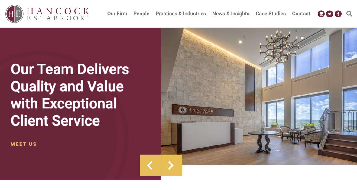
Hancock Estabrook, a law firm in upstate New York, has six main navigation items. Practices & Industries answers the question or what they do, there’s a call to action for a visitor wanting to reach out to the firm and the remaining four items all serve to establish trust and authority – their answer to ‘Why Hancock Estabrook?’
For law firms, the expertise of the attorneys is one of the most compelling assets of the firm as are case studies and insights written by the firm. While the team members weren’t as critical for some of the earlier product-focused companies, for service companies, they often are worthwhile inclusions in the main navigation.
Policygenius
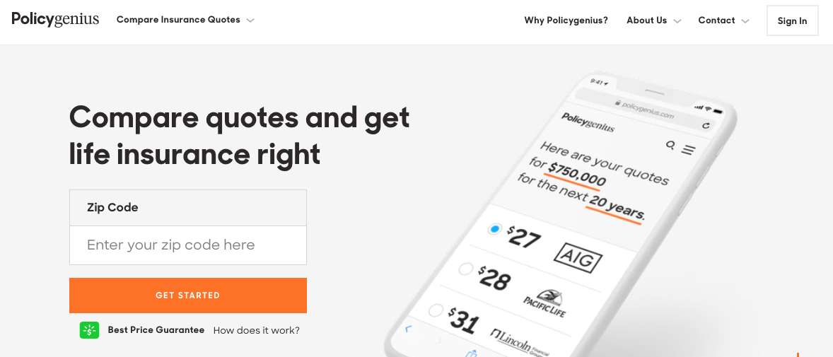
Policygenius has five main navigation items. Their highest visibility nav item shows what they offer – the ability to find the right insurance by comparing prices. They have two calls to action depending on whether you’re a prospective or current customer and an explicit page designed to answer the ‘Why Policygenius’ question. Their fifth nav item functions as a bit of a catch-all for ‘other items you may be looking for’ under About Us.
They have a massive footer navigation that includes more detailed information you may be looking for on a range of topics, whether that’s their products, FAQs, reviews or their address.
Wirecutter
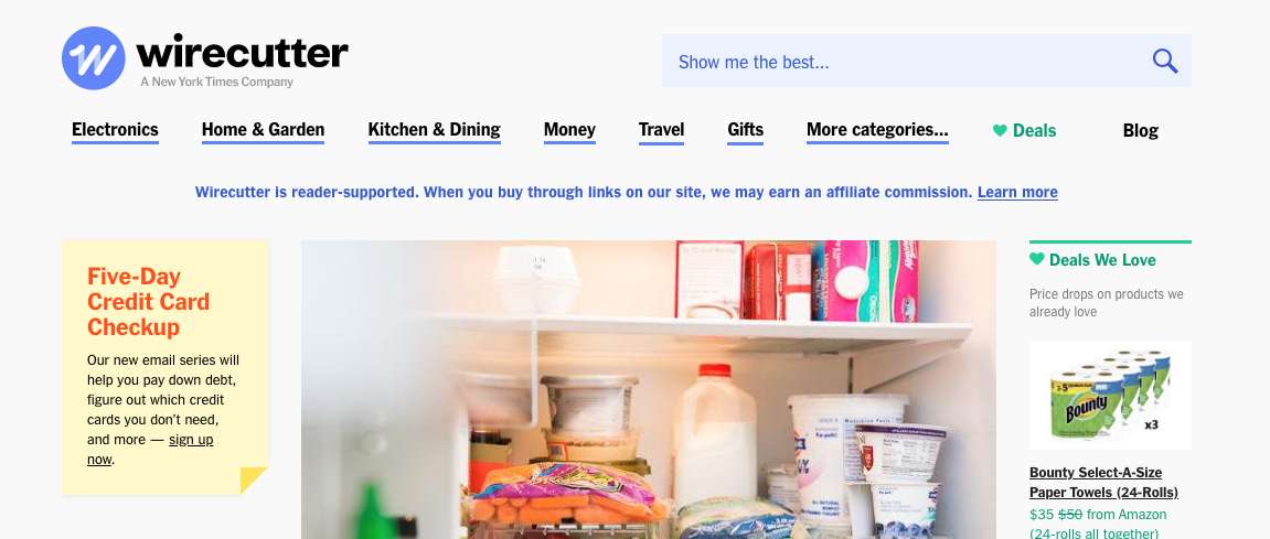
Wirecutter is a reader-supported content-based site with eight navigation items. Their entire site functions as a resource for outlining the best product in its category. While affiliate links are included in each of their pieces of content, they highlight current Deals in the main navigation. Otherwise, their entire navigation serves to showcase their different review categories and subcategories.
For Wirecutter, the ‘what we offer’ question is by far the most important question as each piece of content reinforces the value of their offerings and naturally drives visitors to take the next step by presenting calls to action within the content.
Information about the company, jobs and how to contact them are all relegated to the footer navigation.
Common mistakes to avoid when deciding on your main navigation
When determining your site's content structure and main navigation, consider the following common mistakes:
Not segmenting your target audiences
If the offerings on your site can be clearly divided into different audiences, your main navigation should serve to segment your audiences so that you can present information that is geared towards that group. For example:
- Product-focused companies segmenting men's, women's and children's products.
- Law firms clearly laying out their different practice areas.
- University websites showing content separately for Students, Faculty and Alumni
Including non-crucial top navigation items
Every item in the main navigation is taking away from the attention on the other items. If a piece of content is not absolutely crucial, it should be featured somewhere other than the main navigation. A few common examples of main navigation items that are often included and may not be necessary are:
- 'Home' – it's become common practice to have the logo of a site link to the site's home page. For most companies, there's no need to have a 'home' main menu item.
- 'Blog' or 'News' – if your blog or news feed isn't maintained regularly, it could actually hurt your company to show it prominently. You could be better served to include another main nav item that answers the 'why your company' question.
- 'About' – Having an about page is certainly important, particularly for less established brands, but it may be more impactful to call that page Mission, Experience, History or Team in the main navigation.
- 'Team' – Sometimes it's crucial to show your team, particularly in the professional services industry, but if the staff or leadership content isn't vital to the public, it can be placed in the footer of the site or linked to from other areas of the site.
To have a dropdown or to not have a dropdown, that is the question
Whether or not you have a dropdown menu comes down to whether exposing additional information is more valuable than visitors clicking to a landing page that has greater detail about the items you would have included in the dropdown menu. The best use cases for dropdown menus are when they're used to segment an audience. They should never be used just for the sake of squeezing more information at the top of the page.
If you do decide to have a dropdown menu, make sure that the dropdown menu functions well. A few things to avoid when using dropdown menus:
- Avoid third level 'fly-out' navigations and instead use mega menus.
- For accessibility reasons, the top level navigation item should either link to a page or toggle open a dropdown menu, not both.
- Have a slight delay when leaving a dropdown menu before closing it out so that users can quickly get back to where they were if they accidentally navigate away from the menu.
If you do go with a dropdown navigation, be sure to test it extensively on mobile devices as that's where most people access the web.
Sitemap Resources and Tools
While you can lay out your main nav and site structure using Google Sheets or Excel, the following tools are useful for presenting the sitemap more elegantly and planning the content creation process for any missing pieces of content.
- Gloomaps – minimalist and free
- Slickplan – feature rich, good for agencies and teams
- Miro – feature rich, particularly for substantial collaboration
- Octopus – free, good for smaller sites with block building capabilities
- Writemaps – fewer features, but usable free version
Conclusion
Your website's main navigation is one of the first places a user looks when they visit a page on your website. It's crucial that you easily present what you're offering, why they should choose you, and how they can take action quickly and clearly.
When weighing different main navigations, be sure that you're selecting the items based on how likely they are to convince a visitor to engage with your organization and whether they're worth drawing attention away from the other navigation items. The main navigation should be reserved for only the most crucial information on your site.


Leave the first comment