Tips and Lessons Learned in Producing a Successful Infographic
Earlier this year, we saw an opportunity to build a site where businesses could post and share local news and press releases. Many of the sites in this space were badly outdated, too commercial or had simply shut down over time. Our website, NC Headlines, focused on optimizing releases for searches and also made social sharing and integration very easy.
The site had steady growth over the first several months, but visits began to level off. We talked about different ways to market the site and decided that an infographic could be a good way to attract visitors, gain inbound links and that it would serve as a great inbound marketing asset for the site, moving forward. Below are the steps we took to build the infographic and a few of the things we learned along the way.
1. Choose a topic
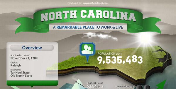
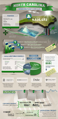
NC Headlines is all about North Carolina and North Carolina Businesses, so our primary decision was around what specific state-related topic we should cover. We looked at things like business growth, schools, employment rates and state-to-state rankings. In the end, we chose to combine many of these, creating a snapshot of the state. Something that people could read, share and be proud of. By the end of the data collection, we were more impressed with our state than ever before. NC really is an awesome state and as someone who has lived here for my entire life, I probably take it for granted! By choosing a topic that directly related to our readers (North Carolinians) we ensured direct overlap between NC Headlines' target audience and people who would enjoy the graphic.
2. Gather information and assets
This step really ties-in with step 1, in that you’re going to need data to support your topic. With each topic considered, we did some light research on what data was readily available. You could always gather your own data to support the topic, but that was beyond the scope of what we could tackle for this project. In the end, we gathered information from a number of sources across the web and compiled a single outline of how we hoped to structure this information in the final graphic. A tip, be sure to include your sources while collecting the data so that you don’t have to go back and track down that information later on. Also, if you’re working in a group, as we were, post your outline online so that everyone in the group can see and edit it without getting into a nasty "reply all" attachment cycle. We used Google Docs.
3. Design
Topic, check. Data, check. Now the fun part! Review your data and explore different ways to bring these stats, numbers and comparisons to life with your designer. In our case, since our data was mostly bullet points of data and snippets of information, we relied heavily on supporting images and graphics to add some life to this relatively "static" information. We also sectioned off our data into individual sections in the outline phase, so we knew that the design needed to tie all of these sections together as one coherent design, but with clearly grouped sections. As web designers, this wasn't much different than the process we’d take when figuring out a site’s information structure and layout.
4. Distribute
When your infographic is ready to go, it's time to start spreading the word. Hopefully you have some good, established channels in place. For us, this was social media and the NC Headlines website. We posted the graphic to the site, which may seem obvious, but is probably worth mentioning. For SEO, you want to make sure the infographic is hosted on your domain and integrated into your website. When people click through, you want the site’s branding and navigation available so that people can explore other parts of the site if they’re interested. If applicable, also include a call to action on the same page as the graphic. This could include an email newsletter form or possibly some type of service or product you’re promoting that ties-into the topic of the infographic. We created a standalone page for the graphic and also added it to the sidebar for other pages on the site.
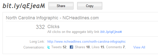
Once the graphic was on the site, we created a shortened link to the page. We used bit.ly since it has some nice, simple tracking options. If you’re using a social media measurement platform, like Argyle Social (another local company), you could also use that.
Next, put it out there. We first tweeted a link to the page, both from the site's account and also from my personal one, and then posted it to our company Facebook page. We chose to send it around early in the morning since we knew that was a time where we had seen good social activity with our followers in the past. Next, we did a little light prompting, letting co-workers know it was live and reaching out to a few friends. They retweeted the original tweet and within a minute or so it was in front of a few thousand people. A handful of those people also shared the link and within the hour we had gathered a few hundred mentions. If you get one or two people within this group that are big "influencers" in a social circle, you’re in for a nice spider web of quick sharing that can take off quickly.
One other quick note, be sure to put some thought into your tweet and ask yourself, “Is this something I’d retweet or share?” If not, try to reword it.
5. Measure
 I mentioned bit.ly above. We also took a few looks at Topsy throughout the day and some reports on Google Analytics after the weekend. In all, these free measurement tools can give you a good picture of your reach. For more detailed measurements, I’d recommend taking a look at some software specifically built for sharing/measuring social reach and engagement.
Iterate
Don’t wait until the stars align to share your infographic, they probably never will and even if they did, your data will likely be outdated. Instead, get it to a point where you’re comfortable sharing and be prepared to respond to criticism and iterate. In our case, I left off the Charlotte Bobcats, an NBA team in Charlotte, from our list of NC-based sports franchises. Whoops. Not the end of the world, though. Several of our followers noticed the omission quickly and let us know about it. We’ll probably create a second version of the infographic shortly and we’ll include them in version 2. Overall, it’s the web, not a book cover, so just iterate and continue to improve with the help of others. In the end, this slip-up generated a few conversations and probably some sharing that may not have happened otherwise. So, if you’re a glass half full guy or girl, look at it as a silver lining.
Stats & Results
We saw a huge spike in traffic for the day, about 7x what the site normally has. On the social side, we had around 40 mentions on Facebook, over 300 clicks on our Bit.ly link, a handful of Google +1s and some additional sharing through email and LinkedIn. In all, we were really excited with the shorterm reach and as I mentioned earlier, we should continue to see longtail traffic moving forward.
Conclusion
This was our first attempt at producing an infographic, and we were very pleased with the results. 93% of the visitors to the infographic had never been to NC Headlines before, we gained the attention of a few prominent groups in the area, received a lot of inbound links to our side project, and got to brag about our favorite state. Overall, it was a great first experience, but I’m sure there are many others out there with their own unique experiences, and I’d love to hear about what you've found to be successful. If you’re willing, share your thoughts and tips in the comments below.


Leave the first comment