A Designer's Guide to Animating Icons with CSS
As a designer, I love coming across fun animations when visiting a site, and I have definitely been seeing more and more of them lately. Animations take illustrations and icons to the next level, making a site that much more engaging. While they are obviously attractive to look at, they also serve a functional purpose, captivating visitors and encouraging them to interact with the content.
I’ve wanted to add more of these fun touches to my website designs, but always thought the task was more in the development team's realm, and I hadn’t really thought much about creating them myself. I mean, I’m just a designer with a tad bit of coding experience, so I couldn't possibly build these interactive pieces for the web, right? Wrong! After some research, I learned how to code some icon animations myself and it is actually way easier than I thought.
I wanted to share what I've learned and the process that goes into it, allowing all designers to feel a bit more freedom in bringing their creations to life!
Using CSS to Animate Web SVG Icons
I'll walk through a few real examples of how I honed my new skills, creating three simple Services icons that will ultimately look like this when they’re animated:
Each icon uses a different technique so we’ll break them down one-by-one.
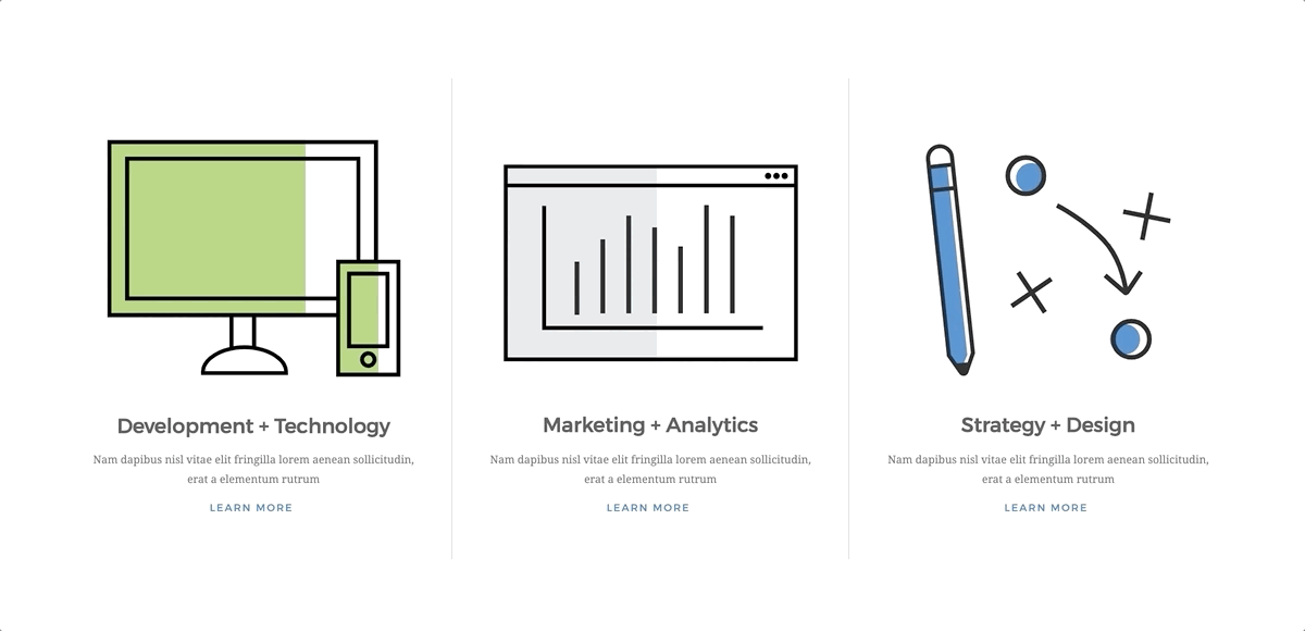
Development + Technology Icon
This icon is the simplest of the set, so let's start there. It includes a computer monitor and smartphone that gradually fill in with a green highlight, as if they are being powered on.
The width of the green blocks will be animated from 0% to 100%, giving the illusion of the screens filling in with color. To make this happen, I simply dropped this nifty snippet right into the svg class for the computer screen:
<animate attributeName="width" from="0" to="165.6" dur="1.75s">
This icon’s svg code tells us that the computer screen highlight is 165.6px wide, so we want to make sure that the to=“#” matches that width. We also gave the animation a duration of 1.75 seconds. Do the same thing for the phone (but with a different width number) and that’s it!
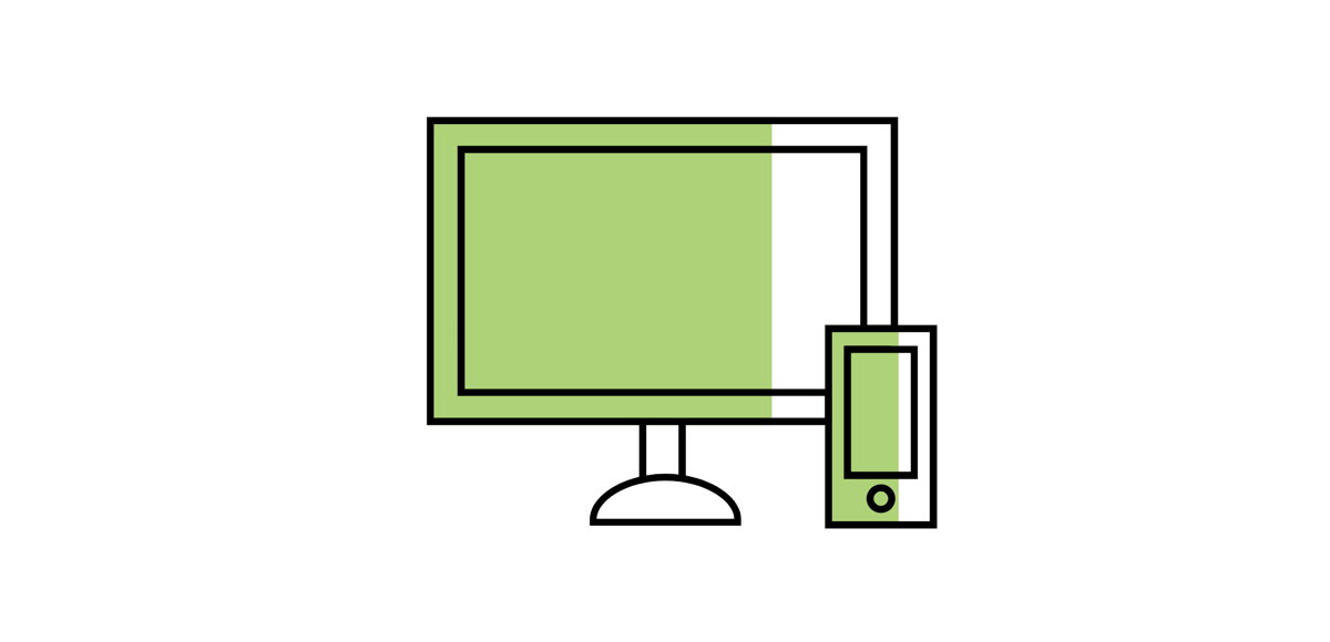
Marketing + Analytics Icon
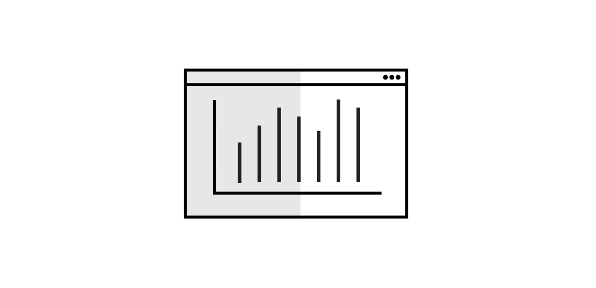
Before getting into this icon, read this awesome article that explains everything you need to know about stroke-dashoffset, which is the type of animation used for the graph lines.
After getting your head wrapped around how to animate the lines, it’s time to make the magic happen. All you have to do is give each bar in the graph a different delay to create the illusion of the graph growing. (Make sure to number each bar in the svg differently so that they are distinctive in the code.)
Animating the Bar Graph Lines
This keyframe code creates the animation:
@keyframes offset { to { stroke-dashoffset:0;}}
Then we apply that animation to each bar in the graph:
.bar-1, .bar-2, .bar-3, .bar-4, .bar-5, .bar-6, .bar-7 {
     stroke-dasharray: 150;
     stroke-dashoffset: 150;
     animation: offset 1s linear forwards}
Then we give each bar a slightly different animation delay time so that they start one after another:
.bar-1 { animation-delay: .4s;}

.bar-2 { animation-delay: .5s;}

.bar-3 { animation-delay: .6s;}

.bar-4 { animation-delay: .7s;}

.bar-5 { animation-delay: .8s;}

.bar-6 { animation-delay: .9s;}
That's all for the bars! Now for the background color animation we use a fadein effect.
Fading in the Graph Background Color
This keyframe code creates the animation:
@keyframes fadein {from { opacity: 0; }to { opacity: 1; }}
Then we apply that animation to the graph highlight:
#graph-highlight { animation: fadein 2s forwards; opacity:0;}
We don’t give the rectangle color any animation delay because we want the animation to begin right away.
So simple, yet so effective!
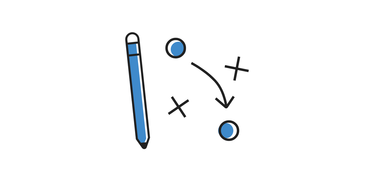
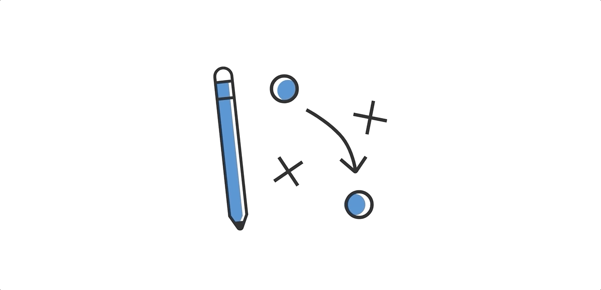
Strategy + Design Icon
The most complex of the three, our intention with these animations was to make the icon look like it was being drawn by hand.
Animating the Lines
To animation the X’s, circles, arrow line, and arrow head we use the stroke-dashoffset animation.
This keyframe code creates the animation:
@keyframes offset { to { stroke-dashoffset:0;}}
Then we apply that animation to the arrow path, arrow head, circles, and each line of the X’s (since each X is actually comprised of two paths.)
arrow-path, arrow-head, .circle-1, .circle-2, .x-1a, .x-1b, .x-2a, .x-2b {
     stroke-dasharray: 150;
     stroke-dashoffset: 150;
     animation: offset 1s linear forwards}
Then we give each item a different delay time to create some interest while the icon is animating:
.arrow-path { animation-delay: .25s;}

.arrow-head { animation-delay: 1s;}

.circle-1 { animation-delay: .15s;}

.circle-2 { animation-delay: .5s;}

.x-1a {  animation-delay: .75s;}

.x-1b{ animation-delay: 1s;}

.x-2a { animation-delay: .25s;}

.x-2b { animation-delay: .5s;}
Fading in the Background Colors
To animate the pencil color and circles background color we used the fadein animation.
This keyframe code creates the animation:
@keyframes fadein {from { opacity: 0; }to { opacity: 1; }}
Then we apply that animation to the circles and pencil colors:
#pencil-highlight, #circle-1-highlight, #circle-2-highlight {
     animation: fadein 2s forwards; opacity:0;}
Then we give each item a different delay time to create some interest while the icon is animating:
#pencil-highlight { animation-delay: .75s;}

#circle-1-highlight { animation-delay: 1s;}

#circle-2-highlight{ animation-delay: 1.2s;}
And that’s it!
Learning this approach has not only been personally rewarding and helpful to our development team, but I think it has also helped encourage me to push my designs even farther. It's more exciting than ever to incorporate animations, knowing that I can (and will!) bring them to life on my own. I hope you found this helpful and let us know if you have any other favorite approaches, techniques, or tips. Happy animating!


Comments
Jan
Hi,Please don’t forget that SMIL, animation for SVG, is deprecated and CSS animation and transitions also don’t work on IE.
Cheers
WPezDeveloper
Very nice. Thanks for sharing.Question: I presume these are triggered as these SVGs enter the viewable part of the screen. What JS are you using to monitor scroll position and, I presume, add a class to the wrapper?
tia
KD
This was very helpful, never knew SVG animations could be done this simple and logical. Thank you! 👏Josh Walcher
Really nice work! I linked in from Codrops and this is really inspirational!Leave a comment