As you’ve probably heard by now, an increasing percentage of all Internet traffic across the globe comes from mobile devices. About 1 in 3 Google searches in 2014 originated from a mobile or tablet device, and this number will continue to grow over the next few years.
This week, the search algorithm that determines how sites rank on mobile Google searches will be updated so it's heavily influenced by mobile usability. Websites that are mobile-friendly or responsive will show up higher in mobile search engine results, while websites that are not mobile ready will be penalized. The goal of this very significant change is to make the web faster and easier to use for anyone on any device.
Here are five things you need to know about the updates to Google’s algorithm, how it might affect your website, and what you can to do make sure your site doesn’t see a significant dropoff in organic mobile search traffic.
1. What changes is Google making to its algorithm?
Broadly speaking, Google will be updating its mobile search algorithm so that search results will lead to content that is usable across all mobile devices. Google explained on its Webmasters Mobile Usability post that it will be prioritizing websites that are:
- Responsive - The defined viewing area adjusts to the device’s screen size. Put another way, all pages on the website use the same URL across devices, and pages “respond” according to the screen size of the device.
- Free of horizontal scrolling or pinching/panning required to view the entire page.
- Using easy-to-click links and elements.
- Incorporating fonts that scale for easier reading on smaller devices.
- Free of technologies (such as Flash) that are no longer rendered by most mobile browsers.
Although no one technically knows the exact algorithm changes that will go into affect in a few weeks, The Moz Blog hypothesizes that Google will "launch a new mobile crawler (probably with an Android user-agent) that will do a better job of crawling single-page web apps."
2. How significantly will mobile rankings be affected?

You don’t have to take Barney Fife’s word for it. By all accounts, the impact of Google's mobile-friendly algorithm is predicted to be huge. Search Engine Land reported that, according to a member of Google’s Webmaster Trends team, this update will have more of an impact on Google’s search results than the previous Google Panda update and Google Penguin update.
Business Insider also reported last week that a number of the world’s largest brands will be significantly punished under the impending update (a few listed were Windows Phone and the official website for the European Union.) The Wall Street Journal is referring to this change as 'Mobilegeddon.'
The effects will be universal - not just for big brands with thousands of monthly site visits. If 50% of your traffic from Google comes from mobile devices, and your site is not mobile-friendly, the implications are that virtually all of that traffic from mobile is at huge risk. As a point of comparison, the NMC website would lose about 2,100 monthly visits if the site weren't responsive.
3. How can I tell if my website meets mobile-friendliness requirements?
Ahead of this major change, you can check your website using Google’s Mobile-Friendly Test, which was recently added to everyone’s Webmaster Tools reports. This test will analyze a URL and report if the page has a mobile-friendly design.
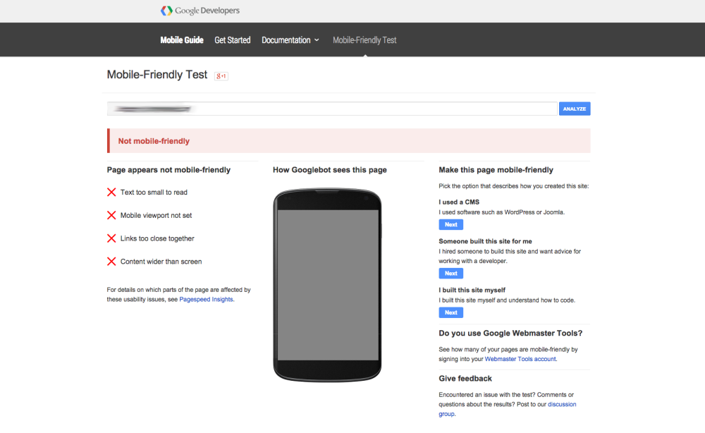
The Mobile-Friendly Test will check that the site avoids software that doesn't work on mobile devices, uses text that is readable without pinching and zooming, has content that sizes to the width of the screen and links that are far enough apart that the correct one can be easily selected.
4. My site failed the mobile-friendly test. What now?!
If you failed the Mobile-Friendly Test, Google’s upcoming change will most likely have a negative impact on your website’s traffic because the website is not optimized for mobile. Thankfully, the Mobile-Friendly Test gives recommendations for how to fix these mobile usability issues across the site. The test will generate a report to help diagnose and fix errors (along with step-by-step instructions) for specific pages to improve their mobile search performance.
A few of those primary mobile usability errors are pretty straightforward, one-off fixes. For example, removing any Flash-based content from the site is a nearly immediate fix that can pay dividends after the algorithm updates on or around April 21st. However, the lack of a responsive web design on your site is a much more involved fix. The site will need to be rebuilt in a responsive manner to comply with those requirements.
5. Is it worth investing in a mobile-friendly or responsive website?
It is almost certainly worth the investment to rebuild your website responsively, as soon as possible. If you're curious about the immediate impact of these changes, you can check your Google Analytics to see what percentage of your search traffic is coming from mobile devices. In the 'Audience' tab, drill down to Mobile -> Overview. This will show you how much of your traffic comes from Desktop, Mobile and Tablet devices. Add a Secondary Dimension for Traffic Acquisition (I find Source / Medium is most helpful, but Default Channel Grouping works, too) to see where that traffic is coming from. You can assume that any traffic from mobile or tablet that was driven by google / organic will be at risk if your website is not mobile-friendly.

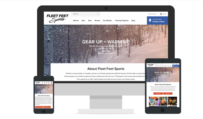
Now is a great time to think about rebuilding your site code in a responsive manner. Each size will reorder the content in a manner that is optimal for that specific screen. A responsive design ensures that you have a tailored experience for people of all screen resolutions and that you’re not alienating mobile visitors with a site that is cumbersome to navigate on a phone. It also alleviates the concern of a major dropoff in mobile organic search traffic with the impending algorithm updates. Beyond the SEO implications, responsive web design has a myriad benefits for businesses and organizations, including increased donations for nonprofits.
Interested in learning more about a mobile-first design for your business or organization's website that will highlight information most relevant to visitors viewing on any device? We'd love to hear from you!
Related Posts


Web Design & Development Trends You'll See in 2015

Comments
plus size women's clothing at macy's
Thhe fact that the jacket is made entirely custo (known among the tailors "largely") and the room (no line work) implies that the assembly steps are completely different from technical manufacturing ready-to-wear, mass-produced (and often in China.Traditional, conservative knitwear that can sell at fine fashion haberdasheries annd boutiques certainly don't seem to go well with the image of a
woman who travels routinely to some of the toughest areas of the world on behalf of the United Nations.
If you are really looking for , ten you have a wide resource of online clothing stores on internet.
A common mistake that is fatal toward hats is publicity to heat.
Girls are never satisfied with their wardrobe collection,
they keep on adding new apparel, but when they have too
wearr something unique and stylish, they feel something
lacking. Beauty Desires is a business administration about the Maxi Dresses.
Leave a comment