Skip to Main Content
NMC Logo
New
Media
Campaigns
Home
About
Services
Work
Blog
Contact
BLOG
Blog
Where we discuss our work, thoughts, and process
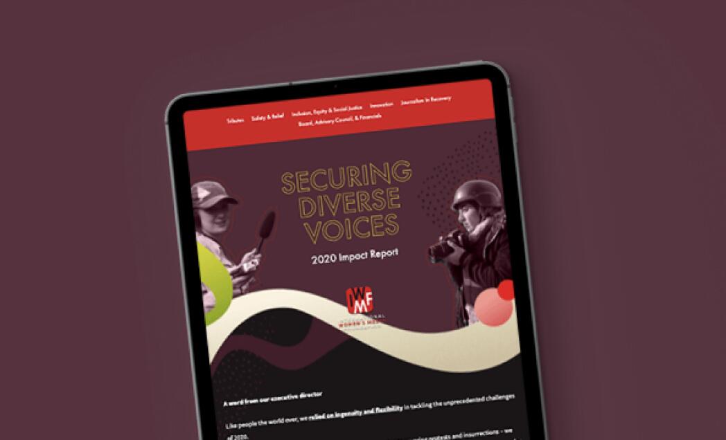
Best Practices and Examples of Annual Report Websites and Impact Report Microsites
Design
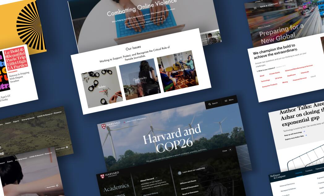
Examples of Content Heavy Editorial Website Designs
Test
Economic Development
Wake County Economic Development
2025 Year in Review: Looking Back at a Big Year of Launches, Learning, and Collaboration
Leveling Up Our Designs with Figma's Prototyping Tools
Newsletter
July 2025 Newsletter
Nonprofit
Partners in Opportunity
Newsletter
June 2025 Newsletter
Nonprofit
American Floral Endowment
Newsletter
May 2025 Newsletter
B2B
CPM
Older Entries ▶
Filter By Subject
Design
Development
Front End
Interview
Marketing
News
Newsletter
NMC
Press Releases
Project Management
Sketch
Filter By Industry
B2B
Economic Development
Higher Ed
Legal
Nonprofit
Politics