Up until a few years ago, splash pages were used prevalently across the web in mundane ways ways like thanking users for visiting the site and then requiring them to click enter to even access content on the site. Fortunately, those days seem to be behind us and their general use on websites has drastically diminished.
We work on a wide spectrum of types of websites, but for the most part splash page use is limited to our political and nonprofit clients.
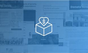
For political work, we use splash pages across nearly all the campaign sites where clients are in the midst of a campaign; primarily for collecting email signups, and intermittently as a call for donations. For nonprofit clients, they are rarely used, but when they are, it's generally for the latter -- the client is in the midst of big fundraising push and many visitors to the site will be accessing the site for the sole reason of making a donation.
For setup on sites that require splash pages, we shifted a year ago to primarily using a lightbox’y modal with cookie integration and various other features like the ability to temporarily hide or show the splash to users when necessary. The code is open sourced at CoverPopjs.com for anyone interested in taking a peek or using it. Additionally, for the sites that require redirecting users to a separate page and cannot be handled by CoverPop, the JavaScript and HiFi setup we use is on our Github account.
With the majority of sites, the best splash page is one that doesn't exist. For visitors, they are at best an inconvenience; and at worst, obnoxious and intrusive enough that they leave the site completely before even accessing the content that they wanted to visit for in the first place.
So why even risk using one? Quite simply – depending on your organization's goals – they can be tremendously effective, making the benefits outweigh the costs.
The goal with this post isn't to dissuade you from using splash pages (Google something like "splash pages and bounce rate" if you want that), but instead offer recommendations on the best way to approach splash pages if you do need to use one.

Use a lightbox overlay instead of a redirecting to a separate page
As I mentioned above, we’ve switched over to using a setup with our clients called CoverPop that we developed ourselves after being frustrated or unsatisfied with other alternatives. CoverPop uses a modal setup similar to lightbox instead of redirecting visitors to an external page.
Here are a few of the reasons we decided to switch over to using a modal as a splash instead of a separate page.
-
Visitors realize they are in the correct place. By making the overlay slightly transparent, visitors can see that there is content behind the splash so visitors aren't confused if they are in the correct place.
-
It's much more seamless. A lightbox overlay keeps visitors on the same page instead of immediately redirecting them somewhere else.
-
It's lightweight. Redirecting users to a different location requires another page load. A lightbox overlay prevents that delay.
Make them responsive – even if your site isn’t
On nearly all sites we launch now the site is fully responsive, but there are some they aren't or were built before the shift towards responsive a few years ago. Even if the site isn't responsive, it's good practice to spend a bit more extra time to make it optimized for different devices and screen sizes. The conversion rate will be higher and the bounce rate will be lower for mobile users.
Redirect users to splash pages ASAP
With splash pages that exist on a separate page, you've likely had an experience similar to this: a page loads with what you want to see, you scroll down a bit to read it, then the JavaScript kicks in and redirects you to a different page. If you are going to redirect visitors, be nice to them and don't tease them by loading the page they want to see, just to send them away.
Be nice to your users and send them back to the page they came from
If you are redirecting visitors to a splash page, keep track of where they came from initially so they can be redirected there after they skip a splash page or do some sort of action. Sometimes developers either unintentionally (because the didn’t think it through) or intentionally (because they were lazy) send visitors to the home page instead.
In addition to it simply being a bad experience for the visitor, Google stated a few months ago that they will penalize a site "when a desktop page redirects smartphone users to an irrelevant page on the smartphone-optimized website" because "[t]his kind of redirect disrupts a user's workflow and may lead them to stop using the site and go elsewhere." Sounds similar to quite a few splash page setups, doesn't it? The same approach with a splash page could very well negatively impact your site’s search result rankings.
Don’t show them to users every time they visit
If the visitor skipped the splash the first time, it's unlikely that they will take the action you originally intended with the splash page the 2nd, 3rd, or 4th time. Depending on the purpose of the splash, delay showing the splash again for something like 7 days or a month. As an example, BarackObama.com currently sets a cookie for 30 days, although the splash pages change frequently enough that it’s unlikely one will be active that long.
Keep them as lightweight as possible
Site speed is enormously important to retaining visitors, so keep the splash page lightweight in size because the longer it takes to load, the more likely visitors are to leave.
For example, the splash pages setups we use:
-
Do not require downloading a library like jQuery, and instead use vanilla JavaScript.
-
Are small enough to have in the head without worrying about blocking. The JavaScript snippet we often use when redirecting users to a separate page is less than 1KB.
-
Avoid including social plugins or video embeds that could slow down loading. For example, a Youtube video embed would use another plugin we wrote called LazyYT to prevent the lag caused from loading the standard Youtube iframe video.
Pay attention to your analytics
Keep an eye on how things are working, and try out variations to see what splash page setup is the most effective. Setups that include embedding a Facebook like button may increase likes, but it may also negatively affect the bounce rate. Without testing and watching the analytics, it's virtually impossible to be aware of these type of occurrences.
Don't make the skip/continue button impossible to find
During one of the first campaigns I worked on a few years back, I was spending some time working at the campaign office when a woman dropped by to work the phone bank. While speaking with her, she asked what I did with the campaign and I'd mentioned that I’d built the website. She replied that she was looking forward to seeing the full site because the current one was pretty plain and lacked content, even though we'd switched from the temporary site to the full site more than a month earlier. After some brief confusion, I realized that the continue/skip button was so inconspicuous that she thought the splash page was the actual site (it only had a picture of the candidate and a list signup form).
While that example dealt with unintentionally sloppy design, other splash setups will be more devious and purposefully make a skip button hard to find with the hope that visitors feel required to enter an email address to get through. Do your website visitors a favor and don't make it impossible to find a way to skip the splash.
Don’t forget about them
This is something I’ve seen enough that it’s worth mentioning. If the splash page deals with something time-related (for example a fundraising push that ends in a few weeks), set a reminder for yourself to turn off the splash page so that visitors aren’t seeing something outdated. When a splash page is set to be hidden from returning visitors, it can be easy to forget that it exists because you won’t see it yourself when you visit your own site.
If you have any other tips or comments from your experiences on good or bad practices for splash pages, please feel free to share them with others in the comments!


Comments
Geraldine Batisla-ong
Hi, this is a great article. We are actually looking for someone who can help us to build splash page for out website. If you are interested please email me and let's discuss this. Looking forward hearing from you.Best,
Geraldine
Leave a comment