
2018 Web Design Trends
2/3/2020 Update: If you're looking for the latest and greatest in web trends, please go visit our new, 2020 web design trends post. Or feel free to read on to give us a grade for how our 2018 predictions fared!
Happy 2018! We love spending some time at the beginning of the year to reflect on our work, but also look forward to what we can create in the upcoming months. It's exciting to take a look at design trends and start putting them to use. This year, we think designers will be breaking the mold, expanding their color palettes, adding custom touches like bold fonts and illustration, and taking more design risks.
Here's a look at what we think we'll see a lot of this year:
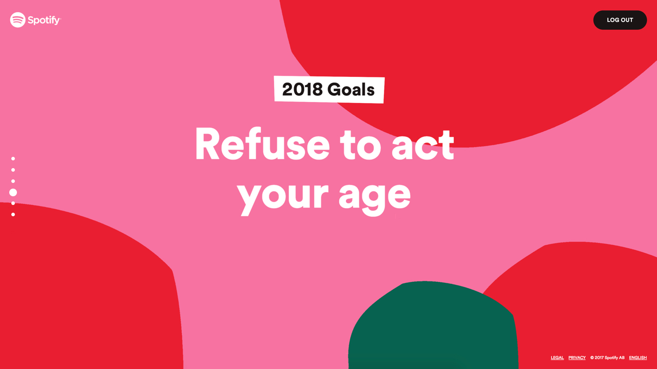
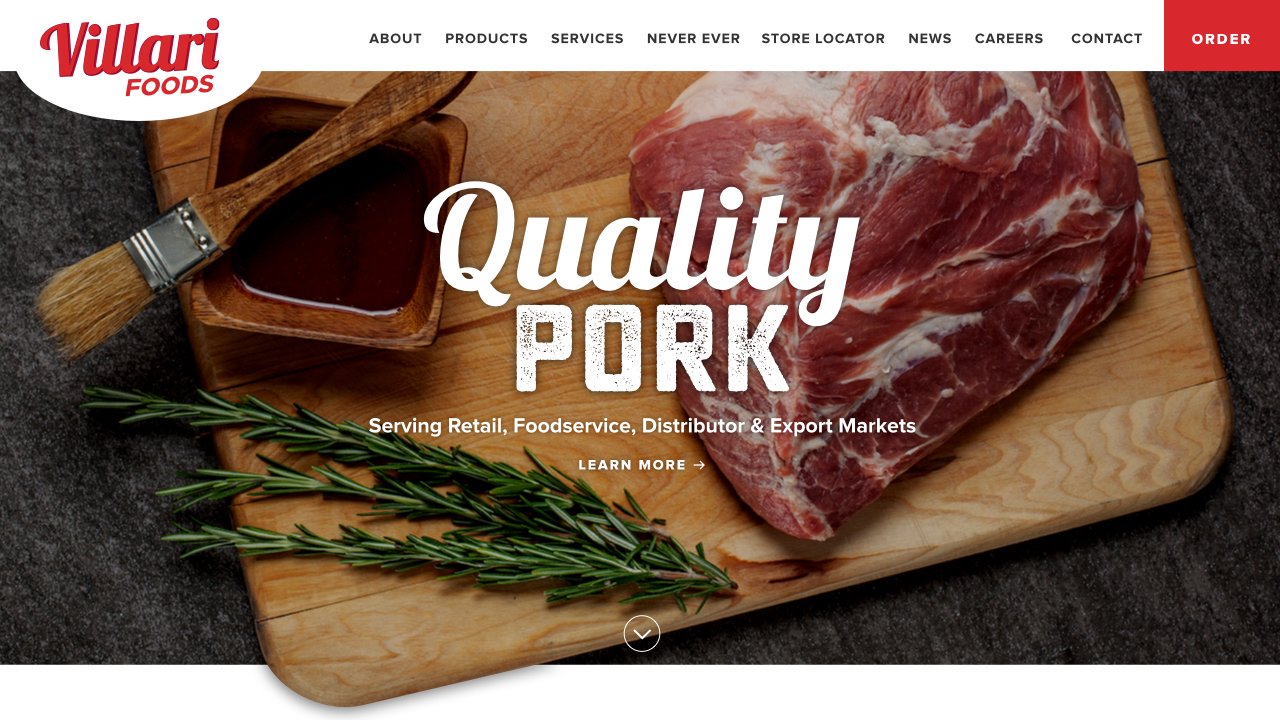
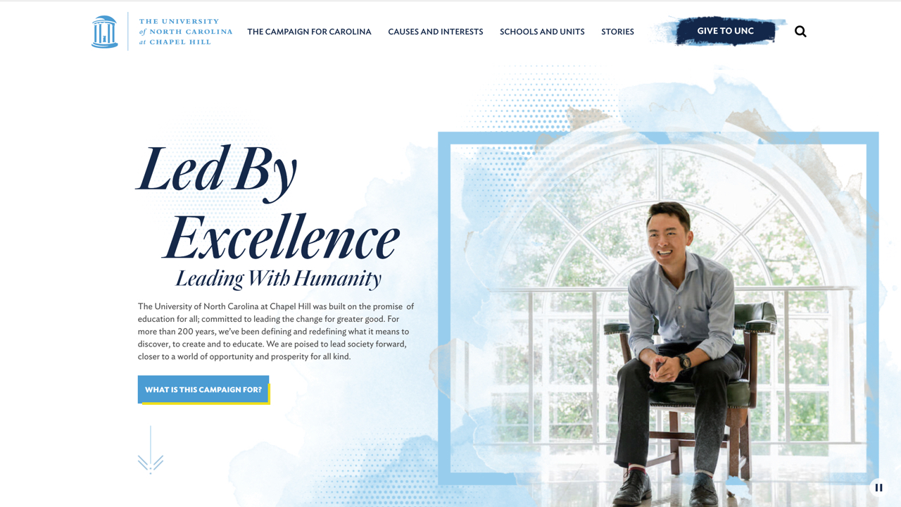
Color, Color, Color
They say design trends come around in 20 year cycles, and I think we can expect the web to embrace the bright hues of the 1980s and 90s this year. Designs will be using not only more colors, but more vibrant gradients, typography, image overlays, and graphics.
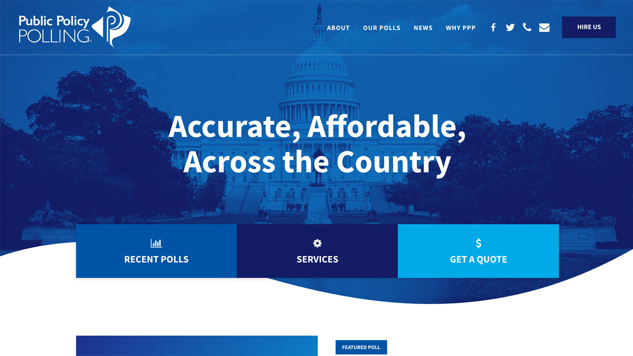
Full Screen Experiences
Every year the standard grid we're all use to designing on breaks a bit more. With new responsive development techniques emerging and more edge-to-edge screen mobile devices, we expect to see more full screen website and apps that create immersive experiences for the user.
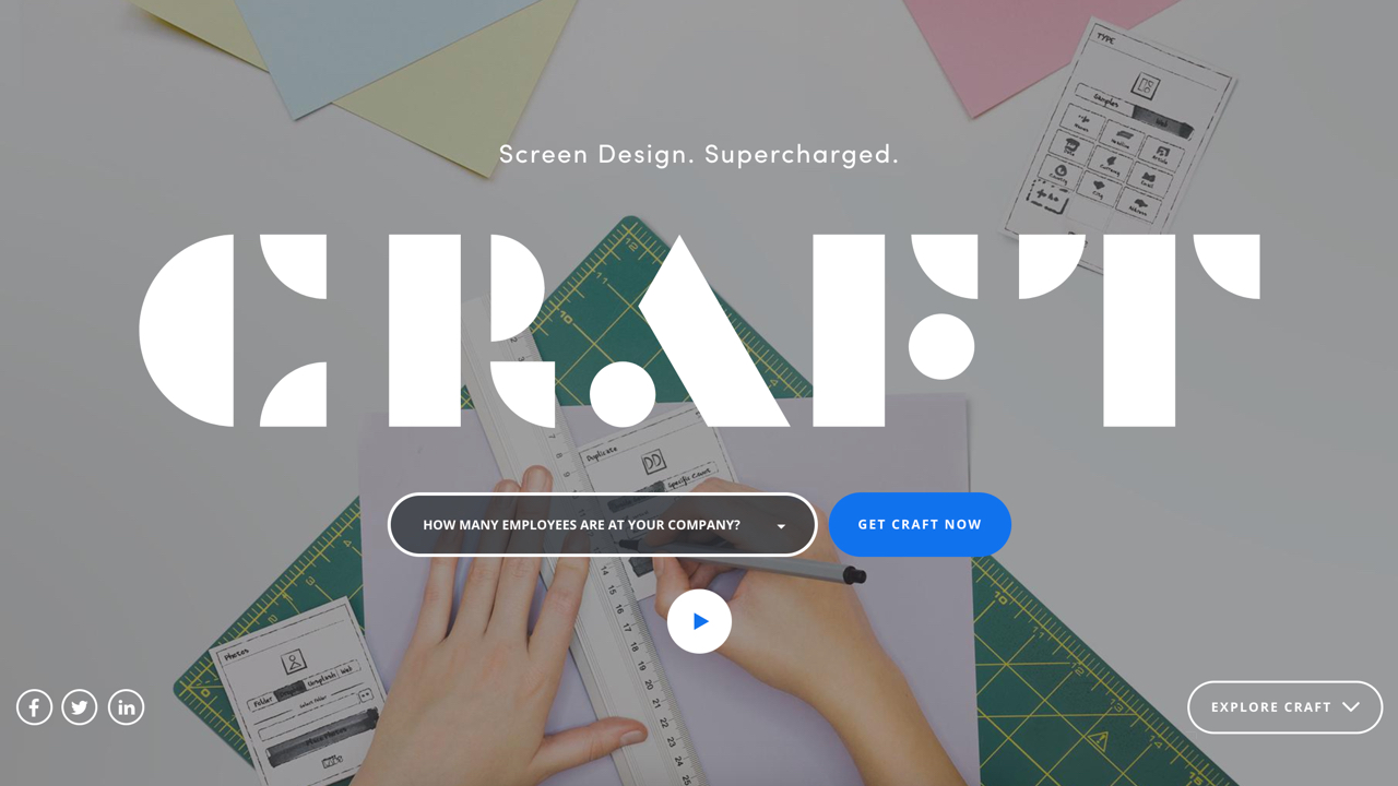
Big, Bold Fonts
Our screens are getting bigger and visitors are used to scrolling, which means typography too can get larger. We'll see big bold fonts in both modern sans serifs and unique decorative styles. Much of this also has to do with development of variable fonts (font files that store a continuous range of design variants), which we think websites will be employing more of this year.
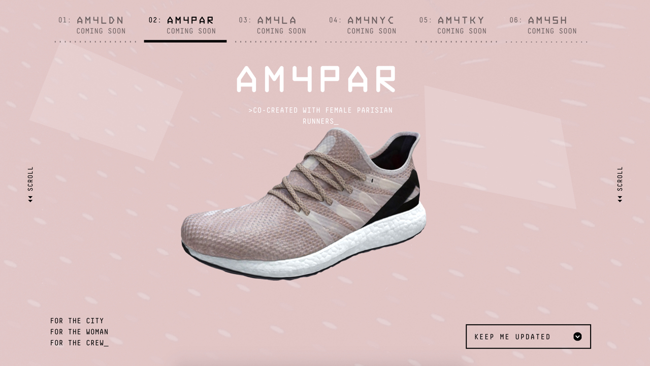
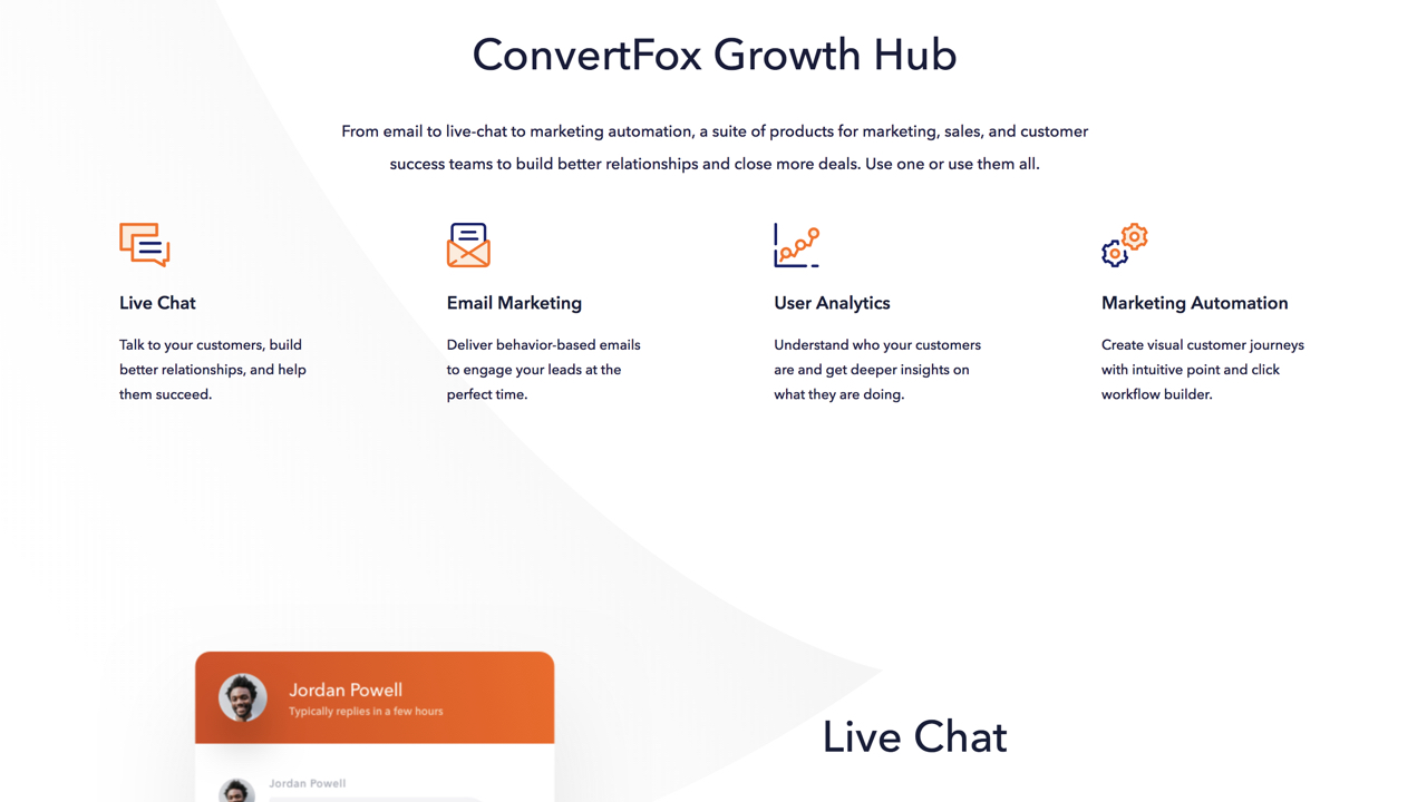
More Illustration
4/23/19 Update: If you're looking for tips on how to bring your illustrations to life with animation, we recently published a helpful guide on animating web icons with CSS.
We've written about the illustration resurgence in past web design trend posts, and we expect to see it keep growing in 2018 as an alternative to overused stock images. Hero images are being replaced by custom and engaging illustrations, and we'll even see illustration in subtle touches like button accents or small service icons. I know for a fact that I expect to spend more design time on illustrating this year.
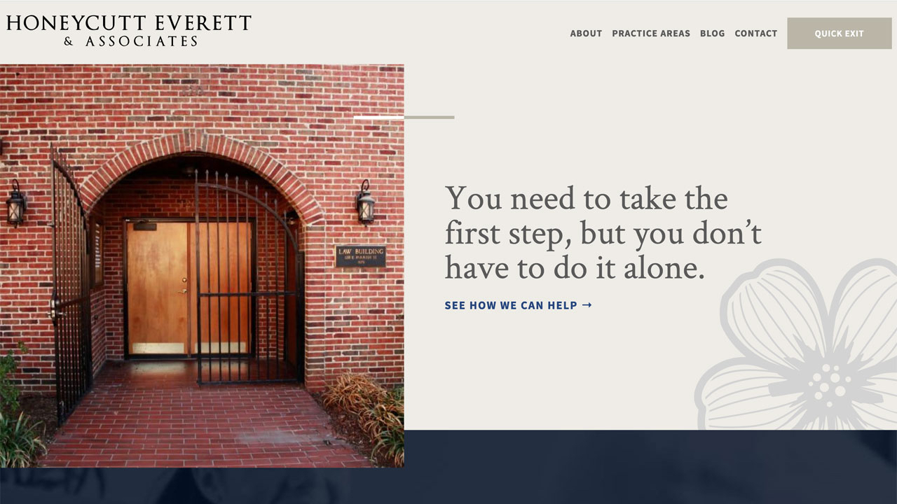
Goodbye to the Hero?
Well, goodbye to the standard hero that is. In recent years, the go-to for a website hero (the big banner section just under the header) has been something along the lines of a static image with a tagline, text, and button. We've started to see more content heavy hero sections with grids, card, etc. and this year designers will push that idea even further. The hero will become more of a part of the full page, rather than a seperate section.
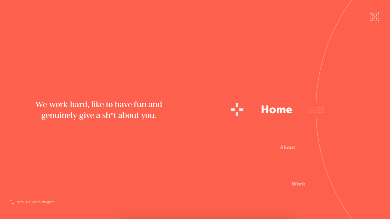
Wide Open Spaces
Related to the hero trend mentioned above, designs will be less rigid and more open. That openness will be created with less defined section seperation and more fluidity between content. For example, instead of giving two sections of a page different colored backgrounds they may just have subtle graphics as a seperation or different typography treatments. We think we'll be see more white background sites, which always feel airy and open.
What Else?
Those are the trends we're focused on and what we see emerging, but we'd love to hear any other thoughts and ideas you have, too! Feel free to share with us in the comments and we look forward to seeing how these predictions fare and what 2018 holds in store for the world of web design!
Related Posts

Spotlight 2017 Websites


Comments
Danny Ericsen
The full screen experience is definitely immersive and helpful. Many people actually count on the immersive experience of a website as a factor of their usage of websites.Branden
You can say BIG, BOLD FONTS again!I love any text element that fills up the screen and puts what you're offering, out there!
Great list of trends for this year!
Leave a comment