
Mobile Trends We're Currently Loving
The mobile breakdown of a site is sometimes as simple as stacking everything into one column, adding a hamburger menu, and calling it a day. But to really take it to the next level it should be thought out and designed well for the user. Here’s some features we’ve been loving recently that provide a cool and user friendly mobile experience:
Non-Traditional Navigation
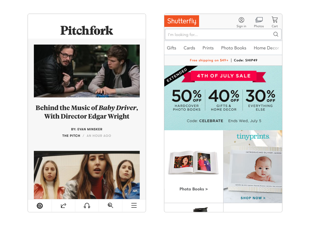
Since responsive design became a standard function on websites, that little top right corner hamburger icon has been the go-to for mobile menus. It's easy, takes up little space, and is now very well know as the icon for a navigation menu. But with larger smartphone screens and more varying device sizes, more thought is being put into whether the hamburger is the best choice for every site. Here's a few examples of sites that use a differnet kind of mobile navigation: Pitchfork places their header and navigation at the bottom of the mobile screen for quick access (no reaching that thumb up to very top!). Shutterfly actually lists their nav items in a scrollable horizontal bar, intuitive to mobile gestures like horizontal swiping.
Beefed Up Menus
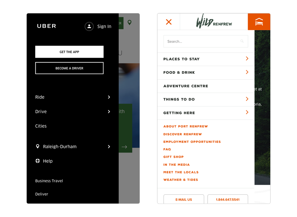
The expanded navigation menu doesn't have to be limited to just your site's menu items. Uber includes call-to-action and sign in buttons in their nav to ensure the user can easily access them. Wild Renfrew includes contact info and social links in their menu so that the user doesn't have to scroll all the way to the bottom of the page for that important information. We've even seen elements like featured news posts and products in expanded menus.
Sliders: Not Just For Images Anymore
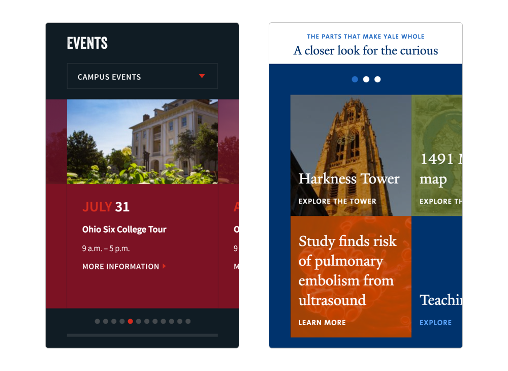
Grids are a huge part of modern website layouts. They can show a lot of information in a small space. But when we breakdown a grid for mobile it’s often a long, one column section of box after box that makes the user scroll endlessly to get to the next section of content. Instead of that, we’ve seen the use of more sliders on mobile screens. They group related content, like grid items, while shortening the length of the mobile page; all of which are user friendly. Take a look at the Ohio Wesleyan University and Yale University homepages and compare them to the screeshots below. Both of them feature large content grids on the desktop version that are reduced down to a one block slider on the mobile version.
Keeping Some Subtle Animation
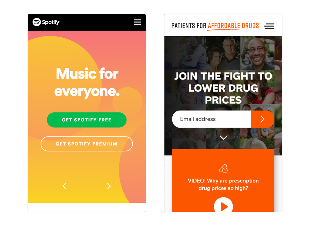
Both Spotify and Patients for Affordable Drugs use lazy loading on many elements on their desktop site that they've carried over to the mobile versions. This makes for an interesting experience for the mobile viewer. The animations keep the users attention while scrolling down a long page, which is inevitable on a phone screen.
Related Posts

2017 Web Design Trends


Leave the first comment