Park Point RTP

A Vibrant Website for an Exciting RTP Development

Situated in North Carolina’s Research Triangle Park region, Park Point is a forthcoming creative office and life science campus that will offer numerous amenities to future tenants. When complete, the development will include an on-site cafe, a state-of-the-art fitness center, generous outdoor spaces, and luxury features like tennis courts and a daily selection of local food trucks.

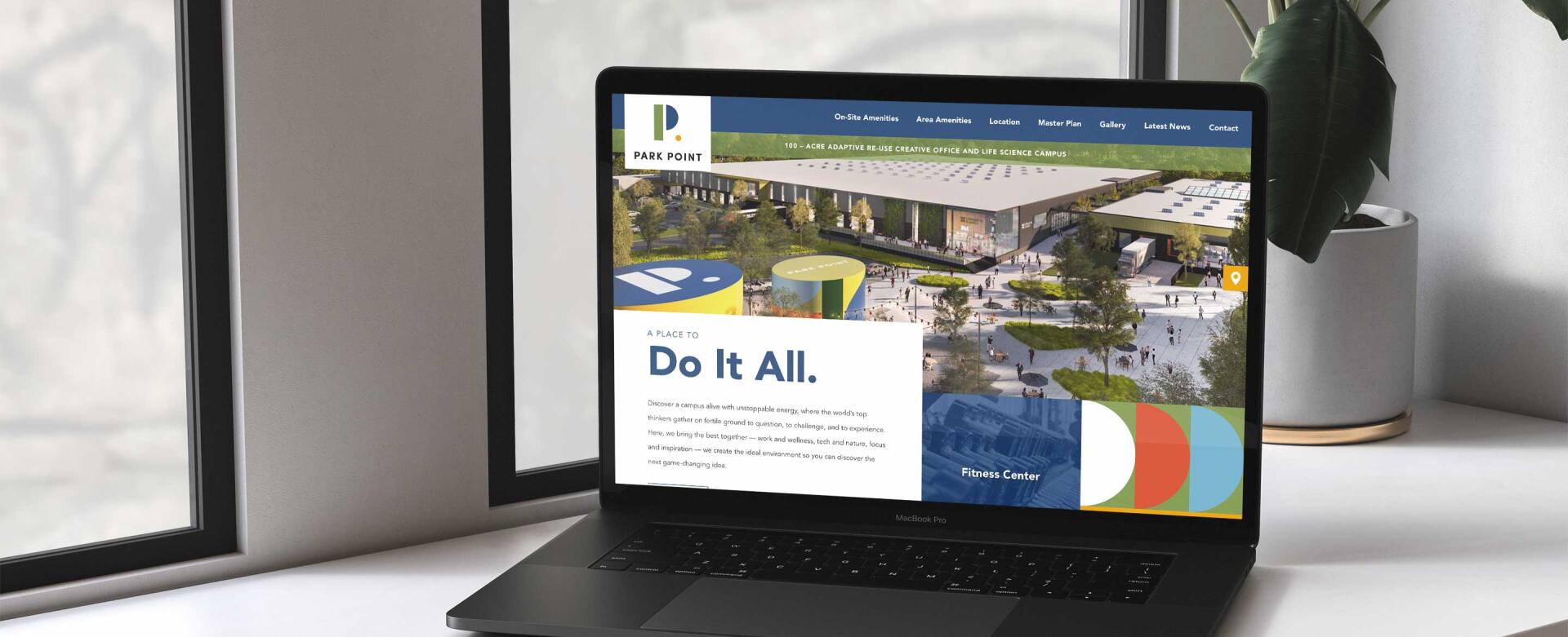
As the planning process picked up, the developers behind the project approached us to design and build a website that would showcase the exciting future of the campus. We pulled in site drawings, mockups, and Park Point’s recognizable branding to form a website that effectively conveys the lively energy that will eventually define the entire development.
Eye-Catching Design

Site visitors are welcomed to the Park Point website with vibrant colors and a memorable, modern design. Moving down the homepage, visitors can explore the development’s numerous amenity offerings, custom map illustrations of the surrounding area, master plan drawings, and recent news articles about the project and leasing progress.

For those who need more specific information, the site also makes it easy to download printable brochures about various aspects of the project. Together with the maps and statistics displayed online, site visitors are sure to depart with a strong vision of the finished project and all of the answers that they need.

Dynamic Features

In order to communicate the sense of fresh excitement that Park Point embodies, we incorporated several interactive features that add an element of fun and novelty. The first is the series of amenity blocks at the top of the homepage. Rather than pairing each item with a static description, we added movement by making each blurb appear and disappear as users hover over the colored blocks.

Further down the page, colorful circle graphics scroll alongside master plan images. This effect is subtle, but it alludes to the dynamic spaces outlined in the section’s content.

The site’s footer completes the energetic feel by sliding left and right as users move their cursor across the page. We love how this feature alludes to the strong momentum that drives the project.

A Bright Future

Post-launch, the website has become a helpful information hub for prospective tenants, interested community members, and the employees of companies that have already reserved their spot at the campus. We’re excited to watch as the project progresses, and we look forward to expanding the website as the development’s digital needs evolve.