With the everpresent attention to global warming and the human impact of increased greenhouse gasses, energy efficiency and conservation are hot topics in the media and on a more grassroots level. As a large consumer of energy with an expansive campus, the University of North Carolina at Chapel Hill's energy department wanted to learn more about energy use campus-wide, with a goal of improving efficiency.
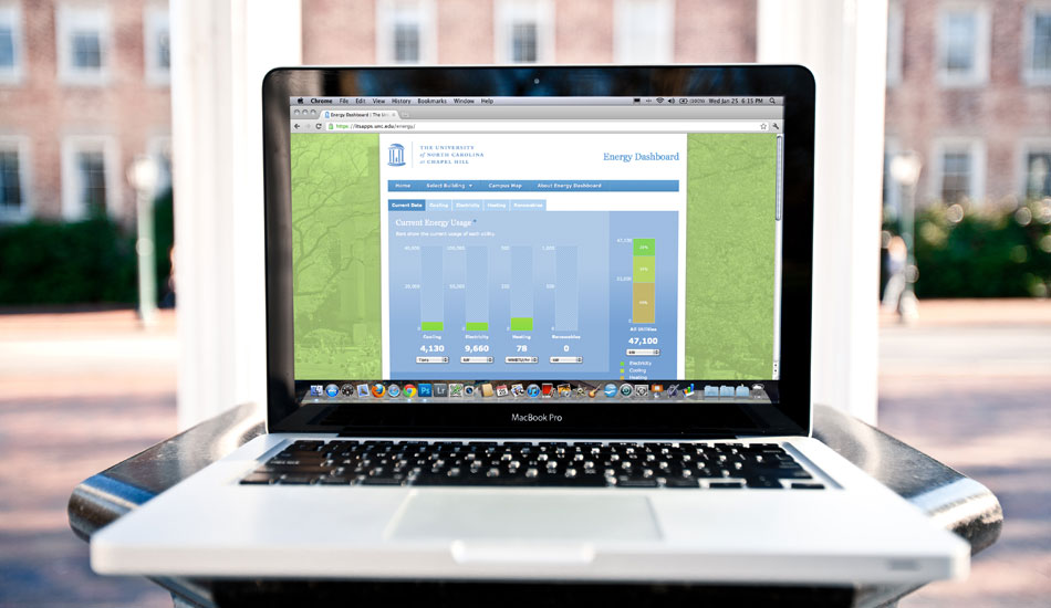
As part of the initiative, the university installed sensors in all the buildings across campus, providing real-time data with which to analyze trends, set goals, and potentially decrease energy use. New Media Campaigns designed a web application that allows the public sharing of the important collected data, for use by both the university and the general public. The dashboard currently features real-time data for steam, electricity, and chilled water, and a wealth of other information is available at monthly or annual intervals. Scalable from the global (campuswide) to the local (individual buildings), the custom graphs are also customizable by time interval.
In addition to these powerful data tools, the dashboard features rotating energy facts, an "Energy Events" panel with relevant energy news, and a helpful glossary of common energy terms used on the site. The design of the site was largely driven by the development and presentation of these various elements. Simple and clean, the site features a subtle green background with UNC's Wilson Library along with the school's Carolina blue colors and Old Well logo. The various bar graphs and diagrams echo these colors and unify the overall design.
Development
The primary development goal was to create a well-designed, usable interface to expose complicated energy usage data in a user-friendly way so that it could easily be read and analzyed. The application is entirely client-side and dependent on remote APIs for its data, and makes extensive use of HTML5, jQuery, and Backbone.js, with a remote REST API driving the whole thing. HighCharts JS is used to build the animated graphs, creating an interface that provides real-time and historical data of energy usage at the University.
One of the more unique projects that NMC has taken on, the development of the site presented several problems that had to be overcome. Chiefly among the challenges was the hierarchical relationship of Views and sub-views on the page, which required that caches be cleared and timers reset in a similarly hierarchical fashion. Backbone's models and pluggable callbacks made solving this problem easier. The data used to build the graphs is refreshed intermittently by polling a remote API using JavaScript timers and 'setTimeout' calls. Using Backbone, this data refresh then triggers the automatic update of affected interface views. All of this provides real-time data logging, which can then be analyzed on the animated graphs, which are built from this real-time data.
Also extremely useful for quickly reading data is the Campus Map feature of the site. Leveraging a Google Maps API, the Campus Map color codes the various campus buildings according to energy usage, with green buildings using the least amount of energy relative to the red buildings, which use the most. This representation of usage data also comes from the remote API, ensuring that the data is as current as anywhere else on the site.
All of this JavaScript wizardry drives realtime charts that are deceptively simple. Easy to read and navigate, these charts are powerful tools for quickly examining energy usage campuswide and focusing on trouble spots or trends. These charts are also helpfully augmented by factoids about energy that regularly refresh on each page, helping visitors understand and interpret the data that they are seeing. The site also provides a glossary of some common energy terms used that might not be familiar to visiting laypeople.
Results
This application for the UNC energy department demonstrates how different APIs and JavaScript tools can be coordinated to articulate a large amount of information in an effective and straightforward way. The application gives the energy department a comprehensive view of campus energy usage, and users can drill down through and customize the various graphical representations of the data to find areas for improvement and then analyze whether efforts to improve energy efficiency are effective or not.