The Complexity of Simplicity
'Simplicity' is often the protagonist in product design lore. Perhaps too often. Simplicity is deceptive. Simplicity isn't always the good guy, and many of its best showings aren't simple at all.
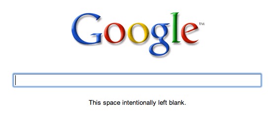
Take Google, for example. Its user interface is undeniably simple. In a recent experiment it is as simple as a logo and a text box. No submit button. No links. No "I'm feeling lucky". No advertisements. The web's most popular application has the simplest design.
Very little about Google though, outside of user interface design, is simple. Google is the web's most complex application. Feel the dissonance? The most complex web app has the simplest interface. This is a key trait of 'good simplicity': leverage.
Leverage is simple with a purpose. Leverage as in mechanical advantage, not Lehman Brothers. The ability to do more with less, not less with less. Simple not as in simple stupid, but as in simple machine. Good simplicity moves the fulcrum closer to the load. Bad simplicity removes the fulcrum all together.
Good simplicity restricts user input to multiply its value. On one end of the Google machine you type in words, on the other end of the Google machine you get a list of the web pages most relevant to those terms *from across the entire internet*. On one end of the Twitter machine you type 140 characters, on the other end everyone on the internet who cares about what you're saying receives it. On one end of the iPhone machine you stretch your fingers out, on the other end a map of the entire world zooms in.
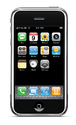 The iPhone is another icon of simple design. Its face has one physical button. One button. This beautiful simplicity is achieved through patentable complexity: a multitouch screen. When the iPhone was introduced it was both the world's simplest smart phone and its most technologically complex. The 'simple' capacitive touch screen leads us to another key trait of 'good simplicity': complexity disguised.
The face of an iPhone really has 153,601 "buttons". Only one of them can be pressed reliably: the one that isn't on the screen. The other 153,600 are points on the screen so small that when a single finger touches it tens to hundreds of them are pressed at once. Specialized hardware and algorithms then turn this large amount of noisy input into the single point on the screen your finger was aiming for. Somehow it works and the result of this complexity is an interface that feels natural and familiar. It feels simple.
Good simplicity disguises necessary complexity. Bad simplicity labels all complexity as unnecessary and throws it out the door. Google could have chosen not to accept misspelled words, they could have created a separate app for solving mathematical expressions, multilingual searches, etc. These are all complex problems Google solved not by avoiding them, but by disguising complexity to make us believe it's just as simple as every other search.
Simple can be a siren just as easily as it can be a signal. Good simplicity is less with leverage, not less with less. Good simplicity is complexity disguised, not complexity denied. Don't give in to stupidity when creating simplicity.


Comments
Alexander
I like Don Norman's systems approach to this http://wantmag.com/release/001/2010/05/don-norman/.
Robert Hacker
Having discussed simplicity, you should now move on to elegance. In many ways what you call simplicity is really elegance. http://bit.ly/cY6UyP
Brian Armstrong
Yep - great post!
Another way to put it: the end result for the user should be simple, not necessarily your work as a programmer.
Joel Sutherland NMC team member
Kris,
I liked this post a lot. I think the way to create simplicity is to build for human needs, regardless of technological complexity. This post seems to describe that exactly.
Leave a comment