Using Infographics with Political Campaign Websites
An online marketing tactic that has really taken hold over the past few years has been creating and promoting infographics. It's a great way to visually convey a complex issue and people really love these graphics, making infographics effective tools at getting links built into your site and having it shared through social media. In the past, NMC has even created our own and blogged about the great marketing results from infographics.
While non-profits and corporations (especially startups) have been the biggest users of this technique, I've noticed that very few political campaigns have hopped in the fray. Media organizations have used infographics to complement their coverage of politics, but the actual campaigns have not created their own interactive infographics for visitors.
The Obama campaign and administration has been noticeably different, creating infographics and posting them to the campaign site and even the official White House site. This tactic makes perfect sense for campaigns and it is one that we frequently recommend to campaigns. Below are some reasons why infographics and political websites are a great fit together.
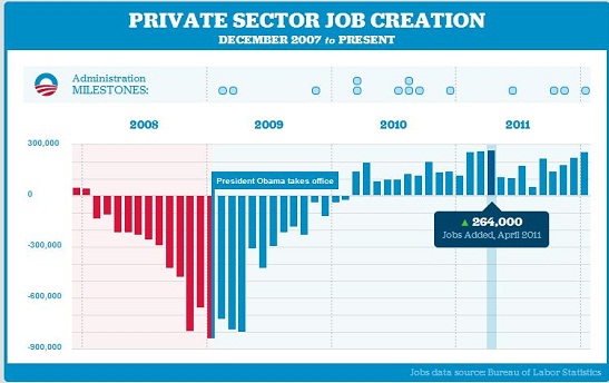
Leaving a lasting image in the minds of voters. The image in this post is the Obama campaign's latest infographic, showing the number of jobs created over the past three years. It demonstrates the value making this data into a graphic -- any visitor can instantly see the upward trend in job creation over the past year, which is exactly what the campaign wants you to take away from the date. It's infinitely easier to quickly convey this message through a graphic than making someone sort through a table of figures. Visitors who see this image, leave the site with it implanted in their minds.
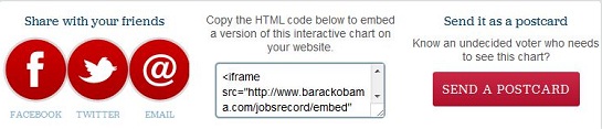
Easy to share with others and embed on sites. An infographic is easy and fun to share with others. The campaign makes it even easier by having prominent links that let people Facebook, Tweet, or Email the infographic to their own networks. Similarly, the campaign also gives an embed code that lets bloggers and journalists insert the graphic onto their own site. By giving people the power to share and embed, an infographic lets a campaign shape and control a story. No numbers will get mistyped and it won't be selectively quoted, your exact message will be sent out to people. Similarly, people are much more excited to share the news on their own blogs and social profiles when there's an attractive image attached to it; supporters are much more likely to send this out to their friends than a bland report. In this specific case, the campaign has even gone one step farther by allowing visitors to turn the graphic into a virtual postcard that they can share with friends.
Repurpose for ads, email blasts, and presentations. The graphics can also be extended outside of the website to different supporting materials and even other media. An infographic can be used as the centerpiece of an email blast or as a display ad to push people to the page. The image can also be repurposed for presentations and mail pieces in the future, allowing the dividends of creating the graphic to be reaped far into the future. With a text-heavy blog post or report, you're limited with what you can incorporate into a punchy ad or email, but the infographic neatly wraps it into a pretty package.
Build in valuable links to the campaign website. As the graphic gets shared around the web by supporters and media, the links built into the site will help greatly with SEO, which is an underrated element of online campaigns. An infographic makes it much more likely that people sharing the campaign's information will build a link back to the campaign website rather than just pulling out quotes like they could with a blog post.
Overall, infographics are an easy and engaging tool that campaigns can use to present information to voters and then benefit from all of the sharing and linking that follows.

Comments
jd hutcheson
That is a great infographic. The reason most campaigns do not use them is simply a case of resources. They don't have a graphic artist and internet consultant on staff. A campaign sign is the first and last impression many have of a campaign and I advocate using it as a logo and you could say an infographic if it has a slogan. Great articleLeave a comment