
Ten Examples of Dropdown Menus on Websites
Finding the Right Menu Style for Your Organization
In this digital age, your website is your organization’s calling card. It communicates your brand through colors, fonts, and images, and spells out your approach in the tone of each piece of content. What many often forget is that your site’s navigation also plays an important role in defining your online presence.
Site elements like navigation bars, menus, and dropdowns serve the essential purpose of anticipating searchers’ needs and guiding site visitors towards the content that they’re interested in. But aside from their functionality, navigation items offer a space to further refine your online brand.
When it comes to dropdown menus, there are an infinite amount of possibilities for structure and design. A B2B website design might require a robust menu to display lots of options, while a local nonprofit website design might be better served by something more minimal and straightforward. In either case, bringing images, fonts, and colors to the dropdowns cultivates a strong sense of identity and goes the extra mile towards exceeding visitors’ expectations.
In this post, we’ll look at ten examples of dropdown menus that utilize a broad range of features and styles. Many of these are menus that we created for our clients, and others are great examples that we’ve encountered on the web. You can jump ahead to specific examples below:
Multi-Level Dropdown Menus
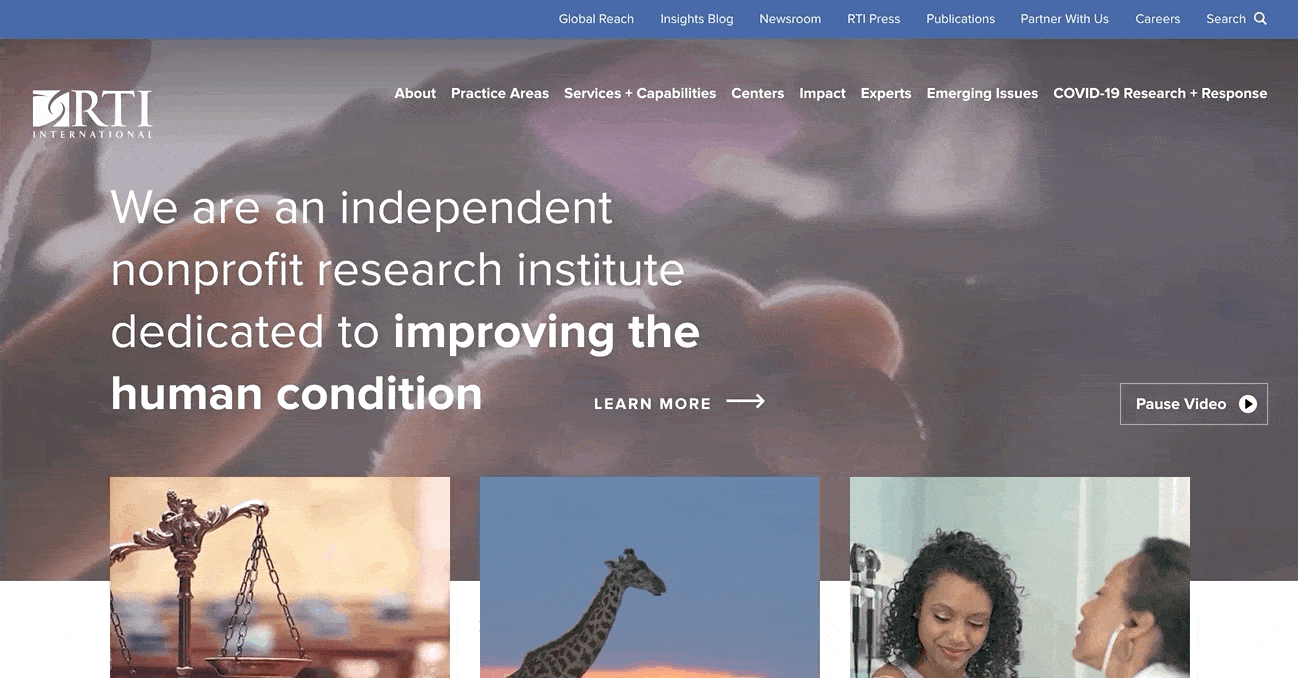
1. RTI
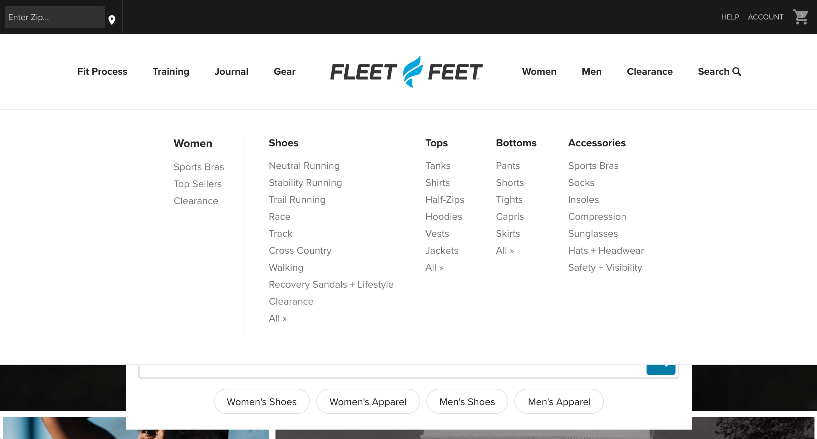
2. Fleet Feet
3. UNC Kenan Flagler
Minimal Dropdown Menus
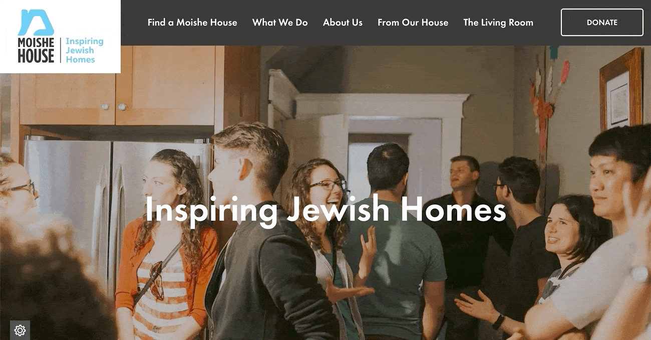
4. Moishe House
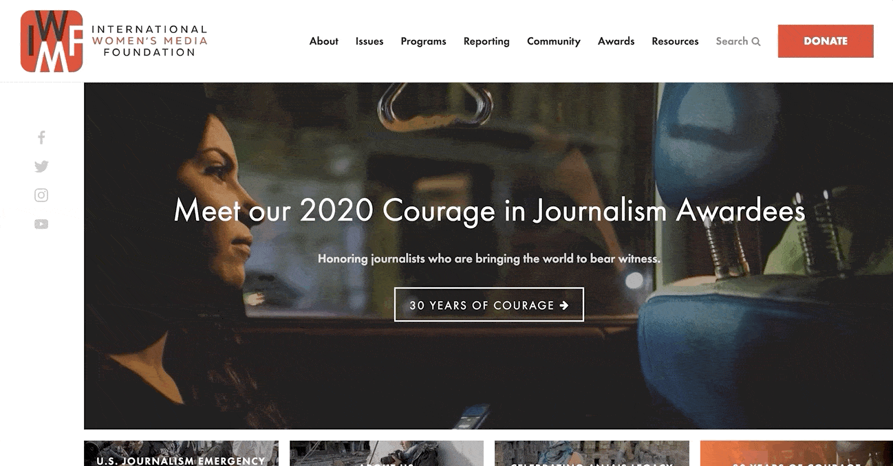
5. International Women’s Media Foundation
Vertical Navigation Examples
6. UNC Campus Recreation
7. Converse
Image-Based Dropdown Menus
8. MiracleFeet
9. Santa Cruz Bicycles
10. Helias Oils
1. RTI
First up is Research Triangle Institute (RTI), a site we created for an international nonprofit that conducts scientific research. RTI has a ton of content on their site, so they needed a menu that would make all of their important pages easy for visitors to find and access.
We accomplished this by using interactive dropdowns that include a third-level of tabs. This means that each dropdown also features narrower categories nested beneath the main list. The third-level options make it easy for site visitors to jump directly to the pages that they’re interested in.
2. Fleet Feet
Fleet Feet is a run-specialty retailer whose website includes a large eCommerce platform. When we were putting the site together, it made a lot of sense to use a megamenu to section out various retail categories. A megamenu is a full-width dropdown that shows many options in a single panel. For a site with a lot of categories, this is a more streamlined alternative to having a separate dropdown for each content area.
On the Fleet Feet site, visitors can click on tabs for Gear, Men, or Women to see a megamanu that points to the browsing pages for an assortment of related items.
3. Kenan Flagler
For Kenan Flagler, UNC-Chapel Hill’s business school, we developed a unique dropdown style that shows nested items without requiring a visitor to hover or click a second time. In this format, the second-level options are simply indented beneath their parent category. The visible nesting ensures that site visitors won’t miss out on pages that cover important sub-topics.

4. Moishe House
Moving away from megamenus and multilevel styles, we prioritized simplicity when working on the site for Moishe House. Moishe House is a nonprofit that facilitates intentional living communities for Jewish young adults. The site’s aesthetic is generally modern and clean, so we used sleek black dropdowns to bring organization without competing with the rest of the design.
In keeping with the site’s playful feel, the dropdown dynamically slides and retreats from the navigation bar when hovered over by a visitor’s cursor.
5. International Women’s Media Foundation
Similar to Moishe House, we used a minimal, modern design when creating dropdowns for the International Women’s Media Foundation (IWMF). The IWMF is an NGO that trains and supports female journalists around the world. They have a series of programs and core issues, so simple dropdowns were the perfect way to present their information without any clutter.
Fun extra details include the red underline and orange highlight that appear when hovering over menu items. The colors are a subtle way that the menu builds on the organization’s brand and style.
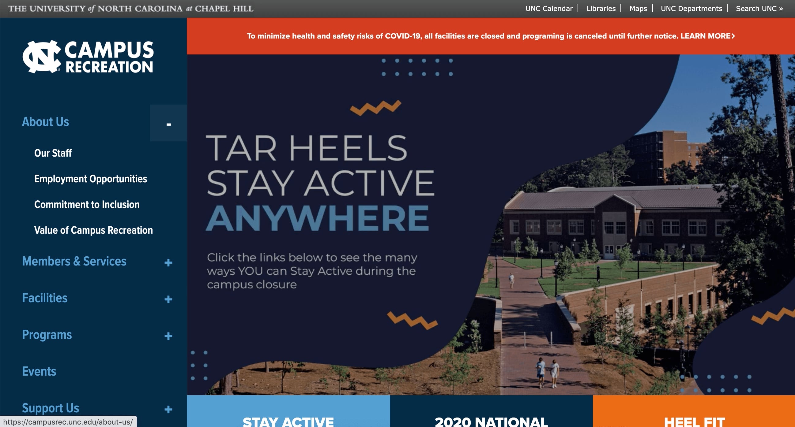
6. UNC Campus Recreation
UNC Campus Recreation (another NMC client!) mixes it up by using a vertical menu. This makes sense for them because the very top of the page is taken up by UNC’s standard navbar. In the sidebar menu, a click on each plus icon opens a dropdown that maps out related interior pages.
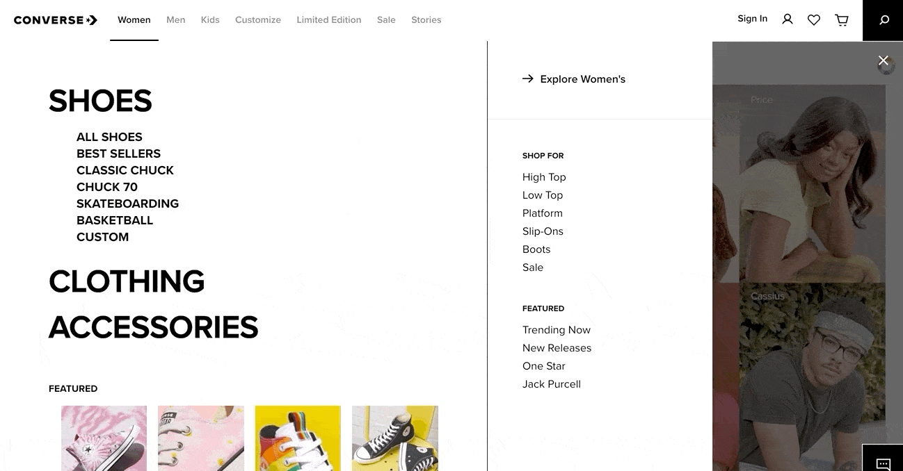
7. Converse
The Converse website uses a top navigation bar that brings in large menus for a more vertical feel. This combination is effective because it allows the brand to offer a lot of different choices without overwhelming the site visitor.
We really love this example because it cleverly uses animation to bring the text to life. The animation is subtle, but it adds a huge amount of personality that speaks to the brand’s creative spirit.
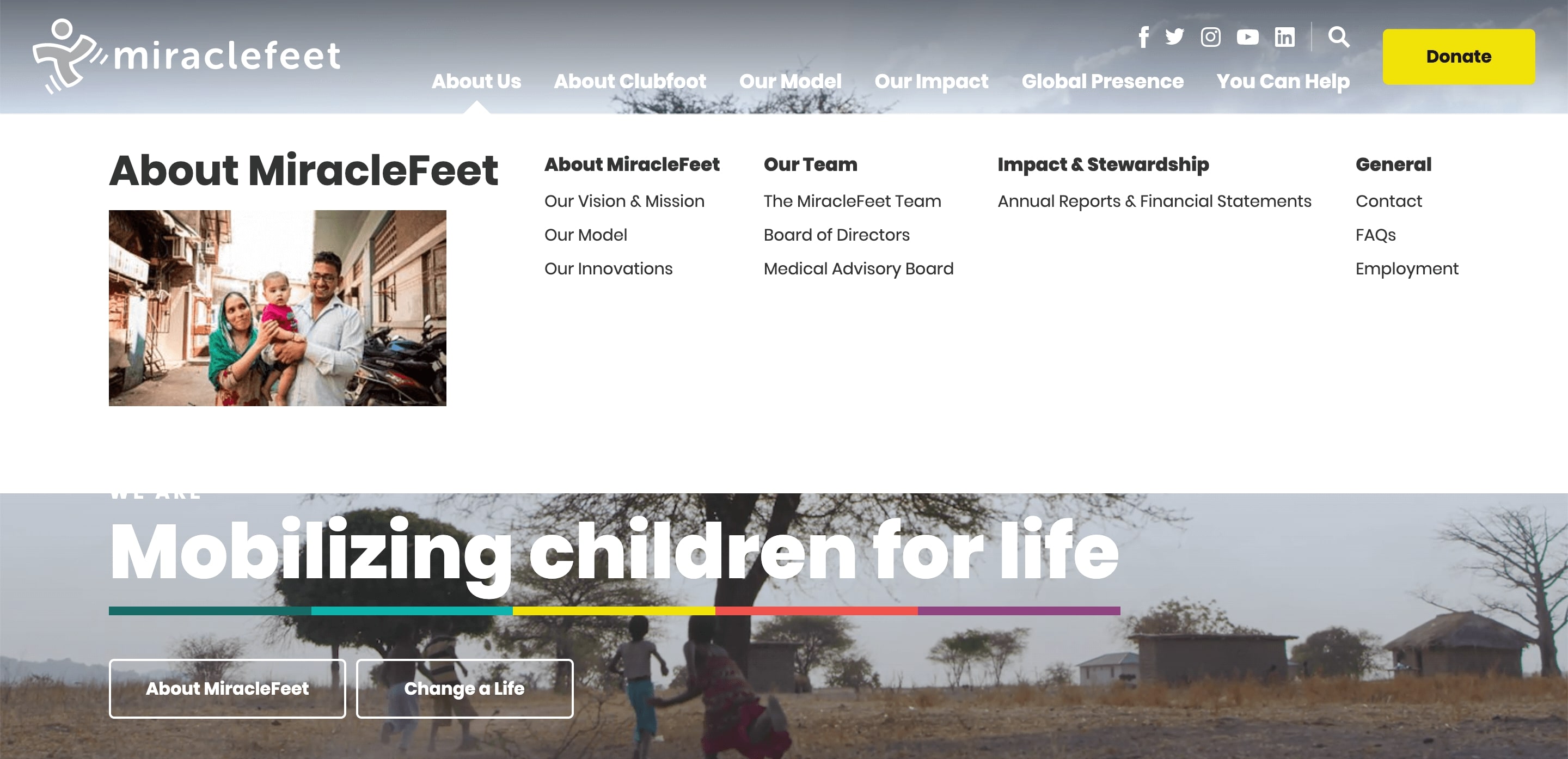
8. MiracleFeet
We recently launched a brand-new site for MiracleFeet, an international nonprofit that provides medical treatment to children with clubfoot. MiracleFeet uses a megamenu that’s similar to what we created for Fleet Feet, but each dropdown also includes a featured image that shows the nonprofit in action. The site is visual-heavy, so the dropdown images are consistent and on-brand.
If you're interested in reading more about the project, check out our Case Study on MiracleFeet's New Website.
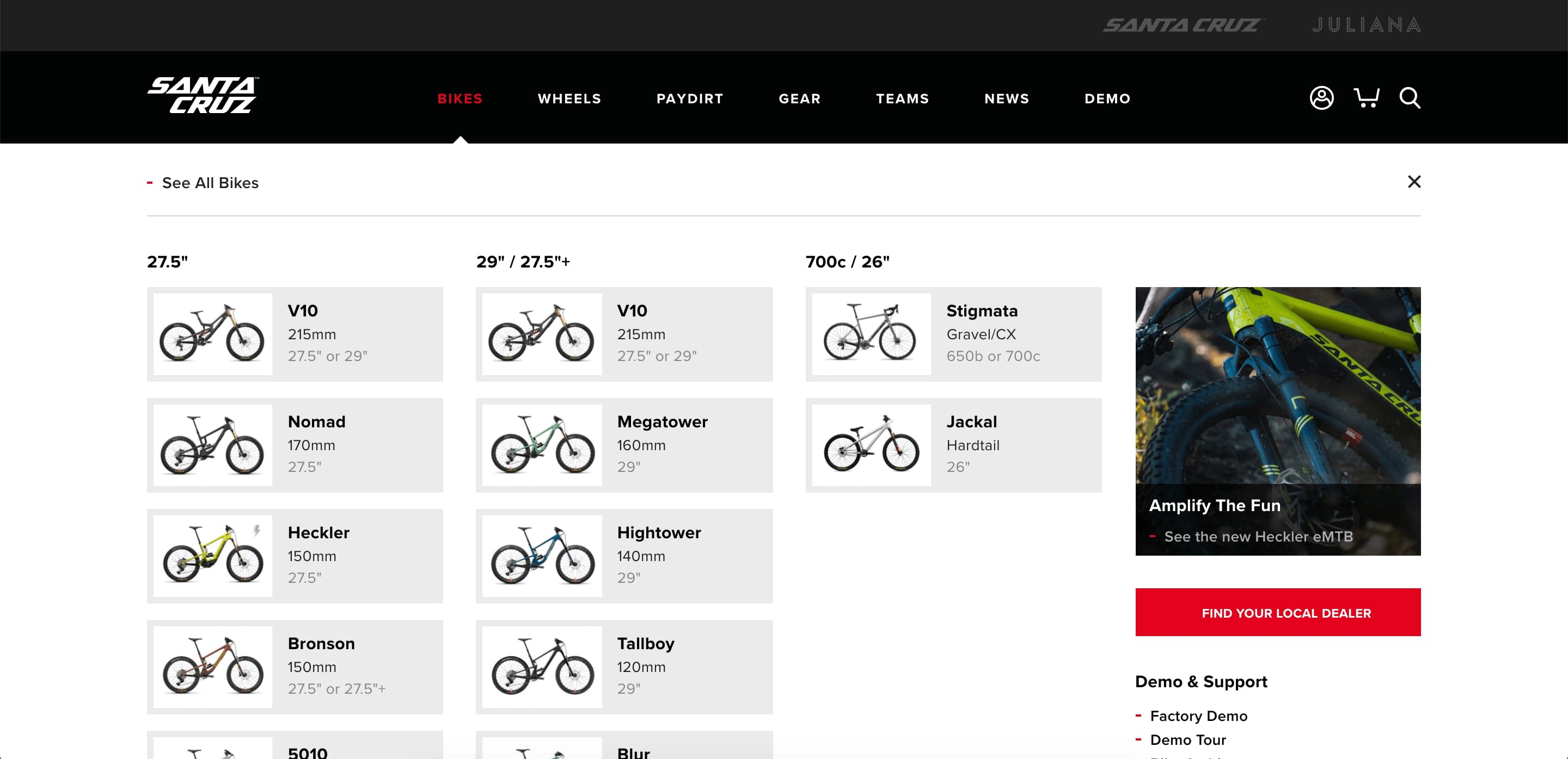
9. Santa Cruz Bicycles
Santa Cruz Bicycles takes things a step further with a menu driven completely by product images and specs. For a bike company, this is a great approach. At the same time, the images make it fun to browse and easy to find a specific item. We also like how the other dropdowns use images to add interest to categories like Gear and Wheels.
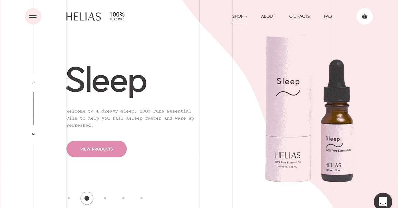
10. Helias Oils
Helias is an essential oils retailer whose homepage was featured in our blog post 2020 Web Design Trends for its use of animation. Like the homepage, Helias’ dropdown menu is unique because it showcases imagery and movement. We love how the dropdown clearly displays the name and packaging of each product, and how the images take on the company’s signature wave animation when hovered over.
Conclusion
As you can see, dropdown menus can be so much more than utilitarian. They can be fun, serious, visual, minimal – or any combination that reflects the needs of an organization and its site visitors. Not every style is right for every project, but whether you’re a content-rich law firm or an energetic startup, we’d be glad to work together to find a dropdown menu that’s right for you. Feel free to drop us a line!


Comments
pp
pp검증사이트 추천
Usually I do not learn post on blogs, however I wish to say that this write-up very pressured me to check out anddo it! Your writing taste has been surprised me.
Thank you, quite great article.
app entwicklung
Hello, after reading his awwesome paragraph i am as well cheerfulto share my know-how here witfh colleagues.
Leave a comment