
Controlling Transparent Colors
Sticking to Your Palette Regardless of Opacity
A strong, cohesive color palette is key when coming up with a visual design. Colors influence a viewer's emotions and so set the mood.1 Along with typography, color scheme is important to branding and creating corporate identity. Transparency—a common feature of modern web design—affects color appearance and so can add unwanted variation into a site's palette, but this change can be accounted for by calculating a new starting color.
In our web designs, we use a unified color palette across graphics, text, visual features such as backgrounds and borders, and interactive features like buttons and mouseover hover effects. This ties a site together and gives it a deliberate "designed" feel which in turn encourages viewers to take your brand more seriously.
Where this gets tricky for the front-end developer is transparent elements. You can start with a carefully selected palette, but that control goes out the window when a drop-down navigation menu lets you see the page underneath it, or block of text in front of an image has a semi-transparent background to aid legibility. Lowering the element's transparency will tone down, wash out, and just generally change its colors… and next thing you know, your perfect Carolina Blue box has turned into a relative of Alice.
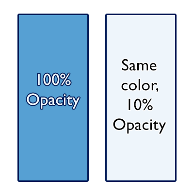
The typical solution is to just let transparency introduce new colors to the final palette. This non-solution isn't necessarily bad: the human mind understands transparency, understands that it changes the way colors look; and there are times when the underlying layer is complex enough that any attempt to control the transparency's color would be meaningless. But there are also times when it would be really nice to not sacrifice that design control, and when the background is simple enough that you know the necessary adjustment must be possible, starting with stronger color which when made transparent will tone down to the color you want.
Happily, calculating the fundamental "full opacity" color is easy, given the color you want to end up with, the opacity it will have, and the color it will stack on top of. To determine the color rgb(ropaque,gopaque,bopaque) that will end up rgb(rfinal,gfinal,btranfinalsparent) when its transparency is alpha and it's in front of a background rgb(rbackground,gbackground,bbackground), the calculation for each of the three channels is
valueopaque = ( valuefinal - valuebackground + (valuebackground * alpha ) / alpha
Simple enough, but still inconvenient… unless you use a CSS preprocessor to make the calculations for you! NMC uses LESS, and this mixin —a solution by StackOverflow user ephemer— works great
/* the mixin */
.bg_alpha_calc (@color_final, @alpha, @color_background: white) {
    @r_final: red(@color_final);
    @g_final: green(@color_final);
    @b_final: blue(@color_final);

    @r_background: red(@color_background);
    @g_background: green(@color_background);
    @b_background: blue(@color_background);

    @r_opaque: ( @r_final - @r_background + (@r_background * @alpha) ) / @alpha;
    @g_opaque: ( @g_final - @g_background + (@g_background * @alpha) ) / @alpha;
    @b_opaque: ( @b_final - @b_background + (@b_background * @alpha) ) / @alpha;

    background-color: @color_final;
    background-color: rgba(@r_opaque, @g_opaque, @b_opaque, @alpha);
}

/* the mixin, in basic use */
.box_overlay {
  .bg_alpha_calc (#abc, 0.5);
}

/* the mixin, with custom background color specified */
.box_overlay {
  .bg_alpha_calc (#abc, 0.5, #def);
}
And here's an example in the wild. This NMC project uses a four-color palette of dark blue, light blue, red, and white. The navigation drop-down menus have a semi-transparent dark blue background. When a menu item is hovered over, its background turns light blue — and the correct light blue, not a lightened dark blue or a semi-transparent light blue. Holds together nicely, right?

Of course in this case the background is still quite variable —as you scroll down the page with the drop-down menu open, it will overlay the photo, then the red stripe, then the subsequent page content— but most of the time it will be close enough to not be noticeably off. Certainly it will be closer that lightening the dark blue background by some eyeballed percentage, or a percentage that happens to be a nice round number. And there are many design situations where the background underneath a transparent element is a known single color, situations where calculating a new color for transparent elements will let you stay precisely within the site's color palette.
It's a small thing, insisting on sticking to your website's palette at times when transparency would otherwise introduce some variation. But it's the sort of little thing that makes all the difference. Websites are a visual medium, and you're taken seriously when you take excellent visual presentation seriously.

Notes
1 The modern field of color psychology is often traced back to Goethe and the late 18th Century. In marketing and advertising, there are all sorts of intriguing anecdotal and soft-science claims about the effect of color on emotional state. While there's still much for us to learn, the common-sense impression that color perception influences emotion is supported by more rigorous study.
Related Posts

Web Design & Development Trends You'll See in 2015


Leave the first comment