Blog
Our in-house web development team creates fully custom site experiences that are second-to-none. Read the blog posts below for a look at the programs we use, the tools that we’ve built, and the best practices that we’ve identified during our 14+ years in the business.
Development
Development, Front End
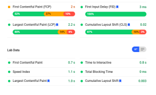
Using Google Page Speed Insights and Core Web Vitals Extension to Grade Website Speed


Development, NMC, Footer
Enjoying Deploying: Using Ansible & Capistrano for a Smooth Process

Development, Footer
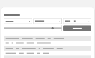
A Review of Craft Commerce

Filter By Subject


