A Boilerplate for CSS Typography
See the Demo | Download the Zip
Writing the CSS for websites can be a very time consuming process. There are often big things that need to be done when creating stylesheets like layout, that leave a developer exhausted when it comes time to handle the details. One detail that is often overlooked is ensuring good coverage of all typographic elements as well as setting up a clean typographic framework.
This is especially an issue when setting up a site on a Content Management System. As new content is created, it is important that the CSS developer has anticipated all of the elements that will show up on the site and set up rules for them. By my count, there are over 20 elements that need to be considered in a variety of combinations.
Using a solid boilerplate foundation can make this task much easier. For that reason, I've developed a CSS Typography Boilerplate that I use to ensure coverage of all elements. As a bonus, using this as a starting point makes it really easy to set up a typographic baseline grid. This post covers this boilerplate, explains what a typographic baseline is and gives you the stylesheet you can use as a starting point.
What is a Baseline Grid?
 When taking about grids and the web, we're usually talking about vertical columns. A typographic baseline grid establishes a vertical order, rhythm and spacing for your text that aligns with a grid.
The idea is to set the font-size, line-height and margins of all of your typographic elements, such that text automatically fits into a grid.
This might seem like overkill, but it is a great way to ensure that the content type on a page looks great. By no means, do I advocate the strict adherence to a grid though. Often it makes sense to break the grid or to not use a grid at all. I do however, think that using a grid is a great starting point for most sites. Additionally, I've found that starting with a grid and modifying from there is a big timesaver.
To see this project's starting grid in action, check out the demo.
How to Use this Boilerplate
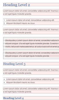
This project includes a zipped directory of a good type starting point. There is a good html-ipsum that contains greeked text showing nearly every element you need to cover. Additionally there is a typography.css file that contains the rules for each element in a fairly organized fashion.
By default, all rules are preceeded with ".content". This is to make it easy to apply this stylesheet to a particular container. If you want to use it globally, which I recommend, just do a search replace to kill all instances of ".content".
/* Block Baselines */
.content h1, .content h2, .content h3, .content h4, .content h5, .content h6,
.content p, .content ul, .content ol, .content pre, .content blockquote {
    margin-bottom: 20px;
}
When configuring this stylesheet for your site, there are three primary rules to consider: font-size, line-height, and margin-bottom. Keeping these consistent or mindfully changing them is the best way to keep the grid. By default, copy is 12px on a 20px grid.
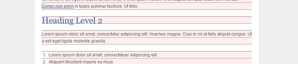
I've also included a set of rules to display the grid on a container class as well as give a background to all block elements. This is great for debugging when you really want to hit the grid exactly. The rules look like this:
/* Baseline Debugging Backgrounds */
.showBaseline {
    background: url(../images/baseline-20.png);
}
.showBaseline h1, .showBaseline h2, .showBaseline h3, .showBaseline h4, .showBaseline h5, .showBaseline h6,
.showBaseline p, .showBaseline ul, .showBaseline ol, .showBaseline pre, .showBaseline blockquote {
    background: rgba(255,200,200,.3);
}
If you want to use a baseline of a different height, just make a 1px wide image of the height you need with the bottom pixel filled in.
A Sidenote on Using Pixels
Starting some time ago, the use of pixels for font-sizing has been making a comeback. To give a quick recap, pixels were basically abolished as a best practice because IE6 and older did not give the option to rescale pixel-sized text. Beginning with IE7, IE has allowed for page-zoom style scaling. As IE6 has lost significant browser share, pixels have become a viable option for sizing text again. I am 100% for this and that is why you see pixels in this boilerplate. I do plan on releasing a version that is not dependent on pixel sizing at some point. (If a reader wants to give a hand with this it would be appreciated!)
To read more about this debate, here are some good articles:
- Coding like it's 1999 ( cameronmoll.com )
- The debate over page zooming vs. text scaling ( cameronmoll.com )
- Zoom ( mezzoblue.com )
- Hello Old Friend ( orderedlist.com )
Demo and Download
Last updated: 11/12/2010
Release Notes:
- <select> breaks the grid. Not sure what to do about this.
- No default styles for tables yet.
If you have any questions, comments, or improvements, be sure to leave them in the comments.
Related Posts


Comments
Alexis
Thanks this looks like a great starting point for type. I'm thinking of converting it to scss. Might put it up on git hub. Let me know if you're ok with it and/or wana contribute. Would make it easier adjusting things like pixel based layouts :)Leave a comment