
"Where should we eat tonight??"
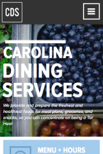
We had the enviable opportunity to work with the University of North Carolina's Dining Services team to reimagine a modern dining locations web site so that, at long last, students will know what's being served, when and where. In partnership with Aramark and the UNC IT Services department, we built a web site powered by not one but two custom web applications. Now, students, faculty, and staff can browse all the dining halls on campus and see which food stations are open at a glance. Then it's one click (or tap!) away from the menu and each item's ingredients. Simple!
It was a large, complex project that required hands-on managers, original design, slick front-end coding and some impressive back-end programming all working well together to pull off successfully. In short, an ideal New Media Campaigns project. We've done quite a few custom apps and web sites for colleges and universities -- including a number for UNC, such as Energy Services, Geology Department, and the Entrepreneurship Minor -- so this one was well within our wheelhouse.
All the Sudden We're Hungry Students Again
The project team got lucky on this one: we all distinctly remembered the pain of getting out of class, walking to a dining hall, and finding it closed. Or worse, paying for a meal only to realize there were no options available for specific dietary limitations. So we knew well the problem UNC Dining wanted to solve. The solution came in three parts: the web site, a custom menu & hours web application, and a second custom app for the live menu screens.
The web site needed to look super modern for a younger audience and be easy to maintain and quick to load. It's built using HiFi, the blazing fast and infinitely configurable content management system. For the menu & hours app, we quickly determined that its driving purpose was to answer these three questions for UNC Chapel Hill's students, staff, and faculty:
- What’s open now (or later on)?
- What's on the menu?
- Can I see the ingredients?
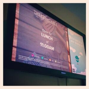
Finally, we wanted to see the user experience all the way through to the end, which meant tying in the actual on-site menu. UNC dining halls have large, LCD screens that show the current menu. Our solution was to point these screens to private web pages with custom display so that site administrators can update the content for each station as easily as if it were a web site. We made it really simple to do and each screen matches the style of the individual station, dining hall, and larger UNC Dining brand. The menu screen app is built in the Scala programming language and works like a charm.
By tying together all three components, we were able to give the UNC Dining Services team the solution they needed to answer the question, "What's for dinner?" The result: a super fast, simple to use, easy to understand web site that just works. Did we mention it's responsive?
Part 1: The Web Site
Managing Content
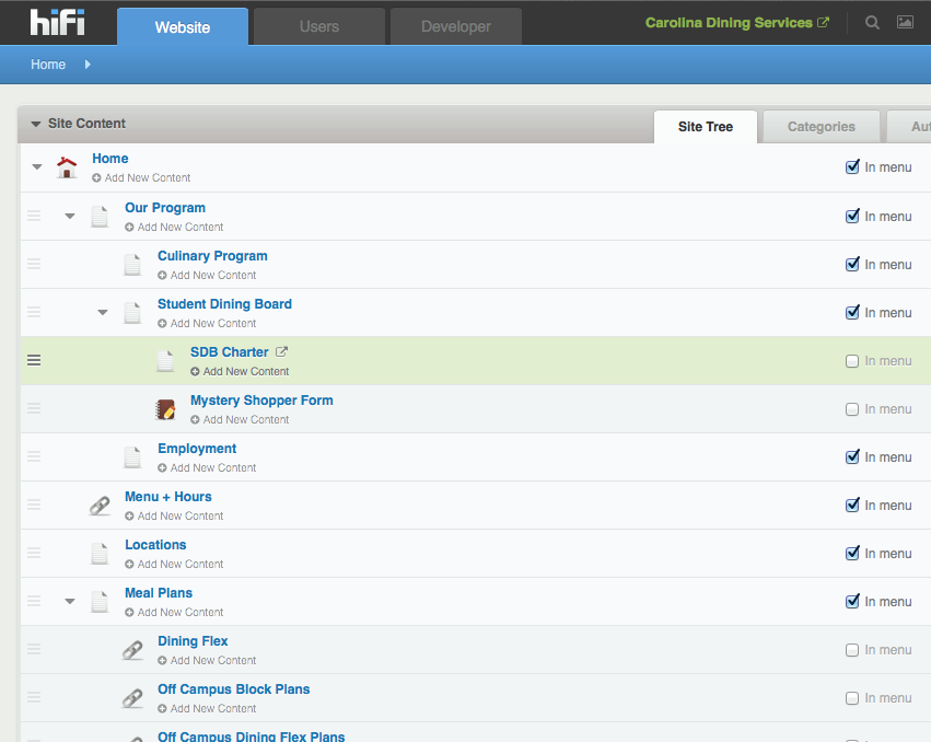
Our first priority was auditing the old site’s existing content. What will stay, what will go, and what can be improved? The original information architecture was not well-designed and there were a number of different kinds of content that the client needed to manage. The site’s content templates included:
- Simple information pages, like About Us, Nutrition Facts, or Catering
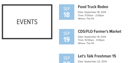
- Information feed with multiple items, like News Blog or Events Calendar
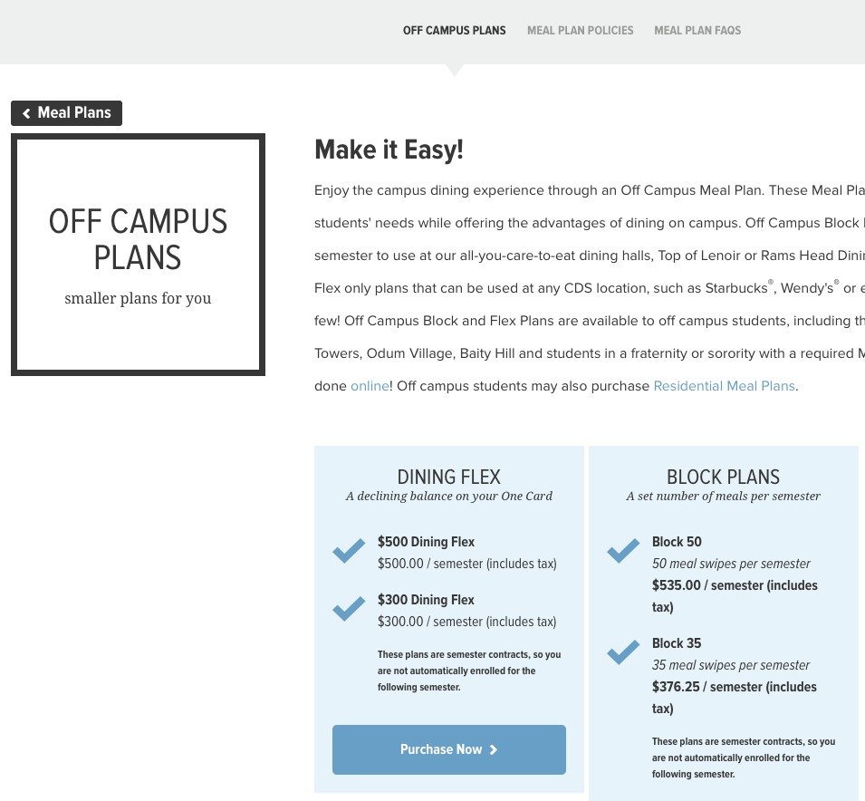
- Specialty pages, like Meal Plans
- Interactive forms, like Contact Us
- And of course, the menu & hours app
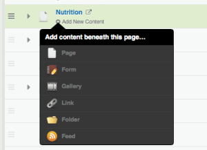
One challenge in the information design portion of the new site was how to handle deeply nested content. Sometimes information is grouped in a group in a group in a group and that can make navigation menus cluttered and hard to use, fast. For example, take the menu and hours app, where we had to design the screen interface to handle five successively granular bits of information: From Location (Say, “Ram’s Head Dining Hall”) down to Meal (“Lunch”) to Individual Station (“Pizza Bar”) to Dish (“Buffalo Chicken”) and finally to Ingredient (“Wheat flour”). If that sounds complicated, it is. But our team solved it elegantly.
Our HiFi Solution
Our solution had to make it easy to drill all the way down the menu app’s tree as well as update and create conent pages in the right spot. And because we built the web site using HiFi, it is easy, since each of these content templates are included by default. News blog, events calendar, contact forms and basic information types are all included. From within the control panel, the navigation hierarchy is clear and each of the different content types is simple to add at the click of a button.
 The client uses HiFi to update menu information, post upcoming events, update the staff profiles, and prepare special guides for students, such as how to plan meals and how to avoid certain allergens. UNC Dining is as much about serving food to students as it is education: a Registered Dietitian is employed to coordinate with UNC Campus Health Services to make sure that the meals are healthy and to counsel students with special dietary needs. Academic success is closely linked to good nutrition and a healthy lifestyle so it’s important that site administrators can use the site to publish accurate, timely, & practical nutrition information.
Design Approach
The old design suffered from the typical flaws we see in web sites that come to us for a redesign:
- No layout grid: page elements are haphazardly arranged and sized
- Poor visual hierarchy: it’s unclear where the eye is supposed to go and headings are indistinguishable from body text
- No obvious calls-to-action: not only does a visitor not know what to read, she doesn’t know what to do or click
- Lack of whitespace: text and content boxes need “breathing room” so that the eye can distinguish them in the field of view
- Drab color palette: subdued blues and grays dominate what should otherwise be a colorful, vibrant subject (delicious food!)
- Sloppy typography: beyond the use of plain, default fonts, the average line length and paragraphy spacing makes reading difficult
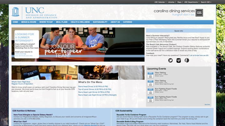
Before & After: The old site didn't use space very well or focus on the tasks or content visitors are most interested in
On top of all this, the old site loaded very slowly and was not optimized for mobile devices. Our task was not only to address each of these design considerations but also to do so in a way that is appropriate to the principal audience: modern and youthful. The resulting design motif has these characteristics:
- Large, bold headlines
- Clear calls-to-action
- Simple, modern shapes (squares and rectangles)
- No unnecessary shading or textures
- Liberal whitespace
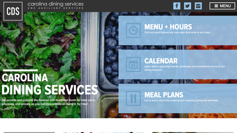
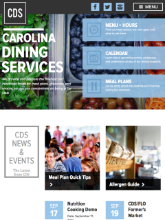
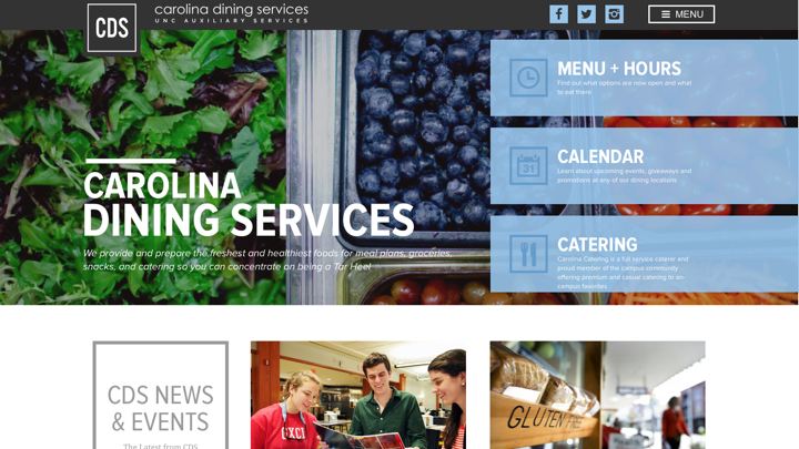
Beyond these, our team designed the interface to feel at home on a screen, the way a program or application on your computer uses the entirety of the real estate. That is, rather than being bound by an arbirtray “page” width, the design is both full-screen and responsive to different device contexts: the new UNC Dining site is as naturally at home on a widescreen desktop monitor as it is a laptop, tablet, or phone.
Links are obvious and easily tappable. The sections and text have clear, well-defined hierarchy. The individual news items and articles are pleasant to read at length. The design spans the whole width of whatever screen you’re using to view it. It employs the same (Carolina) blues and grays of the original palette but balances them against large, high-definition, colorful photographs. The navigation is well-organized, interactive, and hidden except when you want it. Subtle animations convey a sense of responsiveness and whimsy. The overall effect is to put the emphasis squarely on the richness of the content.
Driven by Action
New Media Campaigns employs a philosophy called “Action Driven Design”. This means that we approach every web project by inverting the typical question, “How should it look?” with, “What should it do?”. It forces us to think carefully about what actions people arrive at the site looking to do. It’s often as easy as zeroing in on the one to three most important objectives of the site. In UNC Dining’s case, it was crystal clear:
- What’s open and what is there to eat?
- What’s going on these days?
- What does my meal plan cover?
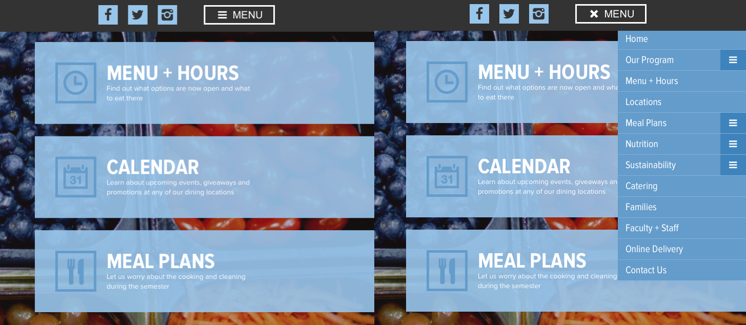
Working backwards from there, you’ll see that all three actions are the most important visual elements on the home page and what most visitors are interested in. But beyond that is a wealth of site information: details about meal plans, catering, and even UNC Dining's commitment to sustainability, all easily accessible from an interactive menu. Click or tap for instant access to all the site's content at a glance.
Social Media
UNC Dining takes its communication channels seriously. It not only posts frequently to twitter, Facebook, and Instragram, but coordinates messaging across all three platforms. That means that followers get a consistent editorial experience whatever their preferred medium.
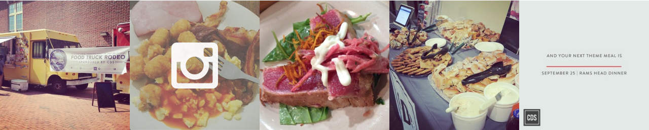
On the home page, we’ve pulled in a live feed from all three. The latest Facebook and twitter updates are pulled in as text and the Instagram updates as large, high-quality photos. This is a terrific way to both reinforce the efforts of the media team as well as provide fresh, original, and attractive content to the home page. It doesn’t hurt to have mouth-watering pictures of food!
Hand-crafted Code
Like all NMC web projects, we write the code by hand. This ensures that it's lean and concise (no unnecessary markup to increase page weight) which optimize the site's page for search engine indexing. It also means we can compress and cache it ahead of time to speed up page rendering time dramatically and work around any browser-specific display bugs (Internet Explorer is notoriously problematic). Finally, UNC Dining works just as well on your giant desktop monitor as it does your laptop, tablet, or phone -- even the menu & hours app, which responds instantly with accurate information as you touch and swipe.
Part 2: Menu & Hours Web Application
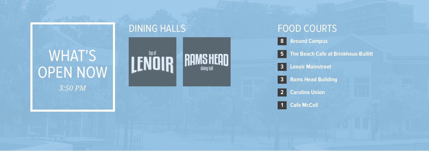
UNC Dining features a web app designed to answer one question: “I’m hungry. What is there to eat on campus?” We designed and built custom software using Ruby on Rails that does a handful of things, instantly and automatically:
- Fetches the current time
- Checks the time against a database of all eating locations throughout UNC campus
- Returns a list of what’s open right now
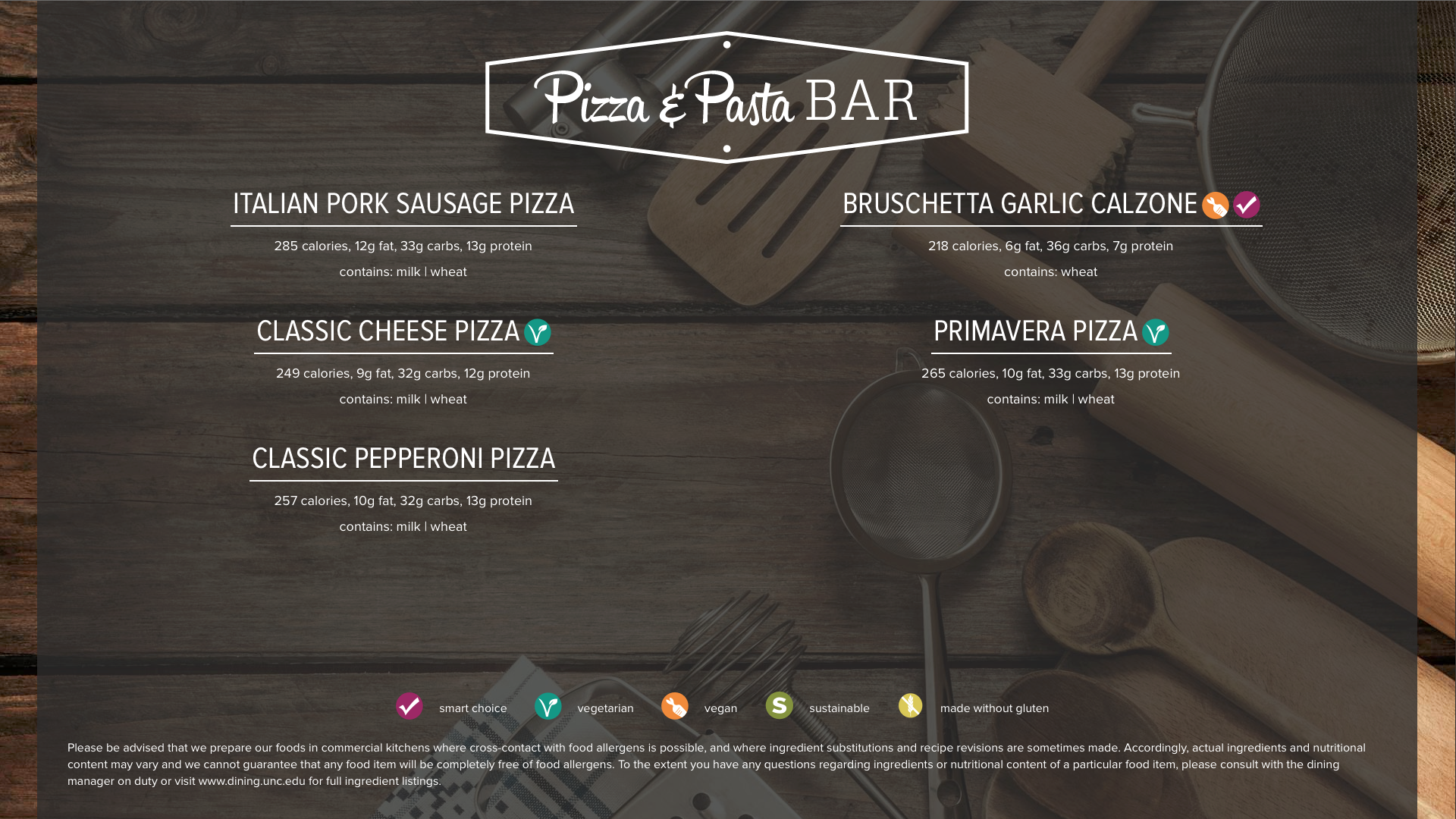
- Displays a current, accurate list of every item on the menu
- Each menu item features full nutrition details & allergen information at a glance
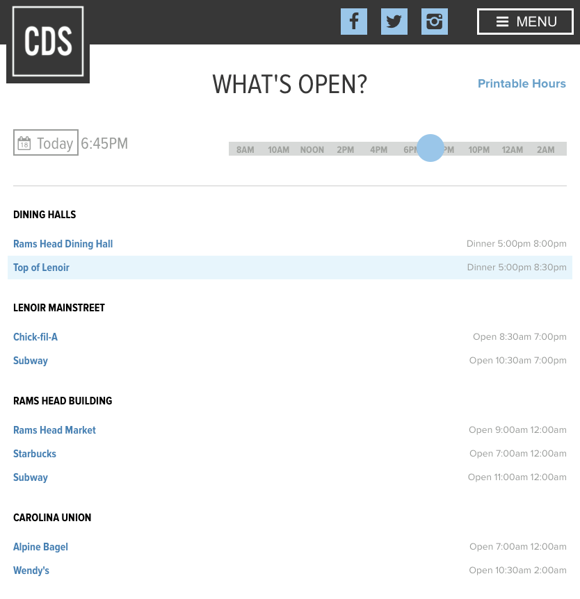
If it just offered that functionality alone, it would be a triumph. But a quick drag of mouse (or thumb) along the timeline reveals the changing hours and options in real time as you slide it, with no delay. Because maybe you’re curious what will be available for dinner later today. And with the instant calendar picker, you can find out what’s for breakfast next week. You can also select multiple meal times from a dropdown menu within the location itself.
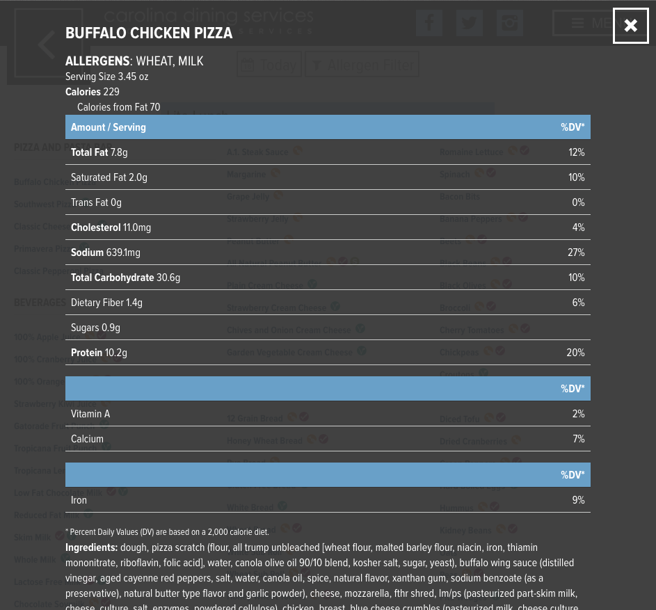
Have special dietary needs? We’ve got you covered there, too. The menu app has an allergen filter listing common suspects like wheat, milk, fish, and peanuts that you can use to exclude from the list any items that contain them. Items with those allergen ingredients are grayed and struck out. Best of all for allergy sufferers, the app remembers your selection each time you visit so you don’t have to keep selecting it every time.
Usage Data
Only a few weeks in and we're witnessing rapid adoption by students as they discover the new app. The application usage has increased every single week since the new website and app launched. We'll continue to keep a close eye on how the new design performs which is just part of our ongoing relationship with the UNC Dining.
Part 3: Menu Screens
To round out the whole new user experience, NMC designed and implemented digital menus on location. These are powered by high-definition LCD television screens at each station in selected dining halls. We worked closely with UNC’s IT staff to pull in a live web feed and make sure everything meshed well. Our goal was for the screens to be as easy to maintain as the rest of the web site but with a customized display so that things like mouse cursors don't show up to ruin the illusion.
Our resident technical genius, Kris Jordan, handled the custom programming (in Scala) and integrated it into UNC's existing screen management system. One of the big improvements of this setup over the previous one the department had was to do away with a ton of design limitations with the old screens, which had to work within the inflexible templates allowed in Scala. We changed the basic setup, however, and instead of using Scala’s templates, we simply pointed each screen at a unique URL and as a result, we were able to take advantage of the flexibilities of modern browsers and really get creative with the screen designs. Now, each screen is set up at a unique URL, allowing for UNC to utilize the latest web techniques and design flexibility in the new layouts
Only NMC
Not many web firms can pull off a project like this. The success of UNC Dining’s new web site and custom application is a perfect example of the unique strengths New Media Campaigns brings together on every web project.
In addition to our extensive familiarity with the particular needs of institutions of higher learning, this project required hands-on coordination from our skilled client relations team; thoughtful, well-structured content strategy & information architecture; bold, original, and effective action-driven visual design; responsive, lean, expert HTML & CSS hand-coding; and complex, custom, back-end programming. All delivered on time and within budget, with wicked fast load times and launched to rave reviews.
We were pleased to have the opportunity to show off our digital chops with the UNC Dining site and the client couldn’t be more thrilled. How can NMC thrill you? Get in touch today.