Tidying up the new Basecamp Calendar
At any one time, we're coordinating up to 50 different projects across our company's nine employees (including one in Wisconsin), meaning we pretty much live and die by 37signals' Basecamp project management tool. It helps us work efficiently and effectively.
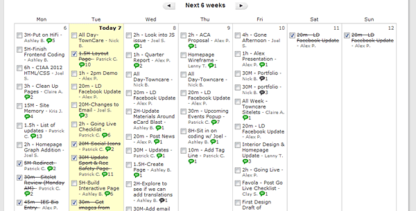
We've been excited for a while for Basecamp's new calendar feature, which launched today! While the functionality was exciting, we were really disappointed by how cluttered it was. It was much tougher to see at-a-glance what was going on at NMC. Here is the new view:

There were are couple of things we didn't like:
- The extremely narrow columns cause wrapping to occur with only one or two words on a line
- The checkboxes are only occasionally needed, but dominate and clutter.
- The message icons add a lot of visual noise
- There is no separation between items
Fortunately, Basecamp is a web app, so it was easy to fix. A number of us in the office use a Chrome Extension called Stylebot. This lets you apply custom styles to an individual site. Within minutes of noticing the new calendar feature in basecamp, we were sharing styles in Campfire (another 37s product).
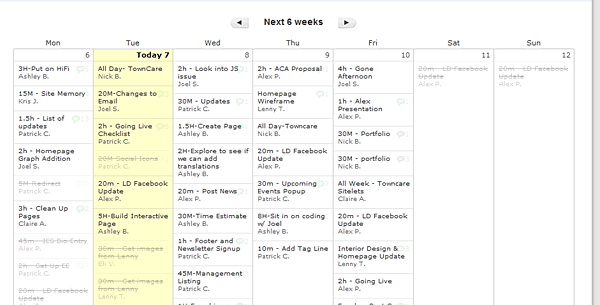
This is the fix we came up with:

This is much less cluttered. The key things we changed were:
- Adding a border separator.
- Hiding the checkbox unless the mouse hovers over an item (we think it should be moved to the popup)
- Fading out the comment bubble and putting it in a consistent location.
- Fading out completed items.
- Decreasing the font-size of the titles by 1px.


Comments
indiaparinam
thank you.It's look very cool.
Leave a comment