From Print to the Web: A Designer's Guide
We work as technology partners with a number of designers. They'll design a site and we'll make it work as a website. These partnerships have been rewarding as we've worked on a diverse range of sites and have been able to meet a number of great designers.
This diversity of work is a product of many of our design partners having a print background. In web design circles we've seen this looked down upon, but frankly our experience with print designers has been incredibly positive. Generally, print designers have a very strong and disciplined design background so once they learn the basic principles of the web as a medium they are able to translate their ability well.
The purpose of this post is to cover the basics of the web for designers who have a strong print background. It doesn't cover core design principals, those translate to the web just fine. The five main areas that will be coverd are:
- Successful Web Layouts
- The Dimensions and Color of the Website Medium
- Safe Typography Choices for the Web
- Backgrounds
- File Organization
Successful Web Layouts
Compared to print pieces, most websites share very common layouts. To some extent, this is because designers tend to copy each other. Other than a lack of creativity however, there are a number of good reasons for this. Websites that behave in expected ways are much easier to use.
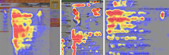
To get an understanding of how web layouts evolved. It is worth reading this piece by Jakob Nielsen about how user's eyes move on a webpage:
F-Shaped Pattern For Reading Web Content
General Website Elements
This eye pattern makes plenty of sense when considering how the elements of site are traditionally placed. Below are some accepted rules-of-thumb to consider when placing website elements:
Logo
A site logo should go in the top left with few exceptions. This is where a visitor's eye goes first so the site will be associated with your brand if the logo is there and ready. Additionally, this is where a visitor will check if they stumble onto the site from elsewhere and they wonder where they are.
Navigation
A site's primary navigation should either be listed vertically along the left side of the page or horizontally along the top of the page. More and more major sites are moving to a horizontal naviation scheme. We believe this trend will continue now that nearly every site designs for a minimum screen width of 1024px. This increased width allows for larger navigational structures to fit horizontally and it also encourages more multi-column content layouts. (See a nytimes.com sectional page.)
Content
The primary content of a page should be towards the left or center and be reasonably narrow. In fact, the same alphabet-and-a-half line length rule applies from print -- for a fixed-width site this means roughly 500 pixels. The primary difference between print is that on the web, text can't easily wrap from one column to the next. Visitors are willing and accustomed to scrolling while reading.
Login, Logout, and Search
These go in the top right of a page by convention. Nearly every bank, ecommerce site, search engine or really every site puts these in the top right so visitors will be looking there.
Banner and Call to Action
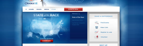
As described in the eye tracking article above, the first pass a visitors eye makes, is in a horizontal stripe across the top of the page. Many sites will put a banner in this area along with a call to action. This has become nearly universal among political websites that must quickly interact with new visitors since the site may be only be up during the campaign.
Contact Forms/Buttons and Signup Forms/Buttons
These are often found in the sidebar of pages towards the top. They can also be placed in the header of a site near the top, but the explosion of blogs has made it more common to see them in sidebars. The important thing to remember is that the farther down the page they are, the number of views they will get will decrease.
Footer
Obviously the footer of a site should be at the bottom. Some of the elements that are often contained within the footer include a repeat of the logo, primary site navigation and copyright line. If the site has a privacy policy or terms of service, this should go in the bottom right.
Well-Understood Layout Elements
"Featured" Box
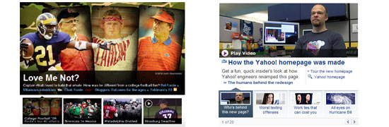
It has become common to use a box in the highlighted banner of a site that features latest stories along with an image. Usually just one will be featured at a time, but it is possible to switch between three or four using tabs, links or buttons. This can be done simply, with a switcher, or other fun effects can be used like sliding or fading. We use this technique on our homepage to highlight our different services and we use a slide transition.
Drop Down Menus
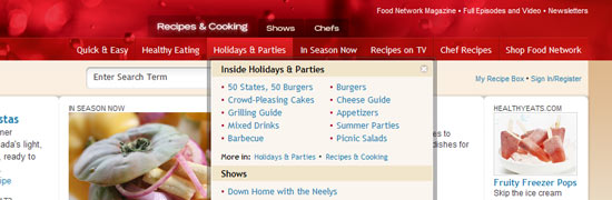
Early-on, drop down's were considered bad practice. This was because they depended on javascript during a time when bandwidth was scarce and javascript was much more unreliable across browsers. Today they are common and quite useful. One form of the dropdown, the mega-dropdown shows a large amount of information at once. These can make deep sites much easier to navigate. Jacob Nielson has a great writeup on these.
The Dimensions and Color of the Website Medium
Compared to print, websites are very small. Websites are shown on low-resolution screens that are poor at reproducing color. This causes a number of issues that a print-to-web designer needs to be aware of.
Pixels vs. Inches vs. DPI
When dealing in print the unit of measure is the inch, or point, or cm or something else that bears a connection to real-life physical dimensions. This is why DPI is used. A designer can create something of a certain size, regardless of the resolution it will be printed at. This is not possible on the web since the unit of measure is the pixel and pixel density varies dramatically. For example, it is possible for the common resolution of 1024x768 to be used on a 12" laptop and a 19" flat panel.
This is why setting your working resolution to 72dpi is not enough! Instead it is important to understand the dimensions of the media in terms of pixels. Monitors may have varied resolutions, but in 2009 it is safe to design for a minimum resolution of 1024x768. This does not mean that you can use all of those pixels as you can see below:
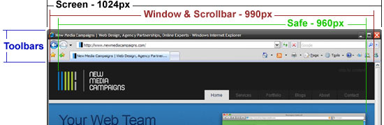
Safe Dimensions
Some of the width and the height will be consumed by the browser, scroll bar, toolbars and even the windows task bar. We consider a safe maximum width to be 960px. It may be worth going more narrow if the background image or color are important to the tone of the site. For elements that must be "above-the-fold" use 500px as a safe number. Also remember that visitors are more and more willing to scroll.
For content columns aim for 450-650px wide. This gives visitors a chance to change their font size without losing a good reading width.
Working in Photoshop
When in Photoshop, be sure to set your unit of measure to the pixel so that it is easy to work out the dimensions of the site. Additionally be sure to use the sRGB colorspace. CMYK does not work on the web. If the site ends up needing translated from CMYK some colors may be slightly different than you originally intended. Additionally, if you are ever saving an image for the web, a CMYK image will not display properly on most visitors machines.
Typography for the Web
Web Safe Fonts
Typography on the web is depressing. There is really no way around it. There are some emerging technologies that could make the situation better, but these are the only safe fonts for copy:
- Times / Times New Roman
- Georgia
- Palatino Linotype
- Andale Mono
- Arial
- Arial Black
- Impact
- Trebuchet MS
- Verdana
- Comic Sans MS
- Courier New
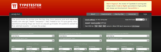
So what does "web-safe" mean? It means you can expect them to be installed on a visitor's computer and that it will render as you expect. If you use a font that a visitor doesn't have, the results cannot necessarily be anticipated and a replacement font will be selected. To try out some of these fonts on the fly, the following tool is great:
Using Non-Web-Safe Fonts
Other fonts can also be used sparingly by using a number of techniques. The thing to remember, however, is that any of these techniques have downsides. They either cause the page to render more slowly, increase the file-size of the site, or make text impossible to copy and paste. Many of the best "web-medium" designs stick to web-safe fonts as much as possible
Replacement Techniques:
- Basic Image Replacement - This is just a rasterizaton of the text to a static jpg, gif or png. This makes it impossible to update the text with a CMS and also can have some SEO downsides. This is the best technique for logos or other major design elements.
- Cufon - This uses javascript to draw the text in a font as vector shapes. It is reasonably lightweight and it is easy to change text since it is done dynamically. As a downside, the text cannot be selected and it can have a delay prior to rendering.
- sIFR - This method is like cufon except it uses flash to render the text. This makes it a little more heavy-weight, but its text can be selected.
Designing for more than Lorem Ipsum
If you are designing a site with client or user generated text, you'll need to consider more than just paragraph text. A good web-style guide will be ready for:
- Headings 1-6
- Paragraph Text
- Ordered Lists
- Unordered Lists
- Blockquotes
Building this out will ensure that the site design will continue to look good even as content is added.
Backgrounds
Since visitors have different monitor sizes, they will see a different amount of the site background. This should be considered when designing the background. In most cases, a repeating background will be used, so it won't matter how large a monitor is. That is how this site works:
A background image must also account for the fact that each page will be a different height. In the case of our site, we repeat the background image horizontally over a white background. The same can be done with a vertical gradient, but it will need to ultimately fade to a static color, so that a webpage can extend down indefinately.
If an image is used as the background, it will need to consider extra wide monitors. It should either fade out to a static color, or the image should be 1920px wide to accomodate 24" monitors. It will also have the issue of vertical expansion to consider.
Organization
As mentioned early on in this guide, it is important to set up Photoshop to be ready to work with web colors and pixel based dimensions. To do this, set your color profile to sRGB and your units to pixels. This will get you off to a great start.
From there, it is important to keep your photoshop file well organized as it will serve as a reference for the website design for the life of the site. There is a great guide on Web Design Depot on how to do this. The key points are:
- Make sure every layer is labeled and organized in a folder.
- Nest Folders into a logical design heirarchy.
- Make sure to include hover and click states
This concludes the guide. We have tried to make it as comprehensive as possible while still remaining brief. If you have any suggestions on additional tips to include or bad advice to remove be sure to let us know in the comments.
Related Posts

Comments
Www.htcs.Com.cn
Wow! This can be one particular of the most helpful blogs We have ever arrive acrosson this subject. Actually Excellent. I am also an expert in this topic therefore I can understand your effort.
web application development
It is advisable to maintain your graphic sizes diminutive. When the pixel size of your graphics is too immense, your page loads slowly. Your readers might not wait that long.
web design chennai
Thanks for this useful Guide. You have given good idea on these basic topics.
Leave a comment