Designing for the mobile web
Devices and Platforms
 New Media Campaigns recently launched a mobile version of its website. When I was first approached with this project, Joel Sutherland and I debated how we should develop the mobile website. Should we develop a mobile website only for Apple, Inc.'s iPhone? Or should we develop a mobile website for as many mobile devices as possible?
The mobile web has surged in popularity lately with help from the iPhone. The iPhone has been a tremendous success, and it has propelled web standards into the main stream thanks to its adoption of the Webkit platform. Other recent smart phones and mobile devices have also adopted the Webkit platform, such as Verizon's Droid and Palm's Pre.
Joel and I decided to target the Webkit platform rather than a single device. The Webkit platform provides a nice breadth of device coverage and a surplus of advanced web development features, such as web standards and CSS3 support. As a result, we were able to leverage advanced CSS properties such as border-radius, text-shadow, and more. Of course, these properties will degrade gracefully in less-advanced web platforms. In an earlier blog post, Joel describes how we targeted specific devices that support the Webkit platform.
Simplify, simplify, simplify
A smart phone is small compared to a desktop web browser. The Apple iPhone and Palm Pre provide a 320x480 screen. The Verizon Droid provides a slightly larger screen. With such little space, it is imperative to provide a good user experience with a simple and easy to use interface that provides only the most important information.
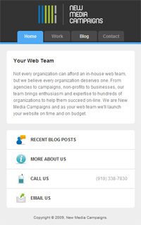
While designing our mobile website, I filtered our primary website into four distinct categories: Home, Work, Blog, and Contact. These categories were translated into tabs, a global layout element that resides at the top of every page on our mobile website. Tabs are an immediately identifiable and easy to use form of website navigation.
The "Home" tab provides a brief description of New Media Campaigns, with links to recent blog posts and an about page. There is also a link that will initiate a phone call and a link that will initiate an email.
The "Blog" tab provides the best example of simplification. Unlike our primary website, we do not use categories or tags on the mobile website. Instead, we provide a single paginated stream of blog posts. The listing view provides the title, excerpt, and number of comments for each blog post. Viewing an individual blog post also allows the mobile website visitor to read existing comments or leave a new comment. Ultimately, our mobile website provides a simple, usable, informative blog that provides exactly what is needed and nothing that is not.
The "Contact" tab provides only what is necessary to contact our web design agency: a simple HTML form and a link to initiate a phone call.
Our mobile website is simple and easy to use. It provides the most important information in an accessible format. This is perfect for mobile website visitors who are usually on the go, in a hurry, and need important information fast.
Device agnostic, platform centric
In my opinion, the future of mobile web-enabled devices is Webkit. Webkit provides a stable, standards-compliant, and forward-thinking platform that is being adopted by the most popular mobile devices, including Apple Inc.'s iPhone, Verizon's Droid, and Palm's Pre. RIM recently posted a job listing for a Webkit developer... perhaps a future Blackberry will also support the Webkit platform.
Our mobile website works in any Webkit-enabled mobile device, in portrait or landscape orientation. If an end-user visits our website in another device, the same information will still be accessible; we used simple, clean, standards-compliant XHTML markup to structure our mobile website. This ensures the information will still be readily accessible to any device that can adequately parse HTML.


Comments
Dan
I think you nailed it right here
"Ultimately, our mobile website provides a simple, usable, informative blog that provides exactly what is needed and nothing that is not."
That is all that is needed in a mobile website, if the website is not meant to be solely a mobile website.
It looks good!
Josh Lockhart NMC team member
@Paul That sounds great! Feel free to shoot me an email and I will be happy to discuss how you would like to approach a mobile version of your website.
Paul Roetzer
Josh,
Very cool. The site looks great on an iPhone. We should talk about the mobile version of our site.
Paul
Leave a comment